SideNav MDB Pro component
Bootstrap sidenav
Bootstrap sidenav is a vertical navigation component which apart from traditional, text links, might embed icons, dropdowns, avatars or search forms.
By virtue of its clarity and simplicity it remarkably increases User Experience. It allows you to navigate through small applications as well as vast portals swiftly. Multiple link embedding functionality enables you to implement more advanced content categorisation, which is almost essential within bigger projects.
Thanks to MDB you can easily implement SideNav in your own projects, by using one of various, alluring Side Menus.
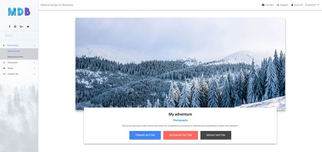
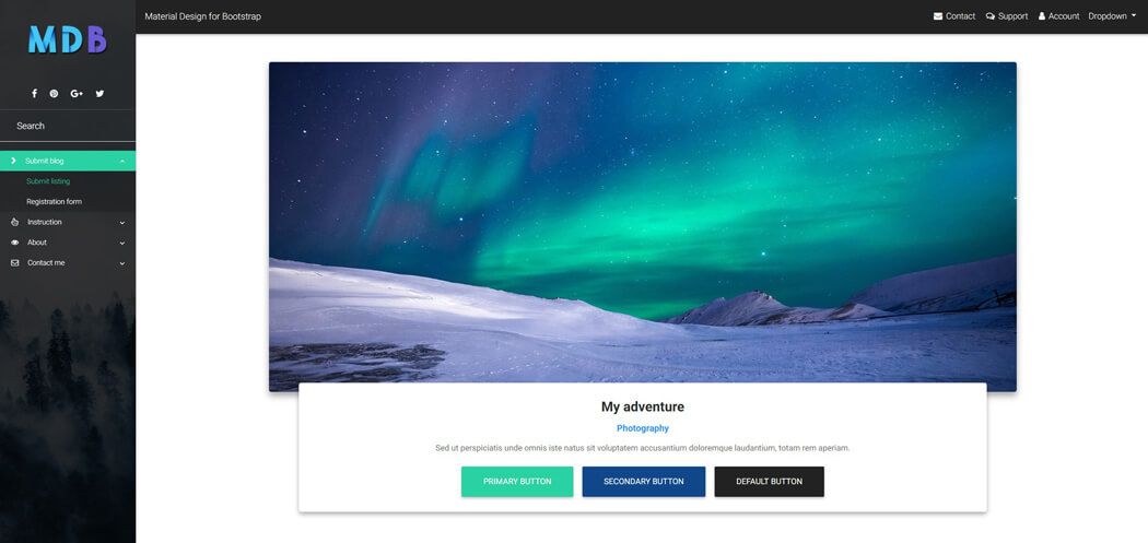
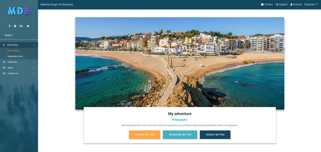
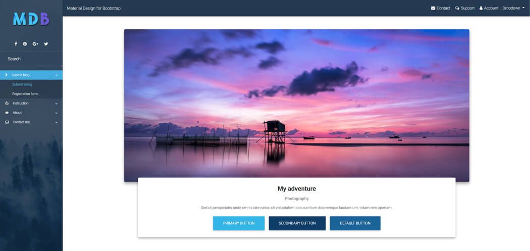
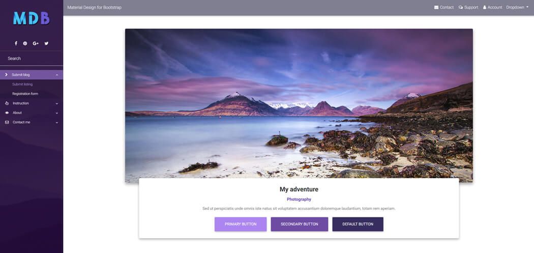
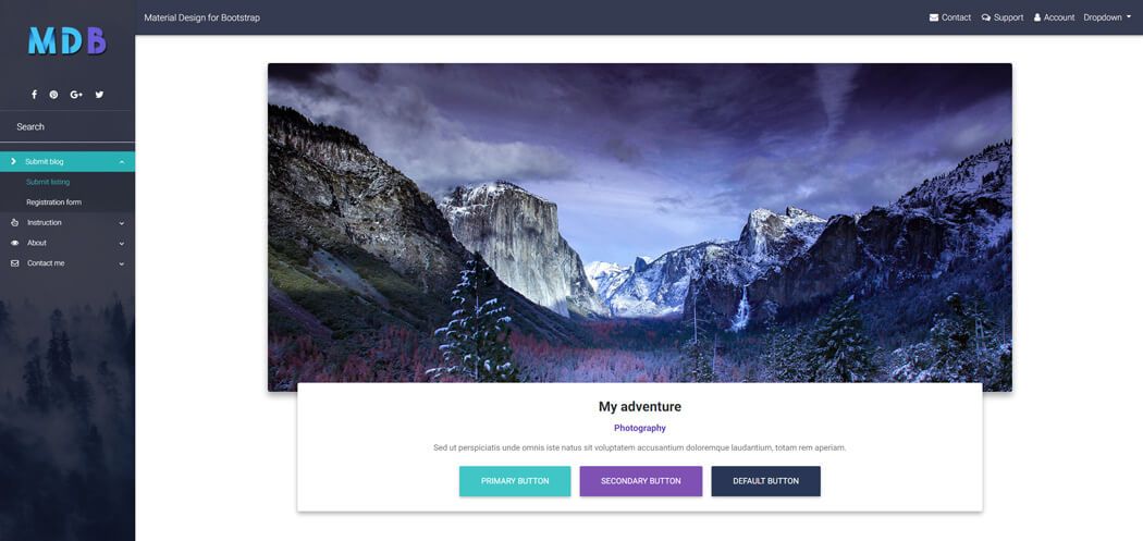
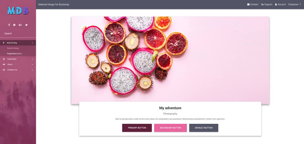
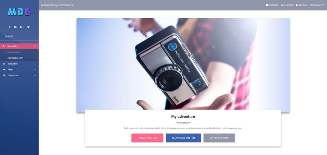
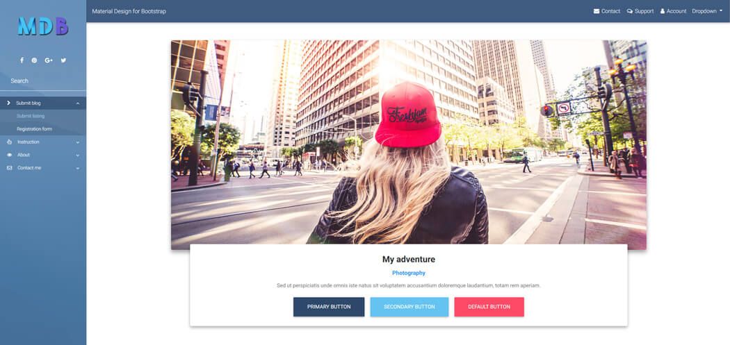
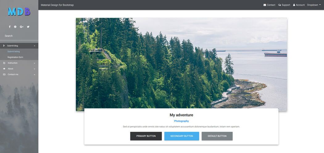
Navigation on the left is a live demo of SideNav.
Mobile version:

SideNav examples
Click on the images below to see live preview
Basic usage
Initialization required
To make SideNav works properly you have to initialize it first with the code below:
Initialization code and HTML structure:
Place JavaScript code below
<script type="text/javascript" src="js/mdb.min.js"></script>
in the scripts section of your project.
        // SideNav Button Initialization
        $(".button-collapse").sideNav();
        // SideNav Scrollbar Initialization
        var sideNavScrollbar = document.querySelector('.custom-scrollbar');
        Ps.initialize(sideNavScrollbar);
        <!-- SideNav slide-out button -->
        <a href="#" data-activates="slide-out" class="btn btn-primary p-3 button-collapse"><i class="fa fa-bars"></i></a>

        <!-- Sidebar navigation -->
        <div id="slide-out" class="side-nav fixed">
          <ul class="custom-scrollbar">
            <!-- Logo -->
            <li>
              <div class="logo-wrapper waves-light">
                <a href="#"><img src="https://mdbootstrap.com/img/logo/mdb-transparent.png" class="img-fluid flex-center"></a>
              </div>
            </li>
            <!--/. Logo -->
            <!--Social-->
            <li>
              <ul class="social">
                <li><a href="#" class="icons-sm fb-ic"><i class="fa fa-facebook"> </i></a></li>
                <li><a href="#" class="icons-sm pin-ic"><i class="fa fa-pinterest"> </i></a></li>
                <li><a href="#" class="icons-sm gplus-ic"><i class="fa fa-google-plus"> </i></a></li>
                <li><a href="#" class="icons-sm tw-ic"><i class="fa fa-twitter"> </i></a></li>
              </ul>
            </li>
            <!--/Social-->
            <!--Search Form-->
            <li>
              <form class="search-form" role="search">
                <div class="form-group md-form mt-0 pt-1 waves-light">
                  <input type="text" class="form-control" placeholder="Search">
                </div>
              </form>
            </li>
            <!--/.Search Form-->
            <!-- Side navigation links -->
            <li>
              <ul class="collapsible collapsible-accordion">
                <li><a class="collapsible-header waves-effect arrow-r"><i class="fa fa-chevron-right"></i> Submit blog<i
                      class="fa fa-angle-down rotate-icon"></i></a>
                  <div class="collapsible-body">
                    <ul>
                      <li><a href="#" class="waves-effect">Submit listing</a>
                      </li>
                      <li><a href="#" class="waves-effect">Registration form</a>
                      </li>
                    </ul>
                  </div>
                </li>
                <li><a class="collapsible-header waves-effect arrow-r"><i class="fa fa-hand-pointer-o"></i> Instruction<i
                      class="fa fa-angle-down rotate-icon"></i></a>
                  <div class="collapsible-body">
                    <ul>
                      <li><a href="#" class="waves-effect">For bloggers</a>
                      </li>
                      <li><a href="#" class="waves-effect">For authors</a>
                      </li>
                    </ul>
                  </div>
                </li>
                <li><a class="collapsible-header waves-effect arrow-r"><i class="fa fa-eye"></i> About<i class="fa fa-angle-down rotate-icon"></i></a>
                  <div class="collapsible-body">
                    <ul>
                      <li><a href="#" class="waves-effect">Introduction</a>
                      </li>
                      <li><a href="#" class="waves-effect">Monthly meetings</a>
                      </li>
                    </ul>
                  </div>
                </li>
                <li><a class="collapsible-header waves-effect arrow-r"><i class="fa fa-envelope-o"></i> Contact me<i
                      class="fa fa-angle-down rotate-icon"></i></a>
                  <div class="collapsible-body">
                    <ul>
                      <li><a href="#" class="waves-effect">FAQ</a>
                      </li>
                      <li><a href="#" class="waves-effect">Write a message</a>
                      </li>
                      <li><a href="#" class="waves-effect">FAQ</a>
                      </li>
                      <li><a href="#" class="waves-effect">Write a message</a>
                      </li>
                      <li><a href="#" class="waves-effect">FAQ</a>
                      </li>
                      <li><a href="#" class="waves-effect">Write a message</a>
                      </li>
                      <li><a href="#" class="waves-effect">FAQ</a>
                      </li>
                      <li><a href="#" class="waves-effect">Write a message</a>
                      </li>
                    </ul>
                  </div>
                </li>
              </ul>
            </li>
            <!--/. Side navigation links -->
          </ul>
          <div class="sidenav-bg rgba-blue-strong"></div>
        </div>
        <!--/. Sidebar navigation -->
Slide out button
Slide out button is a trigger which launches a SideNav when it's hidden. You can place it
wherever you want - you
just need to add
.button-collapse class and
data-activates="slide-out" attribute to the chosen element.
Options
        // SideNav Options
        $('.button-collapse').sideNav({
        edge: 'right', // Choose the horizontal origin
        closeOnClick: true // Closes side-nav on <a> clicks, useful for Angular/Meteor
        });
jQuery Methods
        // Show sideNav
        $('.button-collapse').sideNav('show');
        // Hide sideNav
        $('.button-collapse').sideNav('hide');
Fixed / non-fixed SideNav
Use class
.fixed to have the sideNav be fixed and open on large screens and hides to the regular functionality
on smaller screens.
Our sideNav on the left is an example of fixed SideNav.
If you want to hide your SideNav by default just
remove
.fixed class from the SideNav.
<ul id="slide-out" class="side-nav fixed">
Required
padding-leftwhen using.fixedclassIf you are planning on using this you will have to offset your content by the width of the side menu. Place the padding on where the offset content will be, which in our case is in header, main and footer.
        header, main, footer {
         padding-left: 240px;
        }

        @media only screen and (max-width : 992px) {
           header, main, footer {
               padding-left: 0;
              }
          }
Note: Instead of adding required padding via CSS you can use one of our predefined Navigation Layouts
Customization
Changing the mask
You can use more than 50 rgba colors from our Material Palette just by adding a proper color class.
In the example below we've added a
.rgba-blue-strong color class
<div class="sidenav-bg rgba-blue-strong"></div>
Changing the color
You can use each of 300 colors from our Material Palette just by adding a proper color class.
In the example below we've added a
.purple color class and
.darken-4 to make the color 4 levels darker.
        <!-- SideNav Menu -->
        <ul id="slide-out" class="side-nav fixed purple darken-4 custom-scrollbar">
Light /dark background
Depending on light or dark background you may need to set a proper contrast for links and other SideNav's elements.
Use
.side-nav-light for light backgrounds.
<ul id="slide-out" class="side-nav side-nav-light">
Gradient / images / masks
For gradients, images or masks use our predefined Skins
Layouts & Skins
MDB provides you multiple useful, ready-to-use page layouts with various predefined navigation types.
Getting started : download & setup
Download
All the components and features are part of MDBootstrap package.
MDBootstrap (Material Design for Bootstrap) is a free (MIT Licensed) framework combining Material Design and the newest Bootstrap 4.
Click the button below to go to Download Page, where you can download MDBootstrap package.
MDBootstrap Download MDBootstrap AboutMDB Pro
Using components and features labeled as MDB Pro component requires MDB Pro package.
Click the button below to learn more about MDBbootstrap Pro package
MDBootstrap ProTutorials
If you need additional help to start, use our "5 min Quick Start" or "Full tutorial" resources.
5 min Quick Start Full TutorialCompilation
To reduce a weight of MDBootstrap package, you can compile your own, custom package containing only components and features you need.
Map of dependencies of SCSS files in MDBootstrap:
    Legend:

    '-->' means 'required'

    All free and pro files require files from 'core' catalog

    'none' means 'this component doesn't require anything except core files'

    A file wrapped by `< >` means that this file make the base component prettier but it isn't necessary for the proper working

    All PRO components require 'pro/_variables.scss' file

    scss/
    |
    |-- core/
    |   |
    |   |-- bootstrap/
    |   |	|-- _functions.scss
    |   |	|-- _variables.scss
    |   |
    |   |-- _colors.scss
    |   |-- _global.scss
    |   |-- _helpers.scss
    |   |-- _masks.scss
    |   |-- _mixins.scss
    |   |-- _typography.scss
    |   |-- _variables.scss
    |   |-- _waves.scss
    |
    |-- free/
    |   |-- _animations-basic.scss --> none
    |   |-- _animations-extended.scss --> _animations-basic.scss
    |   |-- _buttons.scss --> none
    |   |-- _cards.scss --> none <_buttons.scss>
    |   |-- _dropdowns.scss --> none <_buttons.scss>
    |   |-- _input-group.scss --> _forms.scss, _buttons.scss, _dropdowns.scss
    |   |-- _navbars.scss --> none <_buttons.scss, _forms.scss, _input-group.scss>
    |   |-- _pagination.scss --> none
    |   |-- _badges.scss --> none
    |   |-- _modals.scss --> _buttons.scss, _forms.scss (PRO --> _tabs.scss)
    |   |-- _carousels.scss --> <_buttons.scss>
    |   |-- _forms.scss --> none
    |   |-- _msc.scss --> none <_buttons.scss, _forms.scss, _cards.scss>
    |   |-- _footers.scss none <_buttons.scss> (PRO: )
    |   |-- _list-group.scss --> none
    |   |-- _tables.scss --> none (PRO: _material-select.scss, pro/_forms.scss, _checkbox.scss, pro/_buttons.scss, pro/_cards.scss, _pagination.scss, pro/_msc.scss)
    |   |-- _depreciated.scss
    |
    |-- pro/
    |   |
    |   |-- picker/
    |   |   |-- _default.scss --> none
    |   |   |-- _default-time.scss --> _default.scss, free/_forms.scss, free/_buttons.scss, pro/_buttons.scss, free/_cards.scss
    |   |   |-- _default-date.scss --> _default.scss, free/_forms.scss
    |   |
    |   |-- sections/
    |   |   |-- _templates.scss --> _sidenav.scss
    |   |   |-- _social.scss --> free/_cards.scss, free/ _forms.scss, free/_buttons.scss, pro/_buttons.scss,
    |   |   |-- _team.scss --> free/_buttons.scss, pro/_buttons.scss, free/_cards.scss, pro/_cards.scss
    |   |   |-- _testimonials.scss --> free/_carousels.scss, pro/_carousels.scss, free/_buttons.scss, pro/_buttons.scss
    |   |   |-- _magazine.scss --> _badges.scss
    |   |   |-- _pricing.scss --> free/_buttons.scss, pro/_buttons.scss
    |   |   |-- _contacts.scss --> free/_forms.scss, pro/_forms.scss, free/_buttons.scss, pro/_buttons.scss
    |   |
    |   |-- _variables.scss
    |   |-- _buttons.scss --> free/_buttons.scss, pro/_msc.scss, _checkbox.scss, _radio.scss
    |   |-- _social-buttons.scss --> free/_buttons.scss, pro/_buttons.scss
    |   |-- _tabs.scss --> _cards.scss
    |   |-- _cards.scss --> free/_cards.scss <_buttons.scss, _social-buttons.scss>
    |   |-- _dropdowns.scss --> free/_dropdowns.scss, free/_buttons.scss
    |   |-- _navbars.scss --> free/_navbars.scss  (PRO: )
    |   |-- _scrollspy.scss --> none
    |   |-- _lightbox.scss --> none
    |   |-- _chips.scss --> none
    |   |-- _msc.scss --> none
    |   |-- _forms.scss --> none
    |   |-- _radio.scss --> none
    |   |-- _checkbox.scss --> none
    |   |-- _material-select.scss --> none
    |   |-- _switch.scss --> none
    |   |-- _file-input.scss --> free/_forms.scss, free/_buttons.scss
    |   |-- _range.scss --> none
    |   |-- _input-group.scss --> free/_input-group.scss and the same what free input group, _checkbox.scss, _radio.scss
    |   |-- _autocomplete.scss --> free/_forms.scss
    |   |-- _accordion.scss --> pro/_animations.scss, free/_cards.scss
    |   |-- _parallax.scss --> none
    |   |-- _sidenav.scss --> free/_forms.scss, pro/_animations.scss, sections/_templates.scss
    |   |-- _ecommerce.scss --> free/_cards.scss, pro/_cards.scss, free/_buttons.scss, pro/_buttons.scss, pro/_msc.scss
    |   |-- _carousels.scss --> free/_carousels.scss, free/_cards.scss, free/_buttons.scss
    |   |-- _steppers.scss --> free/_buttons.scss
    |   |-- _blog.scss --> none
    |   |-- _toasts.scss --> free/_buttons.scss
    |   |-- _animations.scss --> none
    |   |-- _charts.scss --> none
    |   |-- _progress.scss --> none
    |   |-- _scrollbar.scss --> none
    |   |-- _skins.scss --> none
    |   |-- _depreciated.scss
    |
    `-- _custom-skin.scss
    `-- _custom-styles.scss
    `-- _custom-variables.scss
    `-- mdb.scss
Map of dependencies of JavaScript modules in MDBootstrap:
    Legend:

    '-->' means 'required'

    All files require jQuery and bootstrap.js

    js/
    ├── dist/
    │   ├── buttons.js
    │   ├── cards.js
    │   ├── character-counter.js
    │   ├── chips.js
    │   ├── collapsible.js --> vendor/velocity.js
    │   ├── dropdown.js --> Popper.js, jquery.easing.js
    │   ├── file-input.js
    │   ├── forms-free.js
    │   ├── material-select.js --> dropdown.js
    │   ├── mdb-autocomplete.js
    │   ├── preloading.js
    │   ├── range-input.js --> vendor/velocity.js
    │   ├── scrolling-navbar.js
    │   ├── sidenav.js --> vendor/velocity.js, vendor/hammer.js, vendor/jquery.hammer.js
    │   └── smooth-scroll.js
    ├── _intro-mdb-pro.js
    ├── modules.js
    ├── src/
    │   ├── buttons.js
    │   ├── cards.js
    │   ├── character-counter.js
    │   ├── chips.js
    │   ├── collapsible.js --> vendor/velocity.js
    │   ├── dropdown.js --> Popper.js, jquery.easing.js
    │   ├── file-input.js
    │   ├── forms-free.js
    │   ├── material-select.js --> dropdown.js
    │   ├── mdb-autocomplete.js
    │   ├── preloading.js
    │   ├── range-input.js --> vendor/velocity.js
    │   ├── scrolling-navbar.js
    │   ├── sidenav.js --> vendor/velocity.js, vendor/hammer.js, vendor/jquery.hammer.js
    │   └── smooth-scroll.js
    └── vendor/
        ├── addons/
        │   ├── datatables.js
        │   └── datatables.min.js
        ├── chart.js
        ├── enhanced-modals.js
        ├── hammer.js
        ├── jarallax.js
        ├── jarallax-video.js --> vendor/jarallax.js
        ├── jquery.easing.js
        ├── jquery.easypiechart.js
        ├── jquery.hammer.js --> vendor/hammer.js
        ├── jquery.sticky.js
        ├── lightbox.js
        ├── picker-date.js --> vendor/picker.js
        ├── picker.js
        ├── picker-time.js --> vendor/picker.js
        ├── scrollbar.js
        ├── scrolling-navbar.js
        ├── toastr.js
        ├── velocity.js
        ├── waves.js
        └── wow.js
Compilation & Customization tutorial
If you need additional help to compile your custom package, use our Compilation & Customization tutorial
Compilation & Customization tutorialIntegrations with Angular, React or Vue
Apart from standard Bootstrap integration with jQuery, MDBootstrap provides integrations with Angular, React and Vue.
About MDB Angular About MDB React About MDB Vue