Magazine sections
Bootstrap magazine sections
MDB provides you multiple sections and components typical for magazines.
Magazine newsfeed v.1 MDB Pro component
Section title
Duis aute irure dolor in reprehenderit in voluptate velit esse cillum dolore eu fugiat nulla pariatur. Excepteur sint occaecat cupidatat non proident, sunt in culpa qui officia deserunt mollit id laborum.

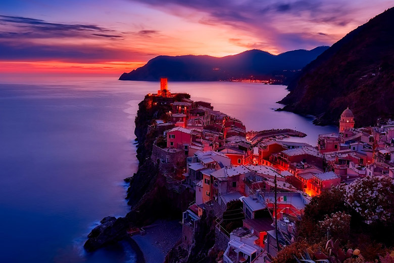
Travels
20/08/2018
Title of the news
Nam libero tempore, cum soluta nobis est eligendi optio cumque nihil impedit quo minus id quod maxime placeat facere possimus, omnis voluptas assumenda est, omnis dolor repellendus.


17/08/2018

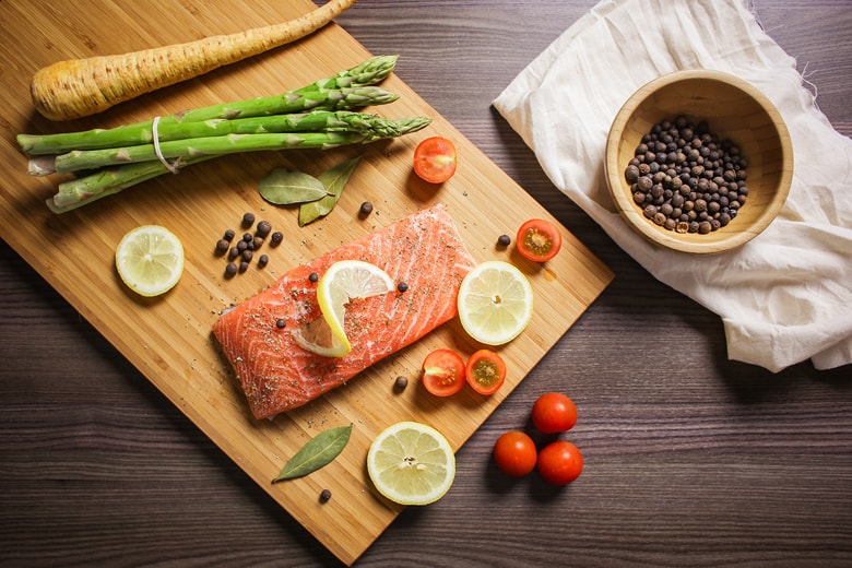
Lifestyle
24/08/2018
Title of the news
Sed ut perspiciatis unde voluptatem omnis iste natus error sit voluptatem accusantium doloremque laudantium, totam rem aperiam, eaque ipsa quae ab illo inventore veritatis et quasi architecto beatae.

.jpg)
21/08/2018
<!--Section: Live preview-->
<section id="v-1">
<h2 class="title pt-4 mt-5">
<strong>Magazine newsfeed v.1 </strong>
<a href="https://mdbootstrap.com/products/jquery-ui-kit/" target="_blank" class="btn btn-danger btn-md"
role="button">MDB Pro component
<i class="fa fa-diamond ml-1"></i>
</a>
</h2>
<!-- Section: Magazine v.1 -->
<section class="magazine-section my-5">
<!-- Section heading -->
<h2 class="h1-responsive font-weight-bold text-center my-5">Section title</h2>
<!-- Section description -->
<p class="text-center dark-grey-text w-responsive mx-auto mb-5">Duis aute irure dolor in reprehenderit in
voluptate velit esse cillum dolore eu fugiat nulla pariatur. Excepteur sint occaecat cupidatat non
proident, sunt in culpa qui officia deserunt mollit id laborum.</p>
<!-- Grid row -->
<div class="row">
<!-- Grid column -->
<div class="col-lg-6 col-md-12">
<!-- Featured news -->
<div class="single-news mb-4">
<!-- Image -->
<div class="view overlay rounded z-depth-1-half mb-4">
<img class="img-fluid" src="https://mdbootstrap.com/img/Photos/Others/images/82.jpg" alt="Sample image">
<a>
<div class="mask rgba-white-slight"></div>
</a>
</div>
<!-- Data -->
<div class="news-data d-flex justify-content-between">
<a href="#!" class="light-blue-text">
<h6 class="font-weight-bold"><i class="fa fa-plane pr-2"></i>Travels</h6>
</a>
<p class="font-weight-bold dark-grey-text"><i class="fa fa-clock-o pr-2"></i>20/08/2018</p>
</div>
<!-- Excerpt -->
<h3 class="font-weight-bold dark-grey-text mb-3"><a>Title of the news</a></h3>
<p class="dark-grey-text">Nam libero tempore, cum soluta nobis est eligendi optio cumque nihil
impedit quo minus id quod maxime placeat facere possimus, omnis voluptas assumenda est, omnis
dolor
repellendus.</p>
</div>
<!-- Featured news -->
<!-- Small news -->
<div class="single-news mb-4">
<!-- Grid row -->
<div class="row">
<!-- Grid column -->
<div class="col-md-3">
<!--Image-->
<div class="view overlay rounded z-depth-1 mb-4">
<img class="img-fluid" src="https://mdbootstrap.com/img/Photos/Others/photo8.jpg" alt="Sample image">
<a>
<div class="mask rgba-white-slight"></div>
</a>
</div>
</div>
<!-- Grid column -->
<!-- Grid column -->
<div class="col-md-9">
<!-- Excerpt -->
<p class="font-weight-bold dark-grey-text">19/08/2018</p>
<div class="d-flex justify-content-between">
<div class="col-11 text-truncate pl-0 mb-3">
<a href="#!" class="dark-grey-text">Lorem ipsum dolor sit amet, consectetur adipiscing elit</a>
</div>
<a><i class="fa fa-angle-double-right"></i></a>
</div>
</div>
<!-- Grid column -->
</div>
<!-- Grid row -->
</div>
<!-- Small news -->
<!-- Small news -->
<div class="single-news mb-4">
<!-- Grid row -->
<div class="row">
<!-- Grid column -->
<div class="col-md-3">
<!--Image-->
<div class="view overlay rounded z-depth-1 mb-4">
<img class="img-fluid" src="https://mdbootstrap.com/img/Photos/Others/images/54.jpg" alt="Sample image">
<a>
<div class="mask rgba-white-slight"></div>
</a>
</div>
</div>
<!-- Grid column -->
<!-- Grid column -->
<div class="col-md-9">
<!-- Excerpt -->
<p class="font-weight-bold dark-grey-text">18/08/2018</p>
<div class="d-flex justify-content-between">
<div class="col-11 text-truncate pl-0 mb-3">
<a href="#!" class="dark-grey-text">Soluta nobis est eligendi optio cumque nihil impedit
quo
minus</a>
</div>
<a><i class="fa fa-angle-double-right"></i></a>
</div>
</div>
<!-- Grid column -->
</div>
<!-- Grid row -->
</div>
<!-- Small news -->
<!-- Small news -->
<div class="single-news mb-lg-0 mb-4">
<!-- Grid row -->
<div class="row">
<!-- Grid column -->
<div class="col-md-3">
<!--Image-->
<div class="view overlay rounded z-depth-1 mb-lg-0 mb-4">
<img class="img-fluid" src="https://mdbootstrap.com/img/Photos/Others/images/49.jpg" alt="Sample image">
<a>
<div class="mask rgba-white-slight"></div>
</a>
</div>
</div>
<!-- Grid column -->
<!-- Grid column -->
<div class="col-md-9">
<!-- Excerpt -->
<p class="font-weight-bold dark-grey-text">17/08/2018</p>
<div class="d-flex justify-content-between">
<div class="col-11 text-truncate pl-0 mb-lg-0 mb-3">
<a href="#!" class="dark-grey-text">Voluptatem accusantium doloremque</a>
</div>
<a><i class="fa fa-angle-double-right"></i></a>
</div>
</div>
<!-- Grid column -->
</div>
<!-- Grid row -->
</div>
<!-- Small news -->
</div>
<!-- Grid column -->
<!-- Grid column -->
<div class="col-lg-6 col-md-12">
<!-- Featured news -->
<div class="single-news mb-4">
<!-- Image -->
<div class="view overlay rounded z-depth-1-half mb-4">
<img class="img-fluid" src="https://mdbootstrap.com/img/Photos/Others/images/84.jpg" alt="Sample image">
<a>
<div class="mask rgba-white-slight"></div>
</a>
</div>
<!-- Data -->
<div class="news-data d-flex justify-content-between">
<a href="#!" class="pink-text">
<h6 class="font-weight-bold"><i class="fa fa-home pr-2"></i>Lifestyle</h6>
</a>
<p class="font-weight-bold dark-grey-text"><i class="fa fa-clock-o pr-2"></i>24/08/2018</p>
</div>
<!-- Excerpt -->
<h3 class="font-weight-bold dark-grey-text mb-3"><a>Title of the news</a></h3>
<p class="dark-grey-text">Sed ut perspiciatis unde voluptatem omnis iste natus error sit voluptatem
accusantium doloremque laudantium, totam rem aperiam, eaque ipsa quae ab illo inventore veritatis
et quasi architecto beatae.</p>
</div>
<!-- Featured news -->
<!-- Small news -->
<div class="single-news mb-4">
<!-- Grid row -->
<div class="row">
<!-- Grid column -->
<div class="col-md-3">
<!--Image-->
<div class="view overlay rounded z-depth-1 mb-4">
<img class="img-fluid" src="https://mdbootstrap.com/img/Photos/Others/images/86.jpg" alt="Sample image">
<a>
<div class="mask rgba-white-slight"></div>
</a>
</div>
</div>
<!-- Grid column -->
<!-- Grid column -->
<div class="col-md-9">
<!-- Excerpt -->
<p class="font-weight-bold dark-grey-text">23/08/2018</p>
<div class="d-flex justify-content-between">
<div class="col-11 text-truncate pl-0 mb-3">
<a href="#!" class="dark-grey-text">Itaque earum rerum hic tenetur a sapiente delectus</a>
</div>
<a><i class="fa fa-angle-double-right"></i></a>
</div>
</div>
<!-- Grid column -->
</div>
<!-- Grid row -->
</div>
<!-- Small news -->
<!-- Small news -->
<div class="single-news mb-4">
<!-- Grid row -->
<div class="row">
<!-- Grid column -->
<div class="col-md-3">
<!--Image-->
<div class="view overlay rounded z-depth-1 mb-4">
<img class="img-fluid" src="https://mdbootstrap.com/img/Photos/Others/images/48.jpg" alt="Sample image">
<a>
<div class="mask rgba-white-slight"></div>
</a>
</div>
</div>
<!-- Grid column -->
<!-- Grid column -->
<div class="col-md-9">
<!-- Excerpt -->
<p class="font-weight-bold dark-grey-text">22/08/2018</p>
<div class="d-flex justify-content-between">
<div class="col-11 text-truncate pl-0 mb-3">
<a href="#!" class="dark-grey-text">Soluta nobis est eligendi optio cumque nihil impedit
quo
minus</a>
</div>
<a><i class="fa fa-angle-double-right"></i></a>
</div>
</div>
<!-- Grid column -->
</div>
<!-- Grid row -->
</div>
<!-- Small news -->
<!-- Small news -->
<div class="single-news">
<!-- Grid row -->
<div class="row">
<!-- Grid column -->
<div class="col-md-3">
<!--Image-->
<div class="view overlay rounded z-depth-1 mb-md-0 mb-4">
<img class="img-fluid" src="https://mdbootstrap.com/img/Photos/Horizontal/E-commerce/Products/img%20(56).jpg"
alt="Sample image">
<a>
<div class="mask rgba-white-slight"></div>
</a>
</div>
</div>
<!-- Grid column -->
<!-- Grid column -->
<div class="col-md-9">
<!-- Excerpt -->
<p class="font-weight-bold dark-grey-text">21/08/2018</p>
<div class="d-flex justify-content-between">
<div class="col-11 text-truncate pl-0">
<a href="#!" class="dark-grey-text">Maiores alias consequatur aut perferendis</a>
</div>
<a><i class="fa fa-angle-double-right"></i></a>
</div>
</div>
<!-- Grid column -->
</div>
<!-- Grid row -->
</div>
<!-- Small news -->
</div>
<!-- Grid column -->
</div>
<!-- Grid row -->
</section>
<!-- Section: Magazine v.1 -->
Magazine newsfeed v.2 MDB Pro component
Section title
Duis aute irure dolor in reprehenderit in voluptate velit esse cillum dolore eu fugiat nulla pariatur. Excepteur sint occaecat cupidatat non proident, sunt in culpa qui officia deserunt mollit id laborum.

Culinary
27/02/2018
Title of the news
Sed ut perspiciatis unde voluptatem omnis iste natus error sit voluptatem accusantium doloremque laudantium, totam rem aperiam, eaque ipsa quae ab illo inventore veritatis et quasi architecto beatae vitae explicabo. Duis aute irure dolor in reprehenderit in voluptate velit esse cillum dolore eu fugiat.
.jpg)
.jpg)
.jpg)
        <!-- Section: Magazine v.2 -->
        <section class="magazine-section my-5">

          <!-- Section heading -->
          <h2 class="h1-responsive font-weight-bold text-center my-5">Section title</h2>
          <!-- Section description -->
          <p class="text-center dark-grey-text w-responsive mx-auto mb-5">Duis aute irure dolor in reprehenderit in
            voluptate velit esse cillum dolore eu fugiat nulla pariatur. Excepteur sint occaecat cupidatat non
            proident, sunt in culpa qui officia deserunt mollit id laborum.</p>

          <!-- Grid row -->
          <div class="row">

            <!-- Grid column -->
            <div class="col-lg-6 col-md-12">

              <!-- Featured news -->
              <div class="single-news mb-lg-0 mb-4">

                <!-- Image -->
                <div class="view overlay rounded z-depth-1-half mb-4">
                  <img class="img-fluid" src="https://mdbootstrap.com/img/Photos/Slides/1.jpg" alt="Sample image">
                  <a>
                    <div class="mask rgba-white-slight"></div>
                  </a>
                </div>

                <!-- Data -->
                <div class="news-data d-flex justify-content-between">
                  <a href="#!" class="deep-orange-text">
                    <h6 class="font-weight-bold"><i class="fa fa-cutlery pr-2"></i>Culinary</h6>
                  </a>
                  <p class="font-weight-bold dark-grey-text"><i class="fa fa-clock-o pr-2"></i>27/02/2018</p>
                </div>

                <!-- Excerpt -->
                <h3 class="font-weight-bold dark-grey-text mb-3"><a>Title of the news</a></h3>
                <p class="dark-grey-text mb-lg-0 mb-md-5 mb-4">Sed ut perspiciatis unde voluptatem omnis iste natus
                  error sit voluptatem accusantium doloremque laudantium, totam rem aperiam, eaque ipsa quae ab illo
                  inventore veritatis et quasi architecto beatae vitae explicabo. Duis aute irure dolor in
                  reprehenderit in voluptate velit esse cillum dolore eu fugiat.</p>

              </div>
              <!-- Featured news -->

            </div>
            <!-- Grid column -->

            <!-- Grid column -->
            <div class="col-lg-6 col-md-12">

              <!-- Small news -->
              <div class="single-news mb-4">

                <!-- Grid row -->
                <div class="row">

                  <!-- Grid column -->
                  <div class="col-md-3">

                    <!--Image-->
                    <div class="view overlay rounded z-depth-1 mb-4">
                      <img class="img-fluid" src="https://mdbootstrap.com/img/Photos/Others/img%20(29).jpg" alt="Sample image">
                      <a>
                        <div class="mask rgba-white-slight"></div>
                      </a>
                    </div>

                  </div>
                  <!-- Grid column -->

                  <!-- Grid column -->
                  <div class="col-md-9">

                    <!-- Excerpt -->
                    <p class="font-weight-bold dark-grey-text">26/02/2018</p>
                    <div class="d-flex justify-content-between">
                      <div class="col-11 text-truncate pl-0 mb-3">
                        <a href="#!" class="dark-grey-text">At vero eos et accusamus et iusto odio dignissimos
                          ducimus qui blanditiis</a>
                      </div>
                      <a><i class="fa fa-angle-double-right"></i></a>
                    </div>

                  </div>
                  <!-- Grid column -->

                </div>
                <!-- Grid row -->

              </div>
              <!-- Small news -->

              <!-- Small news -->
              <div class="single-news mb-4">

                <!-- Grid row -->
                <div class="row">

                  <!-- Grid column -->
                  <div class="col-md-3">

                    <!--Image-->
                    <div class="view overlay rounded z-depth-1 mb-4">
                      <img class="img-fluid" src="https://mdbootstrap.com/img/Photos/Horizontal/Food/4-col/img%20(45).jpg"
                        alt="Sample image">
                      <a>
                        <div class="mask rgba-white-slight"></div>
                      </a>
                    </div>

                  </div>
                  <!-- Grid column -->

                  <!-- Grid column -->
                  <div class="col-md-9">

                    <!-- Excerpt -->
                    <p class="font-weight-bold dark-grey-text">25/02/2018</p>
                    <div class="d-flex justify-content-between">
                      <div class="col-11 text-truncate pl-0 mb-3">
                        <a href="#!" class="dark-grey-text">Itaque earum rerum hic tenetur a sapiente delectus</a>
                      </div>
                      <a><i class="fa fa-angle-double-right"></i></a>
                    </div>

                  </div>
                  <!-- Grid column -->

                </div>
                <!-- Grid row -->

              </div>
              <!-- Small news -->

              <!-- Small news -->
              <div class="single-news mb-4">

                <!-- Grid row -->
                <div class="row">

                  <!-- Grid column -->
                  <div class="col-md-3">

                    <!--Image-->
                    <div class="view overlay rounded z-depth-1 mb-4">
                      <img class="img-fluid" src="https://mdbootstrap.com/img/Photos/Others/images/87.jpg" alt="Sample image">
                      <a>
                        <div class="mask rgba-white-slight"></div>
                      </a>
                    </div>

                  </div>
                  <!-- Grid column -->

                  <!-- Grid column -->
                  <div class="col-md-9">

                    <!-- Excerpt -->
                    <p class="font-weight-bold dark-grey-text">24/02/2018</p>
                    <div class="d-flex justify-content-between">
                      <div class="col-11 text-truncate pl-0 mb-3">
                        <a href="#!" class="dark-grey-text">Soluta nobis est eligendi optio cumque nihil impedit quo
                          minus</a>
                      </div>
                      <a><i class="fa fa-angle-double-right"></i></a>
                    </div>

                  </div>
                  <!-- Grid column -->

                </div>
                <!-- Grid row -->

              </div>
              <!-- Small news -->

              <!-- Small news -->
              <div class="single-news">

                <!-- Grid row -->
                <div class="row">

                  <!-- Grid column -->
                  <div class="col-md-3">

                    <!--Image-->
                    <div class="view overlay rounded z-depth-1 mb-md-0 mb-4">
                      <img class="img-fluid" src="https://mdbootstrap.com/img/Photos/Others/img%20(27).jpg" alt="Sample image">
                      <a>
                        <div class="mask rgba-white-slight"></div>
                      </a>
                    </div>

                  </div>
                  <!-- Grid column -->

                  <!-- Grid column -->
                  <div class="col-md-9">

                    <!-- Excerpt -->
                    <p class="font-weight-bold dark-grey-text">23/02/2018</p>
                    <div class="d-flex justify-content-between">
                      <div class="col-11 text-truncate pl-0 mb-lg-3">
                        <a href="#!" class="dark-grey-text">Duis aute irure dolor in reprehenderit in voluptate</a>
                      </div>
                      <a><i class="fa fa-angle-double-right"></i></a>
                    </div>

                  </div>
                  <!-- Grid column -->

                </div>
                <!-- Grid row -->

              </div>
              <!-- Small news -->

            </div>
            <!--Grid column-->

          </div>
          <!-- Grid row -->

        </section>
        <!-- Section: Magazine v.2 -->
Magazine newsfeed v.3 MDB Pro component
Section title
Duis aute irure dolor in reprehenderit in voluptate velit esse cillum dolore eu fugiat nulla pariatur. Excepteur sint occaecat cupidatat non proident, sunt in culpa qui officia deserunt mollit id laborum.

        <!-- Section: Magazine v.3 -->
        <section class="magazine-section my-5">

          <!-- Section heading -->
          <h2 class="h1-responsive font-weight-bold text-center my-5">Section title</h2>
          <!-- Section description -->
          <p class="text-center w-responsive mx-auto mb-5">Duis aute irure dolor in reprehenderit in voluptate velit
            esse cillum dolore eu fugiat nulla pariatur. Excepteur sint occaecat cupidatat non proident, sunt in
            culpa qui officia deserunt mollit id laborum.</p>

          <!-- Grid row -->
          <div class="row">

            <!-- Grid column -->
            <div class="col-lg-4 col-md-12 mb-lg-0 mb-5">

              <!-- Featured news -->
              <div class="single-news mb-3">

                <!-- Image -->
                <div class="view overlay rounded z-depth-2 mb-4">
                  <img class="img-fluid" src="https://mdbootstrap.com/img/Photos/Others/images/86.jpg" alt="Sample image">
                  <a>
                    <div class="mask rgba-white-slight"></div>
                  </a>
                </div>

                <!-- Grid row -->
                <div class="row mb-3">

                  <!-- Grid column -->
                  <div class="col-12">

                    <!-- Badge -->
                    <a href="#!"><span class="badge pink"><i class="fa fa-camera pr-2" aria-hidden="true"></i>Adventure</span></a>

                  </div>
                  <!-- Grid column -->

                </div>
                <!-- Grid row -->

                <!-- Title -->
                <div class="d-flex justify-content-between">
                  <div class="col-11 text-truncate pl-0 mb-3">
                    <a class="font-weight-bold">This is title of the news</a>
                  </div>
                  <a><i class="fa fa-angle-double-right"></i></a>
                </div>

              </div>
              <!-- Featured news -->

              <!-- Small news -->
              <div class="single-news mb-3">

                <!-- Title -->
                <div class="d-flex justify-content-between">
                  <div class="col-11 text-truncate pl-0 mb-3">
                    <a>24 Food Swaps That Slash Calories.</a>
                  </div>
                  <a><i class="fa fa-angle-double-right"></i></a>
                </div>

              </div>
              <!-- Small news -->

              <!-- Small news -->
              <div class="single-news mb-3">

                <!-- Title -->
                <div class="d-flex justify-content-between">
                  <div class="col-11 text-truncate pl-0 mb-3">
                    <a>How to Make a Beet Cocktail?</a>
                  </div>
                  <a><i class="fa fa-angle-double-right"></i></a>
                </div>

              </div>
              <!-- Small news -->

              <!-- Small news -->
              <div class="single-news mb-3">

                <!-- Title -->
                <div class="d-flex justify-content-between">
                  <div class="col-11 text-truncate pl-0 mb-3">
                    <a>8 Sneaky Reasons You're Always Hungry.</a>
                  </div>
                  <a><i class="fa fa-angle-double-right"></i></a>
                </div>

              </div>
              <!-- Small news -->

              <!-- Small news -->
              <div class="single-news">

                <!-- Title -->
                <div class="d-flex justify-content-between">
                  <div class="col-11 text-truncate pl-0">
                    <a>5 Pressure Cooker Recipes You Need to Try.</a>
                  </div>
                  <a><i class="fa fa-angle-double-right"></i></a>
                </div>

              </div>
              <!-- Small news -->

            </div>
            <!-- Grid column -->

            <!-- Grid column -->
            <div class="col-lg-4 col-md-6 mb-md-0 mb-5">

              <!-- Featured news -->
              <div class="single-news mb-3">

                <!-- Image -->
                <div class="view overlay rounded z-depth-2 mb-4">
                  <img class="img-fluid" src="https://mdbootstrap.com/img/Photos/Others/images/31.jpg" alt="Sample image">
                  <a>
                    <div class="mask rgba-white-slight"></div>
                  </a>
                </div>

                <!-- Grid row -->
                <div class="row mb-3">

                  <!-- Grid column -->
                  <div class="col-12">

                    <!-- Badge -->
                    <a href="#!"><span class="badge deep-orange"><i class="fa fa-plane pr-2" aria-hidden="true"></i>Travel</span></a>

                  </div>
                  <!-- Grid column -->

                </div>
                <!-- Grid row -->

                <!-- Title -->
                <div class="d-flex justify-content-between">
                  <div class="col-11 text-truncate pl-0 mb-3">
                    <a class="font-weight-bold">This is title of the news</a>
                  </div>
                  <a><i class="fa fa-angle-double-right"></i></a>
                </div>

              </div>
              <!-- Featured news -->

              <!-- Small news -->
              <div class="single-news mb-3">

                <!-- Title -->
                <div class="d-flex justify-content-between">
                  <div class="col-11 text-truncate pl-0 mb-3">
                    <a>Trends in the blogosphere for 2018.</a>
                  </div>
                  <a><i class="fa fa-angle-double-right"></i></a>
                </div>

              </div>
              <!-- Small news -->

              <!-- Small news -->
              <div class="single-news mb-3">

                <!-- Title -->
                <div class="d-flex justify-content-between">
                  <div class="col-11 text-truncate pl-0 mb-3">
                    <a>Where can you eat the best lunch in Warsaw?</a>
                  </div>
                  <a><i class="fa fa-angle-double-right"></i></a>
                </div>

              </div>
              <!-- Small news -->

              <!-- Small news -->
              <div class="single-news mb-3">

                <!-- Title -->
                <div class="d-flex justify-content-between">
                  <div class="col-11 text-truncate pl-0 mb-3">
                    <a>What camera is worth taking for holidays?</a>
                  </div>
                  <a><i class="fa fa-angle-double-right"></i></a>
                </div>

              </div>
              <!-- Small news -->

              <!-- Small news -->
              <div class="single-news">

                <!-- Title -->
                <div class="d-flex justify-content-between">
                  <div class="col-11 text-truncate pl-0">
                    <a>Why should you visit Lisbon?</a>
                  </div>
                  <a><i class="fa fa-angle-double-right"></i></a>
                </div>

              </div>
              <!-- Small news -->

            </div>
            <!-- Grid column -->

            <!-- Grid column -->
            <div class="col-lg-4 col-md-6 mb-0">

              <!-- Featured news -->
              <div class="single-news mb-3">

                <!-- Image -->
                <div class="view overlay rounded z-depth-2 mb-4">
                  <img class="img-fluid" src="https://mdbootstrap.com/img/Photos/Others/images/52.jpg" alt="Sample image">
                  <a>
                    <div class="mask rgba-white-slight"></div>
                  </a>
                </div>

                <!-- Grid row -->
                <div class="row mb-3">

                  <!-- Grid column -->
                  <div class="col-12">

                    <!-- Badge -->
                    <a href="#!"><span class="badge success-color"><i class="fa fa-leaf pr-2" aria-hidden="true"></i>Nature</span></a>

                  </div>
                  <!-- Grid column -->

                </div>
                <!-- Grid row -->

                <!-- Title -->
                <div class="d-flex justify-content-between">
                  <div class="col-11 text-truncate pl-0 mb-3">
                    <a class="font-weight-bold">This is title of the news</a>
                  </div>
                  <a><i class="fa fa-angle-double-right"></i></a>
                </div>

              </div>
              <!-- Featured news -->

              <!-- Small news -->
              <div class="single-news mb-3">

                <!-- Title -->
                <div class="d-flex justify-content-between">
                  <div class="col-11 text-truncate pl-0 mb-3">
                    <a>How to recognize the footsteps of wild animals?</a>
                  </div>
                  <a><i class="fa fa-angle-double-right"></i></a>
                </div>

              </div>
              <!-- Small news -->

              <!-- Small news -->
              <div class="single-news mb-3">

                <!-- Title -->
                <div class="d-flex justify-content-between">
                  <div class="col-11 text-truncate pl-0 mb-3">
                    <a>National Parks in Poland.</a>
                  </div>
                  <a><i class="fa fa-angle-double-right"></i></a>
                </div>

              </div>
              <!-- Small news -->

              <!-- Small news -->
              <div class="single-news mb-3">

                <!-- Title -->
                <div class="d-flex justify-content-between">
                  <div class="col-11 text-truncate pl-0 mb-3">
                    <a>Traveling without littering the planet.</a>
                  </div>
                  <a><i class="fa fa-angle-double-right"></i></a>
                </div>

              </div>
              <!-- Small news -->

              <!-- Small news -->
              <div class="single-news">

                <!-- Title -->
                <div class="d-flex justify-content-between">
                  <div class="col-11 text-truncate pl-0">
                    <a>How to protect rainforests?</a>
                  </div>
                  <a><i class="fa fa-angle-double-right"></i></a>
                </div>

              </div>
              <!-- Small news -->

            </div>
            <!-- Grid column -->

          </div>
          <!-- Grid row -->

        </section>
        <!-- Section: Magazine v.3 -->
Getting started : download & setup
Download
All the components and features are part of MDBootstrap package.
MDBootstrap (Material Design for Bootstrap) is a free (MIT Licensed) framework combining Material Design and the newest Bootstrap 4.
Click the button below to go to Download Page, where you can download MDBootstrap package.
MDBootstrap Download MDBootstrap AboutMDB Pro
Using components and features labeled as MDB Pro component requires MDB Pro package.
Click the button below to learn more about MDBbootstrap Pro package
MDBootstrap ProTutorials
If you need additional help to start, use our "5 min Quick Start" or "Full tutorial" resources.
5 min Quick Start Full TutorialCompilation
To reduce a weight of MDBootstrap package, you can compile your own, custom package containing only components and features you need.
Map of dependencies of SCSS files in MDBootstrap:
    Legend:

    '-->' means 'required'

    All free and pro files require files from 'core' catalog

    'none' means 'this component doesn't require anything except core files'

    A file wrapped by `< >` means that this file make the base component prettier but it isn't necessary for the proper working

    All PRO components require 'pro/_variables.scss' file

    scss/
    |
    |-- core/
    |   |
    |   |-- bootstrap/
    |   |	|-- _functions.scss
    |   |	|-- _variables.scss
    |   |
    |   |-- _colors.scss
    |   |-- _global.scss
    |   |-- _helpers.scss
    |   |-- _masks.scss
    |   |-- _mixins.scss
    |   |-- _typography.scss
    |   |-- _variables.scss
    |   |-- _waves.scss
    |
    |-- free/
    |   |-- _animations-basic.scss --> none
    |   |-- _animations-extended.scss --> _animations-basic.scss
    |   |-- _buttons.scss --> none
    |   |-- _cards.scss --> none <_buttons.scss>
    |   |-- _dropdowns.scss --> none <_buttons.scss>
    |   |-- _input-group.scss --> _forms.scss, _buttons.scss, _dropdowns.scss
    |   |-- _navbars.scss --> none <_buttons.scss, _forms.scss, _input-group.scss>
    |   |-- _pagination.scss --> none
    |   |-- _badges.scss --> none
    |   |-- _modals.scss --> _buttons.scss, _forms.scss (PRO --> _tabs.scss)
    |   |-- _carousels.scss --> <_buttons.scss>
    |   |-- _forms.scss --> none
    |   |-- _msc.scss --> none <_buttons.scss, _forms.scss, _cards.scss>
    |   |-- _footers.scss none <_buttons.scss> (PRO: )
    |   |-- _list-group.scss --> none
    |   |-- _tables.scss --> none (PRO: _material-select.scss, pro/_forms.scss, _checkbox.scss, pro/_buttons.scss, pro/_cards.scss, _pagination.scss, pro/_msc.scss)
    |   |-- _depreciated.scss
    |
    |-- pro/
    |   |
    |   |-- picker/
    |   |   |-- _default.scss --> none
    |   |   |-- _default-time.scss --> _default.scss, free/_forms.scss, free/_buttons.scss, pro/_buttons.scss, free/_cards.scss
    |   |   |-- _default-date.scss --> _default.scss, free/_forms.scss
    |   |
    |   |-- sections/
    |   |   |-- _templates.scss --> _sidenav.scss
    |   |   |-- _social.scss --> free/_cards.scss, free/ _forms.scss, free/_buttons.scss, pro/_buttons.scss,
    |   |   |-- _team.scss --> free/_buttons.scss, pro/_buttons.scss, free/_cards.scss, pro/_cards.scss
    |   |   |-- _testimonials.scss --> free/_carousels.scss, pro/_carousels.scss, free/_buttons.scss, pro/_buttons.scss
    |   |   |-- _magazine.scss --> _badges.scss
    |   |   |-- _pricing.scss --> free/_buttons.scss, pro/_buttons.scss
    |   |   |-- _contacts.scss --> free/_forms.scss, pro/_forms.scss, free/_buttons.scss, pro/_buttons.scss
    |   |
    |   |-- _variables.scss
    |   |-- _buttons.scss --> free/_buttons.scss, pro/_msc.scss, _checkbox.scss, _radio.scss
    |   |-- _social-buttons.scss --> free/_buttons.scss, pro/_buttons.scss
    |   |-- _tabs.scss --> _cards.scss
    |   |-- _cards.scss --> free/_cards.scss <_buttons.scss, _social-buttons.scss>
    |   |-- _dropdowns.scss --> free/_dropdowns.scss, free/_buttons.scss
    |   |-- _navbars.scss --> free/_navbars.scss  (PRO: )
    |   |-- _scrollspy.scss --> none
    |   |-- _lightbox.scss --> none
    |   |-- _chips.scss --> none
    |   |-- _msc.scss --> none
    |   |-- _forms.scss --> none
    |   |-- _radio.scss --> none
    |   |-- _checkbox.scss --> none
    |   |-- _material-select.scss --> none
    |   |-- _switch.scss --> none
    |   |-- _file-input.scss --> free/_forms.scss, free/_buttons.scss
    |   |-- _range.scss --> none
    |   |-- _input-group.scss --> free/_input-group.scss and the same what free input group, _checkbox.scss, _radio.scss
    |   |-- _autocomplete.scss --> free/_forms.scss
    |   |-- _accordion.scss --> pro/_animations.scss, free/_cards.scss
    |   |-- _parallax.scss --> none
    |   |-- _sidenav.scss --> free/_forms.scss, pro/_animations.scss, sections/_templates.scss
    |   |-- _ecommerce.scss --> free/_cards.scss, pro/_cards.scss, free/_buttons.scss, pro/_buttons.scss, pro/_msc.scss
    |   |-- _carousels.scss --> free/_carousels.scss, free/_cards.scss, free/_buttons.scss
    |   |-- _steppers.scss --> free/_buttons.scss
    |   |-- _blog.scss --> none
    |   |-- _toasts.scss --> free/_buttons.scss
    |   |-- _animations.scss --> none
    |   |-- _charts.scss --> none
    |   |-- _progress.scss --> none
    |   |-- _scrollbar.scss --> none
    |   |-- _skins.scss --> none
    |   |-- _depreciated.scss
    |
    `-- _custom-skin.scss
    `-- _custom-styles.scss
    `-- _custom-variables.scss
    `-- mdb.scss
Map of dependencies of JavaScript modules in MDBootstrap:
    Legend:

    '-->' means 'required'

    All files require jQuery and bootstrap.js

    js/
    ├── dist/
    │   ├── buttons.js
    │   ├── cards.js
    │   ├── character-counter.js
    │   ├── chips.js
    │   ├── collapsible.js --> vendor/velocity.js
    │   ├── dropdown.js --> Popper.js, jquery.easing.js
    │   ├── file-input.js
    │   ├── forms-free.js
    │   ├── material-select.js --> dropdown.js
    │   ├── mdb-autocomplete.js
    │   ├── preloading.js
    │   ├── range-input.js --> vendor/velocity.js
    │   ├── scrolling-navbar.js
    │   ├── sidenav.js --> vendor/velocity.js, vendor/hammer.js, vendor/jquery.hammer.js
    │   └── smooth-scroll.js
    ├── _intro-mdb-pro.js
    ├── modules.js
    ├── src/
    │   ├── buttons.js
    │   ├── cards.js
    │   ├── character-counter.js
    │   ├── chips.js
    │   ├── collapsible.js --> vendor/velocity.js
    │   ├── dropdown.js --> Popper.js, jquery.easing.js
    │   ├── file-input.js
    │   ├── forms-free.js
    │   ├── material-select.js --> dropdown.js
    │   ├── mdb-autocomplete.js
    │   ├── preloading.js
    │   ├── range-input.js --> vendor/velocity.js
    │   ├── scrolling-navbar.js
    │   ├── sidenav.js --> vendor/velocity.js, vendor/hammer.js, vendor/jquery.hammer.js
    │   └── smooth-scroll.js
    └── vendor/
        ├── addons/
        │   ├── datatables.js
        │   └── datatables.min.js
        ├── chart.js
        ├── enhanced-modals.js
        ├── hammer.js
        ├── jarallax.js
        ├── jarallax-video.js --> vendor/jarallax.js
        ├── jquery.easing.js
        ├── jquery.easypiechart.js
        ├── jquery.hammer.js --> vendor/hammer.js
        ├── jquery.sticky.js
        ├── lightbox.js
        ├── picker-date.js --> vendor/picker.js
        ├── picker.js
        ├── picker-time.js --> vendor/picker.js
        ├── scrollbar.js
        ├── scrolling-navbar.js
        ├── toastr.js
        ├── velocity.js
        ├── waves.js
        └── wow.js
Compilation & Customization tutorial
If you need additional help to compile your custom package, use our Compilation & Customization tutorial
Compilation & Customization tutorialIntegrations with Angular, React or Vue
Apart from standard Bootstrap integration with jQuery, MDBootstrap provides integrations with Angular, React and Vue.
About MDB Angular About MDB React About MDB Vue