Lightbox
Angular Bootstrap 5 Lightbox component
Responsive lightbox built with Bootstrap 5, Angular and Material Design. Lightbox is a responsive gallery with the option to enlarge selected photos.
MDB lightbox is a group of images combined in one responsive gallery. Elements are grouped in a thumbnail grid, which can be displayed as a slideshow.
Note: Read the API tab to find all available options and advanced customization
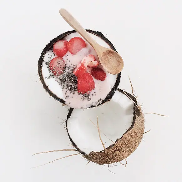
Basic example
A basic example of a lightbox with the most common use case with the bootstrap grid.


            <mdb-lightbox class="lightbox">
              <div class="row">
                <div class="col-lg-4">
                  <img
                    mdbLightboxItem
                    src="https://mdbootstrap.com/img/Photos/Thumbnails/Slides/1.webp"
                    [img]="'https://mdbootstrap.com/img/Photos/Slides/1.webp'"
                    alt="Lightbox image 1"
                    class="w-100"
                  />
                </div>
                <div class="col-lg-4">
                  <img
                    mdbLightboxItem
                    src="https://mdbootstrap.com/img/Photos/Thumbnails/Slides/2.webp"
                    [img]="'https://mdbootstrap.com/img/Photos/Slides/2.webp'"
                    alt="Lightbox image 2"
                    class="w-100"
                  />
                </div>
                <div class="col-lg-4">
                  <img
                    mdbLightboxItem
                    src="https://mdbootstrap.com/img/Photos/Thumbnails/Slides/3.webp"
                    [img]="'https://mdbootstrap.com/img/Photos/Slides/3.webp'"
                    alt="Lightbox image 3"
                    class="w-100"
                  />
                </div>
              </div>
            </mdb-lightbox>
Image optimization
To ensure the proper performance of the page, it is recommended to include thumbnails of
images in the src attribute. Then in the
img input add the path to the image with higher resolution. If the
img input is omitted, the lightbox will display the same image as in
the reduced size.
            <img
              mdbLightboxItem
              src="https://mdbootstrap.com/img/Photos/Thumbnails/Slides/3.webp"
              [img]="'https://mdbootstrap.com/img/Photos/Slides/3.webp'"
              alt="Lightbox image 3"
              class="w-100"
            />
Shadows and rounded corners
You can improve the look of the images by adding shadows and rounded corners.
            <mdb-lightbox class="lightbox">
              <div class="row">
                <div class="col-lg-4">
                  <img
                    mdbLightboxItem
                    src="https://mdbootstrap.com/img/Photos/Thumbnails/Slides/1.webp"
                    [img]="'https://mdbootstrap.com/img/Photos/Slides/1.webp'"
                    alt="Lightbox image 1"
                    class="w-100 shadow-1-strong rounded"
                  />
                </div>
                <div class="col-lg-4">
                  <img
                    mdbLightboxItem
                    src="https://mdbootstrap.com/img/Photos/Thumbnails/Slides/2.webp"
                    [img]="'https://mdbootstrap.com/img/Photos/Slides/2.webp'"
                    alt="Lightbox image 2"
                    class="w-100 shadow-1-strong rounded"
                  />
                </div>
                <div class="col-lg-4">
                  <img
                    mdbLightboxItem
                    src="https://mdbootstrap.com/img/Photos/Thumbnails/Slides/3.webp"
                    [img]="'https://mdbootstrap.com/img/Photos/Slides/3.webp'"
                    alt="Lightbox image 3"
                    class="w-100 shadow-1-strong rounded"
                  />
                </div>
              </div>
            </mdb-lightbox>
Different sizes
Loaded images can have any aspect ratio. Their size will be automatically adjusted to the window when you open the lightbox.

            <mdb-lightbox class="lightbox">
              <div class="row">
                <div class="col-lg-6">
                  <img
                    mdbLightboxItem
                    src="https://mdbootstrap.com/img/Photos/Thumbnails/Slides/1.webp"
                    [img]="'https://mdbootstrap.com/img/Photos/Slides/1.webp'"
                    alt="Lightbox image 1"
                    class="w-100"
                  />
                  <img
                    mdbLightboxItem
                    src="https://mdbootstrap.com/img/Photos/Thumbnails/Square/1.webp"
                    [img]="'https://mdbootstrap.com/img/Photos/Square/1.webp'"
                    alt="Lightbox image 2"
                    class="w-100"
                  />
                </div>
                <div class="col-lg-6">
                  <img
                    mdbLightboxItem
                    src="https://mdbootstrap.com/img/Photos/Thumbnails/Vertical/1.webp"
                    [img]="'https://mdbootstrap.com/img/Photos/Vertical/1.webp'"
                    alt="Lightbox image 3"
                    class="w-100"
                  />
                </div>
              </div>
            </mdb-lightbox>
Zoom level
The zoomLevel input allows you to define the size of a single zoom
in / zoom out.
            <mdb-lightbox class="lightbox" [zoomLevel]="0.25">
              <div class="row">
                <div class="col-lg-4">
                  <img
                    mdbLightboxItem
                    src="https://mdbootstrap.com/img/Photos/Thumbnails/Slides/1.webp"
                    [img]="'https://mdbootstrap.com/img/Photos/Slides/1.webp'"
                    alt="Lightbox image 1"
                    class="w-100"
                  />
                </div>
                <div class="col-lg-4">
                  <img
                    mdbLightboxItem
                    src="https://mdbootstrap.com/img/Photos/Thumbnails/Slides/2.webp"
                    [img]="'https://mdbootstrap.com/img/Photos/Slides/2.webp'"
                    alt="Lightbox image 2"
                    class="w-100"
                  />
                </div>
                <div class="col-lg-4">
                  <img
                    mdbLightboxItem
                    src="https://mdbootstrap.com/img/Photos/Thumbnails/Slides/3.webp"
                    [img]="'https://mdbootstrap.com/img/Photos/Slides/3.webp'"
                    alt="Lightbox image 3"
                    class="w-100"
                  />
                </div>
              </div>
            </mdb-lightbox>
Disabled image
By adding a lightbox-disabled class to any image, you can exclude it from your
lightbox. In the example below, the third image has been disabled.

            <mdb-lightbox class="lightbox">
              <div class="row">
                <div class="col-lg-3">
                  <img
                    mdbLightboxItem
                    src="https://mdbootstrap.com/img/Photos/Thumbnails/Slides/1.webp"
                    [img]="'https://mdbootstrap.com/img/Photos/Slides/1.webp'"
                    alt="Lightbox image 1"
                    class="w-100"
                  />
                </div>
                <div class="col-lg-3">
                  <img
                    mdbLightboxItem
                    src="https://mdbootstrap.com/img/Photos/Thumbnails/Slides/2.webp"
                    [img]="'https://mdbootstrap.com/img/Photos/Slides/2.webp'"
                    alt="Lightbox image 2"
                    class="w-100"
                  />
                </div>
                <div class="col-lg-3">
                  <img
                    mdbLightboxItem
                    src="https://mdbootstrap.com/img/Photos/Thumbnails/Slides/3.webp"
                    [img]="'https://mdbootstrap.com/img/Photos/Slides/3.webp'"
                    [disabled]="true"
                    alt="Lightbox image 3"
                    class="w-100"
                  />
                </div>
                <div class="col-lg-3">
                  <img
                    mdbLightboxItem
                    src="https://mdbootstrap.com/img/Photos/Thumbnails/Slides/4.webp"
                    [img]="'https://mdbootstrap.com/img/Photos/Slides/4.webp'"
                    alt="Lightbox image 3"
                    class="w-100"
                  />
                </div>
              </div>
            </mdb-lightbox>
Captions
Image captions can be added using the caption input. If it is not
set, the data is taken from the alt attribute. When you want to disable caption,
leave the caption empty.
          <img
            mdbLightboxItem
            src="https://mdbootstrap.com/img/Photos/Thumbnails/Slides/1.webp"
            [img]="'https://mdbootstrap.com/img/Photos/Slides/1.webp'"
            [caption]="'Image caption'"
            alt="Lightbox image 2"
            class="w-100"
          />
Outside access
The lightbox can be successfully operated via TypeScript. There are many public methods
available such as open, slide, zoomIn,
zoomOut, or close. All are described in the API tab.
          <mdb-lightbox #lightbox class="lightbox">
            <div class="row">
              <div class="col-lg-4">
                <img
                  mdbLightboxItem
                  src="https://mdbootstrap.com/img/Photos/Thumbnails/Slides/1.webp"
                  [img]="'https://mdbootstrap.com/img/Photos/Slides/1.webp'"
                  alt="Lightbox image 1"
                  class="w-100"
                />
              </div>
              <div class="col-lg-4">
                <img
                  mdbLightboxItem
                  #el="mdbLightboxItem"
                  src="https://mdbootstrap.com/img/Photos/Thumbnails/Slides/2.webp"
                  [img]="'https://mdbootstrap.com/img/Photos/Slides/2.webp'"
                  alt="Lightbox image 2"
                  class="w-100"
                />
              </div>
              <div class="col-lg-4">
                <img
                  mdbLightboxItem
                  src="https://mdbootstrap.com/img/Photos/Thumbnails/Slides/3.webp"
                  [img]="'https://mdbootstrap.com/img/Photos/Slides/3.webp'"
                  alt="Lightbox image 3"
                  class="w-100"
                />
              </div>
            </div>
          </mdb-lightbox>
          <div class="text-center mt-3">
            <button (click)="lightbox.open(el)" class="btn btn-primary" id="lightboxToggler">
              Open second image
            </button>
          </div>
Lightbox - API
Import
          import { MdbLightboxModule } from 'mdb-angular-ui-kit/lightbox';
          …
          @NgModule ({
            ...
            imports: [MdbLightboxModule],
            ...
          })
Inputs
| Name | Type | Default | Description |
|---|---|---|---|
zoomLevel
|
number | 1 |
Defines zoom level while zooming in or out. |
fontAwesome
|
string | 'free' |
Defines version of Font Awesome library. Available options are 'free' and 'pro'. |
img |
string | |
Defines regular image to load when gallery is open. If not set, the value of
src attribute is taken.
|
caption
|
string | |
Defines caption of the image. If not set, the value of
alt attribute is taken.
|
Outputs
| Name | Type | Description |
|---|---|---|
lightboxOpen
|
EventEmitter<void> | Emitted when a lightbox has been toggled. |
lightboxOpened
|
EventEmitter<void> | Emitted when a lightbox is opened. |
lightboxSlide
|
EventEmitter<void> | Emitted when a lightbox has been slided. |
lightboxSlided
|
EventEmitter<void> | Emitted after an image slide. |
lightboxZoomIn
|
EventEmitter<void> | Emitted when an image has been zoom in. |
lightboxZoomedIn
|
EventEmitter<void> | Emitted after an image is zoomed in. |
lightboxZoomOut
|
EventEmitter<void> | Emitted when an image has been zoom out. |
lightboxZoomedOut
|
EventEmitter<void> | Emitted after an image is zoomed out. |
lightboxClose
|
EventEmitter<void> | Emitted when a lightbox has been toggled. |
lightboxClosed
|
EventEmitter<void> | Emitted when a lightbox is closed. |
            <mdb-lightbox (lightboxOpen)="onLightboxOpen()" class="lightbox">
              <div class="row">
                <div class="col-lg-4">
                  <img
                    mdbLightboxItem
                    src="https://mdbootstrap.com/img/Photos/Thumbnails/Slides/1.webp"
                    [img]="'https://mdbootstrap.com/img/Photos/Slides/1.webp'"
                    alt="Lightbox image 1"
                    class="w-100"
                  />
                </div>
              </div>
            </mdb-lightbox>
            import { Component } from '@angular/core';

            @Component({
              selector: 'app-root',
              templateUrl: './app.component.html',
              styleUrls: ['./app.component.scss'],
            })
            export class AppComponent {
              onLightboxOpen() {
                console.log('Lightbox open');
              }
            }
Methods
| Name | Description | Example |
|---|---|---|
open(lightboxItem: MdbLightboxItemDirective) |
Opens the gallery and activates image set by the target key. Default is the first image. | lightbox.open(lightboxItem) |
slide(direction) |
Slides an image in the gallery. Available options: left,
right, first, last. Dafault is right direction.
|
lightbox.slide('last') |
zoomIn |
Zooms in active image by one level. | lightbox.zoomIn() |
zoomOut
|
Zooms out active image by one level. | lightbox.zoomOut() |
toggleFullscreen
|
Toggles fullscreen. | lightbox.toggleFullscreen() |
reset |
Resets changed parameters such as position, zoom or fullscreen. | lightbox.reset() |
close |
Closes the gallery. | lightbox.close() |
          <mdb-lightbox #lightbox class="lightbox">
            <div class="row">
              <div class="col-lg-4">
                <img
                  #lightboxItem="mdbLightboxItem"
                  mdbLightboxItem
                  src="https://mdbootstrap.com/img/Photos/Thumbnails/Slides/1.webp"
                  [img]="'https://mdbootstrap.com/img/Photos/Slides/1.webp'"
                  alt="Lightbox image 1"
                  class="w-100"
                />
              </div>
            </div>
          </mdb-lightbox>
          import { AfterViewInit, Component, ViewChild } from '@angular/core';
          import {
            MdbLightboxComponent,
            MdbLightboxItemDirective,
          } from 'mdb-angular-ui-kit/lightbox';

          @Component({
            selector: 'app-root',
            templateUrl: './app.component.html',
            styleUrls: ['./app.component.scss'],
          })
          export class AppComponent implements AfterViewInit {
            @ViewChild('lightbox') lightbox!: MdbLightboxComponent;
            @ViewChild('lightboxItem') lightboxItem!: MdbLightboxItemDirective;

            ngAfterViewInit(): void {
              setTimeout(() => {
                this.lightbox.open(this.lightboxItem);
              }, 0);
            }
          }
CSS variables
As part of MDB’s evolving CSS variables approach, lightbox now uses local CSS variables on
mdb-lightbox-modal for enhanced real-time customization. Values for the CSS variables are
set via Sass, so Sass customization is still supported, too.
              // mdb-lightbox-modal
              --#{$prefix}lightbox-zindex: #{$lightbox-zindex};
              --#{$prefix}lightbox-toolbar-zindex: #{$lightbox-toolbar-zindex};
              --#{$prefix}lightbox-gallery-background-color: #{$lightbox-gallery-background-color};
              --#{$prefix}lightbox-gallery-transition: #{$lightbox-gallery-transition};
              --#{$prefix}lightbox-gallery-toolbar-height: #{$lightbox-gallery-toolbar-height};
              --#{$prefix}lightbox-gallery-toolbar-transition: #{$lightbox-gallery-toolbar-transition};
              --#{$prefix}lightbox-gallery-toolbar-button-width: #{$lightbox-gallery-toolbar-button-width};
              --#{$prefix}lightbox-gallery-toolbar-button-height: #{$lightbox-gallery-toolbar-button-height};
              --#{$prefix}lightbox-gallery-toolbar-button-color: #{$lightbox-gallery-toolbar-button-color};
              --#{$prefix}lightbox-gallery-toolbar-button-transition: #{$lightbox-gallery-toolbar-button-transition};
              --#{$prefix}lightbox-gallery-toolbar-button-hover-color: #{$lightbox-gallery-toolbar-button-hover-color};
              --#{$prefix}lightbox-gallery-toolbar-button-before-font-weight: #{$lightbox-gallery-toolbar-button-before-font-weight};
              --#{$prefix}lightbox-gallery-content-top: #{$lightbox-gallery-content-top};
              --#{$prefix}lightbox-gallery-content-left: #{$lightbox-gallery-content-left};
              --#{$prefix}lightbox-gallery-content-width: #{$lightbox-gallery-content-width};
              --#{$prefix}lightbox-gallery-content-height: #{$lightbox-gallery-content-height};
              --#{$prefix}lightbox-gallery-arrow-width: #{$lightbox-gallery-arrow-width};
              --#{$prefix}lightbox-gallery-arrow-transition: #{$lightbox-gallery-arrow-transition};
              --#{$prefix}lightbox-gallery-arrow-button-width: #{$lightbox-gallery-arrow-button-width};
              --#{$prefix}lightbox-gallery-arrow-button-height: #{$lightbox-gallery-arrow-button-height};
              --#{$prefix}lightbox-gallery-arrow-button-color: #{$lightbox-gallery-arrow-button-color};
              --#{$prefix}lightbox-gallery-arrow-button-transition: #{$lightbox-gallery-arrow-button-transition};
              --#{$prefix}lightbox-gallery-arrow-button-hover-color: #{$lightbox-gallery-arrow-button-hover-color};
              --#{$prefix}lightbox-gallery-arrow-button-before-font-weight: #{$lightbox-gallery-arrow-button-before-font-weight};
              --#{$prefix}lightbox-gallery-button-focus-color: #{$lightbox-gallery-button-focus-color};
              --#{$prefix}lightbox-gallery-image-transform: #{$lightbox-gallery-image-transform};
              --#{$prefix}lightbox-gallery-image-transition: #{$lightbox-gallery-image-transition};
              --#{$prefix}lightbox-gallery-counter-color: #{$lightbox-gallery-counter-color};
              --#{$prefix}lightbox-gallery-counter-padding-x: #{$lightbox-gallery-counter-padding-x};
              --#{$prefix}lightbox-gallery-caption-color: #{$lightbox-gallery-caption-color};
              --#{$prefix}lightbox-gallery-caption-margin-x: #{$lightbox-gallery-caption-margin-x};
              --#{$prefix}lightbox-gallery-caption-wrapper-height: #{$lightbox-gallery-caption-wrapper-height};
              --#{$prefix}lightbox-gallery-loader-transition: #{$lightbox-gallery-loader-transition};

              // .disabled-scroll
              --#{$prefix}lightbox-disabled-scroll-media-padding-right: #{$lightbox-disabled-scroll-media-padding-right};
SCSS variables
              $lightbox-zindex: 1100;
              $lightbox-zindex-toolbar: 1110;

              $lightbox-gallery-background-color: rgba(0, 0, 0, 0.9);
              $lightbox-gallery-transition: all 0.3s ease-out;
              $lightbox-gallery-toolbar-height: 50px;
              $lightbox-gallery-toolbar-transition: opacity 0.4s;
              $lightbox-gallery-counter-color: #b3b3b3;
              $lightbox-gallery-counter-padding-x: 10px;
              $lightbox-gallery-toolbar-button-width: 50px;
              $lightbox-gallery-toolbar-button-height: 50px;
              $lightbox-gallery-toolbar-button-color: #b3b3b3;
              $lightbox-gallery-toolbar-button-transition: color 0.2s;
              $lightbox-gallery-toolbar-button-hover-color: $white;
              $lightbox-gallery-toolbar-button-before-font-weight: 900;
              $lightbox-gallery-content-top: 50px;
              $lightbox-gallery-content-left: $lightbox-gallery-content-top;
              $lightbox-gallery-content-width: calc(100% - 100px);
              $lightbox-gallery-content-height: $lightbox-gallery-content-width;
              $lightbox-gallery-image-transform: scale(0.25);
              $lightbox-gallery-image-transition: all 0.4s ease-out;
              $lightbox-gallery-arrow-width: 50px;
              $lightbox-gallery-arrow-transition: opacity 0.4s;
              $lightbox-gallery-arrow-button-width: 50px;
              $lightbox-gallery-arrow-button-height: 50px;
              $lightbox-gallery-arrow-button-color: #b3b3b3;
              $lightbox-gallery-arrow-button-transition: color 0.2s;
              $lightbox-gallery-arrow-button-hover-color: $white;
              $lightbox-gallery-arrow-button-before-font-weight: 900;
              $lightbox-gallery-caption-wrapper-height: 50px;
              $lightbox-gallery-caption-color: $white;
              $lightbox-gallery-caption-margin-x: 10px;
              $lightbox-gallery-loader-transition: opacity 1s;
              $lightbox-gallery-button-focus-color: $white;
              $lightbox-disabled-scroll-media-padding-right: 17px;