Modal
Angular Bootstrap 5 Modal component
Use MDB modal plugin to add dialogs to your site for lightboxes, user notifications, or completely custom content.
Note: Read the API tab to find all available options and advanced customization
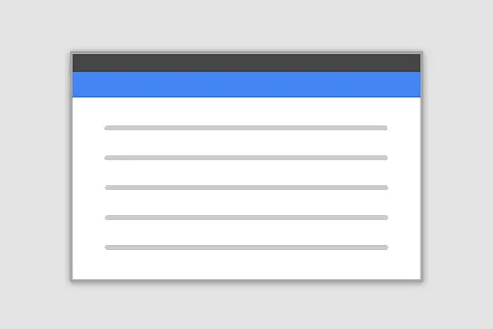
Basic example
Click the button to launch the modal.
You can create modals dynamically from any component using a built-in service. To achieve this, follow these steps:
1. Create a new component with Angular CLI and add some HTML code to the template.
ng generate component modal
          <div class="modal-header">
            <h5 class="modal-title" id="exampleModalLabel">Modal title</h5>
            <button
              type="button"
              class="btn-close"
              aria-label="Close"
              (click)="modalRef.close()"
            ></button>
          </div>
          <div class="modal-body">...</div>
          <div class="modal-footer">
            <button type="button" class="btn btn-secondary" (click)="modalRef.close()">
              Close
            </button>
            <button type="button" class="btn btn-primary">Save changes</button>
          </div>
            import { Component } from '@angular/core';
            import { MdbModalRef } from 'mdb-angular-ui-kit/modal';

            @Component({
              selector: 'app-modal',
              templateUrl: './modal.component.html',
            })
            export class ModalComponent {
              constructor(public modalRef: MdbModalRef<ModalComponent>) {}
            }
2. Inject MdbModalService to the component from which you want to open the
modal and use the open method.
<button class="btn btn-primary" (click)="openModal()">Open modal</button>
          import { Component } from '@angular/core';
          import { ModalComponent } from 'your-path-to-modal-component';
          import { MdbModalRef, MdbModalService } from 'mdb-angular-ui-kit/modal';

          @Component({
            selector: 'app-root',
            templateUrl: './app.component.html',
            styleUrls: ['./app.component.scss'],
          })
          export class AppComponent {
            modalRef: MdbModalRef<ModalComponent> | null = null;

            constructor(private modalService: MdbModalService) {}

            openModal() {
              this.modalRef = this.modalService.open(ModalComponent)
            }

          }
Inject and receive data
You can inject data to the modal by passing it to the data parameter in the modal
options.
<button class="btn btn-primary" (click)="openModal()">Open modal</button>
          import { Component } from '@angular/core';
          import { ModalComponent } from 'your-path-to-modal-component';
          import { MdbModalRef, MdbModalService } from 'mdb-angular-ui-kit/modal';

          @Component({
            selector: 'app-root',
            templateUrl: './app.component.html',
            styleUrls: ['./app.component.scss'],
          })
          export class AppComponent {
            modalRef: MdbModalRef<ModalComponent> | null = null;

            constructor(private modalService: MdbModalService) {}

            openModal() {
              this.modalRef = this.modalService.open(ModalComponent, {
                data: { title: 'Custom title' },
              });
            }
          }
Here is an example showing how to use injected data in the modal component:
          <div class="modal-header">
            <h5 class="modal-title" id="exampleModalLabel">{{ title }}</h5>
            <button
              type="button"
              class="btn-close"
              aria-label="Close"
              (click)="modalRef.close()"
            ></button>
          </div>
          <div class="modal-body">...</div>
          <div class="modal-footer">
            <button type="button" class="btn btn-secondary" (click)="modalRef.close()">
              Close
            </button>
            <button type="button" class="btn btn-primary">Save changes</button>
          </div>
          import { Component } from '@angular/core';
          import { MdbModalRef } from 'mdb-angular-ui-kit/modal';

          @Component(
            { selector: 'app-modal',
            templateUrl: './modal.component.html',
          })
          export class ModalComponent {
            title: string | null = null;

            constructor(public modalRef: MdbModalRef<ModalComponent>) {}
          }
Receive data from the modal
You can receive data from the modal to use it in other components:
          <div class="modal-content">
            <div class="modal-header">
              <h5 class="modal-title" id="exampleModalLabel">Modal title</h5>
              <button type="button" class="btn-close" aria-label="Close" (click)="close()"></button>
            </div>
            <div class="modal-body">...</div>
            <div class="modal-footer">
              <button type="button" class="btn btn-secondary" (click)="close()">
                Close
              </button>
              <button type="button" class="btn btn-primary">Save changes</button>
            </div>
          </div>
          import { Component } from '@angular/core';
          import { MdbModalRef } from 'mdb-angular-ui-kit/modal';

          @Component(
            { selector: 'app-modal',
            templateUrl: './modal.component.html',
          })
          export class ModalComponent {
            constructor(public modalRef: MdbModalRef<ModalComponent>) {}

            close(): void {
              const closeMessage = 'Modal closed';
              this.modalRef.close(closeMessage)
            }
          }
Here is an example showing how to use data received from modal in other components
<button class="btn btn-primary" (click)="openModal()">Open modal</button>
          import { Component } from '@angular/core';
          import { ModalComponent } from 'your-path-to-modal-component';
          import { MdbModalRef, MdbModalService } from 'mdb-angular-ui-kit/modal';

          @Component(
            { selector: 'create-dynamic-modal',
            templateUrl: './create-dynamic-modal.component.html',
          })
          export class AppComponent {
            modalRef: MdbModalRef<ModalComponent> | null = null;

            constructor(private modalService: MdbModalService) {}

            openModal() {
              this.modalRef = this.modalService.open(ModalComponent);
              this.modalRef.onClose.subscribe((message: any) => {
                console.log(message);
              });
            }
          }
Advanced examples
Click the buttons to launch the modals.
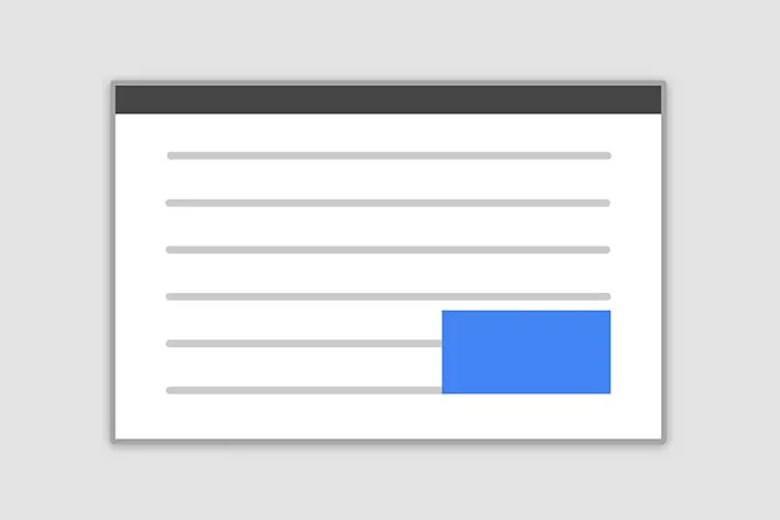
Frame modal
Position
Side modal
Position
Central modal
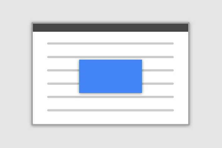
Size

How it works
Before getting started with MDB modal component, be sure to read the following as our menu options have recently changed.
-
Modals are built with HTML, CSS, and JavaScript. They’re positioned over everything else in
the document and remove scroll from the
<body>so that modal content scrolls instead. - Clicking on the modal “backdrop” will automatically close the modal.
- Bootstrap only supports one modal window at a time. Nested modals aren’t supported as we believe them to be poor user experiences.
Position
To change the position of the modal add one of the following classes to the
modalClass option.
Top right: .modal-side +
.modal-top-right
Top left: .modal-side +
.modal-top-left
Bottom right: .modal-side +
.modal-bottom-right
Bottom left: .modal-side +
.modal-bottom-right
Note: If you want to change the direction of modal animation, add the class
.top, .right, bottom or .left to the
containerClass option.
<button class="btn btn-primary" (click)="openModal()">Open modal</button>
              import { Component } from '@angular/core';
              import { ModalComponent } from 'your-path-to-modal-component';
              import { MdbModalRef, MdbModalService } from 'mdb-angular-ui-kit/modal';

              @Component({
                selector: 'app-root',
                templateUrl: './app.component.html',
                styleUrls: ['./app.component.scss'],
              })
              export class AppComponent {
                modalRef: MdbModalRef<ModalComponent> | null = null;

                constructor(private modalService: MdbModalService) {}

                openModal() {
                  this.modalRef = this.modalService.open(ModalComponent, {
                    containerClass: 'right',
                    modalClass: 'modal-side modal-top-right'
                  })
                }
              }
Frame
To make the modal "frame-like" add .frame class and .top or
.bottom class to containerClass option. Add .modal-frame class
and .modal-top or .modal-bottom class to modalClass
option.
<button class="btn btn-primary" (click)="openModal()">Open modal</button>
              import { Component } from '@angular/core';
              import { ModalComponent } from 'your-path-to-modal-component';
              import { MdbModalRef, MdbModalService } from 'mdb-angular-ui-kit/modal';

              @Component({
                selector: 'app-root',
                templateUrl: './app.component.html',
                styleUrls: ['./app.component.scss'],
              })
              export class AppComponent {
                modalRef: MdbModalRef<ModalComponent> | null = null;

                constructor(private modalService: MdbModalService) {}

                openModal() {
                  this.modalRef = this.modalService.open(ModalComponent, {
                    containerClass: 'frame top',
                    modalClass: 'modal-frame modal-top'
                  })
                }
              }
Scrolling long content
When modals become too long for the user’s viewport or device, they scroll independent of the page itself. Try the demo below to see what we mean.
You can also create a scrollable modal that allows scroll the modal body by adding
.modal-dialog-scrollable to modalClass option.
<button class="btn btn-primary" (click)="openModal()">Open modal</button>
            import { Component } from '@angular/core';
            import { ModalComponent } from 'your-path-to-modal-component';
            import { MdbModalRef, MdbModalService } from 'mdb-angular-ui-kit/modal';

            @Component({
              selector: 'app-root',
              templateUrl: './app.component.html',
              styleUrls: ['./app.component.scss'],
            })
            export class AppComponent {
              import { Component } from '@angular/core';
              import { ModalComponent } from 'your-path-to-modal-component';
              import { MdbModalRef, MdbModalService } from 'mdb-angular-ui-kit/modal';

              @Component({
                selector: 'app-root',
                templateUrl: './app.component.html',
                styleUrls: ['./app.component.scss'],
              })
              export class AppComponent {
                modalRef: MdbModalRef<ModalComponent> | null = null;

                constructor(private modalService: MdbModalService) {}

                openModal() {
                  this.modalRef = this.modalService.open(ModalComponent, {
                    modalClass: 'modal-dialog-scrollable'
                  })
                }
              }
Vertically centered
Add .modal-dialog-centered to modalClass option to vertically center
the modal.
<button class="btn btn-primary" (click)="openModal()">Open modal</button>
            import { Component } from '@angular/core';
            import { ModalComponent } from 'your-path-to-modal-component';
            import { MdbModalRef, MdbModalService } from 'mdb-angular-ui-kit/modal';

            @Component({
              selector: 'app-root',
              templateUrl: './app.component.html',
              styleUrls: ['./app.component.scss'],
            })
            export class AppComponent {
              import { Component } from '@angular/core';
              import { ModalComponent } from 'your-path-to-modal-component';
              import { MdbModalRef, MdbModalService } from 'mdb-angular-ui-kit/modal';

              @Component({
                selector: 'app-root',
                templateUrl: './app.component.html',
                styleUrls: ['./app.component.scss'],
              })
              export class AppComponent {
                modalRef: MdbModalRef<ModalComponent> | null = null;

                constructor(private modalService: MdbModalService) {}

                openModal() {
                  this.modalRef = this.modalService.open(ModalComponent, {
                    modalClass: 'modal-dialog-centered'
                  })
                }
              }
Tooltips and popovers
Tooltips and popovers can be placed within modals as needed. When modals are closed, any tooltips and popovers within are also automatically dismissed.
          <div class="modal-header">
            <h5 class="modal-title" id="exampleModalPopoversLabel">Modal title</h5>
            <button
              type="button"
              class="btn-close"
              (click)="modalRef.close()"
              aria-label="Close"
            ></button>
          </div>
          <div class="modal-body">
            <h5>Popover in a modal</h5>
            <p>
              This
              <a
                role="button"
                class="btn btn-secondary popover-test"
                mdbPopover="Popover body content is set in this attribute."
                mdbPopoverTitle="Popover title"
                >button</a
              >
              triggers a popover on click.
            </p>
            <hr />
            <h5>Tooltips in a modal</h5>
            <p>
              <a href="#!" class="tooltip-test" mdbTooltip="Tooltip">This link</a>
              and
              <a href="#!" class="tooltip-test" mdbTooltip="Tooltip">that link</a>
              have tooltips on hover.
            </p>
          </div>
          <div class="modal-footer">
            <button type="button" class="btn btn-secondary" (click)="modalRef.close()">
              Close
            </button>
            <button type="button" class="btn btn-primary">Save changes</button>
          </div>
          import { Component } from '@angular/core';
          import { ModalComponent } from 'your-path-to-modal-component';
          import { MdbModalRef, MdbModalService } from 'mdb-angular-ui-kit/modal';
          @Component({
            selector: 'app-root',
            templateUrl: './app.component.html',
            styleUrls: ['./app.component.scss'],
          })
          export class AppComponent {
            import { Component } from '@angular/core';
            import { MdbModalRef } from 'mdb-angular-ui-kit/modal';

            @Component({
              selector: 'app-modal',
              templateUrl: './modal.component.html',
            })
            export class ModalComponent {

              constructor(public modalRef: MdbModalRef<ModalComponent>) {}

            }
Using the grid
Utilize the Bootstrap grid system within a modal by nesting
.container-fluid within the .modal-body. Then, use the normal grid
system classes as you would anywhere else.
          <div class="modal-header">
            <h5 class="modal-title" id="gridModalLabel">Grids in modals</h5>
            <button
              type="button"
              class="btn-close"
              (click)="modalRef.close()"
              aria-label="Close"
            ></button>
          </div>
          <div class="modal-body">
            <div class="container-fluid bd-example-row">
              <div class="row">
                <div class="col-md-4 col-example">.col-md-4</div>
                <div class="col-md-4 ms-auto col-example">.col-md-4 .ms-auto</div>
              </div>
              <div class="row">
                <div class="col-md-3 ms-auto col-example">.col-md-3 .ms-auto</div>
                <div class="col-md-2 ms-auto col-example">.col-md-2 .ms-auto</div>
              </div>
              <div class="row">
                <div class="col-md-6 ms-auto col-example">.col-md-6 .ms-auto</div>
              </div>
              <div class="row">
                <div class="col-sm-9 col-example">
                  Level 1: .col-sm-9
                  <div class="row">
                    <div class="col-8 col-sm-6 col-example">Level 2: .col-8 .col-sm-6</div>
                    <div class="col-4 col-sm-6 col-example">Level 2: .col-4 .col-sm-6</div>
                  </div>
                </div>
              </div>
            </div>
          </div>
          <div class="modal-footer">
            <button type="button" class="btn btn-secondary" (click)="modalRef.close()">
              Close
            </button>
            <button type="button" class="btn btn-primary">Save changes</button>
          </div>
          import { Component } from '@angular/core';
          import { ModalComponent } from 'your-path-to-modal-component';
          import { MdbModalRef, MdbModalService } from 'mdb-angular-ui-kit/modal';
          @Component({
            selector: 'app-root',
            templateUrl: './app.component.html',
            styleUrls: ['./app.component.scss'],
          })
          export class AppComponent {
            import { Component } from '@angular/core';
            import { MdbModalRef } from 'mdb-angular-ui-kit/modal';

            @Component({
              selector: 'app-modal',
              templateUrl: './modal.component.html',
            })
            export class ModalComponent {

              constructor(public modalRef: MdbModalRef<ModalComponent>) {}

            }
Change animation
The $modal-fade-transform variable determines the transform state of
.modal-dialog before the modal fade-in animation, the
$modal-show-transform variable determines the transform of
.modal-dialog at the end of the modal fade-in animation.
If you want for example a zoom-in animation, you can set
$modal-fade-transform: scale(.8).
Remove animation
For modals that simply appear rather than fade into view, set the
animation option to false.
<button class="btn btn-primary" (click)="openModal()">Open modal</button>
          import { Component } from '@angular/core';
          import { ModalComponent } from 'your-path-to-modal-component';
          import { MdbModalRef, MdbModalService } from 'mdb-angular-ui-kit/modal';

          @Component({
            selector: 'app-root',
            templateUrl: './app.component.html',
            styleUrls: ['./app.component.scss'],
          })
          export class AppComponent {
            modalRef: MdbModalRef<ModalComponent> | null = null;

            constructor(private modalService: MdbModalService) {}

            openModal() {
              this.modalRef = this.modalService.open(ModalComponent, {
                animation: false
              })
            }
          }
Optional sizes
Modals have three optional sizes, available via modifier classes that needs to be added to
modalClass option. These sizes kick in at certain breakpoints to avoid horizontal
scrollbars on narrower viewports.
| Size | Class | Modal max-width |
|---|---|---|
| Small | .modal-sm |
300px |
| Default | None | 500px |
| Large | .modal-lg |
800px |
| Extra large | .modal-xl |
1140px |
<button class="btn btn-primary" (click)="openModal()">Open modal</button>
          import { Component } from '@angular/core';
          import { ModalComponent } from 'your-path-to-modal-component';
          import { MdbModalRef, MdbModalService } from 'mdb-angular-ui-kit/modal';

          @Component({
            selector: 'app-root',
            templateUrl: './app.component.html',
            styleUrls: ['./app.component.scss'],
          })
          export class AppComponent {
            modalRef: MdbModalRef<ModalComponent> | null = null;

            constructor(private modalService: MdbModalService) {}

            openModal() {
              this.modalRef = this.modalService.open(ModalComponent, {
                modalClass: 'modal-xl'
              })
            }
          }
Fullscreen Modal
Another override is the option to pop up a modal that covers the user viewport, available via
modifier classes that are passed to the modalClass option.
| Class | Availability |
|---|---|
.modal-fullscreen |
Always |
.modal-fullscreen-sm-down |
Below 576px |
.modal-fullscreen-md-down |
Below 768px |
.modal-fullscreen-lg-down |
Below 992px |
.modal-fullscreen-xl-down |
Below 1200px |
.modal-fullscreen-xxl-down |
Below 1400px |
<button class="btn btn-primary" (click)="openModal()">Open modal</button>
          import { Component } from '@angular/core';
          import { ModalComponent } from 'your-path-to-modal-component';
          import { MdbModalRef, MdbModalService } from 'mdb-angular-ui-kit/modal';

          @Component({
            selector: 'app-root',
            templateUrl: './app.component.html',
            styleUrls: ['./app.component.scss'],
          })
          export class AppComponent {
            modalRef: MdbModalRef<ModalComponent> | null = null;

            constructor(private modalService: MdbModalService) {}

            openModal() {
              this.modalRef = this.modalService.open(ModalComponent, {
                modalClass: 'modal-fullscreen'
              })
            }
          }
Non-invasive Modal
This type of modal does not block any interaction on the page. Simply add nonInvasive option.
<button class="btn btn-primary" (click)="openModal()">Open modal</button>
        import { Component } from '@angular/core';
        import { ModalComponent } from 'your-path-to-modal-component';
        import { MdbModalRef, MdbModalService } from 'mdb-angular-ui-kit/modal';

        @Component({
          selector: 'app-root',
          templateUrl: './app.component.html',
          styleUrls: ['./app.component.scss'],
        })
        export class AppComponent {
          modalRef: MdbModalRef<ModalComponent> | null = null;

          constructor(private modalService: MdbModalService) {}

          openModal() {
            this.modalRef = this.modalService.open(ModalComponent, {
              data: {
                title: 'Modal title',
              },
              nonInvasive: true,
            })
          }
        }
Modal - API
Import
          import { MdbModalModule } from 'mdb-angular-ui-kit/modal';
          …
          @NgModule ({
            ...
            imports: [MdbModalModule],
            ...
          })
Options
Options can be passed to the open method of MdbModalService.
| Name | Type | Default | Description |
|---|---|---|---|
animation |
boolean | true |
Turns modal animation on/off. |
backdrop |
boolean | true |
Includes a modal-backdrop element. |
containerClass |
string | '' |
Adds new class to modal container. |
data |
any | {} |
Passes data to a modal component. |
ignoreBackdropClick |
boolean | false |
Specifies whether to close modal on backdrop click. |
keyboard |
boolean | true |
Closes the modal when escape key is pressed. |
modalClass |
string | '' |
Adds new class to element with .modal-dialog class. |
nonInvasive |
boolean | false |
Turns modal into non-invasive one. |
<button class="btn btn-primary" (click)="openModal()">Open modal</button>
            import { Component } from '@angular/core';
            import { ModalComponent } from 'your-path-to-modal-component';
            import { MdbModalRef, MdbModalService } from 'mdb-angular-ui-kit/modal';

            @Component(
              { selector: 'create-dynamic-modal',
              templateUrl: './create-dynamic-modal.component.html',
            })
            export class AppComponent {
              modalRef: MdbModalRef<ModalComponent> | null = null;

              config = {
                animation: true,
                backdrop: true,
                containerClass: 'right',
                data: {
                  title: 'Custom title'
                },
                ignoreBackdropClick: false,
                keyboard: true,
                modalClass: 'modal-top-right',
                nonInvasive: true,
              }

              constructor(private modalService: MdbModalService) {}

              openModal() {
                this.modalRef = this.modalService.open(ModalComponent, this.config);
              }
            }
Methods
MdbModalService
| Method | Description |
|---|---|
open(componentType, config?: MdbModalConfig<D>) |
Opens modal. |
            <button class="btn btn-primary" (click)="openModal()">Open modal</button>
            <button class="btn btn-primary" (click)="openFrameBottomModal()">Open bottom frame</button>
            import { Component } from '@angular/core';
            import { ModalComponent } from 'your-path-to-modal-component';
            import { MdbModalRef, MdbModalService } from 'mdb-angular-ui-kit/modal';

            @Component(
              { selector: 'create-dynamic-modal',
              templateUrl: './create-dynamic-modal.component.html',
            })
            export class AppComponent {
              modalRef: MdbModalRef<ModalComponent> | null = null;

              bottomFrame = {
                containerClass: 'frame bottom',
                modalClass: 'modal-frame modal-bottom',
              };

              constructor(private modalService: MdbModalService) {}

              openModal() {
                this.modalRef = this.modalService.open(ModalComponent);
              }

              openFrameBottomModal(): void {
                this.modalRef = this.modalService.open(ModalComponent, this.bottomFrame);
              }
            }
MdbModalRef
| Method | Description |
|---|---|
onClose: Observable<any> |
Returns observable on modal close. |
<button class="btn btn-primary" (click)="openModal()">Open modal</button>
          import { Component } from '@angular/core';
          import { ModalComponent } from 'your-path-to-modal-component';
          import { MdbModalRef, MdbModalService } from 'mdb-angular-ui-kit/modal';

          @Component(
            { selector: 'create-dynamic-modal',
            templateUrl: './create-dynamic-modal.component.html',
          })
          export class AppComponent {
            modalRef: MdbModalRef<ModalComponent> | null = null;

            constructor(private modalService: MdbModalService) {}

            openModal() {
              this.modalRef = this.modalService.open(ModalComponent);
              this.modalRef.onClose.subscribe((message: any) => {
                console.log(message);
              });
            }
          }
Advanced types
MdbModalConfig
| Name | Type | Default | Description |
|---|---|---|---|
animation
|
boolean | undefined | true |
Defines whether modal should fade in or simply appear. |
backdrop
|
boolean | undefined | true |
Defines whether backdrop should be rendered. |
ignoreBackdropClick
|
boolean | undefined | false |
Defines whether modal should close on the backdrop click. |
keyboard
|
boolean | undefined | true |
Defines whether modal should close on escape press. |
modalClass
|
string | undefined | '' |
Enables the addition of custom classes to the modal. |
containerClass
|
string | undefined | '' |
Enables the addition of custom classes to the container. |
viewContainerRef
|
string | undefined | '' |
Defines parent container of the modal component. |
data
|
any | null | null |
Allows passing data, such as a title. |
nonInvasive
|
boolean | undefined | false |
Defines whether modal should block any interaction on the page. |
focusElementSelector
|
string | undefined | '' |
Defines selector of the element that should be focused after the modal opens. |
CSS variables
As part of MDB’s evolving CSS variables approach, modal now use local CSS variables on .modal for
enhanced real-time customization. Values for the CSS variables are set via Sass, so Sass customization is still
supported, too.
Modal's CSS variables are in different classes which belong to this component. To make it easier to use them, you can find below all of the used CSS variables.
        // Variables for modal free
        // .modal
        --#{$prefix}modal-zindex: #{$zindex-modal};
        --#{$prefix}modal-width: #{$modal-md};
        --#{$prefix}modal-padding: #{$modal-inner-padding};
        --#{$prefix}modal-margin: #{$modal-dialog-margin};
        --#{$prefix}modal-color: #{$modal-content-color};
        --#{$prefix}modal-bg: #{$modal-content-bg};
        --#{$prefix}modal-border-color: #{$modal-content-border-color};
        --#{$prefix}modal-border-width: #{$modal-content-border-width};
        --#{$prefix}modal-border-radius: #{$modal-content-border-radius};
        --#{$prefix}modal-box-shadow: #{$modal-content-box-shadow-xs};
        --#{$prefix}modal-inner-border-radius: #{$modal-content-inner-border-radius};
        --#{$prefix}modal-header-padding-x: #{$modal-header-padding-x};
        --#{$prefix}modal-header-padding-y: #{$modal-header-padding-y};
        --#{$prefix}modal-header-padding: #{$modal-header-padding}; // Todo in v6: Split this padding into x and y
        --#{$prefix}modal-header-border-color: #{$modal-header-border-color};
        --#{$prefix}modal-header-border-width: #{$modal-header-border-width};
        --#{$prefix}modal-title-line-height: #{$modal-title-line-height};
        --#{$prefix}modal-footer-gap: #{$modal-footer-margin-between};
        --#{$prefix}modal-footer-bg: #{$modal-footer-bg};
        --#{$prefix}modal-footer-border-color: #{$modal-footer-border-color};
        --#{$prefix}modal-footer-border-width: #{$modal-footer-border-width};

        // .modal-backdrop
        --#{$prefix}backdrop-zindex: #{$zindex-modal-backdrop};
        --#{$prefix}backdrop-bg: #{$modal-backdrop-bg};
        --#{$prefix}backdrop-opacity: #{$modal-backdrop-opacity};

        // .modal
        --#{$prefix}modal-margin: #{$modal-dialog-margin-y-sm-up};
        --#{$prefix}modal-box-shadow: #{$modal-content-box-shadow-sm-up};

        // .modal-sm
        --#{$prefix}modal-width: #{$modal-sm};

        // .modal-lg,
        // .modal-xl
        --#{$prefix}modal-width: #{$modal-lg};

        // .modal-xl
        --#{$prefix}modal-width: #{$modal-xl};

        // .modal-content
        --#{$prefix}modal-box-shadow: #{$modal-box-shadow};

        // Variables for modal pro
        // .modal
        --#{$prefix}modal-top-left-top: #{$modal-top-left-top};
        --#{$prefix}modal-top-left-left: #{$modal-top-left-left};
        --#{$prefix}modal-top-right-top: #{$modal-top-right-top};
        --#{$prefix}modal-top-right-right: #{$modal-top-right-right};
        --#{$prefix}modal-bottom-left-bottom: #{$modal-bottom-left-bottom};
        --#{$prefix}modal-bottom-left-left: #{$modal-bottom-left-left};
        --#{$prefix}modal-bottom-right-bottom: #{$modal-bottom-right-bottom};
        --#{$prefix}modal-bottom-right-right: #{$modal-bottom-right-right};
        --#{$prefix}modal-fade-top-transform: #{$modal-fade-top-transform};
        --#{$prefix}modal-fade-right-transform: #{$modal-fade-right-transform};
        --#{$prefix}modal-fade-bottom-transform: #{$modal-fade-bottom-transform};
        --#{$prefix}modal-fade-left-transform: #{$modal-fade-left-transform};
        --#{$prefix}modal-side-right: #{$modal-side-right};
        --#{$prefix}modal-side-bottom: #{$modal-side-bottom};
        --#{$prefix}modal-non-invasive-box-shadow: #{$modal-non-invasive-box-shadow};
        --#{$prefix}modal-non-invasive-box-shadow-top: #{$modal-non-invasive-box-shadow-top};
SCSS variables
        // Variables for modal free
        $modal-inner-padding: $spacer;

        $modal-footer-margin-between: 0.5rem;

        $modal-dialog-margin: 0.5rem;
        $modal-dialog-margin-y-sm-up: 1.75rem;

        $modal-title-line-height: $line-height-base;

        $modal-content-color: null;
        $modal-content-bg: $white;
        $modal-content-border-color: var(--#{$prefix}border-color-translucent);
        $modal-content-border-width: $border-width;
        $modal-content-inner-border-radius: subtract(
          $modal-content-border-radius,
          $modal-content-border-width
        );
        $modal-content-box-shadow-xs: $box-shadow-sm;
        $modal-content-box-shadow-sm-up: $box-shadow;

        $modal-backdrop-bg: $black;
        $modal-backdrop-opacity: 0.5;

        $modal-header-padding-y: $modal-inner-padding;
        $modal-header-padding-x: $modal-inner-padding;
        $modal-header-padding: $modal-header-padding-y $modal-header-padding-x; // Keep this for backwards compatibility

        $modal-footer-bg: null;

        $modal-sm: 300px;
        $modal-md: 500px;
        $modal-lg: 800px;
        $modal-xl: 1140px;

        $modal-fade-transform: translate(0, -50px);
        $modal-show-transform: none;
        $modal-transition: transform 0.3s ease-out;
        $modal-scale-transform: scale(1.02);

        $modal-box-shadow: $box-shadow-4;
        $modal-content-border-radius: $border-radius-lg;
        $modal-header-border-color: $border-color-alternate;
        $modal-footer-border-color: $border-color-alternate;
        $modal-header-border-width: $border-width-alternate;
        $modal-footer-border-width: $border-width-alternate;

        // Variables for modal pro
        $modal-top-left-top: 10px;
        $modal-top-left-left: 10px;
        $modal-top-right-top: 10px;
        $modal-top-right-right: 10px;
        $modal-bottom-left-bottom: 10px;
        $modal-bottom-left-left: 10px;
        $modal-bottom-right-bottom: 10px;
        $modal-bottom-right-right: 10px;
        $modal-fade-top-transform: translate3d(0, -25%, 0);
        $modal-fade-right-transform: translate3d(25%, 0, 0);
        $modal-fade-bottom-transform: translate3d(0, 25%, 0);
        $modal-fade-left-transform: translate3d(-25%, 0, 0);
        $modal-side-right: 10px;
        $modal-side-bottom: 10px;

        $modal-non-invasive-box-shadow: $box-shadow-3;
        $modal-non-invasive-box-shadow-top: $box-shadow-3-top;