Material Minimal
MDB Design System
MDB design system, called Material Minimal, is an improved version of the classic Material Design.
On the one hand, Material Minimal appreciates and uses the standard created by Google, and on the other hand improves it, giving it lightness, subtlety and elegance.
This documentation will help you to learn the details of the MDB Design System and use its full potential to create beautiful and practical user interfaces.
Classic Material Design
Before we dive into Material Minimal, let's take a look at the classic Material Design created by Google.
According to the official Material Design website:
"Material is the metaphor"
"Material Design is inspired by the physical world and its textures, including how they reflect light and cast shadows. Material surfaces reimagine the mediums of paper and ink."
Real-life objects
Digital Material Design objects
Classic Material Design component
For many years, MDB has tried to follow the Material Design guidelines as closely as possible. However, as time went on, we began to see more and more aspects that could be improved.
Classic Material Design can be heavy, clunky and monotonous. Fortunately, with the release of Material Design 3, Google changed its approach to its guidelines.
"The latest version of Material Design (v.3) includes personalization and accessibility features that put people at the center"
In other words - use the best in Material Design, but at the same time personalize and adapt it to your needs.
MDB takes full advantage of this principle by creating its own, improved version of Material Design, i.e. Material Minimal.
About Material Minimal
The foundations of the MDB design system are three core values.
Material Minimal is:
Natural
Material Minimal is inspired by the physical world and its textures, including how they reflect light and cast shadows. Material surfaces reimagine the mediums of paper and ink. This value is proudly inherited from Material Design.
Clear
It's a style that needs to breathe. It loves space and lightness. Minimalist and clean in form, it is supposed to prevent the user from feeling overwhelmed and confused. Material Minimal wants to be the stage where the content is the main actor.
Scalable
It grows with your project. A clear hierarchy and strict rules from the very beginning lay a solid foundation so that the UI is able to provide an excellent user experience, even when its complexity increases significantly.
These values are reflected in some of the most important principles:
- Accessibility and usefulness as fundamental principles
- Clear hierarchy of elements and colors
- Clear contrast
- Subtle shadows (often smudged with color)
- Gently rounded corners in the components
- Focus on details
- Bright backgrounds (however, full dark mode is welcome)
- Extensive whitespace
- Big, readable headings
- Clear and accessible typography
- Real-life photography
- Limited use of effects
In general, UI designed with Material Minimal should be light, clean, fresh, and aesthetically pleasing.
Let's look at all of these points one by one.
Note: MDB UI KIT fully implements the values and principles of Material Minimal. So if you want to take advantage of Material Minimal, there's no better way than to use MDB UI KIT.
Accessibility and usefulness
Material Minimal puts the user and his comfort first. Design is not an end in itself, but only a tool to provide users (also for those with disabilities) with the best possible experience when interacting with the interface.
Therefore, when using Material Minimal, the designer should ask himself when creating each interface element:
- "Is this really helpful to the user? Or is it just to satisfy my vanity and need for artistic expression?
Creativity is welcome in Material Minimal, but it can never conflict with accessibility and usability.
Hierarchy
The user should be able to easily identify the key interface elements and the actions we expect from him. At the same time, we cannot overload the user with too much information and expect several actions from him at once. Therefore, interface elements should have a clear and distinct hierarchy.
Buttons are a good example here.
User should be able to easily identify which button is the most important (primary button), which is less important (secondary button) and which presents completely additional information (tertiary button).
Elements with strong, filled backgrounds and shadows attract attention the most, which is why button primary is built in this way.
A delicate background without shadows is less engaging, so it is well suited for button secondary.
The lack of background and shadow makes the element the least visible. These features characterize the button tertiary.
How it could look like in a real life composition:
Your shopping cart
€59,00
Remember: there should be only one key action in a given view, represented, for example, by a primary button. Never use more than 1 primary button in a given view, otherwise you will confuse your user.
The secondary and tetiary buttons, however, can appear many times (but be careful not to overdo them as well).
Contrast
Contrast is of particular importance, not only for accessibility but simply for a better experience for every user.
Material Minimal strictly follows Web Content Accessibility Guidelines (WCAG), that recommend a contrast ratio of at least 4.5:1 for normal text, 3:1 for large text, and at least 3:1 for graphics and user interface components (such as form input borders).
Note: Use the contrast measurement tool to make sure your colors meet WCAG requirements.
The problem, however, is that clear and strong contrast can significantly reduce the aesthetics of interface elements.
Badges are a good example here. Have a look at the demo below - these badges are subtle and look nice, but as you can check in the contrast measurement tool, they fail to provide a contrast that is strong enough.
| Contrast ratio | ||
|---|---|---|
|
John Doe
john.doe@gmail.com
|
Active | 2.12 (not enough) |
|
Alex Ray
alex.ray@gmail.com
|
Onboarding | 2.11 (not enough) |
|
Kate Hunington
kate.hunington@gmail.com
|
Awaiting | 1.62 (not enough) |
|
Bob Dorsley
bob.dorsley@gmail.com
|
Removed | 3.05 (not enough) |
We can increase the contrast by using darker colors like backgrounds for the badges, but this raises a new problem - in this form they are really heavy and attract all the user's attention (and they shouldn't, because badges are usually an additional component)..
| Contrast ratio | ||
|---|---|---|
|
John Doe
john.doe@gmail.com
|
Active | 5.35 (AA) |
|
Alex Ray
alex.ray@gmail.com
|
Onboarding | 5.94 (AA) |
|
Kate Hunington
kate.hunington@gmail.com
|
Awaiting | 6.27 (AA) |
|
Bob Dorsley
bob.dorsley@gmail.com
|
Removed | 6.07 (AA) |
We can resolve this conflict by inverting the contrast. By using a similar hue but in different shades (lighter for background and darker for text) we can achieve an effect that is both light and visually attractive, while at the same time providing a strong enough contrast.
| Contrast ratio | ||
|---|---|---|
|
John Doe
john.doe@gmail.com
|
Active | 5.73 (AA) |
|
Alex Ray
alex.ray@gmail.com
|
Onboarding | 5.6 (AA) |
|
Kate Hunington
kate.hunington@gmail.com
|
Awaiting | 6.33 (AA) |
|
Bob Dorsley
bob.dorsley@gmail.com
|
Removed | 5.41 (AA) |
Shadows
As in Material Design, shadows play a big role in Material Minimal. However, they are definitely more subtle here - they have brighter colors and are often more extensive.
Unlike Material Design, Material Minimal is not afraid to use colored shadows, which can be seen in the example of our buttons. However, these are always delicate accents, as Material Minimal values subtlety and avoids exaggeration.
The shadows are undoubtedly one of the most distinctive features of Material Minimal and give it a special flavor.
For light design and bright compositions Material Minimal uses delicate shadows on a five-grade scale. In MDB UI KIT, you can add them with the following classes:
.shadow-0
removes shadows
.shadow-1
.shadow-2
.shadow-3
.shadow-4
.shadow-5
For dark design and dark elements strong shadows are used (also on a five-grade scale).
For most components (such as cards or modals) Material Minimal uses standard, soft shadows of level 4.
          /* Default, soft shadow of level 4  */
          box-shadow: 0 2px 15px -3px rgb(0 0 0 / 7%), 0 10px 20px -2px rgb(0 0 0 / 4%)
In MDB UI KIT they are added by default to the component.
Card example
Some quick example text to build on the card title and make up the bulk of the card's content.
Button shadows are subtly brushed with a color that matches their background color.
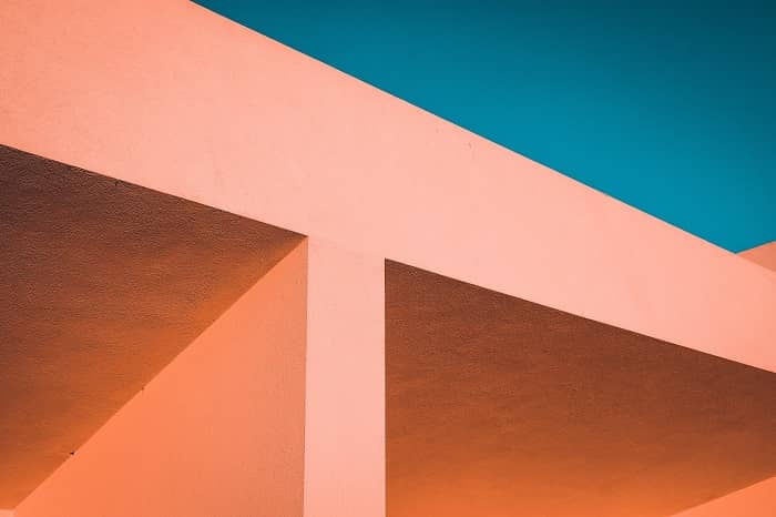
Roundings
The UI elements in Material Minimal are gently rounded to provide the design more friendly and organic look (rounded corners are proven to be more pleasing to the human eye than sharp ones).
In MDB UI KIT you can apply rounded corners by using predefined classes on a scale from 1 to 9.
                    <!-- border-radius: 0px; -->
                    <img src="..." class="rounded-0" alt="...">

                    <!-- border-radius: .2rem; -->
                    <img src="..." class="rounded-1" alt="...">

                    <!-- border-radius: .25rem; -->
                    <img src="..." class="rounded-2" alt="...">

                    <!-- border-radius: .3rem; -->
                    <img src="..." class="rounded-3" alt="...">

                    <!-- border-radius: .375rem; -->
                    <img src="..." class="rounded-4" alt="...">

                    <!-- border-radius: .5rem; -->
                    <img src="..." class="rounded-5" alt="...">

                    <!-- border-radius: .75rem; -->
                    <img src="..." class="rounded-6" alt="...">

                    <!-- border-radius: .1rem; -->
                    <img src="..." class="rounded-7" alt="...">

                    <!-- border-radius: 1.25rem; -->
                    <img src="..." class="rounded-8" alt="...">

                    <!-- border-radius: 1.5rem; -->
                    <img src="..." class="rounded-9" alt="...">
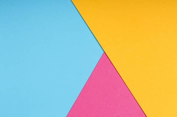
Whitespace
Material Minimal loves wide spaces. It's a style that needs to breathe.
The content is usually presented on a white background (or a dark one in the case of a dark theme). Colorful backgrounds with intense colors are avoided. Only backgrounds slightly touched with a diffused color are allowed.
The home page of mdbootstrap.com is a perfect example.

To ensure enough space between sections or UI elements, in MDB UI KIT you can use a special bottom margin with predefined spacing classes.
Details
Despite its minimalistic form, Material Minimal pays huge attention to details.
The intro section of the mdbootstrap.com homepage is again a good example. A large amount of space, the limited use of colors, and the lack of distracting effects did not result in a lack of attention to detail. Quite the opposite.

All colors are carefully selected here according to a monochromatic pattern, so that on the one hand they blend well together, and on the other hand, they do not distract the user and not distract from the most important action, i.e. the "Get Started" button.
You can also see quite intense, but without exaggeration, the use of icons.
Under the main heading, you can see the logos of the supported technologies. After hovering over one of them, we see a subtle shadow effect. In addition, the logo takes on its branding color (angular - red, react - blue, and so on).
In the background of the section, we see a wavy shape with a color gradient that matches the overall composition. This shape is carefully matched to the graphics on the right, and the whole thing is to give the composition a light, "cloud-like" and flowing style.
As you can see, in such a relatively simple section there are many details that are imperceptible at first glance. However, they give the "magic" to the Material Minimal style and are crucial in creating interfaces that will delight the user.
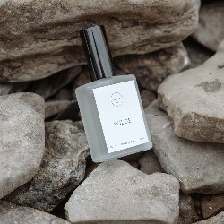
Photos
As one of the key values of Material Minimal is naturalness, photos should also apply to it.
Material Minimal prefers photos of real objects and real people (although this is not a strict rule). Exaggerated editing, very strong filters or caricatured characters do not fit well with the principles of this style.
The illustrations used should be as close to reality as possible.

Card title
Some quick example text to build on the card title and make up the bulk of the card's content.
ButtonEffects
Material Minimal is very reluctant to exaggerate effects and distracting animations. Instead, it prefers subtle, complementary effects that will complement the composition rather than dominate it.
Hover effects are a good example here.

As you can see, the effects are minimalistic and in line with the spirit of Material Minimal.
It is also unacceptable to add functional UI elements (e.g. buttons) activated only by hovering over them with the cursor. This violates the fundamental principle of "mobile first", because it makes the essential interface elements hidden by default and only hovering over them reveals them. This greatly decreases the user experience on mobile devices, so such practices are completely rejected in Material Minimal.
Besides, MDB UI KIT provides a wide variety of animations for you to use. However, use them wisely, so as not to violate the Material Minimal principles.
Detailed specification
As a fully mature design, the Material Minimal system offers predefined values for individual design aspects. Some of them result from Bootstrap specifications, others from Material Design guidelines, and others are original ideas, resulting from years of work and countless projects built by our team and our community. Together, they create exceptional quality that enables you to create great designs.
To learn more about them, see the links below:
Apart from the list above, each component and functionality present in MDB UI KIT is an implementation of Material Minimal principles. Explore them as much as you want with our extensive documentation, which you can navigate using the menu on the left.