Grid system
Vue Bootstrap 5 Grid system
Bootstrap grid is a powerful system for building mobile-first layouts. It's very extensive tool with a great number of options. Below we present you the core knowledge. It's a simplified overview of the most commonly used examples.
Basic example
Bootstrap’s grid system uses a series of containers, rows, and columns to layout and align content. It’s built with flexbox and is fully responsive. Below is an example and an in-depth explanation for how the grid system comes together.
                <template>
                  <MDBContainer>
                    <MDBRow>
                      <MDBCol>One of three columns</MDBCol>
                      <MDBCol>One of three columns</MDBCol>
                      <MDBCol>One of three columns</MDBCol>
                    </MDBRow>
                  </MDBContainer>
                </template>
                    <script>
                      import { MDBCol, MDBRow, MDBContainer } from 'mdb-vue-ui-kit';

                      export default {
                        components: {
                          MDBCol,
                          MDBRow,
                          MDBContainer
                        },
                      };
                    </script>
                    <script setup lang="ts">
                      import { MDBCol, MDBRow, MDBContainer } from 'mdb-vue-ui-kit';
                    </script>
The above example creates three equal-width columns across all devices and viewports using our
predefined grid classes. Those columns are centered in the page with the parent
MDBContainer.
Taking it step by step:
Container
Bootstrap requires a containing element to wrap site contents and house our grid system. Without a container, the grid won't work properly.
Row
Rows create horizontal groups of columns. Therefore, if you want to split your layout
horizontally, use MDBRow.
Columns
Bootstrap's grid system allows up to 12 columns across the page.
We use MDBCol to create a column. You can customize columns with properties, e.g.
md="*" , where * specifies the number of columns between 1 and
12.
Attribute md specifies the breakpoint where the columns change its width.
Attribute md means "screen ≥768px", so in the example below the columns will
stretch to 100% of the width on the screens smaller or equal 768px.
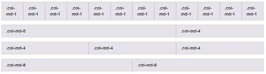
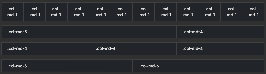
How it works
Breaking it down, here’s how the grid system comes together:
-
Our grid supports six responsive breakpoints. Breakpoints are based on
min-widthmedia queries, meaning they affect that breakpoint and all those above it (e.g.,sm="4"applies tosm,md,lg,xl, andxxl). This means you can control container and column sizing and behavior by each breakpoint. -
Containers center and horizontally pad your content. Use
MDBColfor a responsive pixel width, propertyfluidforwidth: 100%across all viewports and devices, or a responsive container (e.g., propertymd) for combination of fluid and pixel widths. -
Rows are wrappers for columns. Each column has horizontal
padding(called a gutter) for controlling the space between them. Thispaddingis then counteracted on the rows with negative margins to ensure the content in your columns is visually aligned down the left side. Rows also support modifier classes to uniformly apply column sizing and gutter classes to change the spacing of your content. -
Columns are incredibly flexible. There are 12 template columns available per row, allowing you to create different combinations of elements that span any number of columns. Column classes indicate the number of template columns to span (e.g.,
col="4"spans four).widths are set in percentages so you always have the same relative sizing. -
Gutters are also responsive and customizable. Gutter classes are available across all breakpoints, with all the same sizes as our margin and padding spacing. Change horizontal gutters with
.gx-*classes, verical gutters with.gy-*, or all gutters with.g-*classes..g-0is also availble to remove gutters. -
Sass variables, maps, and mixins power the grid. If you don’t want to use the predefined grid classes in Bootstrap, you can use our grid’s source Sass to create your own with more semantic markup. We also include some CSS custom properties to consume these Sass variables for even greater flexibility for you.
Most common examples
A few of the most common grid layout examples to get you familiar with building within the Bootstrap grid system.
Five grid tiers
There are five tiers to the Bootstrap grid system, one for each range of devices we support. Each tier starts at a minimum viewport size and automatically applies to the larger devices unless overridden.
                  <template>
                    <MDBRow>
                      <MDBCol col="4">col="4"</MDBCol>
                      <MDBCol col="4">col="4"</MDBCol>
                      <MDBCol col="4">col="4"</MDBCol>
                    </MDBRow>

                    <MDBRow>
                      <MDBCol sm="4">sm="4"</MDBCol>
                      <MDBCol sm="4">sm="4"</MDBCol>
                      <MDBCol sm="4">sm="4"</MDBCol>
                    </MDBRow>

                    <MDBRow>
                      <MDBCol md="4">md="4"</MDBCol>
                      <MDBCol md="4">md="4"</MDBCol>
                      <MDBCol md="4">md="4"</MDBCol>
                    </MDBRow>

                    <MDBRow>
                      <MDBCol lg="4">lg="4"</MDBCol>
                      <MDBCol lg="4">lg="4"</MDBCol>
                      <MDBCol lg="4">lg="4"</MDBCol>
                    </MDBRow>

                    <MDBRow>
                      <MDBCol xl="4">xl="4"</MDBCol>
                      <MDBCol xl="4">xl="4"</MDBCol>
                      <MDBCol xl="4">xl="4"</MDBCol>
                    </MDBRow>
                  </template>
                      <script>
                        import { MDBCol, MDBRow } from 'mdb-vue-ui-kit';

                        export default {
                          components: {
                            MDBCol,
                            MDBRow
                          },
                        };
                      </script>
                      <script setup lang="ts">
                        import { MDBCol, MDBRow } from 'mdb-vue-ui-kit';
                      </script>
Three equal columns
Get three equal-width columns starting at desktops and scaling to large desktops. On mobile devices, tablets and below, the columns will automatically stack.
                  <template>
                    <MDBRow>
                      <MDBCol md="4">md="4"</MDBCol>
                      <MDBCol md="4">md="4"</MDBCol>
                      <MDBCol md="4">md="4"</MDBCol>
                    </MDBRow>
                  </template>
                      <script>
                        import { MDBCol, MDBRow } from 'mdb-vue-ui-kit';

                        export default {
                          components: {
                            MDBCol,
                            MDBRow
                          },
                        };
                      </script>
                      <script setup lang="ts">
                        import { MDBCol, MDBRow, MDBContainer } from 'mdb-vue-ui-kit';
                      </script>
Three unequal columns
Get three columns starting at desktops and scaling to large desktops of various widths. Remember, grid columns should add up to twelve for a single horizontal block. More than that, and columns start stacking no matter the viewport.
                  <template>
                    <MDBRow>
                      <MDBCol md="3">md="3"</MDBCol>
                      <MDBCol md="6">md="6"</MDBCol>
                      <MDBCol md="3">md="3"</MDBCol>
                    </MDBRow>
                  </template>
                      <script>
                        import { MDBCol, MDBRow } from 'mdb-vue-ui-kit';

                        export default {
                          components: {
                            MDBCol,
                            MDBRow
                          },
                        };
                      </script>
                      <script setup lang="ts">
                        import { MDBCol, MDBRow } from 'mdb-vue-ui-kit';
                      </script>
Two columns
Get two columns starting at desktops and scaling to large desktops.
                  <template>
                    <MDBRow class="row">
                      <MDBCol md="4">md="4"</MDBCol>
                      <MDBCol md="8">md="8"</MDBCol>
                    </MDBRow>
                  </template>
                      <script>
                        import { MDBCol, MDBRow } from 'mdb-vue-ui-kit';

                        export default {
                          components: {
                            MDBCol,
                            MDBRow
                          },
                        };
                      </script>
                      <script setup lang="ts">
                        import { MDBCol, MDBRow } from 'mdb-vue-ui-kit';
                      </script>
Two columns with two nested columns
Per the documentation, nesting is easy—just put a row of columns within an existing column. This gives you two columns starting at desktops and scaling to large desktops, with another two (equal widths) within the larger column.
At mobile device sizes, tablets and down, these columns and their nested columns will stack.
                  <template>
                    <MDBRow class="row">
                      <MDBCol md="8">
                        <div class="pb-3">md="8"</div>
                        <MDBRow>
                          <MDBCol md="6">md="6"</MDBCol>
                          <MDBCol md="6">md="6"</MDBCol>
                        </MDBRow>
                      </MDBCol>
                      <MDBCol md="4">md="4"</MDBCol>
                    </MDBRow>
                  </template>
                      <script>
                        import { MDBCol, MDBRow } from 'mdb-vue-ui-kit';

                        export default {
                          components: {
                            MDBCol,
                            MDBRow
                          },
                        };
                      </script>
                      <script setup lang="ts">
                        import { MDBCol, MDBRow } from 'mdb-vue-ui-kit';
                      </script>
Mixed: mobile and desktop
The Bootstrap v5 grid system has five tiers of classes: xs (extra small, this class infix is not used), sm (small), md (medium), lg (large), and xl (extra large). You can use nearly any combination of these classes as a component property to create more dynamic and flexible layouts.
Each tier of classes scales up, meaning if you plan on setting the same widths for md, lg and xl, you only need to specify md.
                  <template>
                    <MDBRow class="mb-3">
                      <MDBCol md="8">md="8"</MDBCol>
                      <MDBCol col="6" md="4">col="6" md="4"</MDBCol>
                    </MDBRow>
                    <MDBRow class="mb-3">
                      <MDBCol col="6" md="4">col="6" md="4"</MDBCol>
                      <MDBCol col="6" md="4">col="6" md="4"</MDBCol>
                      <MDBCol col="6" md="4">col="6" md="4"</MDBCol>
                    </MDBRow>
                    <MDBRow class="row">
                      <MDBCol col="6">col="6"</MDBCol>
                      <MDBCol col="6">col="6"</MDBCol>
                    </MDBRow>
                  </template>
                      <script>
                        import { MDBCol, MDBRow } from 'mdb-vue-ui-kit';

                        export default {
                          components: {
                            MDBCol,
                            MDBRow
                          },
                        };
                      </script>
                      <script setup lang="ts">
                        import { MDBCol, MDBRow, MDBContainer } from 'mdb-vue-ui-kit';
                      </script>
Mixed: mobile, tablet, and desktop
                  <template>
                    <MDBRow class="mb-3">
                      <MDBCol sm="6" lg="8">sm="6" lg="8"</MDBCol>
                      <MDBCol col="6" lg="4">col="6" lg="4"</MDBCol>
                    </MDBRow>
                    <MDBRow>
                      <MDBCol col="6" sm="4">col="6" sm="4"</MDBCol>
                      <MDBCol col="6" sm="4">col="6" sm="4"</MDBCol>
                      <MDBCol col="6" sm="4">col="6" sm="4"</MDBCol>
                    </MDBRow>
                  </template>
                      <script>
                        import { MDBCol, MDBRow } from 'mdb-vue-ui-kit';

                        export default {
                          components: {
                            MDBCol,
                            MDBRow
                          },
                        };
                      </script>
                      <script setup lang="ts">
                        import { MDBCol, MDBRow } from 'mdb-vue-ui-kit';
                      </script>
Containers
Additional properties added to MDBContainer allow containers that are 100% wide
until a particular breakpoint.
                <template>
                  <MDBContainer>(100% width below 540px)</MDBContainer>
                  <MDBContainer sm>sm (100% width below 540px)</MDBContainer>
                  <MDBContainer md>md (100% width below 720px)</MDBContainer>
                  <MDBContainer lg>lg (100% width below 960px)</MDBContainer>
                  <MDBContainer xl>xl (100% width below 1140px)</MDBContainer>
                  <MDBContainer xxl>xxl (100% width below 1320px)</MDBContainer>
                  <MDBContainer fluid>fluid (always 100% width)</MDBContainer>
                </template>
                    <script>
                      import { MDBContainer } from 'mdb-vue-ui-kit';

                      export default {
                        components: {
                          MDBContainer
                        },
                      };
                    </script>
                    <script setup lang="ts">
                      import { MDBContainer } from 'mdb-vue-ui-kit';
                    </script>
Vue Grid - API
Import
          <script>
            import {
              MDBContainer,
              MDBRow,
              MDBCol
            } from 'mdb-vue-ui-kit';
          </script>
Properties
Containers
| Name | Type | Default | Description | Example |
|---|---|---|---|---|
tag
|
String | 'div' |
Defines tag of the MDBContainer element |
<MDBContainer tag="section" />
|
sm
|
Boolean | 'false' |
Defines max-width of the container at sm responsive breakpoint |
<MDBContainer sm />
|
md
|
Boolean | 'false' |
Defines max-width of the container at md responsive breakpoint |
<MDBContainer md />
|
lg
|
Boolean | 'false' |
Defines max-width of the container at lg responsive breakpoint |
<MDBContainer lg />
|
xl
|
Boolean | 'false' |
Defines max-width of the container at xl responsive breakpoint |
<MDBContainer xl />
|
fluid
|
Boolean | 'false' |
Sets container element to have 100% width at all breakpoints |
<MDBContainer fluid />
|
Rows
| Name | Type | Default | Description | Example |
|---|---|---|---|---|
tag
|
String | 'div' |
Defines tag of the MDBRow element |
<MDBRow tag="section" />
|
start
|
Boolean | 'false' |
Pack content in the row element from the start |
<MDBRow start />
|
end
|
Boolean | 'false' |
Pack content in the row element from the end |
<MDBRow end />
|
center
|
Boolean | 'false' |
Pack content in the row element around the center |
<MDBRow center />
|
between
|
Boolean | 'false' |
Distribute content in the row element evenly. The first item is flush with the start, the last is flush with the end |
<MDBRow between />
|
around
|
Boolean | 'false' |
Distribute content in the row element evenly. Items have a hals-size space on either end |
<MDBRow around />
|
cols
|
String / Array | '' |
Allows to use row-cols specific attributes. |
<MDBRow cols="2" />
<MDBRow cols="[2, lg-5]" />
|
Columns
| Name | Type | Default | Description | Example |
|---|---|---|---|---|
tag
|
String | 'div' |
Defines tag of the MDBCol element |
<MDBCol tag="section" />
|
col
|
String | '' |
Defines width of the element by the number of columns it takes |
<MDBCol col="4" />
|
sm
|
String | '' |
Defines width of the element by the number of columns it takes until
sm breakpoint is reached
|
<MDBCol col="4" sm="3" />
|
md
|
String | '' |
Defines width of the element by the number of columns it takes until
md breakpoint is reached
|
<MDBCol col="4" md="3" />
|
lg
|
String | '' |
Defines width of the element by the number of columns it takes until
lg breakpoint is reached
|
<MDBCol col="4" lg="3" />
|
xl
|
String | '' |
Defines width of the element by the number of columns it takes until
xl breakpoint is reached
|
<MDBCol col="4" xl="3" />
|
offset
|
String | '' |
Defines offset of the element from the other element measured in columns |
<MDBCol col="4" offset="3" />
|
offsetSm
|
String | '' |
Defines offset of the element from the other element for sm breakpoint
measured in columns
|
<MDBCol col="4" offsetSm="3" />
|
offsetMd
|
String | '' |
Defines offset of the element from the other element for sm breakpoint
measured in columns
|
<MDBCol col="4" offsetMd="3" />
|
offsetLg
|
String | '' |
Defines offset of the element from the other element for sm breakpoint
measured in columns
|
<MDBCol col="4" offsetLg="3" />
|
auto
|
Boolean | 'false' |
Sets column element to have width based on the free space of the row |
<MDBCol auto />
|
Sass
When using MDB’s source Sass files, you have the option of using SCSS variables and mixins to create custom, semantic, and responsive page layouts. Our predefined grid classes use these same variables and mixins to provide a whole suite of ready-to-use classes for fast responsive layouts.
Variables
Variables and maps determine the number of columns, the gutter width, and the media query point at which to begin floating columns. We use these to generate the predefined grid classes documented above, as well as for the custom mixins listed below.
          $grid-columns: 12;
          $grid-gutter-width: 1.5rem;
          $grid-row-columns: 6;
          $grid-breakpoints: (
            xs: 0,
            sm: 576px,
            md: 768px,
            lg: 992px,
            xl: 1200px,
            xxl: 1400px,
          );
          $container-max-widths: (
            sm: 540px,
            md: 720px,
            lg: 960px,
            xl: 1140px,
            xxl: 1320px,
          )