Modal
React Bootstrap 5 Modal component
Use MDB modal plugin to add dialogs to your site for lightboxes, user notifications, or completely custom content.
Note: Read the API tab to find all available options and advanced customization
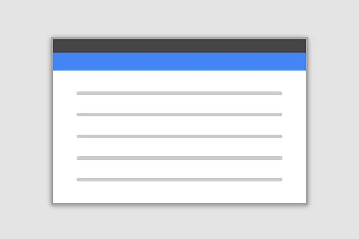
Basic example
Click the button to launch the modal.
Frame modal
Position
Side modal
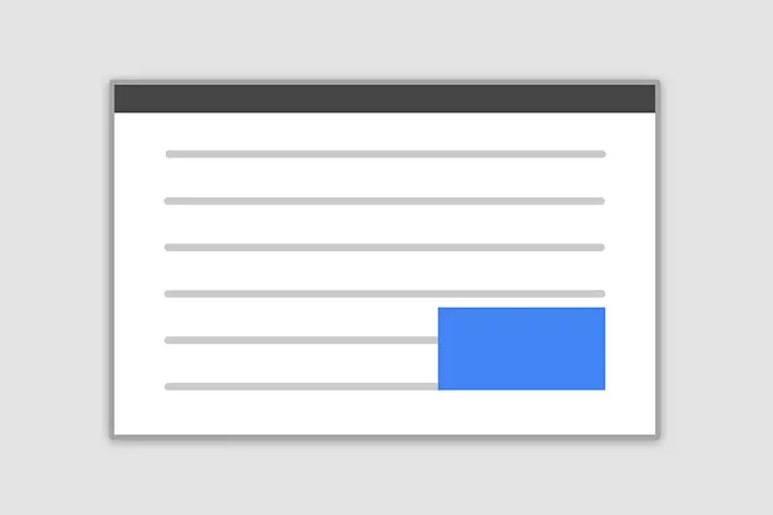
Position
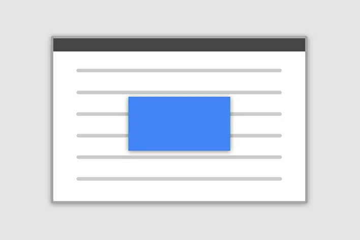
Central modal
Size

How it works
Before getting started with MDB modal component, be sure to read the following as our menu options have recently changed.
-
Modals are positioned over everything else in the document and remove scroll from the
<body>so that modal content scrolls instead. - Clicking on the modal “backdrop” will automatically close the modal.
- Bootstrap only supports one modal window at a time. Nested modals aren’t supported as we believe them to be poor user experiences.
-
Modals use
position: fixed, which can sometimes be a bit particular about its rendering. Whenever possible, place your modal HTML in a top-level position to avoid potential interference from other elements. You’ll likely run into issues when nesting aMDBModalwithin another fixed element. -
Once again, due to
position: fixed, there are some caveats with using modals on mobile devices. -
Due to how HTML5 defines its semantics,
the
autofocusHTML attribute has no effect in Bootstrap modals. To achieve the same effect, use some custom JavaScript:
            import React, { useEffect, useRef, useState } from 'react';
            import {
              MDBBtn,
              MDBModal,
              MDBModalDialog,
              MDBModalContent,
              MDBModalHeader,
              MDBModalTitle,
              MDBModalBody,
              MDBModalFooter,
              MDBInput,
            } from 'mdb-react-ui-kit';

            export default function App() {
              const [open, setOpen] = useState(false);
              const inputRef = useRef(null);

              useEffect(() => {
                if (open) {
                  inputRef.current?.focus();
                }
              }, [open]);

              return (
                <>
                  <MDBBtn onClick={() => setOpen(!open)}>LAUNCH DEMO MODAL</MDBBtn>
                  <MDBModal open={open} setOpen={setOpen} tabIndex={-1}>
                    <MDBModalDialog>
                      <MDBModalContent>
                        <MDBModalHeader>
                          <MDBModalTitle>Modal title</MDBModalTitle>
                          <MDBBtn className='btn-close' color='none' onClick={() => setOpen(!open)}></MDBBtn>
                        </MDBModalHeader>
                        <MDBModalBody>
                          <MDBInput ref={inputRef} />
                        </MDBModalBody>

                        <MDBModalFooter>
                          <MDBBtn type='button' onClick={() => setOpen(!open)}>
                            Close
                          </MDBBtn>
                        </MDBModalFooter>
                      </MDBModalContent>
                    </MDBModalDialog>
                  </MDBModal>
                </>
              );
            }
Modal components
Below is a static modal example (meaning its position and
display have been overridden). Included are the modal header, modal body
(required for padding), and modal footer (optional). We ask that you include
modal headers with dismiss actions whenever possible, or provide another explicit dismiss
action.
          import React, { useState } from 'react';
          import {
            MDBBtn,
            MDBModal,
            MDBModalDialog,
            MDBModalContent,
            MDBModalHeader,
            MDBModalTitle,
            MDBModalBody,
            MDBModalFooter,
          } from 'mdb-react-ui-kit';

          export default function App() {
            const [basicModal, setBasicModal] = useState(false);

            const toggleOpen = () => setBasicModal(!basicModal);

            return (
              <>
                <MDBBtn onClick={toggleOpen}>LAUNCH DEMO MODAL</MDBBtn>
                <MDBModal open={basicModal} onClose={() => setBasicModal(false)} tabIndex='-1'>
                  <MDBModalDialog>
                    <MDBModalContent>
                      <MDBModalHeader>
                        <MDBModalTitle>Modal title</MDBModalTitle>
                        <MDBBtn className='btn-close' color='none' onClick={toggleOpen}></MDBBtn>
                      </MDBModalHeader>
                      <MDBModalBody>Modal body text goes here.</MDBModalBody>

                      <MDBModalFooter>
                        <MDBBtn color='secondary' onClick={toggleOpen}>
                          Close
                        </MDBBtn>
                        <MDBBtn>Save changes</MDBBtn>
                      </MDBModalFooter>
                    </MDBModalContent>
                  </MDBModalDialog>
                </MDBModal>
              </>
            );
          }
Position
To change the position of the modal add one of the following props to the MDBModalDialog
Top right:
side + position="top-right"
Top left:
side + position="top-left"
Bottom right:
side + position="bottom-right"
Bottom left:
side + position="bottom-left"
Note: If you want to change the direction of modal animation, add the prop{' '}
animationDirection, top, bottom or left to the{' '}
Modal component.
            import React, { useState } from 'react';
            import {
              MDBBtn,
              MDBModal,
              MDBModalDialog,
              MDBModalContent,
              MDBModalHeader,
              MDBModalTitle,
              MDBModalBody,
              MDBModalFooter,
            } from 'mdb-react-ui-kit';

            export default function App() {
              const [topRightModal, setTopRightModal] = useState(false);

              const toggleOpen = () => setTopRightModal(!topRightModal);

              return (
                <>
                  <MDBBtn onClick={toggleOpen}>Top right</MDBBtn>

                  <MDBModal
                    animationDirection='right'
                    open={topRightModal}
                    tabIndex='-1'
                    onClose={() => setTopRightModal(false)}
                  >
                    <MDBModalDialog position='top-right' side>
                      <MDBModalContent>
                        <MDBModalHeader className='bg-info text-white'>
                          <MDBModalTitle>Product in the cart</MDBModalTitle>
                          <MDBBtn
                            color='none'
                            className='btn-close btn-close-white'
                            onClick={toggleOpen}
                          ></MDBBtn>
                        </MDBModalHeader>
                        <MDBModalBody>
                          <div className='row'>
                            <div className='col-3 text-center'>
                              <i className='fas fa-shopping-cart fa-4x text-info'></i>
                            </div>

                            <div className='col-9'>
                              <p>Do you need more time to make a purchase decision?</p>
                              <p>No pressure, your product will be waiting for you in the cart.</p>
                            </div>
                          </div>
                        </MDBModalBody>
                        <MDBModalFooter>
                          <MDBBtn color='info'>Go to the cart</MDBBtn>
                          <MDBBtn outline color='info' onClick={toggleOpen}>
                            Close
                          </MDBBtn>
                        </MDBModalFooter>
                      </MDBModalContent>
                    </MDBModalDialog>
                  </MDBModal>
                </>
              );
            }
Frame
To make the modal "frame-like" add frame prop to the
MDBModalDialog element. You also need to specify the direction by adding
position="bottom" or position="top" to the MDBModalDialog.
          import React, { useState } from 'react';
          import { MDBBtn, MDBModal, MDBModalDialog, MDBModalContent, MDBModalBody } from 'mdb-react-ui-kit';

          export default function App() {
            const [bottomModal, setBottomModal] = useState(false);

            const toggleOpen = () => setBottomModal(!bottomModal);

            return (
              <>
                <MDBBtn onClick={toggleOpen}>Launch frame modal</MDBBtn>

                <MDBModal animationDirection='bottom' open={bottomModal} tabIndex='-1' onClose={() => setBottomModal(false)}>
                  <MDBModalDialog position='bottom' frame>
                    <MDBModalContent>
                      <MDBModalBody className='py-1'>
                        <div className='d-flex justify-content-center align-items-center my-3'>
                          <p className='mb-0'>We use cookies to improve your website experience</p>
                          <MDBBtn color='success' size='sm' className='ms-2' onClick={toggleOpen}>
                            Ok, thanks
                          </MDBBtn>
                          <MDBBtn size='sm' className='ms-2'>
                            Learn more
                          </MDBBtn>
                        </div>
                      </MDBModalBody>
                    </MDBModalContent>
                  </MDBModalDialog>
                </MDBModal>
              </>
            );
          }
Static backdrop
When backdrop is set to static, the modal will not close when clicking outside it. Click the button below to try it.
          import React, { useState } from 'react';
          import {
            MDBBtn,
            MDBModal,
            MDBModalDialog,
            MDBModalContent,
            MDBModalHeader,
            MDBModalTitle,
            MDBModalBody,
            MDBModalFooter,
          } from 'mdb-react-ui-kit';

          export default function App() {
            const [staticModal, setStaticModal] = useState(false);

            const toggleOpen = () => setStaticModal(!staticModal);

            return (
              <>
                <MDBBtn onClick={toggleOpen}>Launch static backdrop modal</MDBBtn>

                <MDBModal staticBackdrop tabIndex='-1' open={staticModal} onClose={() => setStaticModal(false)}>
                  <MDBModalDialog>
                    <MDBModalContent>
                      <MDBModalHeader>
                        <MDBModalTitle>Modal title</MDBModalTitle>
                        <MDBBtn className='btn-close' color='none' onClick={toggleOpen}></MDBBtn>
                      </MDBModalHeader>
                      <MDBModalBody>...</MDBModalBody>
                      <MDBModalFooter>
                        <MDBBtn color='secondary' onClick={toggleOpen}>
                          Close
                        </MDBBtn>
                        <MDBBtn>Understood</MDBBtn>
                      </MDBModalFooter>
                    </MDBModalContent>
                  </MDBModalDialog>
                </MDBModal>
              </>
            );
          }
Scrolling long content
When modals become too long for the user’s viewport or device, they scroll independent of the page itself. Try the demo below to see what we mean.
You can also create a scrollable modal that allows scroll the modal body by adding
scrollable to MDBModalDialog.
          import React, { useState } from 'react';
          import {
            MDBBtn,
            MDBModal,
            MDBModalDialog,
            MDBModalContent,
            MDBModalHeader,
            MDBModalTitle,
            MDBModalBody,
            MDBModalFooter,
          } from 'mdb-react-ui-kit';

          export default function App() {
            const [scrollableModal, setScrollableModal] = useState(false);

            return (
              <>
                <MDBBtn onClick={() => setScrollableModal(!scrollableModal)}>LAUNCH DEMO MODAL</MDBBtn>

                <MDBModal open={scrollableModal} onClose={() => setScrollableModal(false)} tabIndex='-1'>
                  <MDBModalDialog scrollable>
                    <MDBModalContent>
                      <MDBModalHeader>
                        <MDBModalTitle>Modal title</MDBModalTitle>
                        <MDBBtn
                          className='btn-close'
                          color='none'
                          onClick={() => setScrollableModal(false)}
                        ></MDBBtn>
                      </MDBModalHeader>
                      <MDBModalBody>
                        <p>
                          Cras mattis consectetur purus sit amet fermentum. Cras justo odio, dapibus ac facilisis in,
                          egestas eget quam. Morbi leo risus, porta ac consectetur ac, vestibulum at eros.
                        </p>
                        <p>
                          Praesent commodo cursus magna, vel scelerisque nisl consectetur et. Vivamus sagittis lacus vel
                          augue laoreet rutrum faucibus dolor auctor.
                        </p>
                        <p>
                          Aenean lacinia bibendum nulla sed consectetur. Praesent commodo cursus magna, vel scelerisque nisl
                          consectetur et. Donec sed odio dui. Donec ullamcorper nulla non metus auctor fringilla.
                        </p>
                        <p>
                          Cras mattis consectetur purus sit amet fermentum. Cras justo odio, dapibus ac facilisis in,
                          egestas eget quam. Morbi leo risus, porta ac consectetur ac, vestibulum at eros.
                        </p>
                        <p>
                          Praesent commodo cursus magna, vel scelerisque nisl consectetur et. Vivamus sagittis lacus vel
                          augue laoreet rutrum faucibus dolor auctor.
                        </p>
                        <p>
                          Aenean lacinia bibendum nulla sed consectetur. Praesent commodo cursus magna, vel scelerisque nisl
                          consectetur et. Donec sed odio dui. Donec ullamcorper nulla non metus auctor fringilla.
                        </p>
                      </MDBModalBody>
                      <MDBModalFooter>
                        <MDBBtn color='secondary' onClick={() => setScrollableModal(!setScrollableModal)}>
                          Close
                        </MDBBtn>
                        <MDBBtn>Save changes</MDBBtn>
                      </MDBModalFooter>
                    </MDBModalContent>
                  </MDBModalDialog>
                </MDBModal>
              </>
            );
          }
Vertically centered
Add centered to MDBModalDialog to vertically center the modal.
          import React, { useState } from 'react';
          import {
            MDBBtn,
            MDBModal,
            MDBModalDialog,
            MDBModalContent,
            MDBModalHeader,
            MDBModalTitle,
            MDBModalBody,
            MDBModalFooter,
          } from 'mdb-react-ui-kit';

          export default function App() {
            const [centredModal, setCentredModal] = useState(false);

            const toggleOpen = () => setCentredModal(!centredModal);

            return (
              <>
                <MDBBtn onClick={toggleOpen}>Vertically centered modal</MDBBtn>

                <MDBModal tabIndex='-1' open={centredModal} onClose={() => setCentredModal(false)}>
                  <MDBModalDialog centered>
                    <MDBModalContent>
                      <MDBModalHeader>
                        <MDBModalTitle>Modal title</MDBModalTitle>
                        <MDBBtn className='btn-close' color='none' onClick={toggleOpen}></MDBBtn>
                      </MDBModalHeader>
                      <MDBModalBody>
                        <p>
                          Cras mattis consectetur purus sit amet fermentum. Cras justo odio, dapibus ac facilisis in,
                          egestas eget quam. Morbi leo risus, porta ac consectetur ac, vestibulum at eros.
                        </p>
                      </MDBModalBody>
                      <MDBModalFooter>
                        <MDBBtn color='secondary' onClick={toggleOpen}>
                          Close
                        </MDBBtn>
                        <MDBBtn>Save changes</MDBBtn>
                      </MDBModalFooter>
                    </MDBModalContent>
                  </MDBModalDialog>
                </MDBModal>
              </>
            );
          }
Tooltips and popovers
Tooltips and popovers can be placed within modals as needed. When modals are closed, any tooltips and popovers within are also automatically dismissed.
          import React, { useState } from 'react';
          import {
            MDBBtn,
            MDBModal,
            MDBModalDialog,
            MDBModalContent,
            MDBModalHeader,
            MDBModalTitle,
            MDBModalBody,
            MDBModalFooter,
            MDBPopover,
            MDBPopoverHeader,
            MDBPopoverBody,
            MDBTooltip
          } from 'mdb-react-ui-kit';

          export default function App() {
            const [popoverModal, setPopoverModal] = useState(false);

            const toggleOpen = () => setPopoverModal(!popoverModal);

            return (
              <>
                <MDBBtn onClick={toggleOpen}>Launch demo modal</MDBBtn>

                <MDBModal tabIndex='-1' open={popoverModal} onClose={() => setPopoverModal(false)}>
                  <MDBModalDialog>
                    <MDBModalContent>
                      <MDBModalHeader>
                        <MDBModalTitle>Modal title</MDBModalTitle>
                        <MDBBtn className='btn-close' color='none' onClick={toggleOpen}></MDBBtn>
                      </MDBModalHeader>
                      <MDBModalBody>
                        <h5>Popover in a modal</h5>
                        <p>
                          This
                          <MDBPopover isOpen={popoverModal} color='secondary' btnChildren='button' placement='right'>
                            <MDBPopoverHeader>Popover title</MDBPopoverHeader>
                            <MDBPopoverBody>Popover body content is set in this attribute.</MDBPopoverBody>
                          </MDBPopover>
                          triggers a popover on click.
                        </p>
                        <hr />
                        <h5>Tooltips in a modal</h5>
                        <p>
                          <MDBTooltip tag='a' wrapperProps={{ href: '#!' }} title='Tooltip'>
                            This link
                          </MDBTooltip>{' '}
                          and{' '}
                          <MDBTooltip tag='a' wrapperProps={{ href: '#!' }} title='Tooltip'>
                            that link
                          </MDBTooltip>{' '}
                          have tooltips on hover.
                        </p>
                      </MDBModalBody>

                      <MDBModalFooter>
                        <MDBBtn color='secondary' onClick={toggleOpen}>
                          Close
                        </MDBBtn>
                        <MDBBtn>Save changes</MDBBtn>
                      </MDBModalFooter>
                    </MDBModalContent>
                  </MDBModalDialog>
                </MDBModal>
              </>
            );
          }
Using the grid
Utilize the Bootstrap grid system within a modal by nesting
.container-fluid within the .modal-body. Then, use the normal grid
system classes as you would anywhere else.
          import React, { useState } from 'react';
          import {
            MDBBtn,
            MDBModal,
            MDBModalDialog,
            MDBModalContent,
            MDBModalHeader,
            MDBModalTitle,
            MDBModalBody,
            MDBModalFooter,
          } from 'mdb-react-ui-kit';

          export default function App() {
            const [gridModal, setGridModal] = useState(false);

            const toggleOpen = () => setGridModal(!gridModal);

            return (
              <>
                <MDBBtn onClick={toggleOpen}>Launch demo modal</MDBBtn>

                <MDBModal tabIndex='-1' open={gridModal} onClose={() => setGridModal(false)}>
                  <MDBModalDialog>
                    <MDBModalContent>
                      <MDBModalHeader>
                        <MDBModalTitle>Grids in modals</MDBModalTitle>
                        <MDBBtn
                          type='button'
                          className='btn-close'
                          color='none'
                          onClick={toggleOpen}
                        ></MDBBtn>
                      </MDBModalHeader>
                      <MDBModalBody>
                        <div className='container-fluid bd-example-row'>
                          <div className='row'>
                            <div className='col-md-4 col-example'>.col-md-4</div>
                            <div className='col-md-4 ms-auto col-example'>.col-md-4 .ms-auto</div>
                          </div>
                          <div className='row'>
                            <div className='col-md-3 ms-auto col-example'>.col-md-3 .ms-auto</div>
                            <div className='col-md-2 ms-auto col-example'>.col-md-2 .ms-auto</div>
                          </div>
                          <div className='row'>
                            <div className='col-md-6 ms-auto col-example'>.col-md-6 .ms-auto</div>
                          </div>
                          <div className='row'>
                            <div className='col-sm-9 col-example'>
                              Level 1: .col-sm-9
                              <div className='row'>
                                <div className='col-8 col-sm-6 col-example'>Level 2: .col-8 .col-sm-6</div>
                                <div className='col-4 col-sm-6 col-example'>Level 2: .col-4 .col-sm-6</div>
                              </div>
                            </div>
                          </div>
                        </div>
                      </MDBModalBody>
                      <MDBModalFooter>
                        <MDBBtn color='secondary' onClick={toggleOpen}>
                          Close
                        </MDBBtn>
                        <MDBBtn>Save changes</MDBBtn>
                      </MDBModalFooter>
                    </MDBModalContent>
                  </MDBModalDialog>
                </MDBModal>
              </>
            );
          }
Varying modal content
Have a bunch of buttons that all trigger the same modal with slightly different contents? Use
event.relatedTarget and
HTML data-mdb-* attributes
to vary the contents of the modal depending on which button was clicked.
Below is a live demo followed by example HTML and JavaScript. For more information, read the
modal API/events doc for details on relatedTarget.
          import React, { ChangeEvent, useState } from 'react';
          import {
            MDBBtn,
            MDBModal,
            MDBModalDialog,
            MDBModalContent,
            MDBModalHeader,
            MDBModalTitle,
            MDBModalBody,
            MDBModalFooter,
            MDBTextArea,
            MDBInput,
          } from 'mdb-react-ui-kit';

          export default function App() {
            const [varyingState, setVaryingState] = useState('');
            const [varyingModal, setVaryingModal] = useState(false);
            const [varyingRecipient, setVaryingRecipient] = useState('');
            const [varyingMessage, setVaryingMessage] = useState('');

            const onChangeRecipient = (event: ChangeEvent<HTMLInputElement>) => {
              setVaryingRecipient(event.target.value);
            };

            const onChangeMessage = (event: ChangeEvent<HTMLTextAreaElement>) => {
              setVaryingMessage(event.target.value);
            };

            return (
              <>
                <MDBBtn
                  onClick={() => {
                    setVaryingState('@mdo');
                    setVaryingModal(!varyingModal);
                    setVaryingRecipient('@mdo');
                  }}
                >
                  Open modal for @mdo
                </MDBBtn>
                <MDBBtn
                  onClick={() => {
                    setVaryingState('@fat');
                    setVaryingModal(!varyingModal);
                    setVaryingRecipient('@fat');
                  }}
                >
                  Open modal for @fat
                </MDBBtn>
                <MDBBtn
                  onClick={() => {
                    setVaryingState('@getbootstrap');
                    setVaryingModal(!varyingModal);
                    setVaryingRecipient('@getbootstrap');
                  }}
                >
                  Open modal for @getbootstrap
                </MDBBtn>

                <MDBModal open={varyingModal} onClose={() => setVaryingModal(false)} tabIndex='-1'>
                  <MDBModalDialog>
                    <MDBModalContent>
                      <MDBModalHeader>
                        <MDBModalTitle>New message to {varyingState}</MDBModalTitle>
                        <MDBBtn className='btn-close' color='none' onClick={() => setVaryingModal(false)}></MDBBtn>
                      </MDBModalHeader>
                      <MDBModalBody>
                        <form>
                          <div className='mb-3'>
                            {varyingModal && (
                              <MDBInput
                                value={varyingRecipient}
                                onChange={onChangeRecipient}
                                labelClass='col-form-label'
                                label='Recipient:'
                              />
                            )}
                          </div>
                          <div className='mb-3'>
                            {varyingModal && (
                              <MDBTextArea
                                value={varyingMessage}
                                onChange={onChangeMessage}
                                labelClass='col-form-label'
                                label='Message:'
                              />
                            )}
                          </div>
                        </form>
                      </MDBModalBody>
                      <MDBModalFooter>
                        <MDBBtn color='secondary' onClick={() => setVaryingModal(!varyingModal)}>
                          Close
                        </MDBBtn>
                        <MDBBtn>Save changes</MDBBtn>
                      </MDBModalFooter>
                    </MDBModalContent>
                  </MDBModalDialog>
                </MDBModal>
              </>
            );
          }
Toggle between modals
Toggle between multiple modals with some clever placement of the
data-mdb-target and data-mdb-toggle attributes. For example, you
could toggle a password reset modal from within an already open sign in modal.
Please note multiple modals cannot be open at the same time—this method
simply toggles between two separate modals.
Below is a live demo followed by example HTML and JavaScript. For more information, read the
modal API/events doc for details on relatedTarget.
          import React, { useState } from 'react';
          import {
            MDBBtn,
            MDBModal,
            MDBModalDialog,
            MDBModalContent,
            MDBModalHeader,
            MDBModalTitle,
            MDBModalBody,
            MDBModalFooter,
          } from 'mdb-react-ui-kit';

          export default function App() {
            const [toggleOneModal, setToggleOneModal] = useState(false);
            const [toggleTwoModal, setToggleTwoModal] = useState(false);

            return (
              <>
                <MDBBtn onClick={() => setToggleOneModal(!toggleOneModal)}>OPEN FIRST MODAL</MDBBtn>

                <MDBModal open={toggleOneModal} onClose={() => setToggleOneModal(false)} tabIndex='-1'>
                  <MDBModalDialog centered>
                    <MDBModalContent>
                      <MDBModalHeader>
                        <MDBModalTitle>Modal 1</MDBModalTitle>
                        <MDBBtn
                          className='btn-close'
                          color='none'
                          onClick={() => setToggleOneModal(!toggleOneModal)}
                        ></MDBBtn>
                      </MDBModalHeader>
                      <MDBModalBody>Show a second modal and hide this one with the button below.</MDBModalBody>
                      <MDBModalFooter>
                        <MDBBtn
                          onClick={() => {
                            setToggleOneModal(!toggleOneModal);
                            setTimeout(() => {
                              setToggleTwoModal(!toggleTwoModal);
                            }, 400);
                          }}
                        >
                          Open second modal
                        </MDBBtn>
                      </MDBModalFooter>
                    </MDBModalContent>
                  </MDBModalDialog>
                </MDBModal>

                <MDBModal open={toggleTwoModal} onClose={() => setToggleTwoModal(false)} tabIndex='-1'>
                  <MDBModalDialog centered>
                    <MDBModalContent>
                      <MDBModalHeader>
                        <MDBModalTitle>Modal 2</MDBModalTitle>
                        <MDBBtn
                          className='btn-close'
                          color='none'
                          onClick={() => setToggleTwoModal(!toggleTwoModal)}
                        ></MDBBtn>
                      </MDBModalHeader>
                      <MDBModalBody>Close this modal and show the first with the button below.</MDBModalBody>
                      <MDBModalFooter>
                        <MDBBtn
                          onClick={() => {
                            setToggleTwoModal(!toggleTwoModal);
                            setTimeout(() => {
                              setToggleOneModal(!toggleOneModal);
                            }, 400);
                          }}
                        >
                          Back to first
                        </MDBBtn>
                      </MDBModalFooter>
                    </MDBModalContent>
                  </MDBModalDialog>
                </MDBModal>
              </>
            );
          }
Accessibility
Be sure to add aria-labelledby="...", referencing the modal title, to
MDBModal. Additionally, you may give a description of your modal dialog with
aria-describedby on MDBModal.
Embedding YouTube videos
Embedding YouTube videos in modals requires additional JavaScript not in Bootstrap to automatically stop playback and more. See this helpful Stack Overflow post for more information.
Optional sizes
Modals have three optional sizes, available via modifier props to be placed on a MDBModalDialog.
These sizes kick in at certain breakpoints to avoid horizontal scrollbars on narrower viewports.
| Size | Prop | Modal max-width |
|---|---|---|
| Small | size="sm" |
300px |
| Default | None | 500px |
| Large | size="lg" |
800px |
| Extra large | size="xl" |
1140px |
          import React, { useState } from 'react';
          import {
            MDBBtn,
            MDBModal,
            MDBModalDialog,
            MDBModalContent,
            MDBModalHeader,
            MDBModalTitle,
            MDBModalBody
          } from 'mdb-react-ui-kit';

          export default function App() {
            const [optSmModal, setOptSmModal] = useState(false);

            const toggleOpen = () => setOptSmModal(!optSmModal);

            return (
              <>
                <MDBBtn onClick={toggleOpen}>Small modal</MDBBtn>
                <MDBModal open={optSmModal} tabIndex='-1' onClose={() => setOptSmModal(false)}>
                  <MDBModalDialog size='sm'>
                    <MDBModalContent>
                      <MDBModalHeader>
                        <MDBModalTitle>Small modal</MDBModalTitle>
                        <MDBBtn className='btn-close' color='none' onClick={toggleOpen}></MDBBtn>
                      </MDBModalHeader>
                      <MDBModalBody>...</MDBModalBody>
                    </MDBModalContent>
                  </MDBModalDialog>
                </MDBModal>
              </>
            );
          }
Fullscreen Modal
Another override is the option to pop up a modal that covers the user viewport, available via
modifier props that are placed on a MDBModalDialog.
| Prop | Availability |
|---|---|
size="fullscreen" |
Always |
size="fullscreen-sm-down" |
Below 576px |
size="fullscreen-md-down" |
Below 768px |
size="fullscreen-lg-down" |
Below 992px |
size="fullscreen-xl-down" |
Below 1200px |
size="fullscreen-xxl-down" |
Below 1400px |
          import React, { useState } from 'react';
          import {
            MDBBtn,
            MDBModal,
            MDBModalDialog,
            MDBModalContent,
            MDBModalHeader,
            MDBModalTitle,
            MDBModalBody,
            MDBModalFooter,
          } from 'mdb-react-ui-kit';

          export default function App() {
            const [fullscreenXlModal, setFullscreenXlModal] = useState(false);

            const toggleOpen = () => setFullscreenXlModal(!fullscreenXlModal);

            return (
              <>
                <MDBBtn onClick={toggleOpen}>Full screen below xl</MDBBtn>
                <MDBModal tabIndex='-1' open={fullscreenXlModal} onClose={() => setFullscreenXlModal(false)}>
                  <MDBModalDialog size='fullscreen-xl-down'>
                    <MDBModalContent>
                      <MDBModalHeader>
                        <MDBModalTitle>Full screen below xl</MDBModalTitle>
                        <MDBBtn
                          type='button'
                          className='btn-close'
                          color='none'
                          onClick={toggleOpen}
                        ></MDBBtn>
                      </MDBModalHeader>
                      <MDBModalBody>...</MDBModalBody>
                      <MDBModalFooter>
                        <MDBBtn type='button' color='secondary' onClick={toggleOpen}>
                          Close
                        </MDBBtn>
                      </MDBModalFooter>
                    </MDBModalContent>
                  </MDBModalDialog>
                </MDBModal>
              </>
            );
          }
Non-invasive Modal
This type of modal does not block any interaction on the page. Simply set nonInvasive property to true.
          import React, { useState } from 'react';
          import {
            MDBBtn,
            MDBModal,
            MDBModalDialog,
            MDBModalContent,
            MDBModalHeader,
            MDBModalTitle,
            MDBModalBody,
            MDBModalFooter,
          } from 'mdb-react-ui-kit';

          export default function App() {
            const [nonInvasiveModal, setNonInvasiveModal] = useState(false);

            const toggleOpen = () => setNonInvasiveModal(!nonInvasiveModal);

            return (
              <>
                <MDBBtn onClick={toggleOpen}>Non Invasive Modal</MDBBtn>
                <MDBModal tabIndex={-1} open={nonInvasiveModal} onClose={() => setNonInvasiveModal(false)} nonInvasive={true}>
                  <MDBModalDialog size='fullscreen-xl-down'>
                    <MDBModalContent>
                      <MDBModalHeader>
                        <MDBModalTitle>Non Invasive Modal</MDBModalTitle>
                        <MDBBtn type='button' className='btn-close' color='none' onClick={toggleOpen}></MDBBtn>
                      </MDBModalHeader>
                      <MDBModalBody>...</MDBModalBody>
                      <MDBModalFooter>
                        <MDBBtn type='button' color='secondary' onClick={toggleOpen}>
                          Close
                        </MDBBtn>
                      </MDBModalFooter>
                    </MDBModalContent>
                  </MDBModalDialog>
                </MDBModal>
              </>
            );
          }
Modal - API
Import
      import {
        MDBModal,
        MDBModalDialog,
        MDBModalContent,
        MDBModalHeader,
        MDBModalTitle,
        MDBModalBody,
        MDBModalFooter,
      } from 'mdb-react-ui-kit';
Properties
MDBModal
| Name | Type | Default | Description | Example |
|---|---|---|---|---|
animationDirection
|
String | '' |
Defines animation direction of the modal |
<MDBModal animationDirection="top" />
|
appendToBody
|
Boolean | false |
Appends element to the end of the body |
<MDBModal appendToBody />
|
backdrop
|
Boolean | true |
Sets a backrop for modal |
<MDBModal backdrop={false} />
|
closeOnEsc
|
Boolean | true |
Allows to close modal on Escape keydown |
<MDBModal closeOnEsc={false} />
|
leaveHiddenModal
|
Boolean | true |
Defines whether the hidden modal stays in VDOM |
<MDBModal leaveHiddenModal={false} />
|
modalRef
|
Reference | '' |
Reference to the modal element |
<MDBModal modalRef={modalReference} />
|
nonInvasive
|
Boolean | false |
Changes the type of modal to Non-Invasive modal |
<MDBModal nonInvasive={true} />
|
setOpen
|
React.SetStateAction | '' |
Allows to pass the setState action to the Modal component which defines if modal is opened or not |
<MDBModal setOpen={setExample} />
|
open
|
Boolean | false |
Sets visibility of the modal |
<MDBModal open={true} />
|
staticBackdrop
|
Boolean | false |
Creates static backdrop for the modal |
<MDBModal staticBackdrop />
|
tag
|
String | 'div' |
Defines tag of the MDBModal element |
<MDBModal tag="section" />
|
MDBModalDialog
| Name | Type | Default | Description | Example |
|---|---|---|---|---|
centered
|
Boolean | false |
Vertically centeres modal dialog window |
<MDBModalDialog centered />
|
scrollable
|
Boolean | false |
Allows to scroll through long contents with a scrollbar |
<MDBModalDialog scrollable />
|
size
|
String | '' |
Defines the size of MDBModal component. |
<MDBModalDialog size="lg" />
|
tag
|
String | 'div' |
Defines tag of the MDBModalDialog element |
<MDBModalDialog tag="section" />
|
MDBModalContent
| Name | Type | Default | Description | Example |
|---|---|---|---|---|
tag
|
String | 'div' |
Defines tag of the MDBModalContent element |
<MDBModalContent tag="section" />
|
MDBModalHeader
| Name | Type | Default | Description | Example |
|---|---|---|---|---|
tag
|
String | 'div' |
Defines tag of the MDBModalHeader element |
<MDBModalHeader tag="section" />
|
MDBModalTitle
| Name | Type | Default | Description | Example |
|---|---|---|---|---|
tag
|
String | 'h5' |
Defines tag of the MDBModalTitle element |
<MDBModalTitle tag="h3" />
|
MDBModalBody
| Name | Type | Default | Description | Example |
|---|---|---|---|---|
tag
|
String | 'div' |
Defines tag of the MDBModalBody element |
<MDBModalBody tag="section" />
|
Events
| Name | Type | Description |
|---|---|---|
onClose
|
() => any | Fired when the modal demands to be closed. |
onClosePrevented
|
() => any | This event is fired when the modal is shown, its backdrop is static and a click outside the modal or an escape key press is performed with the keyboard option. |
onOpen
|
() => any | Fires when the modal demands to be opened. |
CSS variables
As part of MDB’s evolving CSS variables approach, modal now use local CSS variables on .modal for
enhanced real-time customization. Values for the CSS variables are set via Sass, so Sass customization is still
supported, too.
Modal's CSS variables are in different classes which belong to this component. To make it easier to use them, you can find below all of the used CSS variables.
        // Variables for modal free
        // .modal
        --#{$prefix}modal-zindex: #{$zindex-modal};
        --#{$prefix}modal-width: #{$modal-md};
        --#{$prefix}modal-padding: #{$modal-inner-padding};
        --#{$prefix}modal-margin: #{$modal-dialog-margin};
        --#{$prefix}modal-color: #{$modal-content-color};
        --#{$prefix}modal-bg: #{$modal-content-bg};
        --#{$prefix}modal-border-color: #{$modal-content-border-color};
        --#{$prefix}modal-border-width: #{$modal-content-border-width};
        --#{$prefix}modal-border-radius: #{$modal-content-border-radius};
        --#{$prefix}modal-box-shadow: #{$modal-content-box-shadow-xs};
        --#{$prefix}modal-inner-border-radius: #{$modal-content-inner-border-radius};
        --#{$prefix}modal-header-padding-x: #{$modal-header-padding-x};
        --#{$prefix}modal-header-padding-y: #{$modal-header-padding-y};
        --#{$prefix}modal-header-padding: #{$modal-header-padding}; // Todo in v6: Split this padding into x and y
        --#{$prefix}modal-header-border-color: #{$modal-header-border-color};
        --#{$prefix}modal-header-border-width: #{$modal-header-border-width};
        --#{$prefix}modal-title-line-height: #{$modal-title-line-height};
        --#{$prefix}modal-footer-gap: #{$modal-footer-margin-between};
        --#{$prefix}modal-footer-bg: #{$modal-footer-bg};
        --#{$prefix}modal-footer-border-color: #{$modal-footer-border-color};
        --#{$prefix}modal-footer-border-width: #{$modal-footer-border-width};

        // .modal-backdrop
        --#{$prefix}backdrop-zindex: #{$zindex-modal-backdrop};
        --#{$prefix}backdrop-bg: #{$modal-backdrop-bg};
        --#{$prefix}backdrop-opacity: #{$modal-backdrop-opacity};

        // .modal
        --#{$prefix}modal-margin: #{$modal-dialog-margin-y-sm-up};
        --#{$prefix}modal-box-shadow: #{$modal-content-box-shadow-sm-up};

        // .modal-sm
        --#{$prefix}modal-width: #{$modal-sm};

        // .modal-lg,
        // .modal-xl
        --#{$prefix}modal-width: #{$modal-lg};

        // .modal-xl
        --#{$prefix}modal-width: #{$modal-xl};

        // .modal-content
        --#{$prefix}modal-box-shadow: #{$modal-box-shadow};

        // Variables for modal pro
        // .modal
        --#{$prefix}modal-top-left-top: #{$modal-top-left-top};
        --#{$prefix}modal-top-left-left: #{$modal-top-left-left};
        --#{$prefix}modal-top-right-top: #{$modal-top-right-top};
        --#{$prefix}modal-top-right-right: #{$modal-top-right-right};
        --#{$prefix}modal-bottom-left-bottom: #{$modal-bottom-left-bottom};
        --#{$prefix}modal-bottom-left-left: #{$modal-bottom-left-left};
        --#{$prefix}modal-bottom-right-bottom: #{$modal-bottom-right-bottom};
        --#{$prefix}modal-bottom-right-right: #{$modal-bottom-right-right};
        --#{$prefix}modal-fade-top-transform: #{$modal-fade-top-transform};
        --#{$prefix}modal-fade-right-transform: #{$modal-fade-right-transform};
        --#{$prefix}modal-fade-bottom-transform: #{$modal-fade-bottom-transform};
        --#{$prefix}modal-fade-left-transform: #{$modal-fade-left-transform};
        --#{$prefix}modal-side-right: #{$modal-side-right};
        --#{$prefix}modal-side-bottom: #{$modal-side-bottom};
        --#{$prefix}modal-non-invasive-box-shadow: #{$modal-non-invasive-box-shadow};
        --#{$prefix}modal-non-invasive-box-shadow-top: #{$modal-non-invasive-box-shadow-top};
SCSS variables
        // Variables for modal free
        $modal-inner-padding: $spacer;

        $modal-footer-margin-between: 0.5rem;

        $modal-dialog-margin: 0.5rem;
        $modal-dialog-margin-y-sm-up: 1.75rem;

        $modal-title-line-height: $line-height-base;

        $modal-content-color: null;
        $modal-content-bg: $white;
        $modal-content-border-color: var(--#{$prefix}border-color-translucent);
        $modal-content-border-width: $border-width;
        $modal-content-inner-border-radius: subtract(
          $modal-content-border-radius,
          $modal-content-border-width
        );
        $modal-content-box-shadow-xs: $box-shadow-sm;
        $modal-content-box-shadow-sm-up: $box-shadow;

        $modal-backdrop-bg: $black;
        $modal-backdrop-opacity: 0.5;

        $modal-header-padding-y: $modal-inner-padding;
        $modal-header-padding-x: $modal-inner-padding;
        $modal-header-padding: $modal-header-padding-y $modal-header-padding-x; // Keep this for backwards compatibility

        $modal-footer-bg: null;

        $modal-sm: 300px;
        $modal-md: 500px;
        $modal-lg: 800px;
        $modal-xl: 1140px;

        $modal-fade-transform: translate(0, -50px);
        $modal-show-transform: none;
        $modal-transition: transform 0.3s ease-out;
        $modal-scale-transform: scale(1.02);

        $modal-box-shadow: $box-shadow-4;
        $modal-content-border-radius: $border-radius-lg;
        $modal-header-border-color: $border-color-alternate;
        $modal-footer-border-color: $border-color-alternate;
        $modal-header-border-width: $border-width-alternate;
        $modal-footer-border-width: $border-width-alternate;

        // Variables for modal pro
        $modal-top-left-top: 10px;
        $modal-top-left-left: 10px;
        $modal-top-right-top: 10px;
        $modal-top-right-right: 10px;
        $modal-bottom-left-bottom: 10px;
        $modal-bottom-left-left: 10px;
        $modal-bottom-right-bottom: 10px;
        $modal-bottom-right-right: 10px;
        $modal-fade-top-transform: translate3d(0, -25%, 0);
        $modal-fade-right-transform: translate3d(25%, 0, 0);
        $modal-fade-bottom-transform: translate3d(0, 25%, 0);
        $modal-fade-left-transform: translate3d(-25%, 0, 0);
        $modal-side-right: 10px;
        $modal-side-bottom: 10px;

        $modal-non-invasive-box-shadow: $box-shadow-3;
        $modal-non-invasive-box-shadow-top: $box-shadow-3-top;