Bootstrap Dark Mode
Bootstrap 5 Dark Mode free template
Responsive Dark Mode theme built with Bootstrap 5 with Dark Mode toggle button that switches between dark and light themes.
Free Dark Mode Template for Bootstrap 5
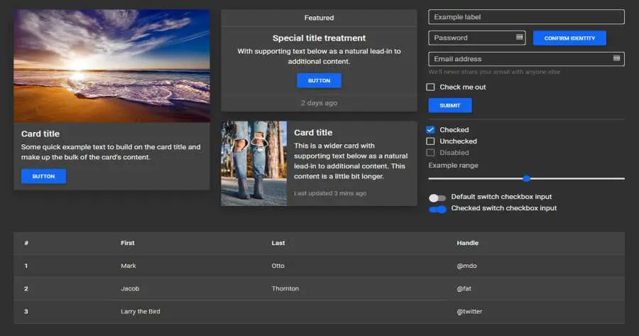
Dark Mode for hundreds of components from the latest Bootstrap 5. Dark mode for cards, carousel, buttons, input elements, forms, progress bars, loaders/spinners, alerts, badges, notes & typography, button groups, collapse, dropdowns, modals, toasts, tooltips, popovers, navbars, headers, scrollspy, footer, breadcrumbs, pagination, pills, tabs, tables, hover effects, masks, shadows & more.
- License MIT License
- Bootstrap version v.5
- MDBootstrap version Standard
Enable color mode for a specific component
You can also change the mode to dark only for the specific component. For example, to change the color mode of a
card, add data-mdb-theme="light" or
data-mdb-theme="dark" to the div with .card class. Now, no matter the global color mode,
these cards will display with the specified theme value.
Card title
Some quick example text to build on the card title and make up the bulk of the card's content.
Card title
Some quick example text to build on the card title and make up the bulk of the card's content.
<div class="row gx-lg-5">
<div class="col-lg-6 mb-5 mb-lg-0">
<div class="mb-4">
<div class="card" data-mdb-theme="light">
<div class="card-body">
<h5 class="card-title">Card title</h5>
<p class="card-text">Some quick example text to build on the card title and make up the bulk of the card's content.</p>
<button type="button" class="btn btn-primary" data-mdb-ripple-init>Button</button>
</div>
</div>
</div>
<div class="mb-4">
<!-- Navbar -->
<nav class="navbar navbar-expand-lg bg-body-tertiary" data-mdb-theme="light">
<!-- Container wrapper -->
<div class="container-fluid">
<!-- Toggle button -->
<button
data-mdb-collapse-init
class="navbar-toggler"
type="button"
data-mdb-target="#navbarSupportedContent"
aria-controls="navbarSupportedContent"
aria-expanded="false"
aria-label="Toggle navigation"
>
<i class="fas fa-bars"></i>
</button>
<!-- Collapsible wrapper -->
<div class="collapse navbar-collapse" id="navbarSupportedContent">
<!-- Navbar brand -->
<a class="navbar-brand mt-2 mt-lg-0" href="#">
<img
src="https://mdbcdn.b-cdn.net/img/logo/mdb-transaprent-noshadows.webp"
height="15"
alt="MDB Logo"
loading="lazy"
/>
</a>
<!-- Left links -->
<ul class="navbar-nav me-auto mb-2 mb-lg-0">
<li class="nav-item">
<a class="nav-link" href="#">Dashboard</a>
</li>
<li class="nav-item">
<a class="nav-link" href="#">Team</a>
</li>
<li class="nav-item">
<a class="nav-link" href="#">Projects</a>
</li>
</ul>
<!-- Left links -->
</div>
<!-- Collapsible wrapper -->
<!-- Right elements -->
<div class="d-flex align-items-center">
<!-- Icon -->
<a class="text-dark me-3" href="#">
<i class="fas fa-shopping-cart"></i>
</a>
<!-- Notifications -->
<div class="dropdown">
<a
data-mdb-dropdown-init
class="text-dark me-3 dropdown-toggle hidden-arrow"
href="#"
id="navbarDropdownMenuLink"
role="button"
aria-expanded="false"
>
<i class="fas fa-bell"></i>
<span class="badge rounded-pill badge-notification bg-danger">1</span>
</a>
<ul
class="dropdown-menu dropdown-menu-end"
aria-labelledby="navbarDropdownMenuLink"
>
<li>
<a class="dropdown-item" href="#">Some news</a>
</li>
<li>
<a class="dropdown-item" href="#">Another news</a>
</li>
<li>
<a class="dropdown-item" href="#">Something else here</a>
</li>
</ul>
</div>
<!-- Avatar -->
<div class="dropdown">
<a
data-mdb-dropdown-init
class="dropdown-toggle d-flex align-items-center hidden-arrow"
href="#"
id="navbarDropdownMenuAvatar"
role="button"
aria-expanded="false"
>
<img
src="https://mdbcdn.b-cdn.net/img/new/avatars/2.webp"
class="rounded-circle"
height="25"
alt="Black and White Portrait of a Man"
loading="lazy"
/>
</a>
<ul
class="dropdown-menu dropdown-menu-end"
aria-labelledby="navbarDropdownMenuAvatar"
>
<li>
<a class="dropdown-item" href="#">My profile</a>
</li>
<li>
<a class="dropdown-item" href="#">Settings</a>
</li>
<li>
<a class="dropdown-item" href="#">Logout</a>
</li>
</ul>
</div>
</div>
<!-- Right elements -->
</div>
<!-- Container wrapper -->
</nav>
<!-- Navbar -->
</div>
<div class="mb-4">
<!-- Button trigger modal -->
<button type="button" class="btn btn-primary" data-mdb-ripple-init data-mdb-modal-init data-mdb-target="#exampleModal">
Launch demo modal
</button>
<!-- Modal -->
<div class="modal fade" id="exampleModal" tabindex="-1" aria-labelledby="exampleModalLabel" aria-hidden="true" data-mdb-theme="light">
<div class="modal-dialog">
<div class="modal-content">
<div class="modal-header" data-mdb-theme="dark">
<h5 class="modal-title" id="exampleModalLabel">Modal title</h5>
<button type="button" class="btn-close" data-mdb-ripple-init data-mdb-dismiss="modal" aria-label="Close"></button>
</div>
<div class="modal-body">...</div>
<div class="modal-footer">
<button type="button" class="btn btn-secondary" data-mdb-ripple-init data-mdb-dismiss="modal">Close</button>
<button type="button" class="btn btn-primary" data-mdb-ripple-init>Save changes</button>
</div>
</div>
</div>
</div>
</div>
<div class="bg-white p-2" data-mdb-theme="light">
<div class="form-outline" data-mdb-datepicker-init data-mdb-input-init>
<input type="text" class="form-control" id="exampleDatepicker11" />
<label for="exampleDatepicker11" class="form-label">Select a date</label>
</div>
</div>
</div>
<div class="col-lg-6 mb-5 mb-lg-0">
<div class="mb-4">
<div class="card" data-mdb-theme="dark">
<div class="card-body">
<h5 class="card-title">Card title</h5>
<p class="card-text">Some quick example text to build on the card title and make up the bulk of the card's content.</p>
<button type="button" class="btn btn-primary" data-mdb-ripple-init>Button</button>
</div>
</div>
</div>
<div class="mb-4">
<!-- Navbar -->
<nav class="navbar navbar-expand-lg bg-body-tertiary" data-mdb-theme="dark">
<!-- Container wrapper -->
<div class="container-fluid">
<!-- Toggle button -->
<button
data-mdb-collapse-init
class="navbar-toggler"
type="button"
data-mdb-target="#navbarSupportedContent"
aria-controls="navbarSupportedContent"
aria-expanded="false"
aria-label="Toggle navigation"
>
<i class="fas fa-bars"></i>
</button>
<!-- Collapsible wrapper -->
<div class="collapse navbar-collapse" id="navbarSupportedContent">
<!-- Navbar brand -->
<a class="navbar-brand mt-2 mt-lg-0" href="#">
<img
src="https://mdbcdn.b-cdn.net/img/logo/mdb-transaprent-noshadows.webp"
height="15"
alt="MDB Logo"
loading="lazy"
/>
</a>
<!-- Left links -->
<ul class="navbar-nav me-auto mb-2 mb-lg-0">
<li class="nav-item">
<a class="nav-link" href="#">Dashboard</a>
</li>
<li class="nav-item">
<a class="nav-link" href="#">Team</a>
</li>
<li class="nav-item">
<a class="nav-link" href="#">Projects</a>
</li>
</ul>
<!-- Left links -->
</div>
<!-- Collapsible wrapper -->
<!-- Right elements -->
<div class="d-flex align-items-center">
<!-- Icon -->
<a class="text-white me-3" href="#">
<i class="fas fa-shopping-cart"></i>
</a>
<!-- Notifications -->
<div class="dropdown">
<a
data-mdb-dropdown-init
class="text-white me-3 dropdown-toggle hidden-arrow"
href="#"
id="navbarDropdownMenuLink"
role="button"
aria-expanded="false"
>
<i class="fas fa-bell"></i>
<span class="badge rounded-pill badge-notification bg-danger">1</span>
</a>
<ul
class="dropdown-menu dropdown-menu-end"
aria-labelledby="navbarDropdownMenuLink"
>
<li>
<a class="dropdown-item" href="#">Some news</a>
</li>
<li>
<a class="dropdown-item" href="#">Another news</a>
</li>
<li>
<a class="dropdown-item" href="#">Something else here</a>
</li>
</ul>
</div>
<!-- Avatar -->
<div class="dropdown">
<a
data-mdb-dropdown-init
class="dropdown-toggle d-flex align-items-center hidden-arrow"
href="#"
id="navbarDropdownMenuAvatar"
role="button"
aria-expanded="false"
>
<img
src="https://mdbcdn.b-cdn.net/img/new/avatars/2.webp"
class="rounded-circle"
height="25"
alt="Black and White Portrait of a Man"
loading="lazy"
/>
</a>
<ul
class="dropdown-menu dropdown-menu-end"
aria-labelledby="navbarDropdownMenuAvatar"
>
<li>
<a class="dropdown-item" href="#">My profile</a>
</li>
<li>
<a class="dropdown-item" href="#">Settings</a>
</li>
<li>
<a class="dropdown-item" href="#">Logout</a>
</li>
</ul>
</div>
</div>
<!-- Right elements -->
</div>
<!-- Container wrapper -->
</nav>
<!-- Navbar -->
</div>
<div class="mb-4">
<!-- Button trigger modal -->
<button type="button" class="btn btn-primary" data-mdb-ripple-init data-mdb-modal-init data-mdb-target="#exampleModalDark">
Launch demo modal
</button>
<!-- Modal -->
<div class="modal fade" id="exampleModalDark" tabindex="-1" aria-labelledby="exampleModalLabelDark" aria-hidden="true" data-mdb-theme="dark">
<div class="modal-dialog">
<div class="modal-content">
<div class="modal-header">
<h5 class="modal-title" id="exampleModalLabelDark">Modal title</h5>
<button type="button" class="btn-close" data-mdb-ripple-init data-mdb-dismiss="modal" aria-label="Close"></button>
</div>
<div class="modal-body">...</div>
<div class="modal-footer">
<button type="button" class="btn btn-secondary" data-mdb-ripple-init data-mdb-dismiss="modal">Close</button>
<button type="button" class="btn btn-primary" data-mdb-ripple-init>Save changes</button>
</div>
</div>
</div>
</div>
</div>
<div class="p-2" style="background-color: #303030;" data-mdb-theme="dark">
<div class="form-outline" data-mdb-datepicker-init data-mdb-input-init>
<input type="text" class="form-control" id="exampleDatepicker2" />
<label for="exampleDatepicker11" class="form-label">Select a date</label>
</div>
</div>
</div>
</div>
Usage
Enable dark mode
Enable the built in dark color mode across your entire project by adding the data-mdb-theme="dark"
attribute to the <html> element. This will apply the dark color mode to all components and
elements, other than those with a specific data-mdb-theme attribute applied.
          <!doctype html>
          <html lang="en" data-mdb-theme="dark">
            <head>
              <meta charset="utf-8">
              <meta name="viewport" content="width=device-width, initial-scale=1">
              <title>MDBootstrap demo</title>
              <!-- Font Awesome -->
              <link href="https://cdnjs.cloudflare.com/ajax/libs/font-awesome/6.0.0/css/all.min.css" rel="stylesheet" />
              <!-- Google Fonts -->
              <link href="https://fonts.googleapis.com/css?family=Roboto:300,400,500,700&display=swap"
                rel="stylesheet" />
              <!-- MDB -->
              <link href="https://cdnjs.cloudflare.com/ajax/libs/mdb-ui-kit/7.0.0/mdb.min.css" rel="stylesheet" />
            </head>
            <body>
              <h1>Hello, world!</h1>
              <!-- MDB -->
              <script type="text/javascript" src="https://cdnjs.cloudflare.com/ajax/libs/mdb-ui-kit/7.0.0/mdb.min.js">
              </script>
            </body>
          </html>
Building with Sass
Our new dark mode option is available to use for all users of MDBootstrap, but it’s controlled via data
attributes instead of media queries and does not automatically toggle your project’s color mode. You can disable
our dark mode entirely via Sass by changing $enable-dark-mode to false.
We use a custom Sass mixin, color-mode(), to help you control how color modes are
applied. By default, we use a data attribute approach, allowing you to create more user-friendly
experiences where your visitors can choose to have an automatic dark mode or control their preference (like in
our own docs here). This is also an easy and scalable way to add different themes and more custom color modes
beyond light and dark.
In case you want to use media queries and only make color modes automatic, you can change the mixin’s default type via Sass variable. Consider the following snippet and its compiled CSS output.
      $color-mode-type: data;

      @include color-mode(dark) {
        .element {
          color: var(--mdb-primary-text-emphasis);
          background-color: var(--mdb-primary-bg-subtle);
        }
      }
Outputs to:
      [data-mdb-theme=dark] .element {
        color: var(--mdb-primary-text-emphasis);
        background-color: var(--mdb-primary-bg-subtle);
      }
And when setting to media-query:
      $color-mode-type: media-query;

      @include color-mode(dark) {
        .element {
          color: var(--mdb-primary-text-emphasis);
          background-color: var(--mdb-primary-bg-subtle);
        }
      }
Outputs to:
      @media (prefers-color-scheme: dark) {
        .element {
          color: var(--mdb-primary-text-emphasis);
          background-color: var(--mdb-primary-bg-subtle);
        }
      }
Dark Mode toggle/switch button
To create a dark mode toggle button add dark mode styles to your main scss file. Use the @include
rule for any customized class.
After that create a toggle button for switching those classes within the entire body.
Learn more how to create your own theming systems and advanced configurations in our theming docs.
        @import '~mdb-ui-kit/src/scss/mdb.pro.scss';

        // DARK SKIN
        $my-theme-primary: #1266f1;
        $my-theme-secondary: #b23cfd;
        $my-dark-theme: mdb-dark-theme($my-theme-primary, $my-theme-secondary);

        .dark {
        @include mdb-theme($my-dark-theme);
        }
<button data-mdb-button-init data-mdb-ripple-init class="btn btn-primary" id="skinToggler">Toggle skin</button>
        const skinToggler = document.getElementById('skinToggler');

        const toggleSkin = () => {
        document.body.classList.toggle('dark');
        }

        skinToggler.addEventListener('click', toggleSkin);