Card Deck
Bootstrap 5 Card Deck
Responsive Card Deck built with Bootstrap 5. Bootstrap card-deck with multiple rows and standard breakpoints.
Card deck layout
In addition to styling the content within cards, Bootstrap includes a few options for laying out series of cards.
Cards group
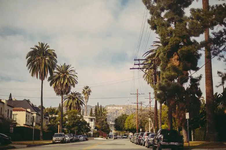
Use card groups to render cards as a single, attached element with equal width and height
columns. Card groups start off stacked and use
display: flex; to become attached with uniform dimensions starting at the
sm breakpoint.
Card title
This is a wider card with supporting text below as a natural lead-in to additional content. This content is a little bit longer.
Last updated 3 mins ago

Card title
This card has supporting text below as a natural lead-in to additional content.
Last updated 3 mins ago
Card title
This is a wider card with supporting text below as a natural lead-in to additional content. This card has even longer content than the first to show that equal height action.
Last updated 3 mins ago
<div class="card-group">
<div class="card">
<img src="https://mdbcdn.b-cdn.net/img/new/standard/city/041.webp" class="card-img-top"
alt="Hollywood Sign on The Hill" />
<div class="card-body">
<h5 class="card-title">Card title</h5>
<p class="card-text">
This is a wider card with supporting text below as a natural lead-in to
additional content. This content is a little bit longer.
</p>
<p class="card-text">
<small class="text-muted">Last updated 3 mins ago</small>
</p>
</div>
</div>
<div class="card">
<img src="https://mdbcdn.b-cdn.net/img/new/standard/city/042.webp" class="card-img-top"
alt="Palm Springs Road" />
<div class="card-body">
<h5 class="card-title">Card title</h5>
<p class="card-text">This card has supporting text below as a natural lead-in to additional content.
</p>
<p class="card-text">
<small class="text-muted">Last updated 3 mins ago</small>
</p>
</div>
</div>
<div class="card">
<img src="https://mdbcdn.b-cdn.net/img/new/standard/city/043.webp" class="card-img-top"
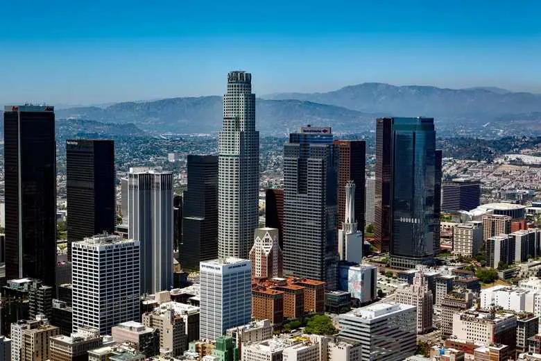
alt="Los Angeles Skyscrapers" />
<div class="card-body">
<h5 class="card-title">Card title</h5>
<p class="card-text">
This is a wider card with supporting text below as a natural lead-in to
additional content. This card has even longer content than the first to show
that equal height action.
</p>
<p class="card-text">
<small class="text-muted">Last updated 3 mins ago</small>
</p>
</div>
</div>
</div>
When using card groups with footers, their content will automatically line up.
Card title
This is a wider card with supporting text below as a natural lead-in to additional content. This content is a little bit longer.
Card title
This card has supporting text below as a natural lead-in to additional content.
Card title
This is a wider card with supporting text below as a natural lead-in to additional content. This card has even longer content than the first to show that equal height action.
            <div class="card-group">
              <div class="card">
                <img src="https://mdbcdn.b-cdn.net/img/new/standard/city/041.webp" class="card-img-top"
                  alt="Hollywood Sign on The Hill" />
                <div class="card-body">
                  <h5 class="card-title">Card title</h5>
                  <p class="card-text">
                    This is a wider card with supporting text below as a natural lead-in to
                    additional content. This content is a little bit longer.
                  </p>
                </div>
                <div class="card-footer">
                  <small class="text-muted">Last updated 3 mins ago</small>
                </div>
              </div>
              <div class="card">
                <img src="https://mdbcdn.b-cdn.net/img/new/standard/city/042.webp" class="card-img-top"
                  alt="Palm Springs Road" />
                <div class="card-body">
                  <h5 class="card-title">Card title</h5>
                  <p class="card-text">This card has supporting text below as a natural lead-in to additional content.
                  </p>
                </div>
                <div class="card-footer">
                  <small class="text-muted">Last updated 3 mins ago</small>
                </div>
              </div>
              <div class="card">
                <img src="https://mdbcdn.b-cdn.net/img/new/standard/city/043.webp" class="card-img-top"
                  alt="Los Angeles Skyscrapers" />
                <div class="card-body">
                  <h5 class="card-title">Card title</h5>
                  <p class="card-text">
                    This is a wider card with supporting text below as a natural lead-in to
                    additional content. This card has even longer content than the first to show
                    that equal height action.
                  </p>
                </div>
                <div class="card-footer">
                  <small class="text-muted">Last updated 3 mins ago</small>
                </div>
              </div>
            </div>
Cards grid
Use the Bootstrap grid system and its
.row-cols classes to control how many grid columns (wrapped around your cards)
you show per row. For example, here’s .row-cols-1 laying out the cards on one
column, and .row-cols-md-2 splitting four cards to equal width across multiple
rows, from the medium breakpoint up.
Card title
This is a longer card with supporting text below as a natural lead-in to additional content. This content is a little bit longer.
Card title
This is a longer card with supporting text below as a natural lead-in to additional content. This content is a little bit longer.
Card title
This is a longer card with supporting text below as a natural lead-in to additional content.

Card title
This is a longer card with supporting text below as a natural lead-in to additional content. This content is a little bit longer.
          <div class="row row-cols-1 row-cols-md-2 g-4">
            <div class="col">
              <div class="card">
                <img src="https://mdbcdn.b-cdn.net/img/new/standard/city/041.webp" class="card-img-top"
                  alt="Hollywood Sign on The Hill" />
                <div class="card-body">
                  <h5 class="card-title">Card title</h5>
                  <p class="card-text">
                    This is a longer card with supporting text below as a natural lead-in to
                    additional content. This content is a little bit longer.
                  </p>
                </div>
              </div>
            </div>
            <div class="col">
              <div class="card">
                <img src="https://mdbcdn.b-cdn.net/img/new/standard/city/042.webp" class="card-img-top"
                  alt="Palm Springs Road" />
                <div class="card-body">
                  <h5 class="card-title">Card title</h5>
                  <p class="card-text">
                    This is a longer card with supporting text below as a natural lead-in to
                    additional content. This content is a little bit longer.
                  </p>
                </div>
              </div>
            </div>
            <div class="col">
              <div class="card">
                <img src="https://mdbcdn.b-cdn.net/img/new/standard/city/043.webp" class="card-img-top"
                  alt="Los Angeles Skyscrapers" />
                <div class="card-body">
                  <h5 class="card-title">Card title</h5>
                  <p class="card-text">This is a longer card with supporting text below as a natural lead-in to
                    additional content.</p>
                </div>
              </div>
            </div>
            <div class="col">
              <div class="card">
                <img src="https://mdbcdn.b-cdn.net/img/new/standard/city/044.webp" class="card-img-top"
                  alt="Skyscrapers" />
                <div class="card-body">
                  <h5 class="card-title">Card title</h5>
                  <p class="card-text">
                    This is a longer card with supporting text below as a natural lead-in to
                    additional content. This content is a little bit longer.
                  </p>
                </div>
              </div>
            </div>
          </div>
Change it to .row-cols-3 and you’ll see the fourth card wrap.
Card title
This is a longer card with supporting text below as a natural lead-in to additional content. This content is a little bit longer.
Card title
This is a longer card with supporting text below as a natural lead-in to additional content. This content is a little bit longer.
Card title
This is a longer card with supporting text below as a natural lead-in to additional content.
Card title
This is a longer card with supporting text below as a natural lead-in to additional content. This content is a little bit longer.
          <div class="row row-cols-1 row-cols-md-3 g-4">
            <div class="col">
              <div class="card">
                <img src="https://mdbcdn.b-cdn.net/img/new/standard/city/041.webp" class="card-img-top"
                  alt="Hollywood Sign on The Hill" />
                <div class="card-body">
                  <h5 class="card-title">Card title</h5>
                  <p class="card-text">
                    This is a longer card with supporting text below as a natural lead-in to
                    additional content. This content is a little bit longer.
                  </p>
                </div>
              </div>
            </div>
            <div class="col">
              <div class="card">
                <img src="https://mdbcdn.b-cdn.net/img/new/standard/city/042.webp" class="card-img-top"
                  alt="Palm Springs Road" />
                <div class="card-body">
                  <h5 class="card-title">Card title</h5>
                  <p class="card-text">
                    This is a longer card with supporting text below as a natural lead-in to
                    additional content. This content is a little bit longer.
                  </p>
                </div>
              </div>
            </div>
            <div class="col">
              <div class="card">
                <img src="https://mdbcdn.b-cdn.net/img/new/standard/city/043.webp" class="card-img-top"
                  alt="Los Angeles Skyscrapers" />
                <div class="card-body">
                  <h5 class="card-title">Card title</h5>
                  <p class="card-text">This is a longer card with supporting text below as a natural lead-in to
                    additional content.</p>
                </div>
              </div>
            </div>
            <div class="col">
              <div class="card">
                <img src="https://mdbcdn.b-cdn.net/img/new/standard/city/044.webp" class="card-img-top"
                  alt="Skyscrapers" />
                <div class="card-body">
                  <h5 class="card-title">Card title</h5>
                  <p class="card-text">
                    This is a longer card with supporting text below as a natural lead-in to
                    additional content. This content is a little bit longer.
                  </p>
                </div>
              </div>
            </div>
          </div>
When you need equal height, add .h-100 to the cards. If you want equal heights
by default, you can set $card-height: 100% in Sass.
Card title
This is a longer card with supporting text below as a natural lead-in to additional content. This content is a little bit longer.
Card title
This is a short card.
Card title
This is a longer card with supporting text below as a natural lead-in to additional content.
Card title
This is a longer card with supporting text below as a natural lead-in to additional content. This content is a little bit longer.
          <div class="row row-cols-1 row-cols-md-3 g-4">
            <div class="col">
              <div class="card h-100">
                <img src="https://mdbcdn.b-cdn.net/img/new/standard/city/041.webp" class="card-img-top"
                  alt="Hollywood Sign on The Hill" />
                <div class="card-body">
                  <h5 class="card-title">Card title</h5>
                  <p class="card-text">
                    This is a longer card with supporting text below as a natural lead-in to
                    additional content. This content is a little bit longer.
                  </p>
                </div>
              </div>
            </div>
            <div class="col">
              <div class="card h-100">
                <img src="https://mdbcdn.b-cdn.net/img/new/standard/city/042.webp" class="card-img-top"
                  alt="Palm Springs Road" />
                <div class="card-body">
                  <h5 class="card-title">Card title</h5>
                  <p class="card-text">This is a short card.</p>
                </div>
              </div>
            </div>
            <div class="col">
              <div class="card h-100">
                <img src="https://mdbcdn.b-cdn.net/img/new/standard/city/043.webp" class="card-img-top"
                  alt="Los Angeles Skyscrapers" />
                <div class="card-body">
                  <h5 class="card-title">Card title</h5>
                  <p class="card-text">This is a longer card with supporting text below as a natural lead-in to
                    additional content.</p>
                </div>
              </div>
            </div>
            <div class="col">
              <div class="card h-100">
                <img src="https://mdbcdn.b-cdn.net/img/new/standard/city/044.webp" class="card-img-top"
                  alt="Skyscrapers" />
                <div class="card-body">
                  <h5 class="card-title">Card title</h5>
                  <p class="card-text">
                    This is a longer card with supporting text below as a natural lead-in to
                    additional content. This content is a little bit longer.
                  </p>
                </div>
              </div>
            </div>
          </div>
Just like with card groups, card footers will automatically line up.
Card title
This is a wider card with supporting text below as a natural lead-in to additional content. This content is a little bit longer.
Card title
This card has supporting text below as a natural lead-in to additional content.
Card title
This is a wider card with supporting text below as a natural lead-in to additional content. This card has even longer content than the first to show that equal height action.
          <div class="row row-cols-1 row-cols-md-3 g-4">
            <div class="col">
              <div class="card h-100">
                <img src="https://mdbcdn.b-cdn.net/img/new/standard/city/044.webp" class="card-img-top"
                  alt="Skyscrapers" />
                <div class="card-body">
                  <h5 class="card-title">Card title</h5>
                  <p class="card-text">
                    This is a wider card with supporting text below as a natural lead-in to
                    additional content. This content is a little bit longer.
                  </p>
                </div>
                <div class="card-footer">
                  <small class="text-muted">Last updated 3 mins ago</small>
                </div>
              </div>
            </div>
            <div class="col">
              <div class="card h-100">
                <img src="https://mdbcdn.b-cdn.net/img/new/standard/city/043.webp" class="card-img-top"
                  alt="Los Angeles Skyscrapers" />
                <div class="card-body">
                  <h5 class="card-title">Card title</h5>
                  <p class="card-text">This card has supporting text below as a natural lead-in to additional content.
                  </p>
                </div>
                <div class="card-footer">
                  <small class="text-muted">Last updated 3 mins ago</small>
                </div>
              </div>
            </div>
            <div class="col">
              <div class="card h-100">
                <img src="https://mdbcdn.b-cdn.net/img/new/standard/city/042.webp" class="card-img-top"
                  alt="Palm Springs Road" />
                <div class="card-body">
                  <h5 class="card-title">Card title</h5>
                  <p class="card-text">
                    This is a wider card with supporting text below as a natural lead-in to
                    additional content. This card has even longer content than the first to show
                    that equal height action.
                  </p>
                </div>
                <div class="card-footer">
                  <small class="text-muted">Last updated 3 mins ago</small>
                </div>
              </div>
            </div>
          </div>