Card with image
Bootstrap 5 Card with image component
Responsive card with image built with Bootstrap 5. Create visually appealing, user-friendly cards that beautifully display images and content seamlessly.
Basic examples
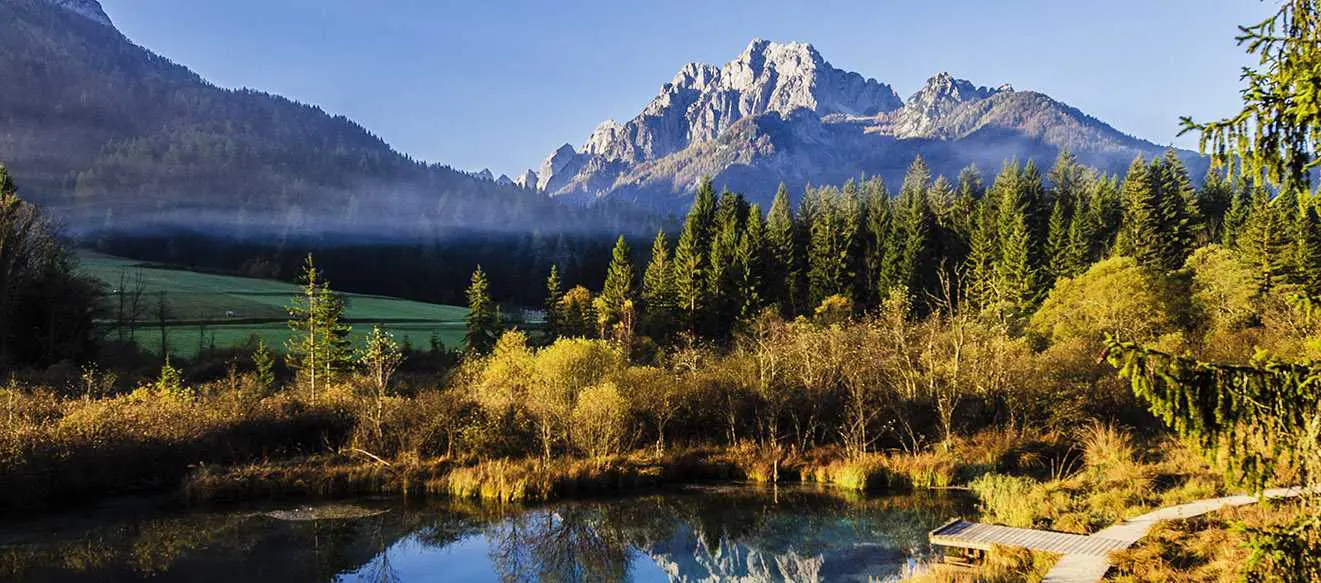
Image
Use the following example of a card element with an image for blog posts, user cards, and many more:

Card title
Some quick example text to build on the card title and make up the bulk of the card's content.
Button
              <div class="card">
                <img src="https://mdbcdn.b-cdn.net/img/new/standard/nature/184.webp" class="card-img-top" alt="Fissure in Sandstone"/>
                <div class="card-body">
                  <h5 class="card-title">Card title</h5>
                  <p class="card-text">Some quick example text to build on the card title and make up the bulk of the card's content.</p>
                  <a href="#!" class="btn btn-primary" data-mdb-ripple-init>Button</a>
                </div>
              </div>
            // Initialization for ES Users
            import { Ripple, initMDB } from "mdb-ui-kit";

            initMDB({ Ripple });
Image with ripple
To add a ripple effect and subtle hover effect you need to modify the HTML markup of the card image.

Card title
Some quick example text to build on the card title and make up the bulk of the card's content.
Button
              <div class="card">
                <div class="bg-image hover-overlay" data-mdb-ripple-init data-mdb-ripple-color="light">
                  <img src="https://mdbcdn.b-cdn.net/img/new/standard/nature/111.webp" class="img-fluid"/>
                  <a href="#!">
                    <div class="mask" style="background-color: rgba(251, 251, 251, 0.15);"></div>
                  </a>
                </div>
                <div class="card-body">
                  <h5 class="card-title">Card title</h5>
                  <p class="card-text">Some quick example text to build on the card title and make up the bulk of the card's content.</p>
                  <a href="#!" class="btn btn-primary" data-mdb-ripple-init>Button</a>
                </div>
              </div>
            // Initialization for ES Users
            import { Ripple, initMDB } from "mdb-ui-kit";

            initMDB({ Ripple });
Note: Some examples here have fixed card width. Cards have no fixed width to start, so they’ll naturally fill the full width of its parent element. To control the width of the card place it in the grid, use the sizing utilities, or set the width inline. You can learn more in the sizing section.
Content types
Cards support a wide variety of content, including images, text, list groups, links, and more. Below are examples of what’s supported.
Images
.card-img-top places an image to the top of the card. With
.card-text, text can be added to the card. Text within
.card-text can also be styled with the standard HTML tags.

Some quick example text to build on the card title and make up the bulk of the card's content.
              <div class="card" style="width: 18rem;">
                <img src="https://mdbcdn.b-cdn.net/img/new/standard/nature/182.webp" class="card-img-top" alt="Sunset Over the Sea"/>
                <div class="card-body">
                  <p class="card-text">Some quick example text to build on the card title and make up the bulk of the card's content.</p>
                </div>
              </div>
Kitchen sink
Mix and match multiple content types to create the card you need, or throw everything in there. Shown below are image styles, blocks, text styles, and a list group—all wrapped in a fixed-width card.

Card title
Some quick example text to build on the card title and make up the bulk of the card's content.
- Cras justo odio
- Dapibus ac facilisis in
- Vestibulum at eros
              <div class="card" style="width: 18rem;">
                <img src="https://mdbcdn.b-cdn.net/img/new/standard/city/062.webp" class="card-img-top" alt="Chicago Skyscrapers"/>
                <div class="card-body">
                  <h5 class="card-title">Card title</h5>
                  <p class="card-text">Some quick example text to build on the card title and make up the bulk of the card's content.</p>
                </div>
                <ul class="list-group list-group-light list-group-small">
                  <li class="list-group-item px-4">Cras justo odio</li>
                  <li class="list-group-item px-4">Dapibus ac facilisis in</li>
                  <li class="list-group-item px-4">Vestibulum at eros</li>
                </ul>
                <div class="card-body">
                  <a href="#" class="card-link">Card link</a>
                  <a href="#" class="card-link">Another link</a>
                </div>
              </div>
Images
Cards include a few options for working with images. Choose from appending “image caps” at either end of a card, overlaying images with card content, or simply embedding the image in a card.
Image caps
Similar to headers and footers, cards can include top and bottom “image caps”—images at the top or bottom of a card.
Card title
This is a wider card with supporting text below as a natural lead-in to additional content. This content is a little bit longer.
Last updated 3 mins ago
Card title
This is a wider card with supporting text below as a natural lead-in to additional content. This content is a little bit longer.
Last updated 3 mins ago

              <div class="card mb-3">
                <img src="https://mdbcdn.b-cdn.net/img/new/slides/041.webp" class="card-img-top" alt="Wild Landscape"/>
                <div class="card-body">
                  <h5 class="card-title">Card title</h5>
                  <p class="card-text">
                    This is a wider card with supporting text below as a natural lead-in to additional
                    content. This content is a little bit longer.
                  </p>
                  <p class="card-text">
                    <small class="text-muted">Last updated 3 mins ago</small>
                  </p>
                </div>
              </div>
              <div class="card">
                <div class="card-body">
                  <h5 class="card-title">Card title</h5>
                  <p class="card-text">
                    This is a wider card with supporting text below as a natural lead-in to additional
                    content. This content is a little bit longer.
                  </p>
                  <p class="card-text">
                    <small class="text-muted">Last updated 3 mins ago</small>
                  </p>
                </div>
                <img src="https://mdbcdn.b-cdn.net/img/new/slides/042.webp" class="card-img-bottom" alt="Camera"/>
              </div>
Image overlays
Turn an image into a card background and overlay your card’s text. Depending on the image, you may or may not need additional styles or utilities.

              <div class="card bg-dark text-white">
                <img src="https://mdbcdn.b-cdn.net/img/new/slides/017.webp" class="card-img" alt="Stony Beach"/>
                <div class="card-img-overlay">
                  <h5 class="card-title">Card title</h5>
                  <p class="card-text">
                    This is a wider card with supporting text below as a natural lead-in to additional
                    content. This content is a little bit longer.
                  </p>
                  <p class="card-text">Last updated 3 mins ago</p>
                </div>
              </div>
Note: Content should not be larger than the height of the image. If content is larger than the image the content will be displayed outside the image.
Horizontal
Using a combination of grid and utility classes, cards can be made horizontal in a
mobile-friendly and responsive way. In the example below, we remove the grid gutters with
.g-0 and use .col-md-* classes to make the card horizontal at the
md breakpoint. Further adjustments may be needed depending on your card content.

Card title
This is a wider card with supporting text below as a natural lead-in to additional content. This content is a little bit longer.
Last updated 3 mins ago
            <div class="card mb-3" style="max-width: 540px;">
              <div class="row g-0">
                <div class="col-md-4">
                  <img
                    src="https://mdbcdn.b-cdn.net/wp-content/uploads/2020/06/vertical.webp"
                    alt="Trendy Pants and Shoes"
                    class="img-fluid rounded-start"
                  />
                </div>
                <div class="col-md-8">
                  <div class="card-body">
                    <h5 class="card-title">Card title</h5>
                    <p class="card-text">
                      This is a wider card with supporting text below as a natural lead-in to
                      additional content. This content is a little bit longer.
                    </p>
                    <p class="card-text">
                      <small class="text-muted">Last updated 3 mins ago</small>
                    </p>
                  </div>
                </div>
              </div>
            </div>
Card deck layout
In addition to styling the content within cards, Bootstrap includes a few options for laying out series of cards. For the time being, these layout options are not yet responsive.
Cards group
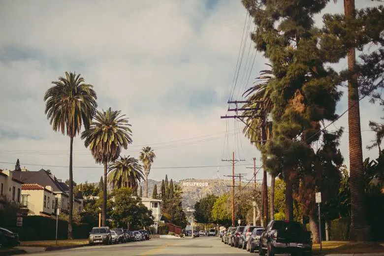
Use card groups to render cards as a single, attached element with equal width and height
columns. Card groups start off stacked and use
display: flex; to become attached with uniform dimensions starting at the
sm breakpoint.
Card title
This is a wider card with supporting text below as a natural lead-in to additional content. This content is a little bit longer.
Last updated 3 mins ago

Card title
This card has supporting text below as a natural lead-in to additional content.
Last updated 3 mins ago

Card title
This is a wider card with supporting text below as a natural lead-in to additional content. This card has even longer content than the first to show that equal height action.
Last updated 3 mins ago
              <div class="card-group">
                <div class="card">
                  <img src="https://mdbcdn.b-cdn.net/img/new/standard/city/041.webp" class="card-img-top" alt="Hollywood Sign on The Hill"/>
                  <div class="card-body">
                    <h5 class="card-title">Card title</h5>
                    <p class="card-text">
                      This is a wider card with supporting text below as a natural lead-in to
                      additional content. This content is a little bit longer.
                    </p>
                    <p class="card-text">
                      <small class="text-muted">Last updated 3 mins ago</small>
                    </p>
                  </div>
                </div>
                <div class="card">
                  <img src="https://mdbcdn.b-cdn.net/img/new/standard/city/042.webp" class="card-img-top" alt="Palm Springs Road"/>
                  <div class="card-body">
                    <h5 class="card-title">Card title</h5>
                    <p class="card-text">This card has supporting text below as a natural lead-in to additional content.</p>
                    <p class="card-text">
                      <small class="text-muted">Last updated 3 mins ago</small>
                    </p>
                  </div>
                </div>
                <div class="card">
                  <img src="https://mdbcdn.b-cdn.net/img/new/standard/city/043.webp" class="card-img-top" alt="Los Angeles Skyscrapers"/>
                  <div class="card-body">
                    <h5 class="card-title">Card title</h5>
                    <p class="card-text">
                      This is a wider card with supporting text below as a natural lead-in to
                      additional content. This card has even longer content than the first to show
                      that equal height action.
                    </p>
                    <p class="card-text">
                      <small class="text-muted">Last updated 3 mins ago</small>
                    </p>
                  </div>
                </div>
              </div>
When using card groups with footers, their content will automatically line up.
Card title
This is a wider card with supporting text below as a natural lead-in to additional content. This content is a little bit longer.
Card title
This card has supporting text below as a natural lead-in to additional content.
Card title
This is a wider card with supporting text below as a natural lead-in to additional content. This card has even longer content than the first to show that equal height action.
              <div class="card-group">
                <div class="card">
                  <img src="https://mdbcdn.b-cdn.net/img/new/standard/city/041.webp" class="card-img-top" alt="Hollywood Sign on The Hill"/>
                  <div class="card-body">
                    <h5 class="card-title">Card title</h5>
                    <p class="card-text">
                      This is a wider card with supporting text below as a natural lead-in to
                      additional content. This content is a little bit longer.
                    </p>
                  </div>
                  <div class="card-footer">
                    <small class="text-muted">Last updated 3 mins ago</small>
                  </div>
                </div>
                <div class="card">
                  <img src="https://mdbcdn.b-cdn.net/img/new/standard/city/042.webp" class="card-img-top" alt="Palm Springs Road"/>
                  <div class="card-body">
                    <h5 class="card-title">Card title</h5>
                    <p class="card-text">This card has supporting text below as a natural lead-in to additional content.</p>
                  </div>
                  <div class="card-footer">
                    <small class="text-muted">Last updated 3 mins ago</small>
                  </div>
                </div>
                <div class="card">
                  <img src="https://mdbcdn.b-cdn.net/img/new/standard/city/043.webp" class="card-img-top" alt="Los Angeles Skyscrapers"/>
                  <div class="card-body">
                    <h5 class="card-title">Card title</h5>
                    <p class="card-text">
                      This is a wider card with supporting text below as a natural lead-in to
                      additional content. This card has even longer content than the first to show
                      that equal height action.
                    </p>
                  </div>
                  <div class="card-footer">
                    <small class="text-muted">Last updated 3 mins ago</small>
                  </div>
                </div>
              </div>
Cards grid
Use the Bootstrap grid system and its
.row-cols classes to control how many grid columns (wrapped around your cards)
you show per row. For example, here’s .row-cols-1 laying out the cards on one
column, and .row-cols-md-2 splitting four cards to equal width across multiple
rows, from the medium breakpoint up.
Card title
This is a longer card with supporting text below as a natural lead-in to additional content. This content is a little bit longer.
Card title
This is a longer card with supporting text below as a natural lead-in to additional content. This content is a little bit longer.
Card title
This is a longer card with supporting text below as a natural lead-in to additional content.

Card title
This is a longer card with supporting text below as a natural lead-in to additional content. This content is a little bit longer.
              <div class="row row-cols-1 row-cols-md-2 g-4">
                <div class="col">
                  <div class="card">
                    <img src="https://mdbcdn.b-cdn.net/img/new/standard/city/041.webp" class="card-img-top" alt="Hollywood Sign on The Hill"/>
                    <div class="card-body">
                      <h5 class="card-title">Card title</h5>
                      <p class="card-text">
                        This is a longer card with supporting text below as a natural lead-in to
                        additional content. This content is a little bit longer.
                      </p>
                    </div>
                  </div>
                </div>
                <div class="col">
                  <div class="card">
                    <img src="https://mdbcdn.b-cdn.net/img/new/standard/city/042.webp" class="card-img-top" alt="Palm Springs Road"/>
                    <div class="card-body">
                      <h5 class="card-title">Card title</h5>
                      <p class="card-text">
                        This is a longer card with supporting text below as a natural lead-in to
                        additional content. This content is a little bit longer.
                      </p>
                    </div>
                  </div>
                </div>
                <div class="col">
                  <div class="card">
                    <img src="https://mdbcdn.b-cdn.net/img/new/standard/city/043.webp" class="card-img-top" alt="Los Angeles Skyscrapers"/>
                    <div class="card-body">
                      <h5 class="card-title">Card title</h5>
                      <p class="card-text">This is a longer card with supporting text below as a natural lead-in to additional content.</p>
                    </div>
                  </div>
                </div>
                <div class="col">
                  <div class="card">
                    <img src="https://mdbcdn.b-cdn.net/img/new/standard/city/044.webp" class="card-img-top" alt="Skyscrapers"/>
                    <div class="card-body">
                      <h5 class="card-title">Card title</h5>
                      <p class="card-text">
                        This is a longer card with supporting text below as a natural lead-in to
                        additional content. This content is a little bit longer.
                      </p>
                    </div>
                  </div>
                </div>
              </div>
Change it to .row-cols-3 and you’ll see the fourth card wrap.
Card title
This is a longer card with supporting text below as a natural lead-in to additional content. This content is a little bit longer.
Card title
This is a longer card with supporting text below as a natural lead-in to additional content. This content is a little bit longer.
Card title
This is a longer card with supporting text below as a natural lead-in to additional content.
Card title
This is a longer card with supporting text below as a natural lead-in to additional content. This content is a little bit longer.
              <div class="row row-cols-1 row-cols-md-3 g-4">
                <div class="col">
                  <div class="card">
                    <img src="https://mdbcdn.b-cdn.net/img/new/standard/city/041.webp" class="card-img-top" alt="Hollywood Sign on The Hill"/>
                    <div class="card-body">
                      <h5 class="card-title">Card title</h5>
                      <p class="card-text">
                        This is a longer card with supporting text below as a natural lead-in to
                        additional content. This content is a little bit longer.
                      </p>
                    </div>
                  </div>
                </div>
                <div class="col">
                  <div class="card">
                    <img src="https://mdbcdn.b-cdn.net/img/new/standard/city/042.webp" class="card-img-top" alt="Palm Springs Road"/>
                    <div class="card-body">
                      <h5 class="card-title">Card title</h5>
                      <p class="card-text">
                        This is a longer card with supporting text below as a natural lead-in to
                        additional content. This content is a little bit longer.
                      </p>
                    </div>
                  </div>
                </div>
                <div class="col">
                  <div class="card">
                    <img src="https://mdbcdn.b-cdn.net/img/new/standard/city/043.webp" class="card-img-top" alt="Los Angeles Skyscrapers"/>
                    <div class="card-body">
                      <h5 class="card-title">Card title</h5>
                      <p class="card-text">This is a longer card with supporting text below as a natural lead-in to additional content.</p>
                    </div>
                  </div>
                </div>
                <div class="col">
                  <div class="card">
                    <img src="https://mdbcdn.b-cdn.net/img/new/standard/city/044.webp" class="card-img-top" alt="Skyscrapers"/>
                    <div class="card-body">
                      <h5 class="card-title">Card title</h5>
                      <p class="card-text">
                        This is a longer card with supporting text below as a natural lead-in to
                        additional content. This content is a little bit longer.
                      </p>
                    </div>
                  </div>
                </div>
              </div>
When you need equal height, add .h-100 to the cards. If you want equal heights
by default, you can set $card-height: 100% in Sass.
Card title
This is a longer card with supporting text below as a natural lead-in to additional content. This content is a little bit longer.
Card title
This is a short card.
Card title
This is a longer card with supporting text below as a natural lead-in to additional content.
Card title
This is a longer card with supporting text below as a natural lead-in to additional content. This content is a little bit longer.
              <div class="row row-cols-1 row-cols-md-3 g-4">
                <div class="col">
                  <div class="card h-100">
                    <img src="https://mdbcdn.b-cdn.net/img/new/standard/city/041.webp" class="card-img-top" alt="Hollywood Sign on The Hill"/>
                    <div class="card-body">
                      <h5 class="card-title">Card title</h5>
                      <p class="card-text">
                        This is a longer card with supporting text below as a natural lead-in to
                        additional content. This content is a little bit longer.
                      </p>
                    </div>
                  </div>
                </div>
                <div class="col">
                  <div class="card h-100">
                    <img src="https://mdbcdn.b-cdn.net/img/new/standard/city/042.webp" class="card-img-top" alt="Palm Springs Road"/>
                    <div class="card-body">
                      <h5 class="card-title">Card title</h5>
                      <p class="card-text">This is a short card.</p>
                    </div>
                  </div>
                </div>
                <div class="col">
                  <div class="card h-100">
                    <img src="https://mdbcdn.b-cdn.net/img/new/standard/city/043.webp" class="card-img-top" alt="Los Angeles Skyscrapers"/>
                    <div class="card-body">
                      <h5 class="card-title">Card title</h5>
                      <p class="card-text">This is a longer card with supporting text below as a natural lead-in to additional content.</p>
                    </div>
                  </div>
                </div>
                <div class="col">
                  <div class="card h-100">
                    <img src="https://mdbcdn.b-cdn.net/img/new/standard/city/044.webp" class="card-img-top" alt="Skyscrapers"/>
                    <div class="card-body">
                      <h5 class="card-title">Card title</h5>
                      <p class="card-text">
                        This is a longer card with supporting text below as a natural lead-in to
                        additional content. This content is a little bit longer.
                      </p>
                    </div>
                  </div>
                </div>
              </div>
Just like with card groups, card footers will automatically line up.
Card title
This is a wider card with supporting text below as a natural lead-in to additional content. This content is a little bit longer.
Card title
This card has supporting text below as a natural lead-in to additional content.
Card title
This is a wider card with supporting text below as a natural lead-in to additional content. This card has even longer content than the first to show that equal height action.
              <div class="row row-cols-1 row-cols-md-3 g-4">
                <div class="col">
                  <div class="card h-100">
                    <img src="https://mdbcdn.b-cdn.net/img/new/standard/city/044.webp" class="card-img-top" alt="Skyscrapers"/>
                    <div class="card-body">
                      <h5 class="card-title">Card title</h5>
                      <p class="card-text">
                        This is a wider card with supporting text below as a natural lead-in to
                        additional content. This content is a little bit longer.
                      </p>
                    </div>
                    <div class="card-footer">
                      <small class="text-muted">Last updated 3 mins ago</small>
                    </div>
                  </div>
                </div>
                <div class="col">
                  <div class="card h-100">
                    <img src="https://mdbcdn.b-cdn.net/img/new/standard/city/043.webp" class="card-img-top" alt="Los Angeles Skyscrapers"/>
                    <div class="card-body">
                      <h5 class="card-title">Card title</h5>
                      <p class="card-text">This card has supporting text below as a natural lead-in to additional content.</p>
                    </div>
                    <div class="card-footer">
                      <small class="text-muted">Last updated 3 mins ago</small>
                    </div>
                  </div>
                </div>
                <div class="col">
                  <div class="card h-100">
                    <img src="https://mdbcdn.b-cdn.net/img/new/standard/city/042.webp" class="card-img-top" alt="Palm Springs Road"/>
                    <div class="card-body">
                      <h5 class="card-title">Card title</h5>
                      <p class="card-text">
                        This is a wider card with supporting text below as a natural lead-in to
                        additional content. This card has even longer content than the first to show
                        that equal height action.
                      </p>
                    </div>
                    <div class="card-footer">
                      <small class="text-muted">Last updated 3 mins ago</small>
                    </div>
                  </div>
                </div>
              </div>