Cards side by side
Bootstrap 5 Cards side by side component
Responsive cards side by side built with Bootstrap 5. Arrange your content in a visually appealing, user-friendly layout with side-by-side cards for better engagement.
Cards group
Use card groups to render cards as a single, attached element with equal width and height
columns. Card groups start off stacked and use
display: flex; to become attached with uniform dimensions starting at the
sm breakpoint.
Card title
This is a wider card with supporting text below as a natural lead-in to additional content. This content is a little bit longer.
Last updated 3 mins ago

Card title
This card has supporting text below as a natural lead-in to additional content.
Last updated 3 mins ago

Card title
This is a wider card with supporting text below as a natural lead-in to additional content. This card has even longer content than the first to show that equal height action.
Last updated 3 mins ago
<div class="card-group">
<div class="card">
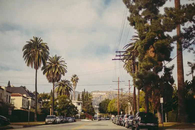
<img src="https://mdbcdn.b-cdn.net/img/new/standard/city/041.webp" class="card-img-top" alt="Hollywood Sign on The Hill"/>
<div class="card-body">
<h5 class="card-title">Card title</h5>
<p class="card-text">
This is a wider card with supporting text below as a natural lead-in to
additional content. This content is a little bit longer.
</p>
<p class="card-text">
<small class="text-muted">Last updated 3 mins ago</small>
</p>
</div>
</div>
<div class="card">
<img src="https://mdbcdn.b-cdn.net/img/new/standard/city/042.webp" class="card-img-top" alt="Palm Springs Road"/>
<div class="card-body">
<h5 class="card-title">Card title</h5>
<p class="card-text">This card has supporting text below as a natural lead-in to additional content.</p>
<p class="card-text">
<small class="text-muted">Last updated 3 mins ago</small>
</p>
</div>
</div>
<div class="card">
<img src="https://mdbcdn.b-cdn.net/img/new/standard/city/043.webp" class="card-img-top" alt="Los Angeles Skyscrapers"/>
<div class="card-body">
<h5 class="card-title">Card title</h5>
<p class="card-text">
This is a wider card with supporting text below as a natural lead-in to
additional content. This card has even longer content than the first to show
that equal height action.
</p>
<p class="card-text">
<small class="text-muted">Last updated 3 mins ago</small>
</p>
</div>
</div>
</div>
When using card groups with footers, their content will automatically line up.
Card title
This is a wider card with supporting text below as a natural lead-in to additional content. This content is a little bit longer.
Card title
This card has supporting text below as a natural lead-in to additional content.
Card title
This is a wider card with supporting text below as a natural lead-in to additional content. This card has even longer content than the first to show that equal height action.
              <div class="card-group">
                <div class="card">
                  <img src="https://mdbcdn.b-cdn.net/img/new/standard/city/041.webp" class="card-img-top" alt="Hollywood Sign on The Hill"/>
                  <div class="card-body">
                    <h5 class="card-title">Card title</h5>
                    <p class="card-text">
                      This is a wider card with supporting text below as a natural lead-in to
                      additional content. This content is a little bit longer.
                    </p>
                  </div>
                  <div class="card-footer">
                    <small class="text-muted">Last updated 3 mins ago</small>
                  </div>
                </div>
                <div class="card">
                  <img src="https://mdbcdn.b-cdn.net/img/new/standard/city/042.webp" class="card-img-top" alt="Palm Springs Road"/>
                  <div class="card-body">
                    <h5 class="card-title">Card title</h5>
                    <p class="card-text">This card has supporting text below as a natural lead-in to additional content.</p>
                  </div>
                  <div class="card-footer">
                    <small class="text-muted">Last updated 3 mins ago</small>
                  </div>
                </div>
                <div class="card">
                  <img src="https://mdbcdn.b-cdn.net/img/new/standard/city/043.webp" class="card-img-top" alt="Los Angeles Skyscrapers"/>
                  <div class="card-body">
                    <h5 class="card-title">Card title</h5>
                    <p class="card-text">
                      This is a wider card with supporting text below as a natural lead-in to
                      additional content. This card has even longer content than the first to show
                      that equal height action.
                    </p>
                  </div>
                  <div class="card-footer">
                    <small class="text-muted">Last updated 3 mins ago</small>
                  </div>
                </div>
              </div>
Cards grid
Use the Bootstrap grid system and its
.row-cols classes to control how many grid columns (wrapped around your cards)
you show per row. For example, here’s .row-cols-1 laying out the cards on one
column, and .row-cols-md-2 splitting four cards to equal width across multiple
rows, from the medium breakpoint up.
Card title
This is a longer card with supporting text below as a natural lead-in to additional content. This content is a little bit longer.
Card title
This is a longer card with supporting text below as a natural lead-in to additional content. This content is a little bit longer.
Card title
This is a longer card with supporting text below as a natural lead-in to additional content.

Card title
This is a longer card with supporting text below as a natural lead-in to additional content. This content is a little bit longer.
              <div class="row row-cols-1 row-cols-md-2 g-4">
                <div class="col">
                  <div class="card">
                    <img src="https://mdbcdn.b-cdn.net/img/new/standard/city/041.webp" class="card-img-top" alt="Hollywood Sign on The Hill"/>
                    <div class="card-body">
                      <h5 class="card-title">Card title</h5>
                      <p class="card-text">
                        This is a longer card with supporting text below as a natural lead-in to
                        additional content. This content is a little bit longer.
                      </p>
                    </div>
                  </div>
                </div>
                <div class="col">
                  <div class="card">
                    <img src="https://mdbcdn.b-cdn.net/img/new/standard/city/042.webp" class="card-img-top" alt="Palm Springs Road"/>
                    <div class="card-body">
                      <h5 class="card-title">Card title</h5>
                      <p class="card-text">
                        This is a longer card with supporting text below as a natural lead-in to
                        additional content. This content is a little bit longer.
                      </p>
                    </div>
                  </div>
                </div>
                <div class="col">
                  <div class="card">
                    <img src="https://mdbcdn.b-cdn.net/img/new/standard/city/043.webp" class="card-img-top" alt="Los Angeles Skyscrapers"/>
                    <div class="card-body">
                      <h5 class="card-title">Card title</h5>
                      <p class="card-text">This is a longer card with supporting text below as a natural lead-in to additional content.</p>
                    </div>
                  </div>
                </div>
                <div class="col">
                  <div class="card">
                    <img src="https://mdbcdn.b-cdn.net/img/new/standard/city/044.webp" class="card-img-top" alt="Skyscrapers"/>
                    <div class="card-body">
                      <h5 class="card-title">Card title</h5>
                      <p class="card-text">
                        This is a longer card with supporting text below as a natural lead-in to
                        additional content. This content is a little bit longer.
                      </p>
                    </div>
                  </div>
                </div>
              </div>
Change it to .row-cols-3 and you’ll see the fourth card wrap.
Card title
This is a longer card with supporting text below as a natural lead-in to additional content. This content is a little bit longer.
Card title
This is a longer card with supporting text below as a natural lead-in to additional content. This content is a little bit longer.
Card title
This is a longer card with supporting text below as a natural lead-in to additional content.
Card title
This is a longer card with supporting text below as a natural lead-in to additional content. This content is a little bit longer.
              <div class="row row-cols-1 row-cols-md-3 g-4">
                <div class="col">
                  <div class="card">
                    <img src="https://mdbcdn.b-cdn.net/img/new/standard/city/041.webp" class="card-img-top" alt="Hollywood Sign on The Hill"/>
                    <div class="card-body">
                      <h5 class="card-title">Card title</h5>
                      <p class="card-text">
                        This is a longer card with supporting text below as a natural lead-in to
                        additional content. This content is a little bit longer.
                      </p>
                    </div>
                  </div>
                </div>
                <div class="col">
                  <div class="card">
                    <img src="https://mdbcdn.b-cdn.net/img/new/standard/city/042.webp" class="card-img-top" alt="Palm Springs Road"/>
                    <div class="card-body">
                      <h5 class="card-title">Card title</h5>
                      <p class="card-text">
                        This is a longer card with supporting text below as a natural lead-in to
                        additional content. This content is a little bit longer.
                      </p>
                    </div>
                  </div>
                </div>
                <div class="col">
                  <div class="card">
                    <img src="https://mdbcdn.b-cdn.net/img/new/standard/city/043.webp" class="card-img-top" alt="Los Angeles Skyscrapers"/>
                    <div class="card-body">
                      <h5 class="card-title">Card title</h5>
                      <p class="card-text">This is a longer card with supporting text below as a natural lead-in to additional content.</p>
                    </div>
                  </div>
                </div>
                <div class="col">
                  <div class="card">
                    <img src="https://mdbcdn.b-cdn.net/img/new/standard/city/044.webp" class="card-img-top" alt="Skyscrapers"/>
                    <div class="card-body">
                      <h5 class="card-title">Card title</h5>
                      <p class="card-text">
                        This is a longer card with supporting text below as a natural lead-in to
                        additional content. This content is a little bit longer.
                      </p>
                    </div>
                  </div>
                </div>
              </div>
When you need equal height, add .h-100 to the cards. If you want equal heights
by default, you can set $card-height: 100% in Sass.
Card title
This is a longer card with supporting text below as a natural lead-in to additional content. This content is a little bit longer.
Card title
This is a short card.
Card title
This is a longer card with supporting text below as a natural lead-in to additional content.
Card title
This is a longer card with supporting text below as a natural lead-in to additional content. This content is a little bit longer.
              <div class="row row-cols-1 row-cols-md-3 g-4">
                <div class="col">
                  <div class="card h-100">
                    <img src="https://mdbcdn.b-cdn.net/img/new/standard/city/041.webp" class="card-img-top" alt="Hollywood Sign on The Hill"/>
                    <div class="card-body">
                      <h5 class="card-title">Card title</h5>
                      <p class="card-text">
                        This is a longer card with supporting text below as a natural lead-in to
                        additional content. This content is a little bit longer.
                      </p>
                    </div>
                  </div>
                </div>
                <div class="col">
                  <div class="card h-100">
                    <img src="https://mdbcdn.b-cdn.net/img/new/standard/city/042.webp" class="card-img-top" alt="Palm Springs Road"/>
                    <div class="card-body">
                      <h5 class="card-title">Card title</h5>
                      <p class="card-text">This is a short card.</p>
                    </div>
                  </div>
                </div>
                <div class="col">
                  <div class="card h-100">
                    <img src="https://mdbcdn.b-cdn.net/img/new/standard/city/043.webp" class="card-img-top" alt="Los Angeles Skyscrapers"/>
                    <div class="card-body">
                      <h5 class="card-title">Card title</h5>
                      <p class="card-text">This is a longer card with supporting text below as a natural lead-in to additional content.</p>
                    </div>
                  </div>
                </div>
                <div class="col">
                  <div class="card h-100">
                    <img src="https://mdbcdn.b-cdn.net/img/new/standard/city/044.webp" class="card-img-top" alt="Skyscrapers"/>
                    <div class="card-body">
                      <h5 class="card-title">Card title</h5>
                      <p class="card-text">
                        This is a longer card with supporting text below as a natural lead-in to
                        additional content. This content is a little bit longer.
                      </p>
                    </div>
                  </div>
                </div>
              </div>
Just like with card groups, card footers will automatically line up.
Card title
This is a wider card with supporting text below as a natural lead-in to additional content. This content is a little bit longer.
Card title
This card has supporting text below as a natural lead-in to additional content.
Card title
This is a wider card with supporting text below as a natural lead-in to additional content. This card has even longer content than the first to show that equal height action.
              <div class="row row-cols-1 row-cols-md-3 g-4">
                <div class="col">
                  <div class="card h-100">
                    <img src="https://mdbcdn.b-cdn.net/img/new/standard/city/044.webp" class="card-img-top" alt="Skyscrapers"/>
                    <div class="card-body">
                      <h5 class="card-title">Card title</h5>
                      <p class="card-text">
                        This is a wider card with supporting text below as a natural lead-in to
                        additional content. This content is a little bit longer.
                      </p>
                    </div>
                    <div class="card-footer">
                      <small class="text-muted">Last updated 3 mins ago</small>
                    </div>
                  </div>
                </div>
                <div class="col">
                  <div class="card h-100">
                    <img src="https://mdbcdn.b-cdn.net/img/new/standard/city/043.webp" class="card-img-top" alt="Los Angeles Skyscrapers"/>
                    <div class="card-body">
                      <h5 class="card-title">Card title</h5>
                      <p class="card-text">This card has supporting text below as a natural lead-in to additional content.</p>
                    </div>
                    <div class="card-footer">
                      <small class="text-muted">Last updated 3 mins ago</small>
                    </div>
                  </div>
                </div>
                <div class="col">
                  <div class="card h-100">
                    <img src="https://mdbcdn.b-cdn.net/img/new/standard/city/042.webp" class="card-img-top" alt="Palm Springs Road"/>
                    <div class="card-body">
                      <h5 class="card-title">Card title</h5>
                      <p class="card-text">
                        This is a wider card with supporting text below as a natural lead-in to
                        additional content. This card has even longer content than the first to show
                        that equal height action.
                      </p>
                    </div>
                    <div class="card-footer">
                      <small class="text-muted">Last updated 3 mins ago</small>
                    </div>
                  </div>
                </div>
              </div>
Testimonials
Colorful testimonial cards with circle avatars and equal height cards.
Testimonials
Lorem ipsum dolor sit amet, consectetur adipisicing elit. Fugit, error amet numquam iure provident voluptate esse quasi, veritatis totam voluptas nostrum quisquam eum porro a pariatur veniam.
.webp)
Maria Smantha
Lorem ipsum dolor sit amet eos adipisci, consectetur adipisicing elit.
.webp)
Lisa Cudrow
Neque cupiditate assumenda in maiores repudi mollitia architecto.
.webp)
John Smith
Delectus impedit saepe officiis ab aliquam repellat rem unde ducimus.
      <section>
        <div class="row d-flex justify-content-center">
          <div class="col-md-10 col-xl-8 text-center">
            <h3 class="mb-4">Testimonials</h3>
            <p class="mb-4 pb-2 mb-md-5 pb-md-0">
              Lorem ipsum dolor sit amet, consectetur adipisicing elit. Fugit, error amet
              numquam iure provident voluptate esse quasi, veritatis totam voluptas nostrum
              quisquam eum porro a pariatur veniam.
            </p>
          </div>
        </div>

        <div class="row text-center d-flex align-items-stretch">
          <div class="col-md-4 mb-5 mb-md-0 d-flex align-items-stretch">
            <div class="card testimonial-card">
              <div class="card-up" style="background-color: #9d789b;"></div>
              <div class="avatar mx-auto bg-white">
                <img src="https://mdbcdn.b-cdn.net/img/Photos/Avatars/img%20(1).webp"
                  class="rounded-circle img-fluid" />
              </div>
              <div class="card-body">
                <h4 class="mb-4">Maria Smantha</h4>
                <hr />
                <p class="dark-grey-text mt-4">
                  <i class="fas fa-quote-left pe-2"></i>Lorem ipsum dolor sit amet eos adipisci,
                  consectetur adipisicing elit.
                </p>
              </div>
            </div>
          </div>
          <div class="col-md-4 mb-5 mb-md-0 d-flex align-items-stretch">
            <div class="card testimonial-card">
              <div class="card-up" style="background-color: #7a81a8;"></div>
              <div class="avatar mx-auto bg-white">
                <img src="https://mdbcdn.b-cdn.net/img/Photos/Avatars/img%20(2).webp"
                  class="rounded-circle img-fluid" />
              </div>
              <div class="card-body">
                <h4 class="mb-4">Lisa Cudrow</h4>
                <hr />
                <p class="dark-grey-text mt-4">
                  <i class="fas fa-quote-left pe-2"></i>Neque cupiditate assumenda in maiores
                  repudi mollitia architecto.
                </p>
              </div>
            </div>
          </div>
          <div class="col-md-4 mb-0 d-flex align-items-stretch">
            <div class="card testimonial-card">
              <div class="card-up" style="background-color: #6d5b98;"></div>
              <div class="avatar mx-auto bg-white">
                <img src="https://mdbcdn.b-cdn.net/img/Photos/Avatars/img%20(9).webp"
                  class="rounded-circle img-fluid" />
              </div>
              <div class="card-body">
                <h4 class="mb-4">John Smith</h4>
                <hr />
                <p class="dark-grey-text mt-4">
                  <i class="fas fa-quote-left pe-2"></i>Delectus impedit saepe officiis ab
                  aliquam repellat rem unde ducimus.
                </p>
              </div>
            </div>
          </div>
        </div>
      </section>
      .testimonial-card .card-up {
        height: 120px;
        overflow: hidden;
        border-top-left-radius: 0.25rem;
        border-top-right-radius: 0.25rem;
      }
      .testimonial-card .avatar {
        width: 110px;
        margin-top: -60px;
        overflow: hidden;
        border: 3px solid #fff;
        border-radius: 50%;
      }
Multi-item carousel
By using a combination of available classes you can create a carousel with multiple items on each slide.
If you need more advanced options and examples of multi-item carousel have a look at Multi-item Carousel Docs

Card title
Some quick example text to build on the card title and make up the bulk of the card's content.
Button
Card title
Some quick example text to build on the card title and make up the bulk of the card's content.
Button
Card title
Some quick example text to build on the card title and make up the bulk of the card's content.
Button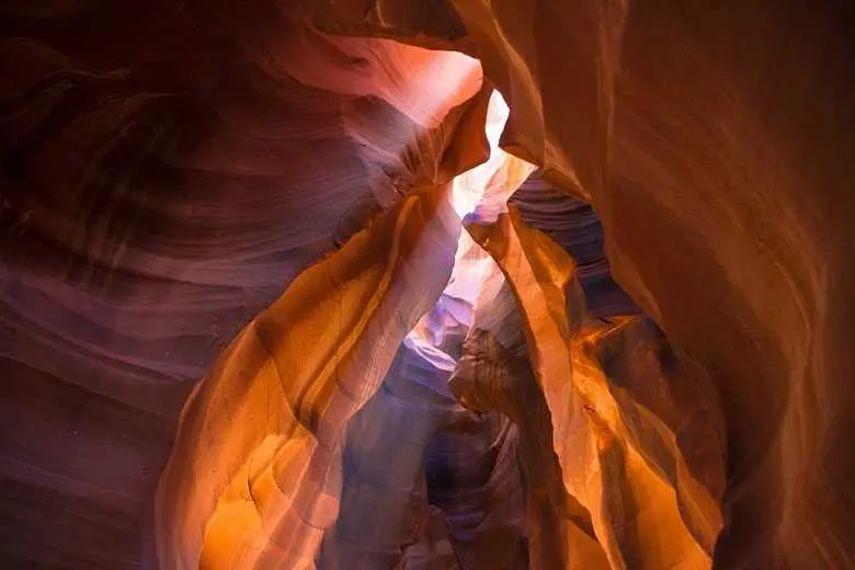
Card title
Some quick example text to build on the card title and make up the bulk of the card's content.
Button
Card title
Some quick example text to build on the card title and make up the bulk of the card's content.
Button
Card title
Some quick example text to build on the card title and make up the bulk of the card's content.
Button
Card title
Some quick example text to build on the card title and make up the bulk of the card's content.
Button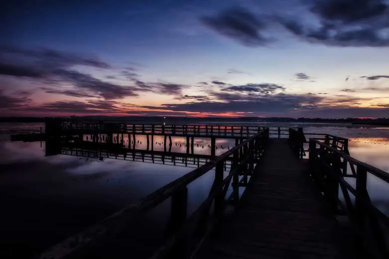
Card title
Some quick example text to build on the card title and make up the bulk of the card's content.
Button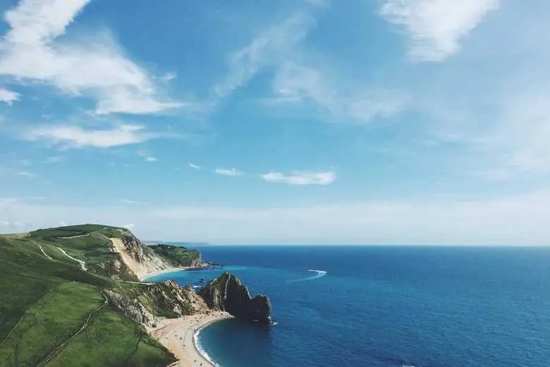
Card title
Some quick example text to build on the card title and make up the bulk of the card's content.
Button
          <!-- Carousel wrapper -->
          <div
            id="carouselMultiItemExample"
            data-mdb-carousel-init class="carousel slide carousel-dark text-center"
            data-mdb-ride="carousel"
          >
            <!-- Controls -->
            <div class="d-flex justify-content-center mb-4">
              <button data-mdb-button-init
                class="carousel-control-prev position-relative"
                type="button"
                data-mdb-target="#carouselMultiItemExample"
                data-mdb-slide="prev"
              >
                <span class="carousel-control-prev-icon" aria-hidden="true"></span>
                <span class="visually-hidden">Previous</span>
              </button>
              <button data-mdb-button-init
                class="carousel-control-next position-relative"
                type="button"
                data-mdb-target="#carouselMultiItemExample"
                data-mdb-slide="next"
              >
                <span class="carousel-control-next-icon" aria-hidden="true"></span>
                <span class="visually-hidden">Next</span>
              </button>
            </div>
            <!-- Inner -->
            <div class="carousel-inner py-4">
              <!-- Single item -->
              <div class="carousel-item active">
                <div class="container">
                  <div class="row">
                    <div class="col-lg-4">
                      <div class="card">
                        <img
                          src="https://mdbcdn.b-cdn.net/img/new/standard/nature/181.webp"
                          class="card-img-top"
                          alt="Waterfall"
                        />
                        <div class="card-body">
                          <h5 class="card-title">Card title</h5>
                          <p class="card-text">
                            Some quick example text to build on the card title and make up the bulk
                            of the card's content.
                          </p>
                          <a href="#!" data-mdb-ripple-init class="btn btn-primary">Button</a>
                        </div>
                      </div>
                    </div>

                    <div class="col-lg-4 d-none d-lg-block">
                      <div class="card">
                        <img
                          src="https://mdbcdn.b-cdn.net/img/new/standard/nature/182.webp"
                          class="card-img-top"
                          alt="Sunset Over the Sea"
                        />
                        <div class="card-body">
                          <h5 class="card-title">Card title</h5>
                          <p class="card-text">
                            Some quick example text to build on the card title and make up the bulk
                            of the card's content.
                          </p>
                          <a href="#!" data-mdb-ripple-init class="btn btn-primary">Button</a>
                        </div>
                      </div>
                    </div>

                    <div class="col-lg-4 d-none d-lg-block">
                      <div class="card">
                        <img
                          src="https://mdbcdn.b-cdn.net/img/new/standard/nature/183.webp"
                          class="card-img-top"
                          alt="Sunset over the Sea"
                        />
                        <div class="card-body">
                          <h5 class="card-title">Card title</h5>
                          <p class="card-text">
                            Some quick example text to build on the card title and make up the bulk
                            of the card's content.
                          </p>
                          <a href="#!" data-mdb-ripple-init class="btn btn-primary">Button</a>
                        </div>
                      </div>
                    </div>
                  </div>
                </div>
              </div>

              <!-- Single item -->
              <div class="carousel-item">
                <div class="container">
                  <div class="row">
                    <div class="col-lg-4 col-md-12">
                      <div class="card">
                        <img
                          src="https://mdbcdn.b-cdn.net/img/new/standard/nature/184.webp"
                          class="card-img-top"
                          alt="Fissure in Sandstone"
                        />
                        <div class="card-body">
                          <h5 class="card-title">Card title</h5>
                          <p class="card-text">
                            Some quick example text to build on the card title and make up the bulk
                            of the card's content.
                          </p>
                          <a href="#!" data-mdb-ripple-init class="btn btn-primary">Button</a>
                        </div>
                      </div>
                    </div>

                    <div class="col-lg-4 d-none d-lg-block">
                      <div class="card">
                        <img
                          src="https://mdbcdn.b-cdn.net/img/new/standard/nature/185.webp"
                          class="card-img-top"
                          alt="Storm Clouds"
                        />
                        <div class="card-body">
                          <h5 class="card-title">Card title</h5>
                          <p class="card-text">
                            Some quick example text to build on the card title and make up the bulk
                            of the card's content.
                          </p>
                          <a href="#!" data-mdb-ripple-init class="btn btn-primary">Button</a>
                        </div>
                      </div>
                    </div>

                    <div class="col-lg-4 d-none d-lg-block">
                      <div class="card">
                        <img
                          src="https://mdbcdn.b-cdn.net/img/new/standard/nature/186.webp"
                          class="card-img-top"
                          alt="Hot Air Balloons"
                        />
                        <div class="card-body">
                          <h5 class="card-title">Card title</h5>
                          <p class="card-text">
                            Some quick example text to build on the card title and make up the bulk
                            of the card's content.
                          </p>
                          <a href="#!" data-mdb-ripple-init class="btn btn-primary">Button</a>
                        </div>
                      </div>
                    </div>
                  </div>
                </div>
              </div>

              <!-- Single item -->
              <div class="carousel-item">
                <div class="container">
                  <div class="row">
                    <div class="col-lg-4 col-md-12 mb-4 mb-lg-0">
                      <div class="card">
                        <img
                          src="https://mdbcdn.b-cdn.net/img/new/standard/nature/187.webp"
                          class="card-img-top"
                          alt="Peaks Against the Starry Sky"
                        />
                        <div class="card-body">
                          <h5 class="card-title">Card title</h5>
                          <p class="card-text">
                            Some quick example text to build on the card title and make up the bulk
                            of the card's content.
                          </p>
                          <a href="#!" data-mdb-ripple-init class="btn btn-primary">Button</a>
                        </div>
                      </div>
                    </div>

                    <div class="col-lg-4 mb-4 mb-lg-0 d-none d-lg-block">
                      <div class="card">
                        <img
                          src="https://mdbcdn.b-cdn.net/img/new/standard/nature/188.webp"
                          class="card-img-top"
                          alt="Bridge Over Water"
                        />
                        <div class="card-body">
                          <h5 class="card-title">Card title</h5>
                          <p class="card-text">
                            Some quick example text to build on the card title and make up the bulk
                            of the card's content.
                          </p>
                          <a href="#!" data-mdb-ripple-init class="btn btn-primary">Button</a>
                        </div>
                      </div>
                    </div>

                    <div class="col-lg-4 mb-4 mb-lg-0 d-none d-lg-block">
                      <div class="card">
                        <img
                          src="https://mdbcdn.b-cdn.net/img/new/standard/nature/189.webp"
                          class="card-img-top"
                          alt="Purbeck Heritage Coast"
                        />
                        <div class="card-body">
                          <h5 class="card-title">Card title</h5>
                          <p class="card-text">
                            Some quick example text to build on the card title and make up the bulk
                            of the card's content.
                          </p>
                          <a href="#!" data-mdb-ripple-init class="btn btn-primary">Button</a>
                        </div>
                      </div>
                    </div>
                  </div>
                </div>
              </div>
            </div>
            <!-- Inner -->
          </div>
          <!-- Carousel wrapper -->