Bootstrap Dark Mode
Bootstrap 5 Dark Mode free template
Responsive Dark Mode theme built with Bootstrap 5 with Dark Mode toggle button that switches between dark and light themes.
Free Dark Mode Template for Bootstrap 5
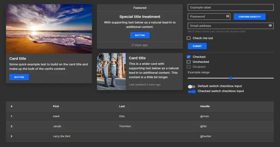
Dark Mode for hundreds of components from the latest Bootstrap 5. Dark mode for cards, carousel, buttons, input elements, forms, progress bars, loaders/spinners, alerts, badges, notes & typography, button groups, collapse, dropdowns, modals, toasts, tooltips, popovers, navbars, headers, scrollspy, footer, breadcrumbs, pagination, pills, tabs, tables, hover effects, masks, shadows & more.
- License MIT License
- Bootstrap version v.5
- MDBootstrap version Standard
Dark Mode toggle/switch button
To create a dark mode toggle button add dark mode styles to your main scss file. Use the @include
rule for any customized class.
After that create a toggle button for switching those classes within the entire body.
Learn more how to create your own theming systems and advanced configurations in our theming docs.
        @import '~mdb-ui-kit/src/scss/mdb.pro.scss';

        // DARK SKIN
        $my-theme-primary: #1266f1;
        $my-theme-secondary: #b23cfd;
        $my-dark-theme: mdb-dark-theme($my-theme-primary, $my-theme-secondary);

        .dark {
        @include mdb-theme($my-dark-theme);
        }
<button data-mdb-button-init data-mdb-ripple-init class="btn btn-primary" id="skinToggler">Toggle skin</button>
        const skinToggler = document.getElementById('skinToggler');

        const toggleSkin = () => {
        document.body.classList.toggle('dark');
        }

        skinToggler.addEventListener('click', toggleSkin);
<link rel="stylesheet" href="css/mdb.min.css" /> and
<link rel="stylesheet" href="css/mdb.dark.min.css" /> after clicking the
toggle button.Dark mode support
MDB5 Free supports a ready-to-use dark mode. Using the dark mode is very simple, just replace the current path to the mdb.min.css stylesheet with the mdb.dark.min.css file. The file can be found in the css folder.
Download MDB Free now
<link rel="stylesheet" href="css/mdb.dark.min.css" />