Horizontal list
Bootstrap 5 Horizontal list component
Responsive Horizontal list built with Bootstrap 5. Horizontal lists are responsive components for displaying a series of content.
Basic example
Add .list-group-horizontal to change the layout of list group items from vertical to horizontal across all breakpoints. Alternatively, choose a responsive variant
.list-group-horizontal-{sm|md|lg|xl|xxl} to make a list group horizontal starting at that breakpoint’s min-width. Currently,
horizontal list groups cannot be combined with flush or light list groups.
ProTip: Want equal-width list group items when horizontal? Add .flex-fill to each list group item.
- Cras justo odio
- Dapibus ac facilisis in
- Morbi leo risus
- Cras justo odio
- Dapibus ac facilisis in
- Morbi leo risus
- Cras justo odio
- Dapibus ac facilisis in
- Morbi leo risus
- Cras justo odio
- Dapibus ac facilisis in
- Morbi leo risus
- Cras justo odio
- Dapibus ac facilisis in
- Morbi leo risus
- Cras justo odio
- Dapibus ac facilisis in
- Morbi leo risus
                <ul class="list-group list-group-horizontal">
                    <li class="list-group-item">Cras justo odio</li>
                    <li class="list-group-item">Dapibus ac facilisis in</li>
                    <li class="list-group-item">Morbi leo risus</li>
                </ul>
                <ul class="list-group list-group-horizontal-sm">
                    <li class="list-group-item">Cras justo odio</li>
                    <li class="list-group-item">Dapibus ac facilisis in</li>
                    <li class="list-group-item">Morbi leo risus</li>
                </ul>
                <ul class="list-group list-group-horizontal-md">
                    <li class="list-group-item">Cras justo odio</li>
                    <li class="list-group-item">Dapibus ac facilisis in</li>
                    <li class="list-group-item">Morbi leo risus</li>
                </ul>
                <ul class="list-group list-group-horizontal-lg">
                    <li class="list-group-item">Cras justo odio</li>
                    <li class="list-group-item">Dapibus ac facilisis in</li>
                    <li class="list-group-item">Morbi leo risus</li>
                </ul>
                <ul class="list-group list-group-horizontal-xl">
                    <li class="list-group-item">Cras justo odio</li>
                    <li class="list-group-item">Dapibus ac facilisis in</li>
                    <li class="list-group-item">Morbi leo risus</li>
                </ul>
                <ul class="list-group list-group-horizontal-xxl">
                    <li class="list-group-item">Cras justo odio</li>
                    <li class="list-group-item">Dapibus ac facilisis in</li>
                    <li class="list-group-item">Morbi leo risus</li>
                </ul>
Scroll
Add .overflow-auto and .position-relative to get a scrollbar.
- Item 1
- Item 2
- Item 3
- Item 4
- Item 5
- Item 6
- Item 7
- Item 8
- Item 9
- Item 10
- Item 11
- Item 12
- Item 13
- Item 14
- Item 15
                <ul class="list-group list-group-horizontal position-relative overflow-auto w-75">
                    <li class="list-group-item">Item 1</li>
                    <li class="list-group-item">Item 2</li>
                    <li class="list-group-item">Item 3</li>
                    <li class="list-group-item">Item 4</li>
                    <li class="list-group-item">Item 5</li>
                    <li class="list-group-item">Item 6</li>
                    <li class="list-group-item">Item 7</li>
                    <li class="list-group-item">Item 8</li>
                    <li class="list-group-item">Item 9</li>
                    <li class="list-group-item">Item 10</li>
                    <li class="list-group-item">Item 11</li>
                    <li class="list-group-item">Item 12</li>
                    <li class="list-group-item">Item 13</li>
                    <li class="list-group-item">Item 14</li>
                    <li class="list-group-item">Item 15</li>
                </ul>
Links
Add a button with .btn and .btn-link to get a link.
                <ul class="list-group list-group-horizontal">
                    <li class="list-group-item"><button  type="button" data-mdb-button-init data-mdb-ripple-init class="btn btn-link" data-mdb-ripple-color="dark">Link 1</button></li>
                    <li class="list-group-item"><button  type="button" data-mdb-button-init data-mdb-ripple-init class="btn btn-link" data-mdb-ripple-color="dark">Link 2</button></li>
                    <li class="list-group-item"><button  type="button" data-mdb-button-init data-mdb-ripple-init class="btn btn-link" data-mdb-ripple-color="dark">Link 3</button></li>
                    <li class="list-group-item"><button  type="button" data-mdb-button-init data-mdb-ripple-init class="btn btn-link" data-mdb-ripple-color="dark">Link 4</button></li>
                    <li class="list-group-item"><button  type="button" data-mdb-button-init data-mdb-ripple-init class="btn btn-link" data-mdb-ripple-color="dark">Link 5</button></li>
                </ul>
Images
Cards
Replace ul to div with .card-group and li to div with .card to keep the photos of the same size.
Card title
This is a wider card with supporting text below as a natural lead-in to additional content. This content is a little bit longer.

Card title
This card has supporting text below as a natural lead-in to additional content.

Card title
This is a wider card with supporting text below as a natural lead-in to additional content. This card has even longer content than the first to show that equal height action.
<div class="card-group">
<div class="card">
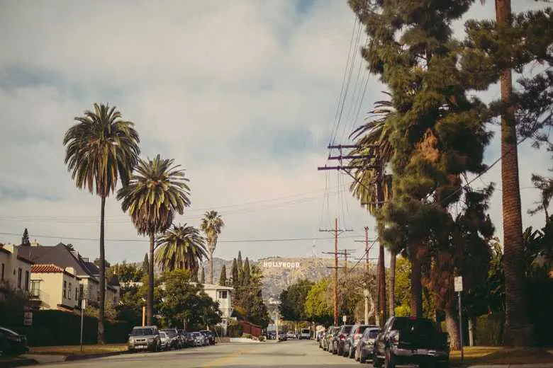
<img src="https://mdbcdn.b-cdn.net/img/new/standard/city/041.webp" class="card-img-top" alt="Hollywood Sign on The Hill" />
<div class="card-body">
<h5 class="card-title">Card title</h5>
<p class="card-text">
This is a wider card with supporting text below as a natural lead-in to additional content. This content is a little bit longer.
</p>
</div>
<div class="card-footer">
<small class="text-muted">Last updated 3 mins ago</small>
</div>
</div>
<div class="card">
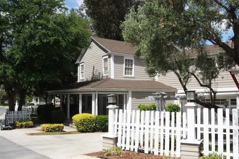
<img src="https://mdbcdn.b-cdn.net/img/new/standard/city/042.webp" class="card-img-top" alt="Palm Springs Road" />
<div class="card-body">
<h5 class="card-title">Card title</h5>
<p class="card-text">This card has supporting text below as a natural lead-in to additional content.</p>
</div>
<div class="card-footer">
<small class="text-muted">Last updated 3 mins ago</small>
</div>
</div>
<div class="card">
<img src="https://mdbcdn.b-cdn.net/img/new/standard/city/043.webp" class="card-img-top" alt="Los Angeles Skyscrapers" />
<div class="card-body">
<h5 class="card-title">Card title</h5>
<p class="card-text">
This is a wider card with supporting text below as a natural lead-in to additional content. This card has even longer content than the first to show that equal height action.
</p>
</div>
<div class="card-footer">
<small class="text-muted">Last updated 3 mins ago</small>
</div>
</div>
</div>
With scroll
Add .card-group-scroll to the main div and JS to get a scroll bar.
Card title
This is a wider card with supporting text below as a natural lead-in to additional content. This content is a little bit longer.
Card title
This card has supporting text below as a natural lead-in to additional content.
Card title
This is a wider card with supporting text below as a natural lead-in to additional content. This card has even longer content than the first to show that equal height action.

Card title
This is a wider card with supporting text below as a natural lead-in to additional content. This content is a little bit longer.

Card title
This card has supporting text below as a natural lead-in to additional content.
Card title
This is a wider card with supporting text below as a natural lead-in to additional content. This card has even longer content than the first to show that equal height action.
                    <div class="card-group card-group-scroll">
                        <div class="card">
                            <img src="https://mdbcdn.b-cdn.net/img/new/standard/city/041.webp" class="card-img-top" alt="Hollywood Sign on The Hill" />
                            <div class="card-body">
                                <h5 class="card-title">Card title</h5>
                                <p class="card-text">
                                    This is a wider card with supporting text below as a natural lead-in to additional content. This content is a little bit longer.
                                </p>
                            </div>
                            <div class="card-footer">
                                <small class="text-muted">Last updated 3 mins ago</small>
                            </div>
                        </div>
                        <div class="card">
                            <img src="https://mdbcdn.b-cdn.net/img/new/standard/city/042.webp" class="card-img-top" alt="Palm Springs Road" />
                            <div class="card-body">
                                <h5 class="card-title">Card title</h5>
                                <p class="card-text">This card has supporting text below as a natural lead-in to additional content.</p>
                            </div>
                            <div class="card-footer">
                                <small class="text-muted">Last updated 3 mins ago</small>
                            </div>
                        </div>
                        <div class="card">
                            <img src="https://mdbcdn.b-cdn.net/img/new/standard/city/043.webp" class="card-img-top" alt="Los Angeles Skyscrapers" />
                            <div class="card-body">
                                <h5 class="card-title">Card title</h5>
                                <p class="card-text">
                                    This is a wider card with supporting text below as a natural lead-in to additional content. This card has even longer content than the first to show that equal height action.
                                </p>
                            </div>
                            <div class="card-footer">
                                <small class="text-muted">Last updated 3 mins ago</small>
                            </div>
                        </div>
                        <div class="card">
                            <img src="https://mdbcdn.b-cdn.net/img/new/standard/city/044.webp" class="card-img-top" alt="Hollywood Sign on The Hill" />
                            <div class="card-body">
                                <h5 class="card-title">Card title</h5>
                                <p class="card-text">
                                    This is a wider card with supporting text below as a natural lead-in to additional content. This content is a little bit longer.
                                </p>
                            </div>
                            <div class="card-footer">
                                <small class="text-muted">Last updated 3 mins ago</small>
                            </div>
                        </div>
                        <div class="card">
                            <img src="https://mdbcdn.b-cdn.net/img/new/standard/city/045.webp" class="card-img-top" alt="Palm Springs Road" />
                            <div class="card-body">
                                <h5 class="card-title">Card title</h5>
                                <p class="card-text">This card has supporting text below as a natural lead-in to additional content.</p>
                            </div>
                            <div class="card-footer">
                                <small class="text-muted">Last updated 3 mins ago</small>
                            </div>
                        </div>
                        <div class="card">
                            <img src="https://mdbcdn.b-cdn.net/img/new/standard/city/046.webp" class="card-img-top" alt="Los Angeles Skyscrapers" />
                            <div class="card-body">
                                <h5 class="card-title">Card title</h5>
                                <p class="card-text">
                                    This is a wider card with supporting text below as a natural lead-in to additional content. This card has even longer content than the first to show that equal height action.
                                </p>
                            </div>
                            <div class="card-footer">
                                <small class="text-muted">Last updated 3 mins ago</small>
                            </div>
                        </div>
                    </div>
                    body {
                        padding-top: 2rem;
                    }

                    @media (min-width: 576px) {
                        .card-group.card-group-scroll {
                            overflow-x: auto;
                            flex-wrap: nowrap;
                        }
                    }

                    .card-group.card-group-scroll > .card {
                        flex-basis: 35%;
                    }