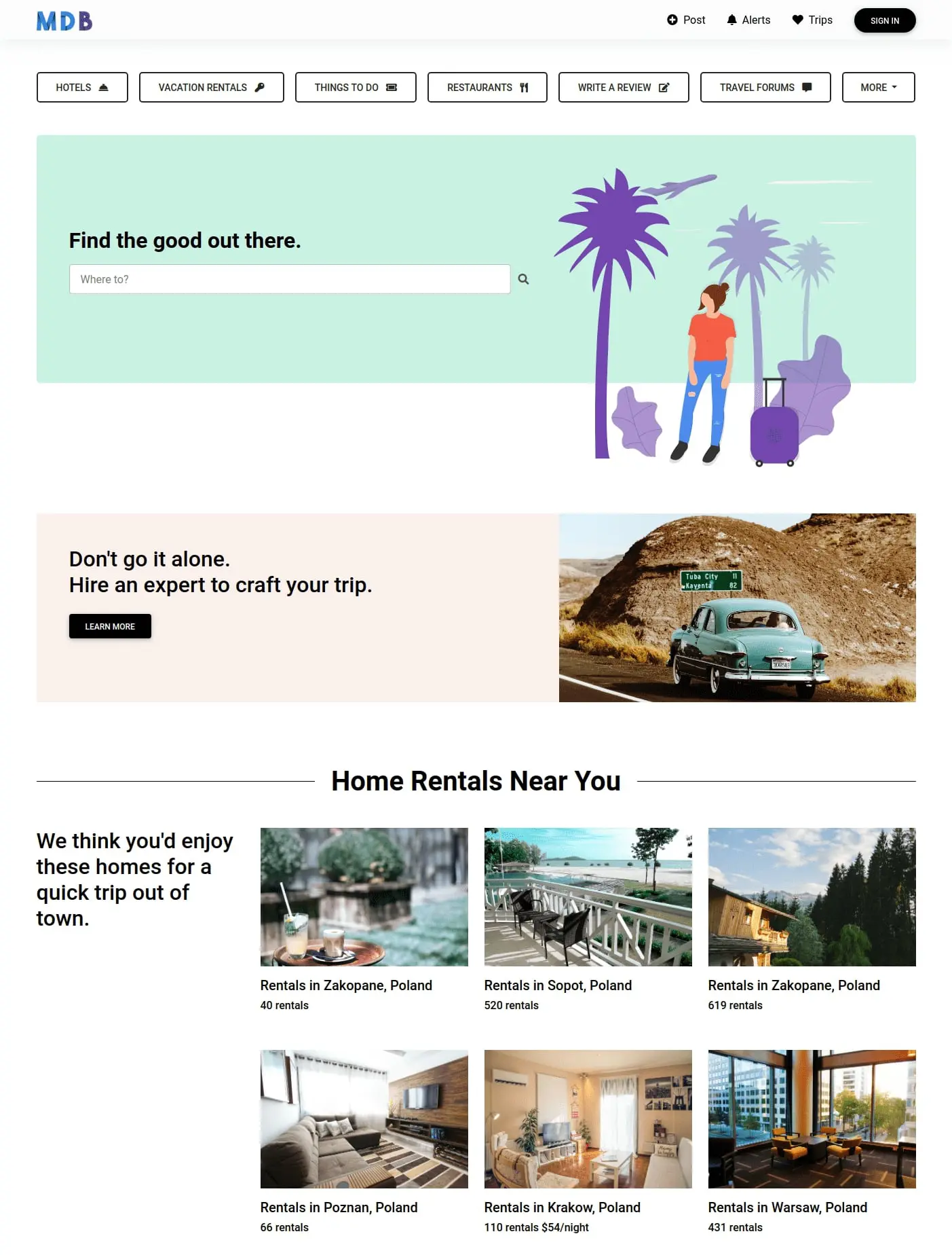
"Tripadvisor homepage" by Marta Wierzbicka
Desktop

Mobile

Description
The world's largest travel platform recreated in Material Design 2.0 using MDB 5.
The project includes a home page with one column layout with easy to use navigation in shortcuts under the navbar. The page includes also a search form & number of cards with advised the best places to rest.
Live demo & source codeFrom the creator, about the project:
Marta Wierzbicka
The new version of the Tripadvisor homepage is clear, easy to use and intuitive. Therefore, the MDB package was perfect for recreating it as it contains all the necessary components and a light, minimalist style.
The main assumptions of a website such as Tripadvisor is to show a large number of beautiful places to go to and intuitive navigation for the user. For these purposes, I used cards with photos, buttons and descriptions arranged in a grid, as well as navbar, dropdown and search input.
