Landing Page Tutorial
Landing page tutorial
Landing page tutorial – how to build a stunning, responsive website with Bootstrap 5
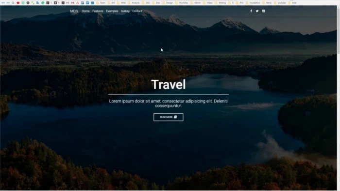
Landing Page using Bootstrap 5
The goal of this tutorial is to show you how to build a fully responsive landing page from scratch, using Bootstrap 5 & CSS. This web page can be used to promote many different types of businesses, such as creative agencies or software houses.
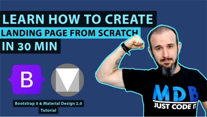
Landing Page with Bootstrap 5 & Material Design 2.0
Let's imagine you have your first customer and you're about to create a landing page for them. With this tutorial, you'll learn got to create a landing page from scratch in just 30 minutes.
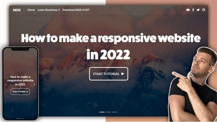
How to make responsive website using bootstrap 5
This tutorial will show you how to create a responsive website according to the latest standards and trends.
Bootstrap 4 Landing Page Tutorial
This tutorial will show you how to create a landing page using Bootstrap 4.