How to mask
Adding a mask to an image allows you to create custom shapes, add intricate designs, and enhance the visual appeal of your web pages.
Using Bootstrap
A detailed explanation of how the masks work in MDB:
-
Masks require
.bg-imagewrapper which sets a position to relative, overflow to hidden, and properly center the image. -
The inside
.bg-imagewrapper as the first child we place animgelement with the source link. -
Below is the actual mask. We set a color and opacity via
hslacode and inline CSS. -
If you want to put a text on the image you have to place it within the
.maskwrapper. To center it you have to use flex utilities.
Without mask
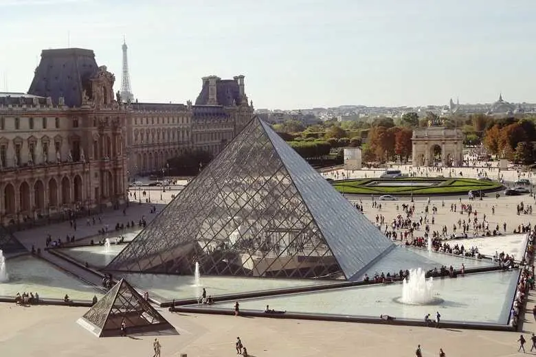
Can you see me?
With mask
Can you see me?
        <div class="bg-image">
          <img
            src="path/to/your/image.jpg"
            class="w-100"
            alt="Louvre Museum"
          />
          <div class="mask" style="background-color: hsla(0, 0%, 0%, 0.6)">
            <div class="d-flex justify-content-center align-items-center h-100">
              <p class="text-white mb-0">Can you see me?</p>
            </div>
          </div>
        </div>
Gradient Using Bootstrap
Using Bootstrap, you can apply a gradient mask to an image. Here's an example:
bg-imageclass contains the image and mask elements.w-100class ensures the image spans the full width of its container.maskdiv with a gradient background creates the masking effect.- The gradient is defined using
linear-gradientwith a 45-degree angle and two colors with 70% opacity.
        <div class="bg-image">
          <img src="https://mdbcdn.b-cdn.net/img/new/standard/city/053.webp" class="w-100" />
          <div
            class="mask"
            style="
              background: linear-gradient(
                45deg,
                hsla(168, 85%, 52%, 0.7),
                hsla(263, 88%, 45%, 0.7) 100%
              );
            "
          ></div>
        </div>
Using CSS
Here's how to create a gradient mask effect using plain HTML and CSS.
image-containerclass contains the image and mask elements and ensures the mask is positioned relative to the image.full-width-imageclass ensures the image spans the full width of its container.gradient-maskclass withposition: absoluteplaces the mask over the image, covering it entirely.- The gradient background is created using
linear-gradientwith a 135-degree angle and two colors with 70% opacity.
        <div class="image-container">
          <img src="https://mdbcdn.b-cdn.net/img/new/standard/city/053.webp" class="full-width-image" alt="City Image">
          <div class="gradient-mask"></div>
        </div>
        .image-container {
          position: relative;
          width: 100%;
        }

        .full-width-image {
          width: 100%;
          height: auto;
        }

        .gradient-mask {
          position: absolute;
          top: 0;
          left: 0;
          width: 100%;
          height: 100%;
          background: linear-gradient(
            135deg,
            hsla(168, 85%, 52%, 0.7),
            hsla(263, 88%, 45%, 0.7) 100%
          );
        }