Background Image
Bootstrap 5 Background Image
Setting a background image in Bootstrap can seem troublesome, especially for novice web developers. Thanks to this tutorial, you will not only learn how to use this functionality without any problems, but you will also learn advanced tricks that will allow you to create truly amazing projects with unconventional design.
Also, try these ready-to-use templates to see how you can implement the background image in a real project.
Basic example
This is a basic example of a full-page background image. If you need a background image with different settings have a look at other sections of this docs.
- Add
background-imagevia inline CSS. -
Define the background height. In the example below we use
vhunits, which stands for "viewport height" (height: 100vhmeans 100% of available height.) -
Add
.bg-imageclass to scale the image properly and to enable responsiveness
          <!-- Background image -->
          <div
            class="bg-image"
            style="
              background-image: url('https://mdbcdn.b-cdn.net/img/Photos/Others/images/76.webp');
              height: 100vh;
            "
          ></div>
          <!-- Background image -->
How it works
You can easily set the background image in each HTML element by adding a single line of CSS:
style="background-image: url('');
Inside of the url('') we need to provide a link to our image.
If you want to use the image on your computer, the path should look like this:
| Path | Description |
|---|---|
img src="picture.webp" |
The "picture.webp" file is located in the same folder as the current page |
img src="images/picture.webp" |
The "picture.webp" file is located in the images folder in the current folder |
img src="/images/picture.webp" |
The "picture.webp" file is located in the images folder at the root of the current web |
img src="../picture.webp" |
The "picture.webp" file is located in the folder one level up from the current folder |
You can also use an absolute path and add a link to the image directly from the Internet.
          <!-- Background image -->
          <div style="background-image: url('https://mdbcdn.b-cdn.net/img/new/standard/city/041.webp');"></div>
          <!-- Background image -->
Then we just need to add this CSS line to the HTML element.
          <!-- Background image -->
          <div style="background-image: url('https://mdbcdn.b-cdn.net/img/new/standard/city/041.webp');"></div>
          <!-- Background image -->
However, despite this, our picture does not appear. Take a look at the demo:
That's because we need to provide a height to this HTML element. Let's add
height: 400px; to set a height.
          <!-- Background image -->
          <div
            style="
              background-image: url('https://mdbcdn.b-cdn.net/img/new/standard/city/041.webp');
              height: 400px;
            "
          ></div>
          <!-- Background image -->
Now it works ... partially. We see the picture, but it is cut and unsightly.
Click on the images to launch the live demo.
Fortunately, there is a class in MDBootstrap that fixes this issue. Just add .bg-image to the class and you will see the problem magically disappear.
          <!-- Background image -->
          <div
            class="bg-image"
            style="
              background-image: url('https://mdbcdn.b-cdn.net/img/new/standard/city/041.webp');
              height: 400px;
            "
          ></div>
          <!-- Background image -->
Full page background image
Now we can easily make this background image to cover the full available space and make it a full-page background image.
Just replace height: 400px; with height: 100vh;
vh stands for viewport height.
height: 100vh; means 100% of available height.
          <!-- Background image -->
          <div
            class="bg-image"
            style="
              background-image: url('https://mdbcdn.b-cdn.net/img/new/standard/city/041.webp');
              height: 100vh;
            "
          ></div>
          <!-- Background image -->
Note: If you want to stretch the image to the full available height and width remember to use the image with enough high resolution. However, be careful not to overdo it. Heigh-resolution images weigh a lot and can slow down your website.
Half page background image
You can also stretch the background image half page (or any other percentage). Just replace
"height: 100vh" with "height: 50vh".
          <!-- Background image -->
          <div
            class="bg-image"
            style="
              background-image: url('https://mdbcdn.b-cdn.net/img/Photos/Others/images/77.webp');
              height: 50vh;
            "
          ></div>
          <!-- Background image -->
This is a very useful design that is often used in many landing pages.
Jumbotron with background image
In bootstrap 5 there is no dedicated jumbotron component, but it's not a problem at all. You can easily create your own component by using available classes.
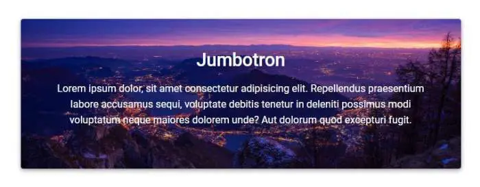
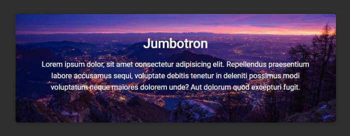
          <!-- Jumbotron -->
          <div
            class="bg-image p-5 text-center shadow-1-strong rounded mb-5 text-white"
            style="background-image: url('https://mdbcdn.b-cdn.net/img/new/slides/003.webp');"
          >
            <h1 class="mb-3 h2">Jumbotron</h1>

            <p>
              Lorem ipsum dolor, sit amet consectetur adipisicing elit. Repellendus praesentium
              labore accusamus sequi, voluptate debitis tenetur in deleniti possimus modi voluptatum
              neque maiores dolorem unde? Aut dolorum quod excepturi fugit.
            </p>
          </div>
          <!-- Jumbotron -->
Cards with background image
Using the same technique as with the jumbotron, we can easily create cards with an image in the background.
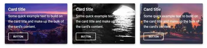
          <!-- Card -->
          <div
            class="bg-image card shadow-1-strong"
            style="background-image: url('https://mdbcdn.b-cdn.net/img/new/slides/003.webp');"
          >
            <div class="card-body text-white">
              <h5 class="card-title">Card title</h5>
              <p class="card-text">
                Some quick example text to build on the card title and make up the bulk of the
                card's content.
              </p>
              <a href="#!" class="btn btn-outline-light" data-mdb-ripple-init>Button</a>
            </div>
          </div>
          <!-- Card -->
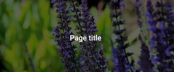
Centering content
An important part of using components with background images is content alignment. In most cases, we need to center the content vertically and horizontally. The best way to do this is to use flexbox.
Add.d-flex to .bg-image to enable flexbox. Then add
.justify-content-center to align content horizontally and.align-items-center
to align them vertically.
To learn more about flexbox have a look at our Flexbox docs. You can also use our Flexbox generator to set up the desired flexbox settings.
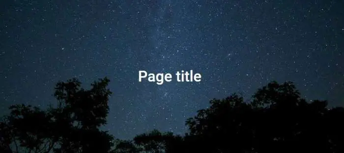
          <!-- Background image -->
          <div
            class="bg-image d-flex justify-content-center align-items-center"
            style="
              background-image: url('https://mdbcdn.b-cdn.net/img/new/fluid/nature/015.webp');
              height: 100vh;
            "
          >
            <h1 class="text-white">Page title</h1>
          </div>
          <!-- Background image -->
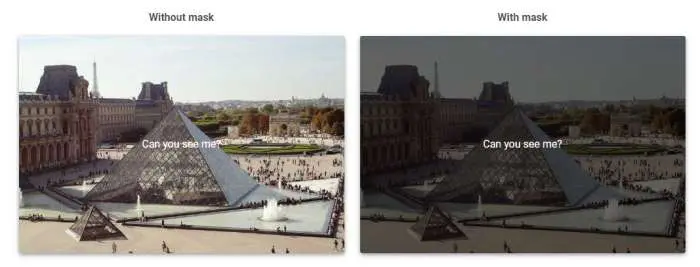
Masks
Rarely does the background image alone provide sufficient contrast for the content to be clearly visible. That's why we use masks.
Masks alter the visibility of an element by either partially or fully hiding it. Masks are used to make content more visible by providing a proper contrast.
To learn more about masks have a look at our Masks docs. You can also use our Masks generator to create the desired mask.
How it works:
-
Masks require
.bg-imagewrapper which sets a position to relative, overflow to hidden, and properly center the image. -
The inside
.bg-imagewrapper as the first child we place animgelement with the source link -
Below is the actual mask. We set a color and opacity via
rgbacode and inline CSS. - If you want to put a text on the image you have to place it within the .mask wrapper. To center it you have to use flex utilities .
          <!-- Background image -->
          <div
            class="bg-image"
            style="
              background-image: url('https://mdbcdn.b-cdn.net/img/new/fluid/nature/012.webp');
              height: 100vh;
            "
          >
            <div class="mask" style="background-color: rgba(0, 0, 0, 0.6);">
              <div class="d-flex justify-content-center align-items-center h-100">
                <h1 class="text-white mb-0">Page title</h1>
              </div>
            </div>
          </div>
          <!-- Background image -->
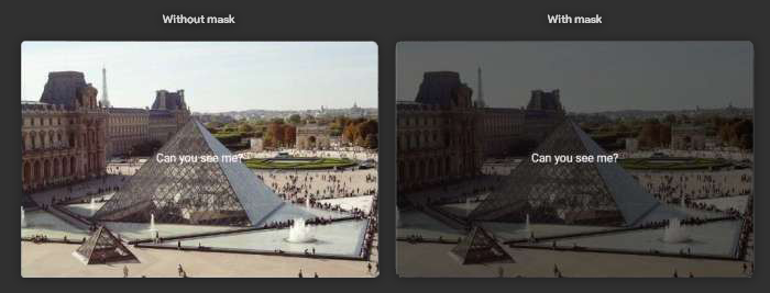
By manipulating RGBA code you can change the color and opacity of the mask.

          <!-- Background image -->
          <div
            class="bg-image"
            style="
              background-image: url('https://mdbcdn.b-cdn.net/img/new/fluid/nature/012.webp');
              height: 100vh;
            "
          >
            <div class="mask" style="background-color: rgba(178, 60, 253, 0.6);">
              <div class="d-flex justify-content-center align-items-center h-100">
                <h1 class="text-white mb-0">Page title</h1>
              </div>
            </div>
          </div>
          <!-- Background image -->
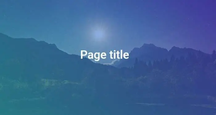
Gradients
You can also use our Gradient generator to apply stunning gradients to the background image.
          <style>
            .gradient-custom {
              /* fallback for old browsers */
              background: #a18cd1;

              /* Chrome 10-25, Safari 5.1-6 */
              background: -webkit-linear-gradient(
                45deg,
                rgba(29, 236, 197, 0.6),
                rgba(91, 14, 214, 0.6) 100%
              );

              /* W3C, IE 10+/ Edge, Firefox 16+, Chrome 26+, Opera 12+, Safari 7+ */
              background: linear-gradient(
                45deg,
                rgba(29, 236, 197, 0.6),
                rgba(91, 14, 214, 0.6) 100%
              );
            }
          </style>

          <!-- Background image -->
          <div
            class="bg-image"
            style="
              background-image: url('https://mdbcdn.b-cdn.net/img/new/fluid/nature/011.webp');
              height: 100vh;
            "
          >
            <div class="mask gradient-custom">
              <div class="d-flex justify-content-center align-items-center h-100">
                <h1 class="text-white mb-0">Page title</h1>
              </div>
            </div>
          </div>
          <!-- Background image -->
I suppose you've heard of the famous Instagram filters. Thanks to our Instagram filter generator you can apply them to your background image.
          <style>
            .mask-custom {
              backdrop-filter: contrast(140%) brightness(100%) saturate(100%) sepia(50%) hue-rotate(0deg) grayscale(0%) invert(0%) blur(0px);
              mix-blend-mode: lighten;
              background: rgba(161, 44, 199, 0.31);
              opacity: 1;
            }
          </style>

          <!-- Background image -->
          <div
            class="bg-image"
            style="
              background-image: url('https://mdbcdn.b-cdn.net/img/new/fluid/nature/018.webp');
              height: 100vh;
            "
          >
            <div class="mask mask-custom"></div>
          </div>
          <!-- Background image -->
SVG
Are you looking for something even more extravagant? Use our SVG wave generator and apply vector shapes to the background image.
          <!-- Background image -->
          <div class="position-relative">
            <div
              class="svg-wrapper bg-image shadow-1-strong rounded-lg"
              style="
                background-image: url('https://mdbcdn.b-cdn.net/img/new/slides/026.webp');
                height: 100vh;
              "
            >
              <svg
                data-name="Layer 1"
                xmlns="http://www.w3.org/2000/svg"
                viewBox="0 0 1200 120"
                preserveAspectRatio="none"
                class="svg"
                style="
                  height: 669px;
                  width: 100%;
                  fill: rgb(20, 77, 133);
                  opacity: 0.8;
                  transform: rotateY(0deg);
                "
              >
                <path d="M321.39,56.44c58-10.79,114.16-30.13,172-41.86,82.39-16.72,168.19-17.73,250.45-.39C823.78,31,906.67,72,985.66,92.83c70.05,18.48,146.53,26.09,214.34,3V0H0V27.35A600.21,600.21,0,0,0,321.39,56.44Z"></path>
              </svg>
            </div>
          </div>
          <!-- Background image -->