Media object
Bootstrap 5 Media object - free examples & tutorial
Responsive Media objects built with the latest Bootstrap 5. Dedicated for highly repetitive components like blog comments, tweets, and the like.
Bootstrap 5 does not provide ready-to-use Media Objects (such as in Bootstrap 4), but you can easily reconstruct it using the Flexbox functionalities.
Basic example
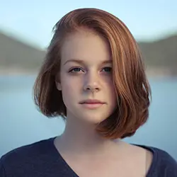
A simple media object with an avatar image on the left side - ideal for testimonials / reviews, profile card or for a newsfeed post.

John Doe Posted on February 19, 2021
Lorem ipsum dolor sit amet, consectetur adipiscing elit, sed do eiusmod tempor incididunt ut labore et dolore magna aliqua.
          <!-- Media object -->
          <div class="d-flex">
            <!-- Image -->
            <img
              src="https://mdbcdn.b-cdn.net/img/new/avatars/2.webp"
              alt="John Doe"
              class="me-3 rounded-circle"
              style="width: 60px; height: 60px;"
            />
            <!-- Body -->
            <div>
              <h5 class="fw-bold">
                John Doe
                <small class="text-muted">Posted on February 19, 2021</small>
              </h5>
              <p>
                Lorem ipsum dolor sit amet, consectetur adipiscing elit, sed do eiusmod tempor
                incididunt ut labore et dolore magna aliqua.
              </p>
            </div>
          </div>
          <!-- Media object -->
Nesting
Nesting media objects comes very handy, when you need to create a layout for comments or a chat app.
John Doe Posted on February 19, 2021
Lorem ipsum dolor sit amet, consectetur adipiscing elit, sed do eiusmod tempor incididunt ut labore et dolore magna aliqua.
Anna Doe Posted on February 19, 2021
Lorem ipsum dolor sit amet, consectetur adipiscing elit, sed do eiusmod tempor incididunt ut labore et dolore magna aliqua. Lorem ipsum dolor sit amet, consectetur adipiscing elit, sed do eiusmod tempor incididunt ut labore et dolore magna aliqua.
          <!-- Media object -->
          <div class="d-flex">
            <!-- Image -->
            <img
              src="https://mdbcdn.b-cdn.net/img/new/avatars/2.webp"
              alt="John Doe"
              class="me-3 rounded-circle"
              style="width: 60px; height: 60px;"
            />
            <!-- Media body -->
            <div>
              <h5 class="fw-bold">
                John Doe
                <small class="text-muted">Posted on February 19, 2021</small>
              </h5>
              <p>
                Lorem ipsum dolor sit amet, consectetur adipiscing elit, sed do eiusmod tempor
                incididunt ut labore et dolore magna aliqua.
              </p>
              <!-- Nested Media object -->
              <div class="d-flex mt-4">
                <img
                  src="https://mdbcdn.b-cdn.net/img/new/avatars/4.webp"
                  alt="Anna Doe"
                  class="me-3 rounded-circle"
                  style="width: 60px; height: 60px;"
                />
                <div>
                  <h5 class="fw-bold">
                    Anna Doe
                    <small class="text-muted">Posted on February 19, 2021</small>
                  </h5>
                  <p>
                    Lorem ipsum dolor sit amet, consectetur adipiscing elit, sed do eiusmod tempor
                    incididunt ut labore et dolore magna aliqua. Lorem ipsum dolor sit amet,
                    consectetur adipiscing elit, sed do eiusmod tempor incididunt ut labore et
                    dolore magna aliqua.
                  </p>
                </div>
              </div>
              <!-- Nested Media object -->
            </div>
            <!-- Media body -->
          </div>
          <!-- Media object -->