Modal
Bootstrap 5 Modal component
Responsive popup window with Bootstrap 5. Examples of with image, modal position i.e. center, z-index usage, modal fade animation, backdrop usage, modal size & more.
Modal is a responsive popup used to display extra content. That includes prompts, configurations, cookie consents, etc.
Use MDB modal component to add dialogs to your site for lightboxes, user notifications, or completely custom content.
Note: Read the API tab to find all available options and advanced customization
*
* UMD autoinits are enabled
by default. This means that you don't need to initialize
the component manually. However if you are using MDBootstrap ES format then you should pass
the required components to the initMDB method.
Basic example
Click the button to launch the modal.
            <!-- Button trigger modal -->
            <button type="button" class="btn btn-primary" data-mdb-ripple-init data-mdb-modal-init data-mdb-target="#exampleModal">
              Launch demo modal
            </button>

            <!-- Modal -->
            <div class="modal fade" id="exampleModal" tabindex="-1" aria-labelledby="exampleModalLabel" aria-hidden="true">
              <div class="modal-dialog">
                <div class="modal-content">
                  <div class="modal-header">
                    <h5 class="modal-title" id="exampleModalLabel">Modal title</h5>
                    <button type="button" class="btn-close" data-mdb-ripple-init data-mdb-dismiss="modal" aria-label="Close"></button>
                  </div>
                  <div class="modal-body">...</div>
                  <div class="modal-footer">
                    <button type="button" class="btn btn-secondary" data-mdb-ripple-init data-mdb-dismiss="modal">Close</button>
                    <button type="button" class="btn btn-primary" data-mdb-ripple-init>Save changes</button>
                  </div>
                </div>
              </div>
            </div>
          // Initialization for ES Users
          import { Modal, Ripple, initMDB } from "mdb-ui-kit";

          initMDB({ Modal, Ripple });
Advanced examples
Click the buttons to launch the modals.
Frame modal
Position
Side modal
Position
Central modal

Size

How it works
Before getting started with MDB modal component, be sure to read the following as our menu options have recently changed.
-
Modals are built with HTML, CSS, and JavaScript. They’re positioned over everything else in
the document and remove scroll from the
<body>so that modal content scrolls instead. - Clicking on the modal “backdrop” will automatically close the modal.
- Bootstrap only supports one modal window at a time. Nested modals aren’t supported as we believe them to be poor user experiences.
-
Modals use
position: fixed, which can sometimes be a bit particular about its rendering. Whenever possible, place your modal HTML in a top-level position to avoid potential interference from other elements. You’ll likely run into issues when nesting a.modalwithin another fixed element. -
Once again, due to
position: fixed, there are some caveats with using modals on mobile devices. -
Due to how HTML5 defines its semantics,
the
autofocusHTML attribute has no effect in Bootstrap modals. To achieve the same effect, use some custom JavaScript:
            const myModal = document.getElementById('myModal');
            const myInput = document.getElementById('myInput');

            myModal.addEventListener('shown.mdb.modal', () => {
              myInput.focus();
            });
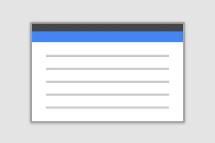
Modal components
Below is a static modal example (meaning its position and
display have been overridden). Included are the modal header, modal body
(required for padding), and modal footer (optional). We ask that you include
modal headers with dismiss actions whenever possible, or provide another explicit dismiss
action.
            <div class="modal" tabindex="-1">
              <div class="modal-dialog">
                <div class="modal-content">
                  <div class="modal-header">
                    <h5 class="modal-title">Modal title</h5>
                    <button type="button" class="btn-close" data-mdb-ripple-init data-mdb-dismiss="modal" aria-label="Close"></button>
                  </div>
                  <div class="modal-body">
                    <p>Modal body text goes here.</p>
                  </div>
                  <div class="modal-footer">
                    <button type="button" class="btn btn-secondary" data-mdb-ripple-init data-mdb-dismiss="modal">Close</button>
                    <button type="button" class="btn btn-primary" data-mdb-ripple-init>Save changes</button>
                  </div>
                </div>
              </div>
            </div>
            // Initialization for ES Users
            import { Modal, Ripple, initMDB } from "mdb-ui-kit";

            initMDB({ Modal, Ripple });
Position
To change the position of the modal add one of the following classes to the
.modal-dialog
Top right: .modal-side +
.modal-top-right
Top left: .modal-side +
.modal-top-left
Bottom right: .modal-side +
.modal-bottom-right
Bottom left: .modal-side +
.modal-bottom-right
Note: If you want to change the direction of modal animation, add the class
.top, .right, bottom or .left to the
.modal div.
              <!-- Button trigger modal -->
              <button type="button" class="btn btn-primary m-1" data-mdb-ripple-init data-mdb-modal-init data-mdb-target="#exampleSideModal1">
                Top right
              </button>

              <!-- Modal example - top right -->
              <div class="modal fade right" id="exampleSideModal1" tabindex="-1" aria-labelledby="exampleSideModal1" aria-hidden="true">
                <div class="modal-dialog modal-side modal-top-right">
                  <div class="modal-content">
                    <div class="modal-header bg-info text-white">
                      <h5 class="modal-title" id="exampleSideModal1">Product in the cart</h5>
                      <button type="button" class="btn-close btn-close-white" data-mdb-ripple-init data-mdb-dismiss="modal" aria-label="Close"></button>
                    </div>
                    <div class="modal-body">
                      <div class="row">
                        <div class="col-3 text-center">
                          <i class="fas fa-shopping-cart fa-4x text-info"></i>
                        </div>

                        <div class="col-9">
                          <p>Do you need more time to make a purchase decision?</p>
                          <p>No pressure, your product will be waiting for you in the cart.</p>
                        </div>
                      </div>
                    </div>
                    <div class="modal-footer">
                      <button type="button" class="btn btn-info" data-mdb-ripple-init>Go to the cart</button>
                      <button type="button" class="btn btn-outline-info" data-mdb-ripple-init data-mdb-dismiss="modal">Close</button>
                    </div>
                  </div>
                </div>
              </div>
              // Initialization for ES Users
              import { Modal, Ripple, initMDB } from "mdb-ui-kit";

              initMDB({ Modal, Ripple });
Frame
To make the modal "frame-like" add class .frame to .modal div and
.modal-frame class to the .modal-dialog element. You also need to
specify the direction by adding .modal-bottom or .modal-top to
the .modal-dialog.
              <!-- Button trigger modal -->
              <button type="button" class="btn btn-primary" data-mdb-ripple-init data-mdb-modal-init data-mdb-target="#exampleFrameModal2">
                Launch frame modal
              </button>

              <!-- Modal frame bottom example -->
              <div class="modal frame fade bottom" id="exampleFrameModal2" tabindex="-1" aria-labelledby="exampleFrameModal2" aria-hidden="true">
                <div class="modal-dialog modal-frame modal-bottom">
                  <div class="modal-content rounded-0">
                    <div class="modal-body py-1">
                      <div class="d-flex justify-content-center align-items-center my-3">
                        <p class="mb-0">We use cookies to improve your website experience</p>
                        <button type="button" class="btn btn-success btn-sm ms-2" data-mdb-ripple-init data-mdb-dismiss="modal">Ok, thanks</button>
                        <button type="button" class="btn btn-primary btn-sm ms-2" data-mdb-ripple-init>Learn more</button>
                      </div>
                    </div>
                  </div>
                </div>
              </div>
              <!-- Modal frame bottom example-->
            // Initialization for ES Users
            import { Modal, Ripple, initMDB } from "mdb-ui-kit";

            initMDB({ Modal, Ripple });
Static backdrop
When backdrop is set to static, the modal will not close when clicking outside it. Click the button below to try it.
              <!-- Button trigger modal -->
              <button type="button" class="btn btn-primary" data-mdb-ripple-init data-mdb-modal-init data-mdb-target="#staticBackdrop">
                Launch static backdrop modal
              </button>

              <!-- Modal -->
              <div
                class="modal fade"
                id="staticBackdrop"
                data-mdb-backdrop="static"
                data-mdb-keyboard="false"
                tabindex="-1"
                aria-labelledby="staticBackdropLabel"
                aria-hidden="true"
              >
                <div class="modal-dialog">
                  <div class="modal-content">
                    <div class="modal-header">
                      <h5 class="modal-title" id="staticBackdropLabel">Modal title</h5>
                      <button type="button" class="btn-close" data-mdb-ripple-init data-mdb-dismiss="modal" aria-label="Close"></button>
                    </div>
                    <div class="modal-body">...</div>
                    <div class="modal-footer">
                      <button type="button" class="btn btn-secondary" data-mdb-ripple-init data-mdb-dismiss="modal">Close</button>
                      <button type="button" class="btn btn-primary" data-mdb-ripple-init>Understood</button>
                    </div>
                  </div>
                </div>
              </div>
            // Initialization for ES Users
            import { Modal, Ripple, initMDB } from "mdb-ui-kit";

            initMDB({ Modal, Ripple });
Scrolling long content
When modals become too long for the user’s viewport or device, they scroll independent of the page itself. Try the demo below to see what we mean.
You can also create a scrollable modal that allows scroll the modal body by adding
.modal-dialog-scrollable to .modal-dialog.
              <!-- Scrollable modal -->
              <div class="modal-dialog modal-dialog-scrollable">...</div>
            // Initialization for ES Users
            import { Modal, Ripple, initMDB } from "mdb-ui-kit";

            initMDB({ Modal, Ripple });
Vertically centered
Add .modal-dialog-centered to .modal-dialog to vertically center
the modal.
              <!-- Vertically centered modal -->
              <div class="modal-dialog modal-dialog-centered">...</div>

              <!-- Vertically centered scrollable modal -->
              <div class="modal-dialog modal-dialog-centered modal-dialog-scrollable">...</div>
            // Initialization for ES Users
            import { Modal, Ripple, initMDB } from "mdb-ui-kit";

            initMDB({ Modal, Ripple });
Tooltips and popovers
Tooltips and popovers can be placed within modals as needed. When modals are closed, any tooltips and popovers within are also automatically dismissed.
              <div class="modal-body">
                <h5>Popover in a modal</h5>
                <p>
                  This
                  <a
                    href="#!"
                    role="button"
                    class="btn btn-secondary popover-test"
                    data-mdb-ripple-init
                    data-mdb-popover-init
                    title="Popover title"
                    data-mdb-content="Popover body content is set in this attribute."
                    >button</a
                  >
                  triggers a popover on click.
                </p>
                <hr />
                <h5>Tooltips in a modal</h5>
                <p>
                  <a href="#!" class="tooltip-test" data-mdb-popover-init title="Tooltip">This link</a>
                  and
                  <a href="#!" class="tooltip-test" data-mdb-popover-init title="Tooltip">that link</a>
                  have tooltips on hover.
                </p>
              </div>
            // Initialization for ES Users
            import { Modal, Ripple, Tooltip, Popover, initMDB } from "mdb-ui-kit";

            initMDB({ Modal, Ripple, Tooltip, Popover });
Using the grid
Utilize the Bootstrap grid system within a modal by nesting
.container-fluid within the .modal-body. Then, use the normal grid
system classes as you would anywhere else.
              <div class="modal-body">
                <div class="container-fluid">
                  <div class="row">
                    <div class="col-md-4">.col-md-4</div>
                    <div class="col-md-4 ms-auto">.col-md-4 .ms-auto</div>
                  </div>
                  <div class="row">
                    <div class="col-md-3 ms-auto">.col-md-3 .ms-auto</div>
                    <div class="col-md-2 ms-auto">.col-md-2 .ms-auto</div>
                  </div>
                  <div class="row">
                    <div class="col-md-6 ms-auto">.col-md-6 .ms-auto</div>
                  </div>
                  <div class="row">
                    <div class="col-sm-9">
                      Level 1: .col-sm-9
                      <div class="row">
                        <div class="col-8 col-sm-6">Level 2: .col-8 .col-sm-6</div>
                        <div class="col-4 col-sm-6">Level 2: .col-4 .col-sm-6</div>
                      </div>
                    </div>
                  </div>
                </div>
              </div>
Varying modal content
Have a bunch of buttons that all trigger the same modal with slightly different contents?
Use
event.relatedTarget and
HTML data-mdb-* attributes
to vary the contents of the modal depending on which button was clicked.
Below is a live demo followed by example HTML and JavaScript. For more information, read the
modal API/events doc for details on relatedTarget.
              <button
                type="button"
                class="btn btn-primary"
                data-mdb-ripple-init
                data-mdb-modal-init
                data-mdb-target="#exampleModal"
                data-mdb-whatever="@mdo"
              >
                Open modal for @mdo
              </button>
              <button
                type="button"
                class="btn btn-primary"
                data-mdb-ripple-init
                data-mdb-modal-init
                data-mdb-target="#exampleModal"
                data-mdb-whatever="@fat"
              >
                Open modal for @fat
              </button>
              <button
                type="button"
                class="btn btn-primary"
                data-mdb-ripple-init
                data-mdb-modal-init
                data-mdb-target="#exampleModal"
                data-mdb-whatever="@getbootstrap"
              >
                Open modal for @getbootstrap
              </button>

              <div class="modal fade" id="exampleModal" tabindex="-1" aria-labelledby="exampleModalLabel" aria-hidden="true">
                <div class="modal-dialog">
                  <div class="modal-content">
                    <div class="modal-header">
                      <h5 class="modal-title" id="exampleModalLabel">New message</h5>
                      <button type="button" class="btn-close" data-mdb-ripple-init data-mdb-dismiss="modal" aria-label="Close"></button>
                    </div>
                    <div class="modal-body">
                      <form>
                        <div class="mb-3">
                          <label for="recipient-name" class="col-form-label">Recipient:</label>
                          <input type="text" class="form-control" id="recipient-name" />
                        </div>
                        <div class="mb-3">
                          <label for="message-text" class="col-form-label">Message:</label>
                          <textarea class="form-control" id="message-text"></textarea>
                        </div>
                      </form>
                    </div>
                    <div class="modal-footer">
                      <button type="button" class="btn btn-secondary" data-mdb-ripple-init data-mdb-dismiss="modal">Close</button>
                      <button type="button" class="btn btn-primary" data-mdb-ripple-init>Send message</button>
                    </div>
                  </div>
                </div>
              </div>
              // Initialization for ES Users
              import { Modal, initMDB } from "mdb-ui-kit";
              initMDB({ Modal });

              const exampleModal = document.getElementById('exampleModal');
              exampleModal.addEventListener('show.mdb.modal', (e) => {
                // Button that triggered the modal
                const button = e.relatedTarget;
                // Extract info from data-mdb-* attributes
                const recipient = button.getAttribute('data-mdb-whatever');
                // If necessary, you could initiate an AJAX request here
                // and then do the updating in a callback.
                //
                // Update the modal's content.
                const modalTitle = exampleModal.querySelector('.modal-title');
                const modalBodyInput = exampleModal.querySelector('.modal-body input');

                modalTitle.textContent = `New message to ${recipient}`;
                modalBodyInput.value = recipient;
              })
            const exampleModal = document.getElementById('exampleModal');
            exampleModal.addEventListener('show.mdb.modal', (e) => {
              // Button that triggered the modal
              const button = e.relatedTarget;
              // Extract info from data-mdb-* attributes
              const recipient = button.getAttribute('data-mdb-whatever');
              // If necessary, you could initiate an AJAX request here
              // and then do the updating in a callback.
              //
              // Update the modal's content.
              const modalTitle = exampleModal.querySelector('.modal-title');
              const modalBodyInput = exampleModal.querySelector('.modal-body input');

              modalTitle.textContent = `New message to ${recipient}`;
              modalBodyInput.value = recipient;
            })
Toggle between modals
Toggle between multiple modals with some clever placement of the
data-mdb-target attribute. For example, you
could toggle a password reset modal from within an already open sign in modal.
Please note multiple modals cannot be open at the same time—this method
simply toggles between two separate modals.
Below is a live demo followed by example HTML. For more information, read the
modal API/events doc for details on relatedTarget.
              <a class="btn btn-primary" data-mdb-ripple-init data-mdb-modal-init href="#exampleModalToggle1" role="button">Open first modal</a>

              <!-- First modal dialog -->
              <div class="modal fade" id="exampleModalToggle1" aria-hidden="true" aria-labelledby="exampleModalToggleLabel1" tabindex="-1">
                <div class="modal-dialog modal-dialog-centered">
                  <div class="modal-content">
                    <div class="modal-header">
                      <h5 class="modal-title" id="exampleModalToggleLabel1">Modal 1</h5>
                      <button type="button" class="btn-close" data-mdb-ripple-init data-mdb-dismiss="modal" aria-label="Close"></button>
                    </div>
                    <div class="modal-body">
                      Show a second modal and hide this one with the button below.
                    </div>
                    <div class="modal-footer">
                      <button class="btn btn-primary" data-mdb-ripple-init data-mdb-target="#exampleModalToggle22" data-mdb-modal-init data-mdb-dismiss="modal">
                        Open second modal
                      </button>
                    </div>
                  </div>
                </div>
              </div>
              <!-- Second modal dialog -->
              <div class="modal fade" id="exampleModalToggle22" aria-hidden="true" aria-labelledby="exampleModalToggleLabel22" tabindex="-1">
                <div class="modal-dialog modal-dialog-centered">
                  <div class="modal-content">
                    <div class="modal-header">
                      <h5 class="modal-title" id="exampleModalToggleLabel22">Modal 2</h5>
                      <button type="button" class="btn-close" data-mdb-ripple-init data-mdb-dismiss="modal" aria-label="Close"></button>
                    </div>
                    <div class="modal-body">
                      Hide this modal and show the first with the button below.
                    </div>
                    <div class="modal-footer">
                      <button class="btn btn-primary" data-mdb-ripple-init data-mdb-target="#exampleModalToggle1" data-mdb-modal-init>
                        Back to first
                      </button>
                    </div>
                  </div>
                </div>
              </div>
              // Initialization for ES Users
              import { Modal, initMDB } from "mdb-ui-kit";

              initMDB({ Modal });
Change animation
The $modal-fade-transform variable determines the transform state of
.modal-dialog before the modal fade-in animation, the
$modal-show-transform variable determines the transform of
.modal-dialog at the end of the modal fade-in animation.
If you want for example a zoom-in animation, you can set
$modal-fade-transform: scale(.8).
Remove animation
For modals that simply appear rather than fade in to view, remove the
.fade class from your modal markup.
<div class="modal" tabindex="-1" aria-labelledby="..." aria-hidden="true">...</div>
              // Initialization for ES Users
              import { Modal, initMDB } from "mdb-ui-kit";

              initMDB({ Modal });
Dynamic heights
If the height of a modal changes while it is open, you should call
myModal.handleUpdate() to readjust the modal’s position in case a scrollbar
appears.
Accessibility
Be sure to add aria-labelledby="...", referencing the modal title, to
.modal. Additionally, you may give a description of your modal dialog with
aria-describedby on .modal. Note that you don’t need to add
role="dialog" since we already add it via JavaScript.
Embedding YouTube videos
Embedding YouTube videos in modals requires additional JavaScript not in Bootstrap to automatically stop playback and more. See this helpful Stack Overflow post for more information.
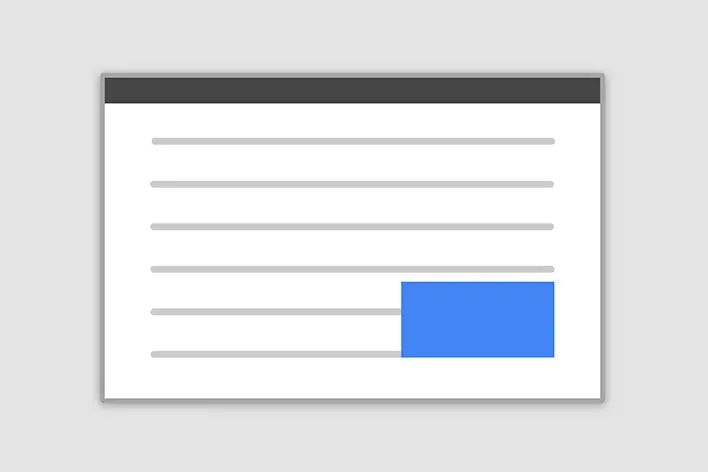
Optional sizes
Modals have three optional sizes, available via modifier classes to be placed on a
.modal-dialog. These sizes kick in at certain breakpoints to avoid horizontal
scrollbars on narrower viewports.
| Size | Class | Modal max-width |
|---|---|---|
| Small | .modal-sm |
300px |
| Default | None | 500px |
| Large | .modal-lg |
800px |
| Extra large | .modal-xl |
1140px |
<div class="modal-dialog modal-xl">...</div>
<div class="modal-dialog modal-lg">...</div>
<div class="modal-dialog modal-sm">...</div>
Fullscreen Modal
Another override is the option to pop up a modal that covers the user viewport, available
via modifier classes that are placed on a .modal-dialog.
| Class | Availability |
|---|---|
.modal-fullscreen |
Always |
.modal-fullscreen-sm-down |
Below 576px |
.modal-fullscreen-md-down |
Below 768px |
.modal-fullscreen-lg-down |
Below 992px |
.modal-fullscreen-xl-down |
Below 1200px |
.modal-fullscreen-xxl-down |
Below 1400px |
<!-- Full screen modal -->
<div class="modal-dialog modal-fullscreen-sm-down">...</div>
Non-invasive Modal
This type of modal does not block any interaction on the page. Simply set data-mdb-modal-non-invasive to true.
<!-- Button trigger modal -->
<button
type="button"
class="btn btn-primary"
data-mdb-ripple-init
data-mdb-modal-init
data-mdb-target="#exampleNonInvasiveModal"
>
Launch demo modal
</button>
<!-- Modal -->
<div
class="modal fade"
id="exampleNonInvasiveModal"
tabindex="-1"
role="dialog"
aria-labelledby="exampleNonInvasiveModalLabel"
aria-hidden="true"
data-mdb-modal-non-invasive="true"
>
<div class="modal-dialog" role="document">
<div class="modal-content">
<div class="modal-header">
<h5 class="modal-title" id="exampleModalLabel">Modal title</h5>
<button
type="button"
class="btn-close"
data-mdb-ripple-init
data-mdb-dismiss="modal"
aria-label="Close"
></button>
</div>
<div class="modal-body">...</div>
<div class="modal-footer">
<button type="button" class="btn btn-secondary" data-mdb-ripple-init data-mdb-dismiss="modal">
Close
</button>
<button type="button" class="btn btn-primary" data-mdb-ripple-init>Save changes</button>
</div>
</div>
</div>
</div>
                // Initialization for ES Users
                import { Modal, Ripple, initMDB } from "mdb-ui-kit";

                initMDB({ Modal, Ripple });
Modal - API
Import
Importing components depends on how your application works. If you intend to use the MDBootstrap ES format, you must
first import the component and then initialize it with the initMDB method. If you are going to use the UMD format,
just import the mdb-ui-kit package.
          import { Modal, initMDB } from "mdb-ui-kit";

          initMDB({ Modal });
import "mdb-ui-kit"
Usage
The modal plugin toggles your hidden content on demand, via data attributes or JavaScript. It
also overrides default scrolling behavior and generates a .modal-backdrop to
provide a click area for dismissing shown modals when clicking outside the modal.
Via data attributes
Using the Modal component doesn't require any additional JavaScript code - simply add
data-mdb-modal-init attribute to
toggle button
and use other data attributes to set all options.
For ES format, you must first import and call the initMDB method.
            <button type="button" data-mdb-modal-init data-mdb-target="#myModal">
              Launch modal
            </button>
Dismiss
Dismissal can be achieved with data attributes on a button within the modal as demonstrated below:
<button type="button" class="btn-close" data-mdb-dismiss="modal" aria-label="Close"></button>
or on a button outside the modal using the data-mdb-target as
demonstrated below:
            <button type="button" class="btn-close" data-mdb-dismiss="modal" data-mdb-target="#my-modal"
              aria-label="Close"></button>
While both ways to dismiss a modal are supported, keep in mind that dismissing from outside a modal does not match the WAI-ARIA modal dialog design pattern. Do this at your own risk.
Via JavaScript
            const element = document.querySelector('.modal');
            const instance = new Modal(element, options)
            const element = document.querySelector('.modal');
            const instance = new mdb.Modal(element, options)
Options
Options can be passed via data attributes or JavaScript. For data attributes, append the option name to
data-mdb-, as in data-mdb-backdrop="static".
| Name | Type | Default | Description |
|---|---|---|---|
backdrop |
boolean or the string 'static' |
true |
Includes a modal-backdrop element. Alternatively, specify
static for a backdrop which doesn't close the modal on click.
|
keyboard |
boolean | true |
Closes the modal when escape key is pressed |
focus |
boolean | true |
Puts the focus on the modal when initialized. |
Methods
Asynchronous methods and transitions:
All API methods are asynchronous and start a transition.
They return to the caller as soon as the transition is started but
before it ends. In addition, a method call on a
transitioning component will be ignored.
Passing options
Activates your content as a modal. Accepts an optional options
object.
| Method | Description | Example |
|---|---|---|
dispose |
Destroys an element’s modal. | myModal.dispose() |
handleUpdate |
Manually readjust the modal’s position if the height of a modal changes while it is open (i.e. in case a scrollbar appears). | myModal.handleUpdate() |
hide |
Manually hides a modal.
Returns to the caller before the modal has actually been hidden
(i.e. before the hidden.mdb.modal event occurs).
|
myModal.hide() |
show |
Manually opens a modal.
Returns to the caller before the modal has actually been shown
(i.e. before the shown.mdb.modal event occurs).
|
myModal.show() |
toggle |
Manually toggles a modal.
Returns to the caller before the modal has actually been shown or hidden
(i.e. before the shown.mdb.modal or hidden.mdb.modal event
occurs).
|
myModal.toggle() |
getInstance |
Static method which allows you to get the modal instance associated with a DOM element. | Modal.getInstance() |
getOrCreateInstance |
Static method which allows you to get the modal instance associated with a DOM element or create a new one in case it wasn't initialized. | Modal.getOrCreateInstance() |
            const myModalEl = document.getElementById('myModal')
            const modal = new Modal(myModalEl)
            modal.show()
            const myModalEl = document.getElementById('myModal')
            const modal = new mdb.Modal(myModalEl)
            modal.show()
Events
Bootstrap’s modal class exposes a few events for hooking into modal functionality. All modal
events are fired at the modal itself (i.e. at the
<div class="modal">).
| Event type | Description |
|---|---|
show.mdb.modal |
This event fires immediately when the show instance method is called. If
caused by a click, the clicked element is available as the
relatedTarget property of the event.
|
shown.mdb.modal |
This event is fired when the modal has been made visible to the user (will wait for CSS
transitions to complete). If caused by a click, the clicked element is available as the
relatedTarget property of the event.
|
hide.mdb.modal |
This event is fired immediately when the hide instance method has been
called.
|
hidden.mdb.modal |
This event is fired when the modal has finished being hidden from the user (will wait for CSS transitions to complete). |
hidePrevented.mdb.modal |
This event is fired when the modal is shown, its backdrop is
static and a click outside the modal or an escape key press is performed
with the keyboard option or data-mdb-keyboard set to false.
|
            const myModalEl = document.getElementById('myModal')
            myModalEl.addEventListener('hidden.mdb.modal', (e) => {
              // do something...
            })
CSS variables
As part of MDB’s evolving CSS variables approach, modal now use local CSS variables on
.modal for enhanced real-time customization. Values for the CSS variables are set
via Sass, so Sass customization is still supported, too.
Modal's CSS variables are in different classes which belong to this component. To make it easier to use them, you can find below all of the used CSS variables.
        // Variables for modal free
        // .modal
        --#{$prefix}modal-zindex: #{$zindex-modal};
        --#{$prefix}modal-width: #{$modal-md};
        --#{$prefix}modal-padding: #{$modal-inner-padding};
        --#{$prefix}modal-margin: #{$modal-dialog-margin};
        --#{$prefix}modal-color: #{$modal-content-color};
        --#{$prefix}modal-bg: #{$modal-content-bg};
        --#{$prefix}modal-border-color: #{$modal-content-border-color};
        --#{$prefix}modal-border-width: #{$modal-content-border-width};
        --#{$prefix}modal-border-radius: #{$modal-content-border-radius};
        --#{$prefix}modal-box-shadow: #{$modal-content-box-shadow-xs};
        --#{$prefix}modal-inner-border-radius: #{$modal-content-inner-border-radius};
        --#{$prefix}modal-header-padding-x: #{$modal-header-padding-x};
        --#{$prefix}modal-header-padding-y: #{$modal-header-padding-y};
        --#{$prefix}modal-header-padding: #{$modal-header-padding}; // Todo in v6: Split this padding into x and y
        --#{$prefix}modal-header-border-color: #{$modal-header-border-color};
        --#{$prefix}modal-header-border-width: #{$modal-header-border-width};
        --#{$prefix}modal-title-line-height: #{$modal-title-line-height};
        --#{$prefix}modal-footer-gap: #{$modal-footer-margin-between};
        --#{$prefix}modal-footer-bg: #{$modal-footer-bg};
        --#{$prefix}modal-footer-border-color: #{$modal-footer-border-color};
        --#{$prefix}modal-footer-border-width: #{$modal-footer-border-width};

        // .modal-backdrop
        --#{$prefix}backdrop-zindex: #{$zindex-modal-backdrop};
        --#{$prefix}backdrop-bg: #{$modal-backdrop-bg};
        --#{$prefix}backdrop-opacity: #{$modal-backdrop-opacity};

        // .modal
        --#{$prefix}modal-margin: #{$modal-dialog-margin-y-sm-up};
        --#{$prefix}modal-box-shadow: #{$modal-content-box-shadow-sm-up};

        // .modal-sm
        --#{$prefix}modal-width: #{$modal-sm};

        // .modal-lg,
        // .modal-xl
        --#{$prefix}modal-width: #{$modal-lg};

        // .modal-xl
        --#{$prefix}modal-width: #{$modal-xl};

        // .modal-content
        --#{$prefix}modal-box-shadow: #{$modal-box-shadow};

        // Variables for modal pro
        // .modal
        --#{$prefix}modal-top-left-top: #{$modal-top-left-top};
        --#{$prefix}modal-top-left-left: #{$modal-top-left-left};
        --#{$prefix}modal-top-right-top: #{$modal-top-right-top};
        --#{$prefix}modal-top-right-right: #{$modal-top-right-right};
        --#{$prefix}modal-bottom-left-bottom: #{$modal-bottom-left-bottom};
        --#{$prefix}modal-bottom-left-left: #{$modal-bottom-left-left};
        --#{$prefix}modal-bottom-right-bottom: #{$modal-bottom-right-bottom};
        --#{$prefix}modal-bottom-right-right: #{$modal-bottom-right-right};
        --#{$prefix}modal-fade-top-transform: #{$modal-fade-top-transform};
        --#{$prefix}modal-fade-right-transform: #{$modal-fade-right-transform};
        --#{$prefix}modal-fade-bottom-transform: #{$modal-fade-bottom-transform};
        --#{$prefix}modal-fade-left-transform: #{$modal-fade-left-transform};
        --#{$prefix}modal-side-right: #{$modal-side-right};
        --#{$prefix}modal-side-bottom: #{$modal-side-bottom};
        --#{$prefix}modal-non-invasive-box-shadow: #{$modal-non-invasive-box-shadow};
        --#{$prefix}modal-non-invasive-box-shadow-top: #{$modal-non-invasive-box-shadow-top};
SCSS variables
        // Variables for modal free
        $modal-inner-padding: $spacer;

        $modal-footer-margin-between: 0.5rem;

        $modal-dialog-margin: 0.5rem;
        $modal-dialog-margin-y-sm-up: 1.75rem;

        $modal-title-line-height: $line-height-base;

        $modal-content-border-color: var(--#{$prefix}border-color-translucent);
        $modal-content-border-width: var(--#{$prefix}border-width);
        $modal-content-inner-border-radius: subtract(
          $modal-content-border-radius,
          $modal-content-border-width
        );
        $modal-content-box-shadow-xs: var(--#{$prefix}box-shadow-sm);
        $modal-content-box-shadow-sm-up: var(--#{$prefix}box-shadow);

        $modal-backdrop-bg: $black;
        $modal-backdrop-opacity: 0.5;

        $modal-header-padding-y: $modal-inner-padding;
        $modal-header-padding-x: $modal-inner-padding;
        $modal-header-padding: $modal-header-padding-y $modal-header-padding-x; // Keep this for backwards compatibility

        $modal-footer-bg: null;

        $modal-sm: 300px;
        $modal-md: 500px;
        $modal-lg: 800px;
        $modal-xl: 1140px;

        $modal-fade-transform: translate(0, -50px);
        $modal-show-transform: none;
        $modal-transition: transform 0.3s ease-out;
        $modal-scale-transform: scale(1.02);

        $modal-box-shadow: $box-shadow-4;
        $modal-content-border-radius: $border-radius-lg;
        $modal-header-border-color: var(--#{$prefix}divider-color);
        $modal-footer-border-color: var(--#{$prefix}divider-color);
        $modal-header-border-width: $border-width-alternate;
        $modal-footer-border-width: $border-width-alternate;
        $modal-content-color: var(--#{$prefix}surface-color);
        $modal-content-bg: var(--#{$prefix}surface-bg);

        // Variables for modal pro
        $modal-top-left-top: 10px;
        $modal-top-left-left: 10px;
        $modal-top-right-top: 10px;
        $modal-top-right-right: 10px;
        $modal-bottom-left-bottom: 10px;
        $modal-bottom-left-left: 10px;
        $modal-bottom-right-bottom: 10px;
        $modal-bottom-right-right: 10px;
        $modal-fade-top-transform: translate3d(0, -25%, 0);
        $modal-fade-right-transform: translate3d(25%, 0, 0);
        $modal-fade-bottom-transform: translate3d(0, 25%, 0);
        $modal-fade-left-transform: translate3d(-25%, 0, 0);
        $modal-side-right: 10px;
        $modal-side-bottom: 10px;

        $modal-non-invasive-box-shadow: $box-shadow-3;
        $modal-non-invasive-box-shadow-top: $box-shadow-3-top;