Image grid
Bootstrap 5 Image grid component
Responsive Image grid built with Bootstrap 5. Bootstrap image grid is a simple construction that allows you to create a responsive layout for your images.
Basic example
Use .row and .col to create a grid. To learn more about it, read Grid Docs.
.webp)

.webp)
<!-- Gallery -->
<div class="row">
<div class="col-lg-4 col-md-12 mb-4 mb-lg-0">
<img
src="https://mdbcdn.b-cdn.net/img/Photos/Horizontal/Nature/4-col/img%20(73).webp"
class="w-100 shadow-1-strong rounded mb-4"
alt="Boat on Calm Water"
/>
<img
src="https://mdbcdn.b-cdn.net/img/Photos/Vertical/mountain1.webp"
class="w-100 shadow-1-strong rounded mb-4"
alt="Wintry Mountain Landscape"
/>
</div>
<div class="col-lg-4 mb-4 mb-lg-0">
<img
src="https://mdbcdn.b-cdn.net/img/Photos/Vertical/mountain2.webp"
class="w-100 shadow-1-strong rounded mb-4"
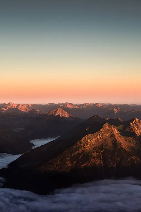
alt="Mountains in the Clouds"
/>
<img
src="https://mdbcdn.b-cdn.net/img/Photos/Horizontal/Nature/4-col/img%20(73).webp"
class="w-100 shadow-1-strong rounded mb-4"
alt="Boat on Calm Water"
/>
</div>
<div class="col-lg-4 mb-4 mb-lg-0">
<img
src="https://mdbcdn.b-cdn.net/img/Photos/Horizontal/Nature/4-col/img%20(18).webp"
class="w-100 shadow-1-strong rounded mb-4"
alt="Waves at Sea"
/>
<img
src="https://mdbcdn.b-cdn.net/img/Photos/Vertical/mountain3.webp"
class="w-100 shadow-1-strong rounded mb-4"
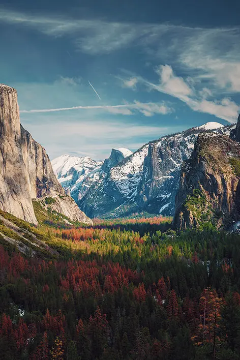
alt="Yosemite National Park"
/>
</div>
</div>
<!-- Gallery -->