Carousel
Bootstrap 5 Carousel component
Responsive carousel built with the latest Bootstrap 5. Carousel is a slideshow cycling through different elements such as photos, videos, or text. Many examples and easy tutorials.
A slideshow component for cycling through elements—images or slides of text—like a carousel.
Note: Read the API tab to find all available options and advanced customization
*
* UMD autoinits are enabled
by default. This means that you don't need to initialize
the component manually. However if you are using MDBootstrap ES format then you should pass
the required components to the initMDB method.
Basic example
Carousel allows to navigate through a collection of images in a sequential fashion, moving to the previous/next one through the arrows on the sides.
.webp)
First slide label
Nulla vitae elit libero, a pharetra augue mollis interdum.
.webp)
Second slide label
Lorem ipsum dolor sit amet, consectetur adipiscing elit.
.webp)
Third slide label
Praesent commodo cursus magna, vel scelerisque nisl consectetur.
            <!-- Carousel wrapper -->
            <div id="carouselBasicExample" class="carousel slide carousel-fade" data-mdb-ride="carousel" data-mdb-carousel-init>
              <!-- Indicators -->
              <div class="carousel-indicators">
                <button
                  type="button"
                  data-mdb-target="#carouselBasicExample"
                  data-mdb-slide-to="0"
                  class="active"
                  aria-current="true"
                  aria-label="Slide 1"
                ></button>
                <button
                  type="button"
                  data-mdb-target="#carouselBasicExample"
                  data-mdb-slide-to="1"
                  aria-label="Slide 2"
                ></button>
                <button
                  type="button"
                  data-mdb-target="#carouselBasicExample"
                  data-mdb-slide-to="2"
                  aria-label="Slide 3"
                ></button>
              </div>

              <!-- Inner -->
              <div class="carousel-inner">
                <!-- Single item -->
                <div class="carousel-item active">
                  <img src="https://mdbcdn.b-cdn.net/img/Photos/Slides/img%20(15).webp" class="d-block w-100" alt="Sunset Over the City"/>
                  <div class="carousel-caption d-none d-md-block">
                    <h5>First slide label</h5>
                    <p>Nulla vitae elit libero, a pharetra augue mollis interdum.</p>
                  </div>
                </div>

                <!-- Single item -->
                <div class="carousel-item">
                  <img src="https://mdbcdn.b-cdn.net/img/Photos/Slides/img%20(22).webp" class="d-block w-100" alt="Canyon at Nigh"/>
                  <div class="carousel-caption d-none d-md-block">
                    <h5>Second slide label</h5>
                    <p>Lorem ipsum dolor sit amet, consectetur adipiscing elit.</p>
                  </div>
                </div>

                <!-- Single item -->
                <div class="carousel-item">
                  <img src="https://mdbcdn.b-cdn.net/img/Photos/Slides/img%20(23).webp" class="d-block w-100" alt="Cliff Above a Stormy Sea"/>
                  <div class="carousel-caption d-none d-md-block">
                    <h5>Third slide label</h5>
                    <p>Praesent commodo cursus magna, vel scelerisque nisl consectetur.</p>
                  </div>
                </div>
              </div>
              <!-- Inner -->

              <!-- Controls -->
              <button class="carousel-control-prev" type="button" data-mdb-target="#carouselBasicExample" data-mdb-slide="prev">
                <span class="carousel-control-prev-icon" aria-hidden="true"></span>
                <span class="visually-hidden">Previous</span>
              </button>
              <button class="carousel-control-next" type="button" data-mdb-target="#carouselBasicExample" data-mdb-slide="next">
                <span class="carousel-control-next-icon" aria-hidden="true"></span>
                <span class="visually-hidden">Next</span>
              </button>
            </div>
            <!-- Carousel wrapper -->
            // Initialization for ES Users
            import { Carousel, initMDB } from "mdb-ui-kit";

            initMDB({ Carousel });
How it works
The carousel is a slideshow for cycling through a series of content, built with CSS 3D transforms and a bit of JavaScript. It works with a series of images, text, or custom markup. It also includes support for previous/next controls and indicators.
In browsers where the Page Visibility API is supported, the carousel will avoid sliding when the webpage is not visible to the user (such as when the browser tab is inactive, the browser window is minimized, etc.).
Note: Please be aware that nested carousels are not supported, and carousels are generally not compliant with accessibility standards.
Carousels don’t automatically normalize slide dimensions. As such, you may need to use additional utilities or custom styles to appropriately size content. While carousels support previous/next controls and indicators, they’re not explicitly required. Add and customize as you see fit.
The .active class needs to be added to one of the slides
otherwise the carousel will not be visible. Also be sure to set a unique id on the
.carousel for optional controls, especially if you’re using multiple carousels on
a single page. Control and indicator elements must have a
data-mdb-target attribute (or href for links) that matches the id of
the .carousel element.
Variations
Slides only
Here’s a carousel with slides only. Note the presence of the
.d-block and .w-100 on carousel images to prevent browser default
image alignment.
<div id="carouselExampleSlidesOnly" class="carousel slide" data-mdb-ride="carousel" data-mdb-carousel-init>
<div class="carousel-inner">
<div class="carousel-item active">
<img src="https://mdbcdn.b-cdn.net/img/new/slides/041.webp" class="d-block w-100" alt="Wild Landscape"/>
</div>
<div class="carousel-item">
<img src="https://mdbcdn.b-cdn.net/img/new/slides/042.webp" class="d-block w-100" alt="Camera"/>
</div>
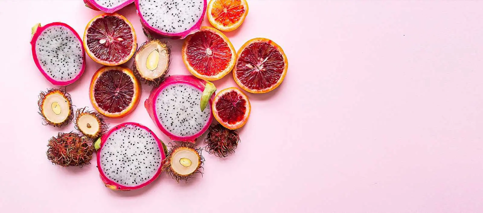
<div class="carousel-item">
<img src="https://mdbcdn.b-cdn.net/img/new/slides/043.webp" class="d-block w-100" alt="Exotic Fruits"/>
</div>
</div>
</div>
              // Initialization for ES Users
              import { Carousel, initMDB } from "mdb-ui-kit";

              initMDB({ Carousel });
With controls
Adding in the previous and next controls:
              <div id="carouselExampleControls" class="carousel slide" data-mdb-ride="carousel" data-mdb-carousel-init>
                <div class="carousel-inner">
                  <div class="carousel-item active">
                    <img src="https://mdbcdn.b-cdn.net/img/new/slides/041.webp" class="d-block w-100" alt="Wild Landscape"/>
                  </div>
                  <div class="carousel-item">
                    <img src="https://mdbcdn.b-cdn.net/img/new/slides/042.webp" class="d-block w-100" alt="Camera"/>
                  </div>
                  <div class="carousel-item">
                    <img src="https://mdbcdn.b-cdn.net/img/new/slides/043.webp" class="d-block w-100" alt="Exotic Fruits"/>
                  </div>
                </div>
                <button class="carousel-control-prev" type="button" data-mdb-target="#carouselExampleControls" data-mdb-slide="prev">
                  <span class="carousel-control-prev-icon" aria-hidden="true"></span>
                  <span class="visually-hidden">Previous</span>
                </button>
                <button class="carousel-control-next" type="button" data-mdb-target="#carouselExampleControls" data-mdb-slide="next">
                  <span class="carousel-control-next-icon" aria-hidden="true"></span>
                  <span class="visually-hidden">Next</span>
                </button>
              </div>
              // Initialization for ES Users
              import { Carousel, initMDB } from "mdb-ui-kit";

              initMDB({ Carousel });
With indicators
You can also add the indicators to the carousel, alongside the controls, too.
              <div id="carouselExampleIndicators" class="carousel slide" data-mdb-ride="carousel" data-mdb-carousel-init>
                <div class="carousel-indicators">
                  <button
                    type="button"
                    data-mdb-target="#carouselExampleIndicators"
                    data-mdb-slide-to="0"
                    class="active"
                    aria-current="true"
                    aria-label="Slide 1"
                  ></button>
                  <button
                    type="button"
                    data-mdb-target="#carouselExampleIndicators"
                    data-mdb-slide-to="1"
                    aria-label="Slide 2"
                  ></button>
                  <button
                    type="button"
                    data-mdb-target="#carouselExampleIndicators"
                    data-mdb-slide-to="2"
                    aria-label="Slide 3"
                  ></button>
                </div>
                <div class="carousel-inner">
                  <div class="carousel-item active">
                    <img src="https://mdbcdn.b-cdn.net/img/new/slides/041.webp" class="d-block w-100" alt="Wild Landscape"/>
                  </div>
                  <div class="carousel-item">
                    <img src="https://mdbcdn.b-cdn.net/img/new/slides/042.webp" class="d-block w-100" alt="Camera"/>
                  </div>
                  <div class="carousel-item">
                    <img src="https://mdbcdn.b-cdn.net/img/new/slides/043.webp" class="d-block w-100" alt="Exotic Fruits"/>
                  </div>
                </div>
                <button class="carousel-control-prev" type="button" data-mdb-target="#carouselExampleIndicators" data-mdb-slide="prev">
                  <span class="carousel-control-prev-icon" aria-hidden="true"></span>
                  <span class="visually-hidden">Previous</span>
                </button>
                <button class="carousel-control-next" type="button" data-mdb-target="#carouselExampleIndicators" data-mdb-slide="next">
                  <span class="carousel-control-next-icon" aria-hidden="true"></span>
                  <span class="visually-hidden">Next</span>
                </button>
              </div>
              // Initialization for ES Users
              import { Carousel, initMDB } from "mdb-ui-kit";

              initMDB({ Carousel });
With captions
Add captions to your slides easily with the
.carousel-caption element within any .carousel-item. They can be
easily hidden on smaller viewports, as shown below, with optional
display utilities. We hide them initially
with .d-none and bring them back on medium-sized devices with
.d-md-block.

First slide label
Nulla vitae elit libero, a pharetra augue mollis interdum.

Second slide label
Lorem ipsum dolor sit amet, consectetur adipiscing elit.
Third slide label
Praesent commodo cursus magna, vel scelerisque nisl consectetur.
              <div id="carouselExampleCaptions" class="carousel slide" data-mdb-ride="carousel" data-mdb-carousel-init>
                <div class="carousel-indicators">
                  <button
                    type="button"
                    data-mdb-target="#carouselExampleCaptions"
                    data-mdb-slide-to="0"
                    class="active"
                    aria-current="true"
                    aria-label="Slide 1"
                  ></button>
                  <button
                    type="button"
                    data-mdb-target="#carouselExampleCaptions"
                    data-mdb-slide-to="1"
                    aria-label="Slide 2"
                  ></button>
                  <button
                    type="button"
                    data-mdb-target="#carouselExampleCaptions"
                    data-mdb-slide-to="2"
                    aria-label="Slide 3"
                  ></button>
                </div>
                <div class="carousel-inner">
                  <div class="carousel-item active">
                    <img src="https://mdbcdn.b-cdn.net/img/new/slides/041.webp" class="d-block w-100" alt="Wild Landscape"/>
                    <div class="carousel-caption d-none d-md-block">
                      <h5>First slide label</h5>
                      <p>Nulla vitae elit libero, a pharetra augue mollis interdum.</p>
                    </div>
                  </div>
                  <div class="carousel-item">
                    <img src="https://mdbcdn.b-cdn.net/img/new/slides/042.webp" class="d-block w-100" alt="Camera"/>
                    <div class="carousel-caption d-none d-md-block">
                      <h5>Second slide label</h5>
                      <p>Lorem ipsum dolor sit amet, consectetur adipiscing elit.</p>
                    </div>
                  </div>
                  <div class="carousel-item">
                    <img src="https://mdbcdn.b-cdn.net/img/new/slides/043.webp" class="d-block w-100" alt="Exotic Fruits"/>
                    <div class="carousel-caption d-none d-md-block">
                      <h5>Third slide label</h5>
                      <p>Praesent commodo cursus magna, vel scelerisque nisl consectetur.</p>
                    </div>
                  </div>
                </div>
                <button class="carousel-control-prev" type="button" data-mdb-target="#carouselExampleCaptions" data-mdb-slide="prev">
                  <span class="carousel-control-prev-icon" aria-hidden="true"></span>
                  <span class="visually-hidden">Previous</span>
                </button>
                <button class="carousel-control-next" type="button" data-mdb-target="#carouselExampleCaptions" data-mdb-slide="next">
                  <span class="carousel-control-next-icon" aria-hidden="true"></span>
                  <span class="visually-hidden">Next</span>
                </button>
              </div>
              // Initialization for ES Users
              import { Carousel, initMDB } from "mdb-ui-kit";

              initMDB({ Carousel });
Crossfade
Use fade transition on your slides easily by adding the
.carousel-fade class to any .carousel.
              <div id="carouselExampleCrossfade" class="carousel slide carousel-fade" data-mdb-ride="carousel" data-mdb-carousel-init>
                <div class="carousel-indicators">
                  <button
                    type="button"
                    data-mdb-target="#carouselExampleCrossfade"
                    data-mdb-slide-to="0"
                    class="active"
                    aria-current="true"
                    aria-label="Slide 1"
                  ></button>
                  <button
                    type="button"
                    data-mdb-target="#carouselExampleCrossfade"
                    data-mdb-slide-to="1"
                    aria-label="Slide 2"
                  ></button>
                  <button
                    type="button"
                    data-mdb-target="#carouselExampleCrossfade"
                    data-mdb-slide-to="2"
                    aria-label="Slide 3"
                  ></button>
                </div>
                <div class="carousel-inner">
                  <div class="carousel-item active">
                    <img src="https://mdbcdn.b-cdn.net/img/new/slides/041.webp" class="d-block w-100" alt="Wild Landscape"/>
                  </div>
                  <div class="carousel-item">
                    <img src="https://mdbcdn.b-cdn.net/img/new/slides/042.webp" class="d-block w-100" alt="Camera"/>
                  </div>
                  <div class="carousel-item">
                    <img src="https://mdbcdn.b-cdn.net/img/new/slides/043.webp" class="d-block w-100" alt="Exotic Fruits"/>
                  </div>
                </div>
                <button class="carousel-control-prev" type="button" data-mdb-target="#carouselExampleCrossfade" data-mdb-slide="prev">
                  <span class="carousel-control-prev-icon" aria-hidden="true"></span>
                  <span class="visually-hidden">Previous</span>
                </button>
                <button class="carousel-control-next" type="button" data-mdb-target="#carouselExampleCrossfade" data-mdb-slide="next">
                  <span class="carousel-control-next-icon" aria-hidden="true"></span>
                  <span class="visually-hidden">Next</span>
                </button>
              </div>
              // Initialization for ES Users
              import { Carousel, initMDB } from "mdb-ui-kit";

              initMDB({ Carousel });
Individual .carousel-item interval
Add data-mdb-interval="" to a .carousel-item to change the amount
of time to delay between automatically cycling to the next item.
              <div id="carouselExampleInterval" class="carousel slide" data-mdb-ride="carousel" data-mdb-carousel-init>
                <div class="carousel-inner">
                  <div class="carousel-item active" data-mdb-interval="10000">
                    <img src="https://mdbcdn.b-cdn.net/img/new/slides/041.webp" class="d-block w-100" alt="Wild Landscape"/>
                  </div>
                  <div class="carousel-item" data-mdb-interval="2000">
                    <img src="https://mdbcdn.b-cdn.net/img/new/slides/042.webp" class="d-block w-100" alt="Camera"/>
                  </div>
                  <div class="carousel-item">
                    <img src="https://mdbcdn.b-cdn.net/img/new/slides/043.webp" class="d-block w-100" alt="Exotic Fruits"/>
                  </div>
                </div>
                <button class="carousel-control-prev" data-mdb-target="#carouselExampleInterval" type="button" data-mdb-slide="prev">
                  <span class="carousel-control-prev-icon" aria-hidden="true"></span>
                  <span class="visually-hidden">Previous</span>
                </button>
                <button class="carousel-control-next" data-mdb-target="#carouselExampleInterval" type="button" data-mdb-slide="next">
                  <span class="carousel-control-next-icon" aria-hidden="true"></span>
                  <span class="visually-hidden">Next</span>
                </button>
              </div>
              // Initialization for ES Users
              import { Carousel, initMDB } from "mdb-ui-kit";

              initMDB({ Carousel });
Disable touch swiping
Swiping left/right on touchscreen devices can be disabled by setting the
mdb-data-touch attribute to false.
First slide label
Nulla vitae elit libero, a pharetra augue mollis interdum.
Second slide label
Lorem ipsum dolor sit amet, consectetur adipiscing elit.
Third slide label
Praesent commodo cursus magna, vel scelerisque nisl consectetur.
              <div id="carouselExampleTouch" class="carousel slide" data-mdb-touch="false">
                <div class="carousel-indicators">
                  <button
                    type="button"
                    data-mdb-target="#carouselExampleTouch"
                    data-mdb-slide-to="0"
                    class="active"
                    aria-current="true"
                    aria-label="Slide 1"
                  ></button>
                  <button
                    type="button"
                    data-mdb-target="#carouselExampleTouch"
                    data-mdb-slide-to="1"
                    aria-label="Slide 2"
                  ></button>
                  <button
                    type="button"
                    data-mdb-target="#carouselExampleTouch"
                    data-mdb-slide-to="2"
                    aria-label="Slide 3"
                  ></button>
                </div>
                <div class="carousel-inner">
                  <div class="carousel-item active">
                    <img src="https://mdbcdn.b-cdn.net/img/new/slides/041.webp" class="d-block w-100" alt="Wild Landscape"/>
                    <div class="carousel-caption d-none d-md-block">
                      <h5>First slide label</h5>
                      <p>Nulla vitae elit libero, a pharetra augue mollis interdum.</p>
                    </div>
                  </div>
                  <div class="carousel-item">
                    <img src="https://mdbcdn.b-cdn.net/img/new/slides/042.webp" class="d-block w-100" alt="Camera"/>
                    <div class="carousel-caption d-none d-md-block">
                      <h5>Second slide label</h5>
                      <p>Lorem ipsum dolor sit amet, consectetur adipiscing elit.</p>
                    </div>
                  </div>
                  <div class="carousel-item">
                    <img src="https://mdbcdn.b-cdn.net/img/new/slides/043.webp" class="d-block w-100" alt="Exotic Fruits"/>
                    <div class="carousel-caption d-none d-md-block">
                      <h5>Third slide label</h5>
                      <p>Praesent commodo cursus magna, vel scelerisque nisl consectetur.</p>
                    </div>
                  </div>
                </div>
                <button class="carousel-control-prev" type="button" data-mdb-target="#carouselExampleTouch" data-mdb-slide="prev">
                  <span class="carousel-control-prev-icon" aria-hidden="true"></span>
                  <span class="visually-hidden">Previous</span>
                </button>
                <button class="carousel-control-next" type="button" data-mdb-target="#carouselExampleTouch" data-mdb-slide="next">
                  <span class="carousel-control-next-icon" aria-hidden="true"></span>
                  <span class="visually-hidden">Next</span>
                </button>
              </div>
              // Initialization for ES Users
              import { Carousel, initMDB } from "mdb-ui-kit";

              initMDB({ Carousel });
Material style
If you want to make your carousel look more "material" use the rounded-* and
shadow-* classes to add rounded corners and a shadows.
First slide label
Nulla vitae elit libero, a pharetra augue mollis interdum.
Second slide label
Lorem ipsum dolor sit amet, consectetur adipiscing elit.
Third slide label
Praesent commodo cursus magna, vel scelerisque nisl consectetur.
                <!-- Carousel wrapper -->
                <div id="carouselMaterialStyle" class="carousel slide carousel-fade" data-mdb-ride="carousel" data-mdb-carousel-init>
                  <!-- Indicators -->
                  <div class="carousel-indicators">
                    <button type="button" data-mdb-target="#carouselMaterialStyle" data-mdb-slide-to="0" class="active" aria-current="true"
                      aria-label="Slide 1"></button>
                    <button type="button" data-mdb-target="#carouselMaterialStyle" data-mdb-slide-to="1" aria-label="Slide 2"></button>
                    <button type="button" data-mdb-target="#carouselMaterialStyle" data-mdb-slide-to="2" aria-label="Slide 3"></button>
                  </div>

                  <!-- Inner -->
                  <div class="carousel-inner rounded-5 shadow-4-strong">
                    <!-- Single item -->
                    <div class="carousel-item active">
                      <img src="https://mdbcdn.b-cdn.net/img/Photos/Slides/img%20(15).webp" class="d-block w-100"
                        alt="Sunset Over the City" />
                      <div class="carousel-caption d-none d-md-block">
                        <h5>First slide label</h5>
                        <p>Nulla vitae elit libero, a pharetra augue mollis interdum.</p>
                      </div>
                    </div>

                    <!-- Single item -->
                    <div class="carousel-item">
                      <img src="https://mdbcdn.b-cdn.net/img/Photos/Slides/img%20(22).webp" class="d-block w-100"
                        alt="Canyon at Nigh" />
                      <div class="carousel-caption d-none d-md-block">
                        <h5>Second slide label</h5>
                        <p>Lorem ipsum dolor sit amet, consectetur adipiscing elit.</p>
                      </div>
                    </div>

                    <!-- Single item -->
                    <div class="carousel-item">
                      <img src="https://mdbcdn.b-cdn.net/img/Photos/Slides/img%20(23).webp" class="d-block w-100"
                        alt="Cliff Above a Stormy Sea" />
                      <div class="carousel-caption d-none d-md-block">
                        <h5>Third slide label</h5>
                        <p>Praesent commodo cursus magna, vel scelerisque nisl consectetur.</p>
                      </div>
                    </div>
                  </div>
                  <!-- Inner -->

                  <!-- Controls -->
                  <button class="carousel-control-prev" type="button" data-mdb-target="#carouselMaterialStyle" data-mdb-slide="prev">
                    <span class="carousel-control-prev-icon" aria-hidden="true"></span>
                    <span class="visually-hidden">Previous</span>
                  </button>
                  <button class="carousel-control-next" type="button" data-mdb-target="#carouselMaterialStyle" data-mdb-slide="next">
                    <span class="carousel-control-next-icon" aria-hidden="true"></span>
                    <span class="visually-hidden">Next</span>
                  </button>
                </div>
                <!-- Carousel wrapper -->
                // Initialization for ES Users
                import { Carousel, initMDB } from "mdb-ui-kit";

                initMDB({ Carousel });
Dark variant
Add .carousel-dark to the .carousel for darker controls, indicators,
and captions. Controls are inverted compared to their default white fill with the filter CSS
property. Captions and controls have additional Sass variables that customize the color and
background-color.
.webp)
First slide label
Nulla vitae elit libero, a pharetra augue mollis interdum.
.webp)
Second slide label
Lorem ipsum dolor sit amet, consectetur adipiscing elit.
.webp)
Third slide label
Praesent commodo cursus magna, vel scelerisque nisl consectetur.
            <!-- Carousel wrapper -->
            <div id="carouselDarkVariant" class="carousel slide carousel-fade carousel-dark" data-mdb-ride="carousel" data-mdb-carousel-init>
              <!-- Indicators -->
              <div class="carousel-indicators">
                <button
                  data-mdb-target="#carouselDarkVariant"
                  data-mdb-slide-to="0"
                  class="active"
                  aria-current="true"
                  aria-label="Slide 1"
                ></button>
                <button
                  data-mdb-target="#carouselDarkVariant"
                  data-mdb-slide-to="1"
                  aria-label="Slide 1"
                ></button>
                <button
                  data-mdb-target="#carouselDarkVariant"
                  data-mdb-slide-to="2"
                  aria-label="Slide 1"
                ></button>
              </div>

              <!-- Inner -->
              <div class="carousel-inner">
                <!-- Single item -->
                <div class="carousel-item active">
                  <img src="https://mdbcdn.b-cdn.net/img/Photos/Slides/img%20(19).webp" class="d-block w-100" alt="Motorbike Smoke"/>
                  <div class="carousel-caption d-none d-md-block">
                    <h5>First slide label</h5>
                    <p>Nulla vitae elit libero, a pharetra augue mollis interdum.</p>
                  </div>
                </div>

                <!-- Single item -->
                <div class="carousel-item">
                  <img src="https://mdbcdn.b-cdn.net/img/Photos/Slides/img%20(35).webp" class="d-block w-100" alt="Mountaintop"/>
                  <div class="carousel-caption d-none d-md-block">
                    <h5>Second slide label</h5>
                    <p>Lorem ipsum dolor sit amet, consectetur adipiscing elit.</p>
                  </div>
                </div>

                <!-- Single item -->
                <div class="carousel-item">
                  <img src="https://mdbcdn.b-cdn.net/img/Photos/Slides/img%20(40).webp" class="d-block w-100" alt="Woman Reading a Book"/>
                  <div class="carousel-caption d-none d-md-block">
                    <h5>Third slide label</h5>
                    <p>Praesent commodo cursus magna, vel scelerisque nisl consectetur.</p>
                  </div>
                </div>
              </div>
              <!-- Inner -->

              <!-- Controls -->
              <button class="carousel-control-prev" type="button" data-mdb-target="#carouselDarkVariant" data-mdb-slide="prev">
                <span class="carousel-control-prev-icon" aria-hidden="true"></span>
                <span class="visually-hidden">Previous</span>
              </button>
              <button class="carousel-control-next" type="button" data-mdb-target="#carouselDarkVariant" data-mdb-slide="next">
                <span class="carousel-control-next-icon" aria-hidden="true"></span>
                <span class="visually-hidden">Next</span>
              </button>
            </div>
            <!-- Carousel wrapper -->
            // Initialization for ES Users
            import { Carousel, initMDB } from "mdb-ui-kit";

            initMDB({ Carousel });
Multi-item carousel
A basic example of a multi carousel with the most common use case with 3 active items (default version).
If you need more advanced options and examples of multi-item carousel have a look at Multi-item Carousel Docs


            <div class="multi-carousel" data-mdb-multi-carousel-init>
              <div class="multi-carousel-inner">
                <div class="multi-carousel-item">
                  <img
                    src="https://mdbcdn.b-cdn.net/img/Photos/Thumbnails/Slides/1.webp"
                    alt="Table Full of Spices"
                    class="w-100"
                  />
                </div>
                <div class="multi-carousel-item">
                  <img
                    src="https://mdbcdn.b-cdn.net/img/Photos/Thumbnails/Slides/2.webp"
                    alt="Winter Landscape"
                    class="w-100"
                  />
                </div>
                <div class="multi-carousel-item">
                  <img
                    src="https://mdbcdn.b-cdn.net/img/Photos/Thumbnails/Slides/3.webp"
                    alt="View of the City in the Mountains"
                    class="w-100"
                  />
                </div>
                <div class="multi-carousel-item">
                  <img
                    src="https://mdbcdn.b-cdn.net/img/Photos/Thumbnails/Slides/4.webp"
                    alt="Place Royale Bruxelles"
                    class="w-100"
                  />
                </div>
              </div>
              <button class="carousel-control-prev" type="button" tabindex="0" data-mdb-slide="prev">
                <span class="carousel-control-prev-icon" aria-hidden="true"></span>
              </button>
              <button class="carousel-control-next" type="button" tabindex="0" data-mdb-slide="next">
                <span class="carousel-control-next-icon" aria-hidden="true"></span>
              </button>
            </div>
            // Initialization for ES Users
            import { Carousel, initMDB } from "mdb-ui-kit";

            initMDB({ Carousel });
Carousel - API
Import
Importing components depends on how your application works. If you intend to use the MDBootstrap ES format, you must
first import the component and then initialize it with the initMDB method. If you are going to use the UMD format,
just import the mdb-ui-kit package.
          import { Carousel, initMDB } from "mdb-ui-kit";

          initMDB({ Carousel });
import "mdb-ui-kit"
Usage
Via data attributes
Using the Carousel component doesn't require any additional JavaScript code - simply add
data-mdb-carousel-init attribute to
.carousel
and use other data attributes to set all options.
For ES format, you must first import and call the initMDB method.
Use data attributes to easily control the position of the carousel.
data-mdb-slide accepts the keywords prev or next, which
alters the slide position relative to its current position. Alternatively, use
data-mdb-slide-to to pass a raw slide index to the carousel
data-mdb-slide-to="2", which shifts the slide position to a particular index
beginning with 0.
The data-mdb-ride="carousel" attribute is used to mark a carousel as animating
starting at page load. If you don’t use data-mdb-ride="carousel" to initialize
your carousel, you have to initialize it yourself.
It cannot be used in combination with (redundant and unnecessary) explicit JavaScript
initialization of the same carousel.
          <!-- Carousel wrapper -->
          <div id="carouselBasicExample" class="carousel slide carousel-fade" data-mdb-carousel-init data-mdb-ride="carousel">
            <!-- Indicators -->
            <ol class="carousel-indicators">
              <li data-mdb-target="#carouselBasicExample" data-mdb-slide-to="0" class="active"></li>
              <li data-mdb-target="#carouselBasicExample" data-mdb-slide-to="1"></li>
              <li data-mdb-target="#carouselBasicExample" data-mdb-slide-to="2"></li>
            </ol>

            <!-- Inner -->
            <div class="carousel-inner">
              <!-- Single item -->
              <div class="carousel-item active">
                <img src="https://mdbootstrap.com/img/Photos/Slides/img%20(15).webp" class="d-block w-100" alt="..."/>
                <div class="carousel-caption d-none d-md-block">
                  <h5>First slide label</h5>
                  <p>Nulla vitae elit libero, a pharetra augue mollis interdum.</p>
                </div>
              </div>

              <!-- Single item -->
              <div class="carousel-item">
                <img src="https://mdbootstrap.com/img/Photos/Slides/img%20(22).webp" class="d-block w-100" alt="..."/>
                <div class="carousel-caption d-none d-md-block">
                  <h5>Second slide label</h5>
                  <p>Lorem ipsum dolor sit amet, consectetur adipiscing elit.</p>
                </div>
              </div>

              <!-- Single item -->
              <div class="carousel-item">
                <img src="https://mdbootstrap.com/img/Photos/Slides/img%20(23).webp" class="d-block w-100" alt="..."/>
                <div class="carousel-caption d-none d-md-block">
                  <h5>Third slide label</h5>
                  <p>Praesent commodo cursus magna, vel scelerisque nisl consectetur.</p>
                </div>
              </div>
            </div>
            <!-- Inner -->

            <!-- Controls -->
            <a class="carousel-control-prev" href="#carouselBasicExample" role="button" data-mdb-slide="prev">
              <span class="carousel-control-prev-icon" aria-hidden="true"></span>
              <span class="visually-hidden">Previous</span>
            </a>
            <a class="carousel-control-next" href="#carouselBasicExample" role="button" data-mdb-slide="next">
              <span class="carousel-control-next-icon" aria-hidden="true"></span>
              <span class="visually-hidden">Next</span>
            </a>
          </div>
          <!-- Carousel wrapper -->
Via JavaScript
            const element = document.querySelector('.carousel');
            const instance = new Carousel(element);
            const element = document.querySelector('.carousel');
            const instance = new mdb.Carousel(element);
Options
Options can be passed via data attributes or JavaScript. For data attributes, append the option name to
data-mdb-, as in data-mdb-interval="4000".
| Name | Type | Default | Description |
|---|---|---|---|
interval |
number | boolean | 5000 |
The amount of time to delay between automatically cycling an item. If false, carousel will not automatically cycle. |
keyboard |
boolean | true |
Whether the carousel should react to keyboard events. |
pause |
string | boolean | "hover" |
If set to
On touch-enabled devices, when set to |
ride |
string | boolean | false |
If set to true, autoplays the carousel after the user manually cycles the
first item. If set to "carousel", autoplays the carousel on load.
|
wrap |
boolean | true |
Whether the carousel should cycle continuously or have hard stops. |
touch |
boolean | true |
Whether the carousel should support left/right swipe interactions on touchscreen devices. |
Methods
Asynchronous methods and transitions:
All API methods are asynchronous and start a transition.
They return to the caller as soon as the transition is started but
before it ends. In addition, a method call on a
transitioning component will be ignored.
| Method | Description | Example |
|---|---|---|
cycle |
Cycles through the carousel items from left to right. | instance.cycle() |
pause |
Stops the carousel from cycling through items. | instance.pause() |
prev |
Cycles to the previous item.
Returns to the caller before the previous item has been shown (e.g.,
before the slid.mdb.carousel event occurs).
|
instance.prev() |
next |
Cycles to the next item.
Returns to the caller before the next item has been shown (e.g., before
the slid.mdb.carousel event occurs).
|
instance.next() |
nextWhenVisible |
Don’t cycle the carousel to next when the page isn’t visible or the carousel or its
parent isn’t visible.
Returns to the caller before the next item has been shown (e.g., before
the slid.mdb.carousel event occurs).
|
instance.nextWhenVisible() |
to |
Cycles the carousel to a particular frame (0 based, similar to an array).
Returns to the caller before the target item has been shown (e.g.,
before the slid.mdb.carousel event occurs).
|
instance.to(0) |
dispose |
Destroys an element's carousel. | instance.dispose() |
getInstance |
Static method which allows you to get the carousel instance associated with a DOM element. | Carousel.getInstance(carouselEl) |
getOrCreateInstance |
Static method which allows you to get the carousel instance associated with a DOM element or create a new one in case it wasn't initialized. | Carousel.getOrCreateInstance(carouselEl) |
            const myCarousel = document.querySelector('#myCarousel');
            const carousel = new Carousel(myCarousel);
            carousel.pause();
            const myCarousel = document.querySelector('#myCarousel');
            const carousel = new mdb.Carousel(myCarousel);
            carousel.pause();
Events
Bootstrap’s carousel class exposes two events for hooking into carousel functionality. Both events have the following additional properties:
-
direction: The direction in which the carousel is sliding (either"left"or"right"). -
relatedTarget: The DOM element that is being slid into place as the active item. from: The index of the current itemto: The index of the next item
| Event type | Description |
|---|---|
slide.mdb.carousel |
Fires immediately when the slide instance method is invoked. |
slid.mdb.carousel |
Fired when the carousel has completed its slide transition. |
            const myCarousel = document.getElementById('#myCarousel');
            myCarousel.addEventListener('slide.mdb.carousel', () => {
              // do something...
            });
Change transition duration
The transition duration of .carousel-item can be changed with the
$carousel-transition Sass variable before compiling or custom styles if you’re
using the compiled CSS. If multiple transitions are applied, make sure the transform
transition is defined first (eg.
transition: transform 2s ease, opacity .5s ease-out).
CSS variables
As part of MDB’s evolving CSS variables approach, carousel now uses local CSS variables on
.carousel-control-prev-icon, .carousel-control-next-icon for enhanced real-time
customization. Values for the CSS variables are set via Sass, so Sass customization is still
supported, too.
          --#{$prefix}carousel-control-icon-font-size: #{$carousel-control-icon-font-size};
          --#{$prefix}carousel-control-icon-font-weight: #{$font-weight-bold};
SCSS variables
            $carousel-control-color: $white;
            $carousel-control-width: 15%;
            $carousel-control-opacity: 0.5;
            $carousel-control-hover-opacity: 0.9;
            $carousel-control-transition: opacity 0.15s ease;
            $carousel-indicator-width: 30px;
            $carousel-indicator-height: 3px;
            $carousel-indicator-hit-area-height: 10px;
            $carousel-indicator-spacer: 3px;
            $carousel-indicator-opacity: 0.5;
            $carousel-indicator-active-bg: $white;
            $carousel-indicator-active-opacity: 1;
            $carousel-indicator-transition: opacity 0.6s ease;
            $carousel-caption-width: 70%;
            $carousel-caption-color: $white;
            $carousel-caption-padding-y: 1.25rem;
            $carousel-caption-spacer: 1.25rem;
            $carousel-control-icon-width: 2rem;
            $carousel-control-prev-icon-bg: url("data:image/svg+xml,<svg xmlns='http://www.w3.org/2000/svg' viewBox='0 0 16 16' fill='#{$carousel-control-color}'><path d='M11.354 1.646a.5.5 0 0 1 0 .708L5.707 8l5.647 5.646a.5.5 0 0 1-.708.708l-6-6a.5.5 0 0 1 0-.708l6-6a.5.5 0 0 1 .708 0z'/></svg>");
            $carousel-control-next-icon-bg: url("data:image/svg+xml,<svg xmlns='http://www.w3.org/2000/svg' viewBox='0 0 16 16' fill='#{$carousel-control-color}'><path d='M4.646 1.646a.5.5 0 0 1 .708 0l6 6a.5.5 0 0 1 0 .708l-6 6a.5.5 0 0 1-.708-.708L10.293 8 4.646 2.354a.5.5 0 0 1 0-.708z'/></svg>");
            $carousel-transition-duration: 0.6s;
            $carousel-control-prev-icon-bg: none;
            $carousel-control-next-icon-bg: none;
            $carousel-control-icon-font-size: 1.7rem;
            $carousel-transition: transform $carousel-transition-duration ease-in-out; // Define transform transition first if using multiple transitions (e.g., `transform 2s ease, opacity .5s ease-out`)
            $carousel-dark-indicator-active-bg: $black;
            $carousel-dark-caption-color: $black;
            $carousel-dark-control-icon-filter: invert(1) grayscale(100);
            $carousel-control-prev-icon-bg: none;
            $carousel-control-next-icon-bg: none;
            $carousel-control-icon-font-size: 1.7rem;