Free UI/UX design course
Learn how to create exceptional designs by reading my new tutorial.
Start learningCarousel
Carousel is a very representative component of Bootstrap. It is perfect for presenting various types of media - from photos to videos.
Let's learn how to use it in our project.
Step 1 - add empty section with grid
First, we need to prepare a space where we will place the carousels.
Under the <header> section we have the <main> section, and inside it we have the well-known container.
This is where most of our site content will go, including the carousel.
  <!--Main layout-->
  <main>
    <div class="container">

    </div>
  </main>
  <!--Main layout-->
Inside the container, let's add a new empty section, and in it we will place a grid with 2 columns - one 7 units long and the other 5 units long.
We will call this section "details" because it will contain details about our project.
  <!--Main layout-->
  <main>
    <div class="container">


      <!-- Section: Details -->
      <section class="">
        <div class="row">

          <div class="col-lg-7">

          </div>

          <div class="col-lg-5">

          </div>

        </div>
      </section>
      <!-- Section: Details -->


    </div>
  </main>
  <!--Main layout-->
Step 2 - add a carousel to the first column
Go to the carousel documentation page and copy the basic example HTML code. Then paste it into the first column.
After saving the file and refreshing your browser, you should see the carousel. You can change the slide by clicking on the arrows on the sides.
Before we get to explaining how the carousel works, we need to fix one little problem.
As you can see the carousel is "touching" our Hero Image and it doesn't look good. A space would be useful there, so we will use the already well-known spacing.
Step 3 - add bottom margin to the <header>
As you remember from previous lessons, we have margin classes in 5 sizes.
However, there is one exception - the bottom margins, in addition to the 5 basic sizes, have additional 9 - from the mb-1 class to the mb-14 class.
This allows for easier positioning of larger elements (such as sections or design blocks) in relation to each other and more comfortable creating a layout with a consistent composition.
.mb-6
3.5rem
.mb-7
4rem
.mb-8
5rem
.mb-9
6rem
.mb-10
8rem
.mb-11
10rem
.mb-12
12rem
.mb-13
14rem
.mb-14
16rem
There is one more important thing that I wanted to mention by the way.
Note that to add space between the <header> section and the carousel section, we can add both the bottom margin to the <header> section and the top margin to the carousel section and the visual effect will be the same.
However, if you add a top margin to a section and a bottom margin when creating a core layout, it will create inconsistencies and make it difficult to maintain the design later.
Therefore, it is good practice to choose one method of adding spacing when creating a layout and stick to it.
As you can guess, in the MDB we recommend using the bottom margin and that's why we added extra levels for the bottom margins.
Now add the class mb-7 to the <header> section to add a bottom margin to it.
  <!--Main Navigation-->
  <header class="mb-7">
And by the way, add the mb-10 class to the "Details" section, where we will place our carousel.
      <!-- Section: Details -->
      <section class="mb-10">
How the carousel works
.webp)
First slide label
Nulla vitae elit libero, a pharetra augue mollis interdum.
.webp)
Second slide label
Lorem ipsum dolor sit amet, consectetur adipiscing elit.
.webp)
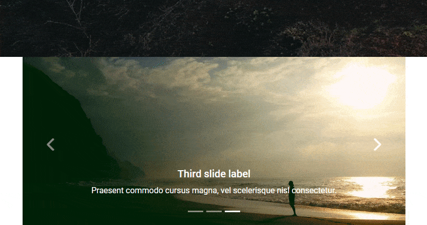
Third slide label
Praesent commodo cursus magna, vel scelerisque nisl consectetur.
  <!-- Carousel wrapper -->
  <div id="carouselBasicExample" class="carousel slide carousel-fade mb-4" data-mdb-ride="carousel" data-mdb-carousel-init>
- The carousel requires an individual ID (in this case,
id="carouselBasicExample"). If you have more than one carousel in your project and they don't have different IDs, they will collide with each other and won't work properly. carouselandslideclasses anddata-mdb-ride="carousel"attribute provide basic styling and functionalities. It is simply required for the carousel to work properly and you shouldn't touch or change them.carousel-fadechanges the default carousel animation from "slide" to "fade". You can test remove this class to see how the animation changes.data-mdb-carousel-initinitializes (behind the scenes) the JavaScript code needed for the carousel to work
Indicators
As the first child item in the carousel component you can see indicators
              <!-- Indicators -->
              <div class="carousel-indicators">
                <button type="button" data-mdb-target="#carouselBasicExample" data-mdb-slide-to="0" class="active"
                  aria-current="true" aria-label="Slide 1"></button>
                <button type="button" data-mdb-target="#carouselBasicExample" data-mdb-slide-to="1"
                  aria-label="Slide 2"></button>
                <button type="button" data-mdb-target="#carouselBasicExample" data-mdb-slide-to="2"
                  aria-label="Slide 3"></button>
              </div>
These are the little dashes that indicate the active slide. They are interactive and you can click on them to jump directly to the corresponding slide.

How indicators work:
data-mdb-target="#carouselBasicExample"attribute indicates which carousel the indicators are linked to. In this case, via the#carouselBasicExamplementioned earlier, they point to our carousel.data-mdb-slide-toattributes indicate which slide the indicator should be linked to. They are zero-indexed, so first slide = 0, second slide = 1, and so on.class="active"indicates which slide should be active at start. If you want the second slide to start the carousel, you have to move this class to the selected slide.
Carousel inner
carousel-inner element holds our actual slides.
              <!-- Inner -->
              <div class="carousel-inner">
                <!-- Single item -->
                <div class="carousel-item active">
                  <img src="https://mdbcdn.b-cdn.net/img/Photos/Slides/img%20(15).webp" class="d-block w-100"
                    alt="Sunset Over the City" />
                  <div class="carousel-caption d-none d-md-block">
                    <h5>First slide label</h5>
                    <p>Nulla vitae elit libero, a pharetra augue mollis interdum.</p>
                  </div>
                </div>

                <!-- Single item -->
                <div class="carousel-item">
                  <img src="https://mdbcdn.b-cdn.net/img/Photos/Slides/img%20(22).webp" class="d-block w-100"
                    alt="Canyon at Nigh" />
                  <div class="carousel-caption d-none d-md-block">
                    <h5>Second slide label</h5>
                    <p>Lorem ipsum dolor sit amet, consectetur adipiscing elit.</p>
                  </div>
                </div>

                <!-- Single item -->
                <div class="carousel-item">
                  <img src="https://mdbcdn.b-cdn.net/img/Photos/Slides/img%20(23).webp" class="d-block w-100"
                    alt="Cliff Above a Stormy Sea" />
                  <div class="carousel-caption d-none d-md-block">
                    <h5>Third slide label</h5>
                    <p>Praesent commodo cursus magna, vel scelerisque nisl consectetur.</p>
                  </div>
                </div>
              </div>
              <!-- Inner -->
Inside the carousel-inner we see carousel-item elements. Each carousel-item is a single slide.
  <!-- Single item -->
  <div class="carousel-item active">
    <img src="https://mdbcdn.b-cdn.net/img/Photos/Slides/img%20(15).webp" class="d-block w-100"
      alt="Sunset Over the City" />
    <div class="carousel-caption d-none d-md-block">
      <h5>First slide label</h5>
      <p>Nulla vitae elit libero, a pharetra augue mollis interdum.</p>
    </div>
  </div>
As with indicators, the active slide contains the active class. You can change it if you want the carousel to start with another active slide by default.
Next you can see the most important actor in this theater - the <img> element containing the image. In addition, it contains the d-block class (display: block) to ensure that the image displays correctly, and the w-100 (width: 100%) class to ensure that the image will stretch to 100% of the width of the carousel.
Below the image, as the second child of carousel-item, you can see the carousel-caption element. With it, you can add a heading and description to your carousel slides. In addition, it contains the d-none and d-md-block classes, which make the caption disappear on small screens and only appear on medium and larger screens. This is to prevent unwanted behavior, as on small screens the caption may completely cover the image.
Controls
The last element in the carousel are controls, i.e. buttons - arrows visible on the sides of the slides. They are, of course, used to switch between one slide and the next.

              <!-- Controls -->
              <button class="carousel-control-prev" type="button" data-mdb-target="#carouselBasicExample"
                data-mdb-slide="prev">
                <span class="carousel-control-prev-icon" aria-hidden="true"></span>
                <span class="visually-hidden">Previous</span>
              </button>
              <button class="carousel-control-next" type="button" data-mdb-target="#carouselBasicExample"
                data-mdb-slide="next">
                <span class="carousel-control-next-icon" aria-hidden="true"></span>
                <span class="visually-hidden">Next</span>
              </button>
Just like indicators, they use the data-mdb-target="#carouselBasicExample" attribute to indicate which carousel they should be connected to.
Other than that, the rest of the classes and attributes should not be modified, as they are required exactly as they are to ensure proper work of controls.
And that's all the most important information about the carousel. If you want, you can change the photos and caption in your project to what you like. You can also experiment with the carousel and see more options available on the carousel documentation page.
When you are ready, click the "next" button to go to the next lesson.

About author
Michal Szymanski
Co Founder at MDBootstrap / Listed in Forbes „30 under 30" / Open-source enthusiast / Dancer, nerd & book lover.
Author of hundreds of articles on programming, business, marketing and productivity. In the past, an educator working with troubled youth in orphanages and correctional facilities.