Free UI/UX design course
Learn how to create exceptional designs by reading my new tutorial.
Start learningHalf carousel
In this lesson, we'll use the component we saw in the previous tutorial, the carousel. We will modify it a bit to fit our Split screen.
Step 1 - add carousel
Copy HTML code of the basic example from the carousel documentation and insert it into the second column of the grid in our Split screen.
<!-- Section: Split screen -->
<section class="">
<div class="container-fluid px-0">
<div class="row g-0">
<!-- First column -->
<div class="col-lg-6 vh-100">
</div>
<!-- First column -->
<!-- Second column -->
<div class="col-lg-6 vh-100">
<!-- Carousel wrapper -->
<div id="carouselBasicExample" class="carousel slide carousel-fade" data-mdb-ride="carousel"
data-mdb-carousel-init>
<!-- Indicators -->
<div class="carousel-indicators">
<button type="button" data-mdb-target="#carouselBasicExample" data-mdb-slide-to="0" class="active"
aria-current="true" aria-label="Slide 1"></button>
<button type="button" data-mdb-target="#carouselBasicExample" data-mdb-slide-to="1"
aria-label="Slide 2"></button>
<button type="button" data-mdb-target="#carouselBasicExample" data-mdb-slide-to="2"
aria-label="Slide 3"></button>
</div>
<!-- Inner -->
<div class="carousel-inner">
<!-- Single item -->
<div class="carousel-item active">
<img src="https://mdbcdn.b-cdn.net/img/Photos/Slides/img%20(15).webp" class="d-block w-100"
alt="Sunset Over the City" />
<div class="carousel-caption d-none d-md-block">
<h5>First slide label</h5>
<p>Nulla vitae elit libero, a pharetra augue mollis interdum.</p>
</div>
</div>
<!-- Single item -->
<div class="carousel-item">
<img src="https://mdbcdn.b-cdn.net/img/Photos/Slides/img%20(22).webp" class="d-block w-100"
alt="Canyon at Nigh" />
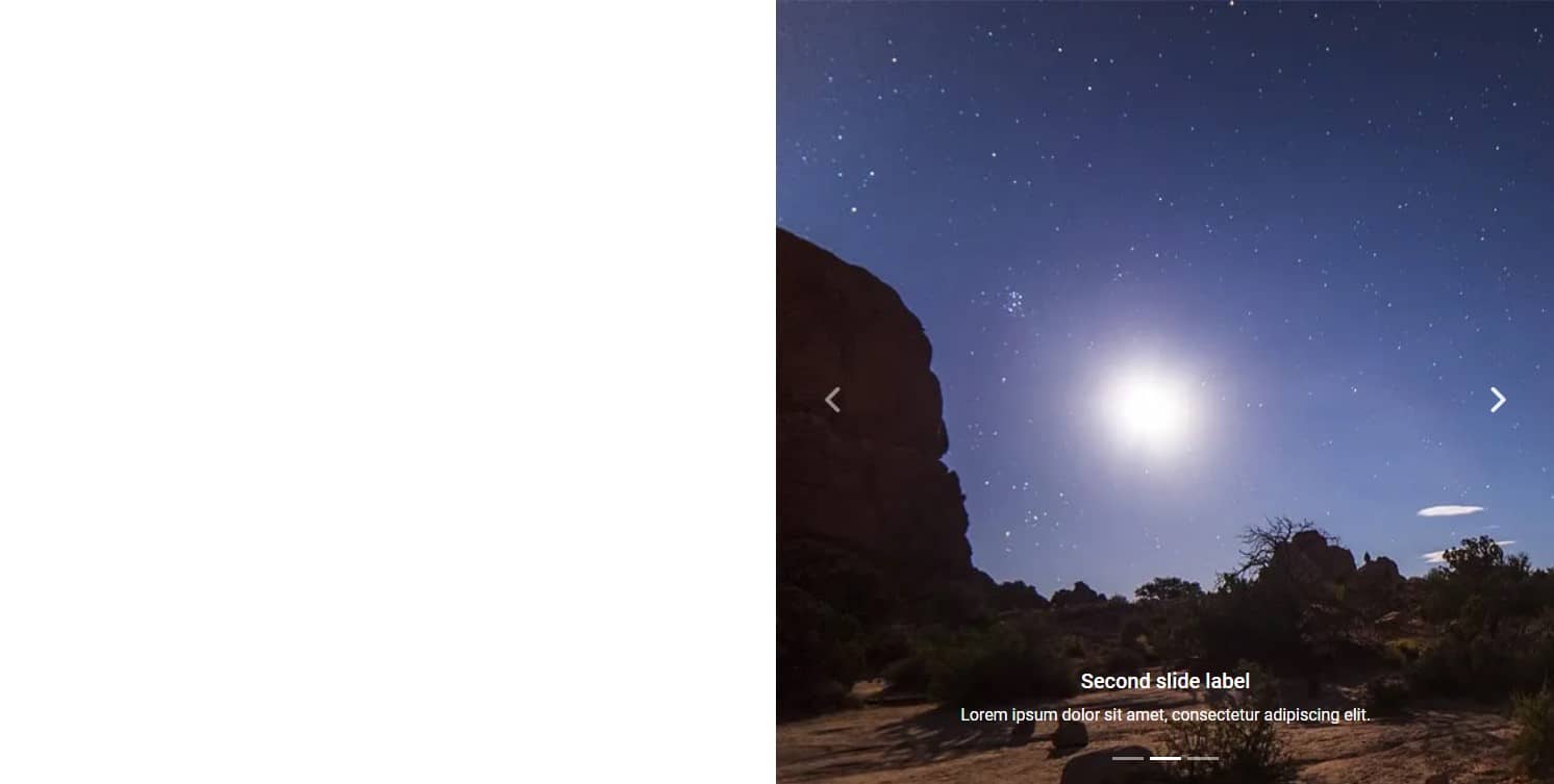
<div class="carousel-caption d-none d-md-block">
<h5>Second slide label</h5>
<p>Lorem ipsum dolor sit amet, consectetur adipiscing elit.</p>
</div>
</div>
<!-- Single item -->
<div class="carousel-item">
<img src="https://mdbcdn.b-cdn.net/img/Photos/Slides/img%20(23).webp" class="d-block w-100"
alt="Cliff Above a Stormy Sea" />
<div class="carousel-caption d-none d-md-block">
<h5>Third slide label</h5>
<p>Praesent commodo cursus magna, vel scelerisque nisl consectetur.</p>
</div>
</div>
</div>
<!-- Inner -->
<!-- Controls -->
<button class="carousel-control-prev" type="button" data-mdb-target="#carouselBasicExample"
data-mdb-slide="prev">
<span class="carousel-control-prev-icon" aria-hidden="true"></span>
<span class="visually-hidden">Previous</span>
</button>
<button class="carousel-control-next" type="button" data-mdb-target="#carouselBasicExample"
data-mdb-slide="next">
<span class="carousel-control-next-icon" aria-hidden="true"></span>
<span class="visually-hidden">Next</span>
</button>
</div>
<!-- Carousel wrapper -->
</div>
<!-- Second column -->
</div>
</div>
</section>
<!-- Section: Split screen -->
Step 2 - set height and width
We will use sizing utilities and unites relatives to the viewport to set height and width of the carousel images to 100% of available space.
Add vh-100 class to each of the image in the carousel to set its height to 100% of available viewport space, and replace w-100 class with vw-100 class to do the same with the width.
<img class="d-block vh-100 vw-100"/>
And this is how the entire code of the carousel should look like:
          <!-- Carousel wrapper -->
          <div id="carouselBasicExample" class="carousel slide carousel-fade" data-mdb-ride="carousel"
            data-mdb-carousel-init>
            <!-- Indicators -->
            <div class="carousel-indicators">
              <button type="button" data-mdb-target="#carouselBasicExample" data-mdb-slide-to="0" class="active"
                aria-current="true" aria-label="Slide 1"></button>
              <button type="button" data-mdb-target="#carouselBasicExample" data-mdb-slide-to="1"
                aria-label="Slide 2"></button>
              <button type="button" data-mdb-target="#carouselBasicExample" data-mdb-slide-to="2"
                aria-label="Slide 3"></button>
            </div>

            <!-- Inner -->
            <div class="carousel-inner">
              <!-- Single item -->
              <div class="carousel-item active">
                <img src="https://mdbcdn.b-cdn.net/img/Photos/Slides/img%20(15).webp" class="d-block vh-100 vw-100"
                  alt="Sunset Over the City" />
                <div class="carousel-caption d-none d-md-block">
                  <h5>First slide label</h5>
                  <p>Nulla vitae elit libero, a pharetra augue mollis interdum.</p>
                </div>
              </div>

              <!-- Single item -->
              <div class="carousel-item">
                <img src="https://mdbcdn.b-cdn.net/img/Photos/Slides/img%20(22).webp" class="d-block vh-100 vw-100"
                  alt="Canyon at Nigh" />
                <div class="carousel-caption d-none d-md-block">
                  <h5>Second slide label</h5>
                  <p>Lorem ipsum dolor sit amet, consectetur adipiscing elit.</p>
                </div>
              </div>

              <!-- Single item -->
              <div class="carousel-item">
                <img src="https://mdbcdn.b-cdn.net/img/Photos/Slides/img%20(23).webp" class="d-block vh-100 vw-100"
                  alt="Cliff Above a Stormy Sea" />
                <div class="carousel-caption d-none d-md-block">
                  <h5>Third slide label</h5>
                  <p>Praesent commodo cursus magna, vel scelerisque nisl consectetur.</p>
                </div>
              </div>
            </div>
            <!-- Inner -->

            <!-- Controls -->
            <button class="carousel-control-prev" type="button" data-mdb-target="#carouselBasicExample"
              data-mdb-slide="prev">
              <span class="carousel-control-prev-icon" aria-hidden="true"></span>
              <span class="visually-hidden">Previous</span>
            </button>
            <button class="carousel-control-next" type="button" data-mdb-target="#carouselBasicExample"
              data-mdb-slide="next">
              <span class="carousel-control-next-icon" aria-hidden="true"></span>
              <span class="visually-hidden">Next</span>
            </button>
          </div>
          <!-- Carousel wrapper -->
And now you should see a carousel that fills perfectly half the screen.
Step 3 - fix the image
Although the images fill exactly the space we want, they are distorted because they try to fit into the available space.
However, we can easily fix this using position utilities, specifically the object property.
Add code object-cover class to each of the image of the carousel:
<img class="d-block vh-100 vw-100 object-cover"/>
After saving the file, you will see that the images are no longer distorted, trying to fit into the available space. They have retained their natural proportions and simply the part that does not fit in the available space is invisible because it goes beyond the screen.
Step 4 - change the images, captions and alt descriptions
Change carousel images, alt descriptions and captions, customizing the entire carousel the way you want.
Note: If you are looking for beautiful, free photos, I recommend one of the following websites. They have very friendly licenses that allow you to use their resources for free in both non-commercial and commercial projects. Importantly, they do not require attribution (i.e. marking who is the author and where the photos come from).
This is how the code of my carousel looks like in the end:
          <!-- Carousel wrapper -->
          <div id="carouselBasicExample" class="carousel slide carousel-fade" data-mdb-ride="carousel"
            data-mdb-carousel-init>
            <!-- Indicators -->
            <div class="carousel-indicators">
              <button type="button" data-mdb-target="#carouselBasicExample" data-mdb-slide-to="0" class="active"
                aria-current="true" aria-label="Slide 1"></button>
              <button type="button" data-mdb-target="#carouselBasicExample" data-mdb-slide-to="1"
                aria-label="Slide 2"></button>
              <button type="button" data-mdb-target="#carouselBasicExample" data-mdb-slide-to="2"
                aria-label="Slide 3"></button>
            </div>

            <!-- Inner -->
            <div class="carousel-inner">
              <!-- Single item -->
              <div class="carousel-item active">
                <img src="https://mdbootstrap.com/img/new/textures/full/243.jpg"
                  class="d-block vh-100 vw-100 object-cover" alt="15 years of experience in the IT industry" />
                <div class="carousel-caption d-none d-md-block">
                  <h5>15 years of experience in the IT industry</h5>
                  <p>I am in love with technology and have spent half my life developing it</p>
                </div>
              </div>

              <!-- Single item -->
              <div class="carousel-item">
                <img src="https://mdbootstrap.com/img/new/textures/full/102.jpg"
                  class="d-block vh-100 vw-100 object-cover" alt="243 completed projects" />
                <div class="carousel-caption d-none d-md-block">
                  <h5>243 completed projects</h5>
                  <p>I love challenges and treat each project as my own</p>
                </div>
              </div>

              <!-- Single item -->
              <div class="carousel-item">
                <img src="https://mdbootstrap.com/img/new/textures/full/107.jpg"
                  class="d-block vh-100 vw-100 object-cover" alt="53 satisfied customers" />
                <div class="carousel-caption d-none d-md-block">
                  <h5>53 satisfied customers</h5>
                  <p>There is no better reward for me than a happy customer</p>
                </div>
              </div>
            </div>
            <!-- Inner -->

            <!-- Controls -->
            <button class="carousel-control-prev" type="button" data-mdb-target="#carouselBasicExample"
              data-mdb-slide="prev">
              <span class="carousel-control-prev-icon" aria-hidden="true"></span>
              <span class="visually-hidden">Previous</span>
            </button>
            <button class="carousel-control-next" type="button" data-mdb-target="#carouselBasicExample"
              data-mdb-slide="next">
              <span class="carousel-control-next-icon" aria-hidden="true"></span>
              <span class="visually-hidden">Next</span>
            </button>
          </div>
          <!-- Carousel wrapper -->
Step 5 - add shadow and rounded corner
It's time to take care of a few important details. Let's start with the shadows.
Add strong shadow to the carousel by adding shadow-5-strong class to the carousel-inner element:
      <!-- Inner -->
      <div class="carousel-inner shadow-5-strong">
Then, using inline CSS, let's add a strongly rounded corner. Unfortunately, we cannot use Bootstrap border utilities classes because this rounding is out of scale.
        <!-- Inner -->
        <div class="carousel-inner shadow-5-strong" style="border-bottom-left-radius: 4rem">

Step 6 - modify the indicators
By default, the indicators in the carousel are dashes. However, the design of our portfolio will be much better suited to dots, as we will make extensive use of rounded corners in many components.
Let's add rounded-circle classes to the indicator buttons, and use inline CSS to set their height and width to 7px.
        <!-- Indicators -->
        <div class="carousel-indicators">
          <button type="button" data-mdb-target="#carouselBasicExample" data-mdb-slide-to="0"
            class="rounded-circle active" style="width: 7px; height: 7px" aria-current="true"
            aria-label="Slide 1"></button>
          <button type="button" data-mdb-target="#carouselBasicExample" data-mdb-slide-to="1" aria-label="Slide 2"
            class="rounded-circle" style="width: 7px; height: 7px"></button>
          <button type="button" data-mdb-target="#carouselBasicExample" data-mdb-slide-to="2" aria-label="Slide 3"
            class="rounded-circle" style="width: 7px; height: 7px"></button>
        </div>
And now we have dots instead of dashes.

Step 7 - hide second column on mobile view
Our Split screen, however impressive, is more decorative than essential. It looks great on the desktop view, but on mobile devices every space is at a premium and it is better to allocate it to key elements and information.
So let's hide the second grid column that contains the carousel by adding display utilities classes d-none (to hide it on mobile) and d-lg-inline-block (to show it back on large screens).
      <!-- Second column -->
      <div class="col-lg-6 d-none d-lg-inline-block vh-100">

About author
Michal Szymanski
Co Founder at MDBootstrap / Listed in Forbes „30 under 30" / Open-source enthusiast / Dancer, nerd & book lover.
Author of hundreds of articles on programming, business, marketing and productivity. In the past, an educator working with troubled youth in orphanages and correctional facilities.