Images
Bootstrap 5 Images
Documentation and examples for opting images into responsive behavior (so they never become wider than their parent) and add lightweight styles to them—all via classes.
Responsive images
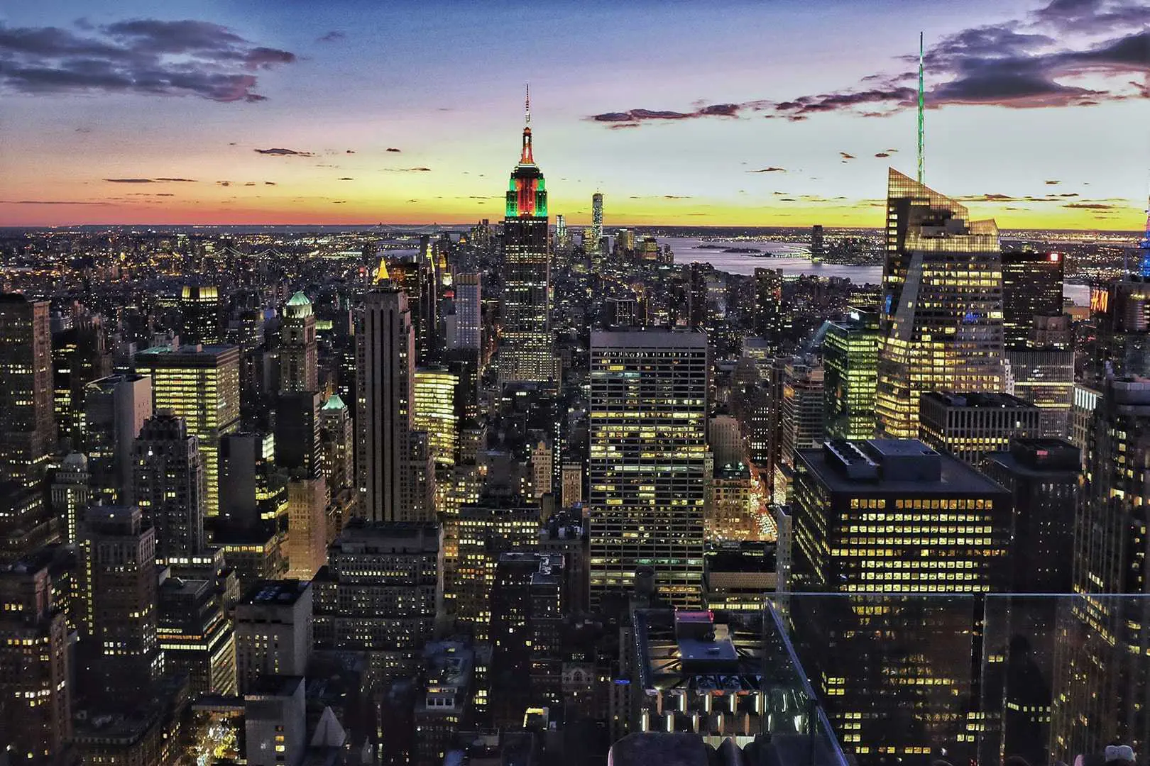
Images in MDB are made responsive with .img-fluid. This applies
max-width: 100%; and height: auto; to the image so that it scales
with the parent width.

<img src="https://mdbcdn.b-cdn.net/img/new/slides/041.webp" class="img-fluid" alt="Wild Landscape" />
Thumbnails
In addition to our
border-radius utilities, you can use
.img-thumbnail to give an image a rounded 1px border appearance.

          <img
            src="https://mdbcdn.b-cdn.net/img/new/standard/city/041.webp"
            class="img-thumbnail"
            alt="Hollywood Sign on The Hill"
          />
Shadows
By using our
shadow classes you can add a shadow to
the image. In the example below, we add shadow-2-strong class.

          <img
            src="https://mdbcdn.b-cdn.net/img/new/standard/city/042.webp"
            class="img-fluid shadow-2-strong"
            alt="Palm Springs Road"
          />
By adding .hover-shadow class to the element you can apply a shadow hover effect.

          <img
            src="https://mdbcdn.b-cdn.net/img/new/standard/city/043.webp"
            class="img-fluid hover-shadow"
            alt="Los Angeles Skyscrapers"
          />
Ripple
You can change the image into a clickable element and apply a
ripple effect to it by simply adding
data-mdb-ripple-init attribute.

        <a data-mdb-ripple-init href="#!">
            <img
              alt="example"
              class="img-fluid rounded"
              src="https://mdbcdn.b-cdn.net/img/new/standard/city/044.webp"
            />
          </a>
Masks
You can cover the image with mask to achieve the desired contrast and for example, place text on it.

Can you see me?
          <div class="bg-image">
            <img
              src="https://mdbcdn.b-cdn.net/img/new/standard/city/053.webp"
              class="img-fluid"
              alt="Sample"
            />
            <div class="mask" style="background-color: rgba(0, 0, 0, 0.6);">
              <div class="d-flex justify-content-center align-items-center h-100">
                <p class="text-white mb-0">Can you see me?</p>
              </div>
            </div>
          </div>
Hover effects
By using .hover-overlay class you can apply gentle and decorative
hover effects to the image.
          <div class="bg-image hover-overlay ripple">
            <img src="https://mdbcdn.b-cdn.net/img/new/fluid/city/055.webp" class="img-fluid" />
            <a href="#!">
              <div class="mask" style="background-color: rgba(57, 192, 237, 0.2);"></div>
            </a>
          </div>
Shapes
By using border utilities you can change the shape of the image.
.rounded

.rounded-circle
.rounded-pill
          <img
            src="https://mdbcdn.b-cdn.net/img/new/standard/city/047.webp"
            class="img-fluid rounded"
            alt="Townhouses and Skyscrapers"
          />

          <img
            src="https://mdbcdn.b-cdn.net/img/new/standard/city/047.webp"
            class="img-fluid rounded-circle"
            alt="Townhouses and Skyscrapers"
          />

          <img
            src="https://mdbcdn.b-cdn.net/img/new/standard/city/047.webp"
            class="img-fluid rounded-pill"
            alt="Townhouses and Skyscrapers"
          />
Images - API
CSS variables
As part of MDB’s evolving CSS variables approach, image now use local CSS variables for enhanced real-time customization. Values for the CSS variables are set via Sass, so Sass customization is still supported, too.
Images CSS variables are in different classes which belong to this component. To make it easier to use them, you can find below all of the used CSS variables.
        // .hover-overlay
        --#{$prefix}image-hover-transition: #{$image-hover-overlay-transition};

        // .hover-zoom
        --#{$prefix}image-hover-zoom-transition: #{$image-hover-zoom-transition};
        --#{$prefix}image-hover-zoom-transform: #{$image-hover-zoom-transform};

        // .hover-shadow
        --#{$prefix}image-hover-shadow-transition: #{$image-hover-shadow-transition};

        // .hover-shadow-soft
        --#{$prefix}image-hover-shadow-box-shadow-soft: #{$image-hover-shadow-box-shadow-soft};
SCSS variables
        $thumbnail-padding: .25rem;
        $thumbnail-bg: $body-bg;
        $thumbnail-border-width: $border-width;
        $thumbnail-border-color: var(--#{$prefix}border-color);
        $thumbnail-border-radius: $border-radius;
        $thumbnail-box-shadow: $box-shadow-sm;

        $image-hover-overlay-transition: all 0.3s ease-in-out;

        $image-hover-zoom-transition: all 0.3s linear;
        $image-hover-zoom-transform: scale(1.1);

        $image-hover-shadow-transition: $image-hover-overlay-transition;
        $image-hover-shadow-box-shadow: $box-shadow-4-strong;
        $image-hover-shadow-box-shadow-soft: $box-shadow-5;