Free UI/UX design course
Learn how to create exceptional designs by reading my new tutorial.
Start learningResponsive images
Adding responsiveness to images in Bootstrap is very easy, but there is a trick here that we need to discuss.
Images in Bootstrap and MDBootstrap are made responsive with .img-fluid. This applies
max-width: 100%; and height: auto; to the image so that it scales
with the parent width.
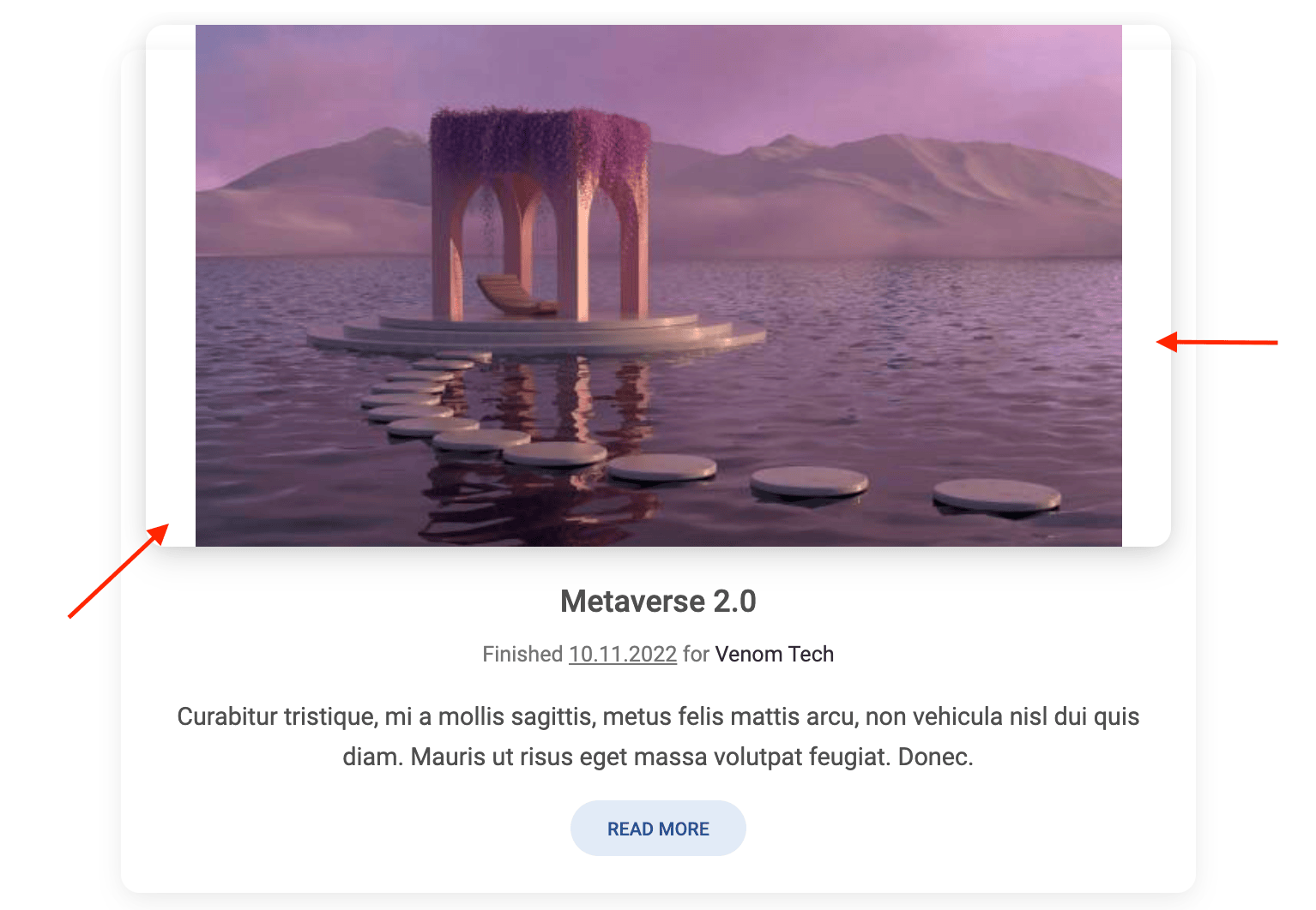
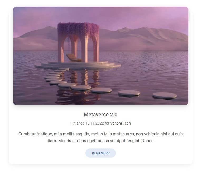
<img class="img-fluid" src="https://mdbcdn.b-cdn.net/img/new/slides/041.webp" alt="Wild Landscape" />

Thanks to this, regardless of the size of the screen, the image will adapt to the available space, no matter what... except in one case.
If you gradually reduce the size of your browser window while looking at our cascading cards section from the previous lesson, you will see a bug at some point.
On about the size of a tablet in vertical mode, when the card is at its widest, you can see that the image doesn't fill all the available space.
That's because it's just too small. You can images the img-fluid class tells to the image: "hey, you can't exceed the width of your parent, so I'm imposing a max-width: 100% on you".
This is sufficient in most cases, but img-fluid does not address situations where the image is smaller than the parent. And then there's this nasty side effect.
How to fix it?
Fortunately, this is easy to fix. Instead of the img-fluid class, we can use the w-100 class, which will force the image to always occupy 100% of the available width (even if the image is smaller than the parent size).
<img class="w-100" src="https://mdbootstrap.com/img/new/textures/small/38.jpg"/>
Thanks to this, the image will never exceed the size of the parent (because it will always be 100% of its width, not more), but it will also not be able to be smaller, because the w-100 class will force it to stretch to its full width.
However, there is a drawback of this solution - if the image is much smaller than the size of the parent, then forcing it to stretch can spoil the quality.
But in the case of small differences in sizes, such as in the images in our cascading cards, this will not be visible so it's safe to use.
Nevertheless, keep this in mind when designing. Using the w-100 class is safer because it prevents the bug with too small images. However, if you don't take care of the quality of the images, your users may see ugly pixelation. Choose wisely!

About author
Michal Szymanski
Co Founder at MDBootstrap / Listed in Forbes „30 under 30" / Open-source enthusiast / Dancer, nerd & book lover.
Author of hundreds of articles on programming, business, marketing and productivity. In the past, an educator working with troubled youth in orphanages and correctional facilities.