Free UI/UX design course
Learn how to create exceptional designs by reading my new tutorial.
Start learningQuick start
We have a long and fascinating journey ahead of us. However, before we move on to the individual aspects of our planned tour, I would like you to have the opportunity right now to feel the potential that MDB gives you.
Therefore, in this short and concise lesson, I will show you how super fast and easily you can launch MDB and create your first small project.
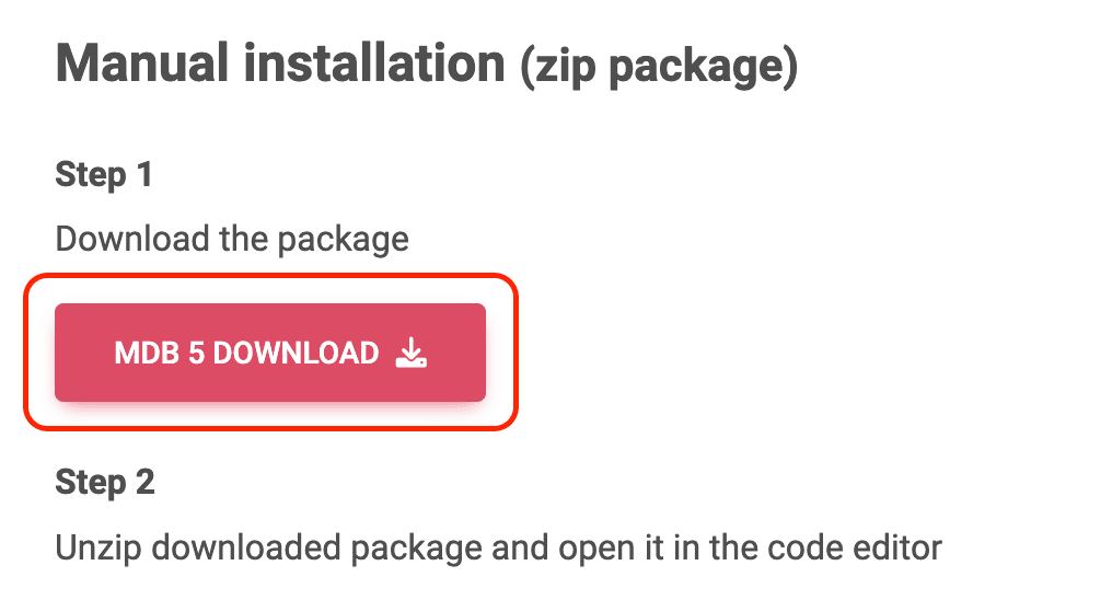
Step 1 - download and setup MDB
We will use the simplest method of installing MDB, i.e. download the .zip package.
Go to the installation page and click the big, red button "MDB 5 download".
Then unzip the downloaded package and open it in your favorite code editor.
Note: The code editor is a matter of preference, but if someone asks me what I would recommend, my answer is Visual Studio Code.
It's free and you can download it here.
Step 2 - open index.html file
In the unpacked MDB directory, locate the index.html file, then drag and drop it into the browser window. You will see the MDB welcome message.

Then open index.html in the code editor. You will see a code like this:
    <!DOCTYPE html>
    <html lang="en">
      <head>
        <meta charset="UTF-8" />
        <meta name="viewport" content="width=device-width, initial-scale=1, shrink-to-fit=no" />
        <meta http-equiv="x-ua-compatible" content="ie=edge" />
        <title>Material Design for Bootstrap</title>
        <!-- MDB icon -->
        <link rel="icon" href="img/mdb-favicon.ico" type="image/x-icon" />
        <!-- Font Awesome -->
        <link
          rel="stylesheet"
          href="https://cdnjs.cloudflare.com/ajax/libs/font-awesome/6.0.0/css/all.min.css"
        />
        <!-- Google Fonts Roboto -->
        <link
          rel="stylesheet"
          href="https://fonts.googleapis.com/css2?family=Roboto:wght@300;400;500;700;900&display=swap"
        />
        <!-- MDB -->
        <link rel="stylesheet" href="css/mdb.min.css" />
      </head>
      <body>
        <!-- Start your project here-->
        <div class="container">
          <div class="d-flex justify-content-center align-items-center" style="height: 100vh">
            <div class="text-center">
              <img
                class="mb-4"
                src="https://mdbootstrap.com/img/logo/mdb-transparent-250px.png"
                style="width: 250px; height: 90px"
              />
              <h5 class="mb-3">Thank you for using our product. We're glad you're with us.</h5>
              <p class="mb-3">MDB Team</p>
              <a
                class="btn btn-primary btn-lg"
                data-mdb-ripple-init
                href="https://mdbootstrap.com/docs/standard/getting-started/"
                target="_blank"
                role="button"
                >Start MDB tutorial</a
              >
            </div>
          </div>
        </div>
        <!-- End your project here-->

        <!-- MDB -->
        <script type="text/javascript" src="js/mdb.umd.min.js"></script>
        <!-- Custom scripts -->
        <script type="text/javascript"></script>
      </body>
    </html>
That's quite a lot of code, and it can feel a bit overwhelming to start with. But don't worry about it now, we'll explain in detail what each of these lines means and does in the next lessons.
Step 3 - prepare index.html file for the new project
Let's remove unnecessary code so we have a place for our new project.
On line 25 you will find the comment Start your project here and on line 46 you will find End your project here. In between is the code with the MDB welcome message:
        <!-- Start your project here-->
        <div class="container">
          <div class="d-flex justify-content-center align-items-center" style="height: 100vh">
            <div class="text-center">
              <img
                class="mb-4"
                src="https://mdbootstrap.com/img/logo/mdb-transparent-250px.png"
                style="width: 250px; height: 90px"
              />
              <h5 class="mb-3">Thank you for using our product. We're glad you're with us.</h5>
              <p class="mb-3">MDB Team</p>
              <a
                class="btn btn-primary btn-lg"
                href="https://mdbootstrap.com/learn/mdb-foundations/basics/introduction/"
                target="_blank"
                role="button"
                >Start MDB tutorial</a
              >
            </div>
          </div>
        </div>
        <!-- End your project here-->
Remove it, save the file, and refresh the browser. You should see a completely blank, white screen. Now we are ready to start our project.
Step 4 - add navigation bar
Go to the navbar documentation page and locate the section "Basic example" at the very beginning of that page. Click "show code" and copy only HTML code (we will learn about later JavaScript part).
<!-- Navbar -->
<nav class="navbar navbar-expand-lg navbar-light bg-body-tertiary">
  <!-- Container wrapper -->
  <div class="container-fluid">
    <!-- Toggle button -->
    <button
      data-mdb-collapse-init
      class="navbar-toggler"
      type="button"
      data-mdb-target="#navbarSupportedContent"
      aria-controls="navbarSupportedContent"
      aria-expanded="false"
      aria-label="Toggle navigation"
    >
      <i class="fas fa-bars"></i>
    </button>

    <!-- Collapsible wrapper -->
    <div class="collapse navbar-collapse" id="navbarSupportedContent">
      <!-- Navbar brand -->
      <a class="navbar-brand mt-2 mt-lg-0" href="#">
        <img
          src="https://mdbcdn.b-cdn.net/img/logo/mdb-transaprent-noshadows.webp"
          height="15"
          alt="MDB Logo"
          loading="lazy"
        />
      </a>
      <!-- Left links -->
      <ul class="navbar-nav me-auto mb-2 mb-lg-0">
        <li class="nav-item">
          <a class="nav-link" href="#">Dashboard</a>
        </li>
        <li class="nav-item">
          <a class="nav-link" href="#">Team</a>
        </li>
        <li class="nav-item">
          <a class="nav-link" href="#">Projects</a>
        </li>
      </ul>
      <!-- Left links -->
    </div>
    <!-- Collapsible wrapper -->

    <!-- Right elements -->
    <div class="d-flex align-items-center">
      <!-- Icon -->
      <a class="text-reset me-3" href="#">
        <i class="fas fa-shopping-cart"></i>
      </a>

      <!-- Notifications -->
      <div class="dropdown">
        <a
          data-mdb-dropdown-init
          class="text-reset me-3 dropdown-toggle hidden-arrow"
          href="#"
          id="navbarDropdownMenuLink"
          role="button"
          aria-expanded="false"
        >
          <i class="fas fa-bell"></i>
          <span class="badge rounded-pill badge-notification bg-danger">1</span>
        </a>
        <ul
          class="dropdown-menu dropdown-menu-end"
          aria-labelledby="navbarDropdownMenuLink"
        >
          <li>
            <a class="dropdown-item" href="#">Some news</a>
          </li>
          <li>
            <a class="dropdown-item" href="#">Another news</a>
          </li>
          <li>
            <a class="dropdown-item" href="#">Something else here</a>
          </li>
        </ul>
      </div>
      <!-- Avatar -->
      <div class="dropdown">
        <a
          data-mdb-dropdown-init
          class="dropdown-toggle d-flex align-items-center hidden-arrow"
          href="#"
          id="navbarDropdownMenuAvatar"
          role="button"
          aria-expanded="false"
        >
          <img
            src="https://mdbcdn.b-cdn.net/img/new/avatars/2.webp"
            class="rounded-circle"
            height="25"
            alt="Black and White Portrait of a Man"
            loading="lazy"
          />
        </a>
        <ul
          class="dropdown-menu dropdown-menu-end"
          aria-labelledby="navbarDropdownMenuAvatar"
        >
          <li>
            <a class="dropdown-item" href="#">My profile</a>
          </li>
          <li>
            <a class="dropdown-item" href="#">Settings</a>
          </li>
          <li>
            <a class="dropdown-item" href="#">Logout</a>
          </li>
        </ul>
      </div>
    </div>
    <!-- Right elements -->
  </div>
  <!-- Container wrapper -->
</nav>
<!-- Navbar -->
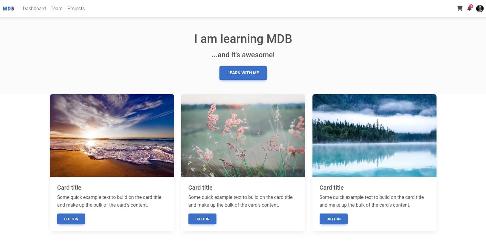
Then paste it into the index.html file and save it. After refreshing the browser you should see a nice, interactive navigation bar.
You have just successfully used the first MDB component. Good job!
Step 5 - add jumbotron
It would be good to add some element that would stand out from the start.
Such an element may be a jumbotron, which is commonly understood as a banner with information crucial for our website.
Directly under the navbar, add the following code:
        <!-- Jumbotron -->
        <div class="p-5 text-center bg-body-tertiary">
          <h1 class="mb-3">I am learning MDB</h1>
          <h4 class="mb-4">...and it's awesome!</h4>
          <a class="btn btn-primary btn-lg" href="https://mdbootstrap.com/learn/mdb-foundations/basics/introduction/"
            role="button">Learn with me</a>
        </div>
        <!-- Jumbotron -->
Save the file and refresh the browser. Our website is taking shape!
Step 6 - add grid
There is a very nice component called a card. Cards are not only visually attractive, but also great for presenting various types of content.

Card title
Some quick example text to build on the card title and make up the bulk of the card's content.
ButtonWouldn't it be great to have some nice cards like this in our design? Sure it would!
However, there is a problem - how to place them in our layout so that they display correctly on both large screens and phones? Of course, on large screens we want to have them next to each other, say 3 in a row. On the other hand, they should line up one above the other on mobile.
This is where bootstrap grid comes in handy, which is a powerful tool for creating a responsive layout.
We will learn about the grid in detail in future lessons. Now just trust me and just follow the steps given.
Go to the grid documentation page and copy the code from the basic example section.
Then paste it below the jumbotron component.
      <div class="container">
        <div class="row">
          <div class="col-md">
            One of three columns
          </div>
          <div class="col-md">
            One of three columns
          </div>
          <div class="col-md">
            One of three columns
          </div>
        </div>
      </div>
After saving the file and refreshing your browser, you should see paragraphs that indicate each of the three columns.
Step 7 - add cards
Now we're ready to add cards.
Go to the cards documentation page and copy the HTML code form the section "Image with ripple".
What is ripple? Ripple is a Material Design effect of the propagation of circular waves upon interaction with a given element. In the documentation example, click the image or the button in the card to see it.
Then paste the card code into each column in our project in index.html.
If you want, you can change the pictures and texts in the cards to whatever you like.
      <div class="container">
        <div class="row">

          <!-- First column -->
          <div class="col-md">

            <!-- Card -->
            <div class="card">
              <div class="bg-image hover-overlay" data-mdb-ripple-init data-mdb-ripple-color="light">
                <img src="https://mdbcdn.b-cdn.net/img/new/standard/nature/111.webp" class="img-fluid" />
                <a href="#!">
                  <div class="mask" style="background-color: rgba(251, 251, 251, 0.15);"></div>
                </a>
              </div>
              <div class="card-body">
                <h5 class="card-title">Card title</h5>
                <p class="card-text">Some quick example text to build on the card title and make up the bulk of the card's
                  content.</p>
                <a href="#!" class="btn btn-primary">Button</a>
              </div>
            </div>
            <!-- Card -->

          </div>
          <!-- First column -->

          <!-- Second column -->
          <div class="col-md">

            <!-- Card -->
            <div class="card">
              <div class="bg-image hover-overlay" data-mdb-ripple-init data-mdb-ripple-color="light">
                <img src="https://mdbcdn.b-cdn.net/img/new/standard/nature/112.webp" class="img-fluid" />
                <a href="#!">
                  <div class="mask" style="background-color: rgba(251, 251, 251, 0.15);"></div>
                </a>
              </div>
              <div class="card-body">
                <h5 class="card-title">Card title</h5>
                <p class="card-text">Some quick example text to build on the card title and make up the bulk of the card's
                  content.</p>
                <a href="#!" class="btn btn-primary">Button</a>
              </div>
            </div>
            <!-- Card -->

          </div>
          <!-- Second column -->

          <!-- Third column -->
          <div class="col-md">

            <!-- Card -->
            <div class="card">
              <div class="bg-image hover-overlay" data-mdb-ripple-init data-mdb-ripple-color="light">
                <img src="https://mdbcdn.b-cdn.net/img/new/standard/nature/113.webp" class="img-fluid" />
                <a href="#!">
                  <div class="mask" style="background-color: rgba(251, 251, 251, 0.15);"></div>
                </a>
              </div>
              <div class="card-body">
                <h5 class="card-title">Card title</h5>
                <p class="card-text">Some quick example text to build on the card title and make up the bulk of the card's
                  content.</p>
                <a href="#!" class="btn btn-primary">Button</a>
              </div>
            </div>
            <!-- Card -->

          </div>
          <!-- Third column -->

        </div>
      </div>
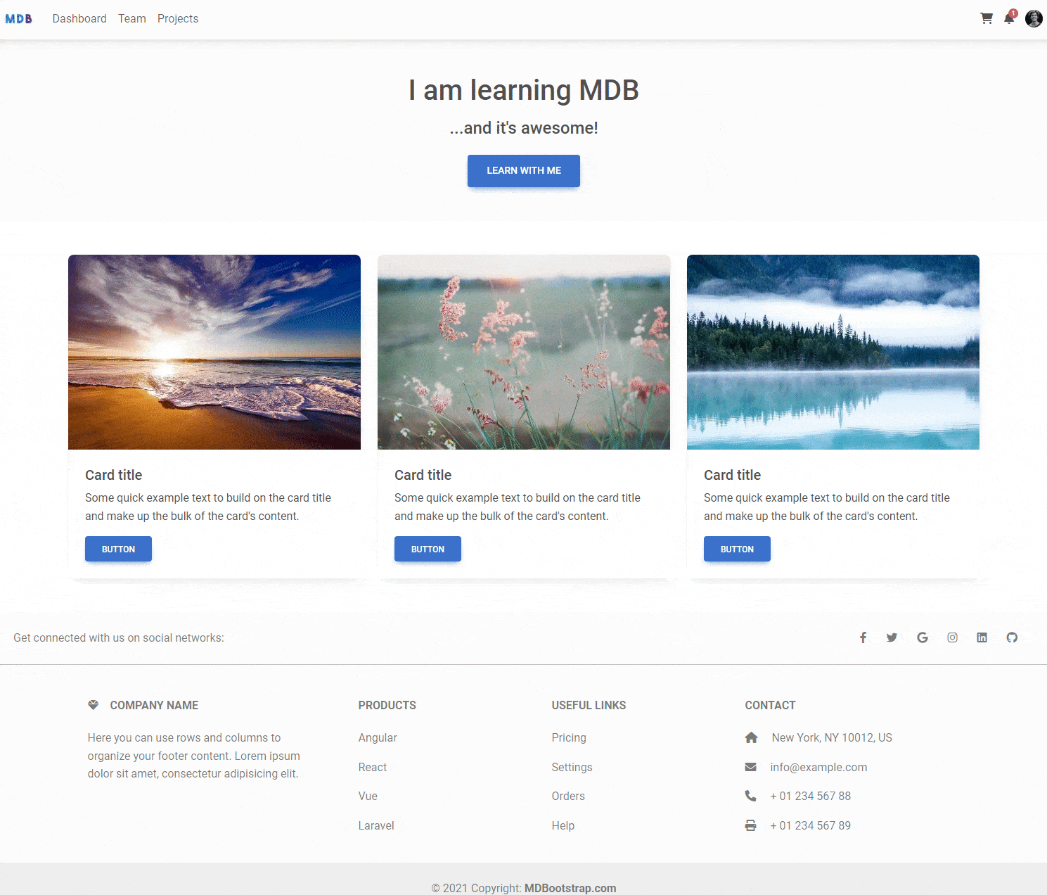
Save the file and refresh the browser. Woah! Our website looks really good now.
There is one little thing worth improving. If you look closely you can see that the bottom edge of the jumbotron touches the top edge of the cards. They would look better if there was a space between them.
It's very easy to fix. Just add mb-5 class (which stands for "margin-bottom 5 units large ") to the jumbotron. We will learn more about it in the future lessons, but right now just add this to your project:
        <!-- Jumbotron -->
        <div class="p-5 text-center bg-body-tertiary mb-5">

        <!-- [...the rest of the code] -->
Step 8 - add footer
The final step of our small project will be adding a footer.
A footer is an additional navigation component. It can hold links, buttons, company info, copyrights, forms, and many other elements.
Go to the footer documentation page and copy the code of the Basic example.
Then paste it below the grid with the cards:
<!-- Footer -->
<footer class="text-center text-lg-start bg-body-tertiary text-muted">
  <!-- Section: Social media -->
  <section class="d-flex justify-content-center justify-content-lg-between p-4 border-bottom">
    <!-- Left -->
    <div class="me-5 d-none d-lg-block">
      <span>Get connected with us on social networks:</span>
    </div>
    <!-- Left -->

    <!-- Right -->
    <div>
      <a href="" class="me-4 text-reset">
        <i class="fab fa-facebook-f"></i>
      </a>
      <a href="" class="me-4 text-reset">
        <i class="fab fa-twitter"></i>
      </a>
      <a href="" class="me-4 text-reset">
        <i class="fab fa-google"></i>
      </a>
      <a href="" class="me-4 text-reset">
        <i class="fab fa-instagram"></i>
      </a>
      <a href="" class="me-4 text-reset">
        <i class="fab fa-linkedin"></i>
      </a>
      <a href="" class="me-4 text-reset">
        <i class="fab fa-github"></i>
      </a>
    </div>
    <!-- Right -->
  </section>
  <!-- Section: Social media -->

  <!-- Section: Links  -->
  <section class="">
    <div class="container text-center text-md-start mt-5">
      <!-- Grid row -->
      <div class="row mt-3">
        <!-- Grid column -->
        <div class="col-md-3 col-lg-4 col-xl-3 mx-auto mb-4">
          <!-- Content -->
          <h6 class="text-uppercase fw-bold mb-4">
            <i class="fas fa-gem me-3"></i>Company name
          </h6>
          <p>
            Here you can use rows and columns to organize your footer content. Lorem ipsum
            dolor sit amet, consectetur adipisicing elit.
          </p>
        </div>
        <!-- Grid column -->

        <!-- Grid column -->
        <div class="col-md-2 col-lg-2 col-xl-2 mx-auto mb-4">
          <!-- Links -->
          <h6 class="text-uppercase fw-bold mb-4">
            Products
          </h6>
          <p>
            <a href="#!" class="text-reset">Angular</a>
          </p>
          <p>
            <a href="#!" class="text-reset">React</a>
          </p>
          <p>
            <a href="#!" class="text-reset">Vue</a>
          </p>
          <p>
            <a href="#!" class="text-reset">Laravel</a>
          </p>
        </div>
        <!-- Grid column -->

        <!-- Grid column -->
        <div class="col-md-3 col-lg-2 col-xl-2 mx-auto mb-4">
          <!-- Links -->
          <h6 class="text-uppercase fw-bold mb-4">
            Useful links
          </h6>
          <p>
            <a href="#!" class="text-reset">Pricing</a>
          </p>
          <p>
            <a href="#!" class="text-reset">Settings</a>
          </p>
          <p>
            <a href="#!" class="text-reset">Orders</a>
          </p>
          <p>
            <a href="#!" class="text-reset">Help</a>
          </p>
        </div>
        <!-- Grid column -->

        <!-- Grid column -->
        <div class="col-md-4 col-lg-3 col-xl-3 mx-auto mb-md-0 mb-4">
          <!-- Links -->
          <h6 class="text-uppercase fw-bold mb-4">Contact</h6>
          <p><i class="fas fa-home me-3"></i> New York, NY 10012, US</p>
          <p>
            <i class="fas fa-envelope me-3"></i>
            info@example.com
          </p>
          <p><i class="fas fa-phone me-3"></i> + 01 234 567 88</p>
          <p><i class="fas fa-print me-3"></i> + 01 234 567 89</p>
        </div>
        <!-- Grid column -->
      </div>
      <!-- Grid row -->
    </div>
  </section>
  <!-- Section: Links  -->

  <!-- Copyright -->
  <div class="text-center p-4" style="background-color: rgba(0, 0, 0, 0.05);">
    © 2021 Copyright:
    <a class="text-reset fw-bold" href="https://mdbootstrap.com/">MDBootstrap.com</a>
  </div>
  <!-- Copyright -->
</footer>
<!-- Footer -->
Save the file and refresh the browser. You should see an extensive gray footer below the tabs.
However, we have a similar problem as in the step above - the bottom edge of the cards touches the top edge of the footer. Let's fix this by adding the mb-5 class to each of the card component.
        <div class="card mb-5">


        <!-- [...the rest of the code] -->
Alright, our first MDB project is ready!
And look, it displays properly on any size screen. Change the size of the browser window to mobile view to see for yourself. Isn't it nice?
Well done, you!
Bonus - if you add a special attribute data-mdb-theme="dark" to the <html> element, your project will change the theme to dark mode!
<html lang="en" data-mdb-theme="dark">
Note: In future lessons we will learn the details of how theming and dark mode work in MDB.
If something did not work out as it should or if you want to make sure that you did everything right - click the button below to see the final result.
FInal demo & source code
About author
Michal Szymanski
Co Founder at MDBootstrap / Listed in Forbes „30 under 30" / Open-source enthusiast / Dancer, nerd & book lover.
Author of hundreds of articles on programming, business, marketing and productivity. In the past, an educator working with troubled youth in orphanages and correctional facilities.