Free UI/UX design course
Learn how to create exceptional designs by reading my new tutorial.
Start learningNavbar
Step 1 - prepare index.html file
Let's remove unnecessary code so we have a place for our new project.
Below the opening <body> tag you will find the comment Start your project here and above the closing </body> tag End your project here. In between is the code with the MDB welcome message:
        <!-- Start your project here-->
        <div class="container">
          <div class="d-flex justify-content-center align-items-center" style="height: 100vh">
            <div class="text-center">
              <img
                class="mb-4"
                src="https://mdbootstrap.com/img/logo/mdb-transparent-250px.png"
                style="width: 250px; height: 90px"
              />
              <h5 class="mb-3">Thank you for using our product. We're glad you're with us.</h5>
              <p class="mb-3">MDB Team</p>
              <a
                class="btn btn-primary btn-lg"
                href="https://mdbootstrap.com/learn/mdb-foundations/basics/introduction/"
                target="_blank"
                role="button"
                >Start MDB tutorial</a
              >
            </div>
          </div>
        </div>
        <!-- End your project here-->
Remove it and save the file. You should see a completely blank, white screen.
Step 2 - prepare the basic structure
The same as with the previous projects, our blog also needs a basic structure to keep the code organized.
Add the following code to your index.html file:
        <!--Main Navigation-->
        <header>

        </header>
        <!--Main Navigation-->

        <!--Main layout-->
        <main>
          <div class="container">

          </div>
        </main>
        <!--Main layout-->

        <!--Footer-->
        <footer>

        </footer>
        <!--Footer-->
After saving the file you will still see a blank page. This is fine, because the structure we added doesn't have any elements to render yet.
Step 3 - add navbar
Go to the navbar documentation page and copy the code of the basic example. Then paste it into the index.html file, inside of the <header> section.
<!--Main Navigation-->
<header>

    <!-- Navbar -->
    <nav class="navbar navbar-expand-lg navbar-light bg-body-tertiary">
      <!-- Container wrapper -->
      <div class="container-fluid">
        <!-- Toggle button -->
        <button
          data-mdb-collapse-init
          class="navbar-toggler"
          type="button"
          data-mdb-target="#navbarSupportedContent"
          aria-controls="navbarSupportedContent"
          aria-expanded="false"
          aria-label="Toggle navigation"
        >
          <i class="fas fa-bars"></i>
        </button>

        <!-- Collapsible wrapper -->
        <div class="collapse navbar-collapse" id="navbarSupportedContent">
          <!-- Navbar brand -->
          <a class="navbar-brand mt-2 mt-lg-0" href="#">
            <img
              src="https://mdbcdn.b-cdn.net/img/logo/mdb-transaprent-noshadows.webp"
              height="15"
              alt="MDB Logo"
              loading="lazy"
            />
          </a>
          <!-- Left links -->
          <ul class="navbar-nav me-auto mb-2 mb-lg-0">
            <li class="nav-item">
              <a class="nav-link" href="#">Dashboard</a>
            </li>
            <li class="nav-item">
              <a class="nav-link" href="#">Team</a>
            </li>
            <li class="nav-item">
              <a class="nav-link" href="#">Projects</a>
            </li>
          </ul>
          <!-- Left links -->
        </div>
        <!-- Collapsible wrapper -->

        <!-- Right elements -->
        <div class="d-flex align-items-center">
          <!-- Icon -->
          <a class="text-reset me-3" href="#">
            <i class="fas fa-shopping-cart"></i>
          </a>

          <!-- Notifications -->
          <div class="dropdown">
            <a
              data-mdb-dropdown-init
              class="text-reset me-3 dropdown-toggle hidden-arrow"
              href="#"
              id="navbarDropdownMenuLink"
              role="button"
              aria-expanded="false"
            >
              <i class="fas fa-bell"></i>
              <span class="badge rounded-pill badge-notification bg-danger">1</span>
            </a>
            <ul
              class="dropdown-menu dropdown-menu-end"
              aria-labelledby="navbarDropdownMenuLink"
            >
              <li>
                <a class="dropdown-item" href="#">Some news</a>
              </li>
              <li>
                <a class="dropdown-item" href="#">Another news</a>
              </li>
              <li>
                <a class="dropdown-item" href="#">Something else here</a>
              </li>
            </ul>
          </div>
          <!-- Avatar -->
          <div class="dropdown">
            <a
              data-mdb-dropdown-init
              class="dropdown-toggle d-flex align-items-center hidden-arrow"
              href="#"
              id="navbarDropdownMenuAvatar"
              role="button"
              aria-expanded="false"
            >
              <img
                src="https://mdbcdn.b-cdn.net/img/new/avatars/2.webp"
                class="rounded-circle"
                height="25"
                alt="Black and White Portrait of a Man"
                loading="lazy"
              />
            </a>
            <ul
              class="dropdown-menu dropdown-menu-end"
              aria-labelledby="navbarDropdownMenuAvatar"
            >
              <li>
                <a class="dropdown-item" href="#">My profile</a>
              </li>
              <li>
                <a class="dropdown-item" href="#">Settings</a>
              </li>
              <li>
                <a class="dropdown-item" href="#">Logout</a>
              </li>
            </ul>
          </div>
        </div>
        <!-- Right elements -->
      </div>
      <!-- Container wrapper -->
    </nav>
    <!-- Navbar -->

</header>
<!--Main Navigation-->
Remember that we are now using the Vite starter, and therefore ES modules. As you remember from previous lessons, in this case we also need to copy the JavaScript code and insert it into the src/js/main.js file to initialize the components.
Insert the code below the imports already existing in the main.js file:
        import '../scss/styles.scss';
        import * as mdb from 'mdb-ui-kit'; // lib
        window.mdb = mdb;

        // Initialization for ES Users
        import { Dropdown, Collapse, initMDB } from "mdb-ui-kit";

        initMDB({ Dropdown, Collapse });
Save the files. You should see the navigation bar.
Step 4 - adjust the navbar
Now we have to customize the default navbar so it looks like the one from the final demo.
We will:
Change the logo using icons available in MDB
Change the links
Change the icons on the right side
Change the color of the links and shadow of the navbar
Note: We've been learning about all these things in previous tutorials. I'm assuming you've followed them all, so I won't go into the details to avoid repeating myself.
However, if something is unclear to you, I suggest you repeat the knowledge from previous lessons or write to me on twitter.
                <!--Main Navigation-->
                <header>

                  <!-- Navbar -->
                  <nav class="navbar navbar-expand-lg navbar-light bg-body-tertiary shadow-2">
                    <!-- Container wrapper -->
                    <div class="container-fluid">
                      <!-- Toggle button -->
                      <button class="navbar-toggler" type="button" data-mdb-collapse-init
                        data-mdb-target="#navbarSupportedContent" aria-controls="navbarSupportedContent" aria-expanded="false"
                        aria-label="Toggle navigation">
                        <i class="fas fa-bars"></i>
                      </button>

                      <!-- Collapsible wrapper -->
                      <div class="collapse navbar-collapse" id="navbarSupportedContent">
                        <ul class="navbar-nav me-auto mb-2 mb-lg-0">
                          <!-- Logo -->
                          <a class="navbar-brand me-2 d-none d-lg-inline-block" href="#"><i
                              class="fas fa-globe-europe text-primary"></i></a>

                          <li class="nav-item fw-bold">
                            <a class="nav-link" href="#!">Start here</a>
                          </li>
                          <li class="nav-item">
                            <a class="nav-link" href="#!">Articles</a>
                          </li>
                          <li class="nav-item">
                            <a class="nav-link" href="#!">eBooks</a>
                          </li>
                          <li class="nav-item">
                            <a class="nav-link" href="#!">About me</a>
                          </li>
                          <li class="nav-item">
                            <a class="nav-link" href="#!">Newsletter</a>
                          </li>
                          <li class="nav-item">
                            <a class="nav-link" href="#!">Contact</a>
                          </li>
                        </ul>


                      </div>
                      <!-- Collapsible wrapper -->

                      <ul class="navbar-nav flex-row">
                        <!-- Icons -->
                        <li class="nav-item">
                          <a class="nav-link pe-2" href="#!">
                            <i class="fab fa-youtube"></i>
                          </a>
                        </li>
                        <li class="nav-item">
                          <a class="nav-link px-2" href="#!">
                            <i class="fab fa-facebook-f"></i>
                          </a>
                        </li>
                        <li class="nav-item">
                          <a class="nav-link px-2" href="#!">
                            <i class="fab fa-twitter"></i>
                          </a>
                        </li>
                        <li class="nav-item">
                          <a class="nav-link ps-2" href="#!">
                            <i class="fab fa-instagram"></i>
                          </a>
                        </li>
                      </ul>

                    </div>
                    <!-- Container wrapper -->
                  </nav>
                  <!-- Navbar -->

                </header>
                <!--Main Navigation-->
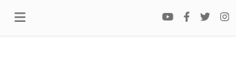
After saving the file you should see the navbar like this:
There is only one thing we did differently from previous lessons. This time, the icons on the right side have been taken out of the collapsible wrapper so that they are visible on the mobile version without having to click on the "hamburger menu".

About author
Michal Szymanski
Co Founder at MDBootstrap / Listed in Forbes „30 under 30" / Open-source enthusiast / Dancer, nerd & book lover.
Author of hundreds of articles on programming, business, marketing and productivity. In the past, an educator working with troubled youth in orphanages and correctional facilities.