Free UI/UX design course
Learn how to create exceptional designs by reading my new tutorial.
Start learningHover effects
In this lesson we will learn how to add interactions when the cursor is over the element. This kind of effects are known as hover effects.
MDB hover effect appears when the user positions the computer cursor over an element without activating it. Hover effects make a website more interactive.
But before we start messing with the code, let's get to know some theory.
Why should you be careful with hover effects?
Hover effects can significantly reduce the user experience if you mix it with functional elements (like a drop-down on hover or hidden buttons visible only after hovering) because such an approach isn't mobile-friendly (actually it isn't good for desktops either).
MDB is a mobile-first framework, so we attach great importance to making each component easy to use for touch screens.
That's why our hover effects are gentle and decorative.
Material Minimal also recommends moderation
Material Minimal (MDB design system) is also very reluctant to exaggerate effects and distracting animations. Instead, it prefers subtle, complementary effects that will complement the composition rather than dominate it.
It is also unacceptable to add functional UI elements (e.g. buttons) activated only by hovering over them with the cursor. This violates the fundamental principle of "mobile first", because it makes the essential interface elements hidden by default and only hovering over them reveals them. This greatly decreases the user experience on mobile devices, so such practices are completely rejected in Material Minimal.
So what specific effects are recommended in MDB and Material Minimal? Hover over the images below to see examples:

As you can see, the effects are minimalistic and in line with the spirit of Material Minimal.
Let's go through each of these effects one by one.
Overlay
Overlay is an effect that covers with color and defined level of opacity the entire image.
The same as with mask you can change the color and opacity by manipulating HSLA code.
MDB overlay hover effect relies on masks. Have a look at our masks docs to learn more.
Here is the most common example of hover effects usage - an image changed to link with an
additional ripple effect on click. We also added shadows and rounded corners and changed ripple color to light via
data-mdb-attribute.
      <div class="bg-image hover-overlay ripple shadow-1-strong rounded" data-mdb-ripple-color="light">
        <img src="https://mdbcdn.b-cdn.net/img/new/fluid/city/113.webp" class="w-100" alt="Louvre" />
        <a href="#!">
          <div class="mask" style="background-color: hsla(0, 0%, 98.4%, 0.2)"></div>
        </a>
      </div>
You can easily manipulate the color of the mask by changing the hsla value.
hsla(217, 88.8%, 50.8%, 0.5)

hsla(277, 98%, 61.4%, 0.2)
hsla(144, 100%, 35.9%, 0.78)
hsla(350, 94.3%, 58.4%, 0.34)
hsla(0, 0%, 98.4%, 0.35)
hsla(195, 83.3%, 57.6%, 0.3)
You can even set a fancy gradient as an overlay.
      <div class="bg-image hover-overlay">
        <img src="https://mdbcdn.b-cdn.net/img/new/standard/city/053.webp" class="w-100" />
        <div class="mask" style="
                  background: linear-gradient(
                    45deg,
                    hsla(169, 84.5%, 52%, 0.5),
                    hsla(263, 87.7%, 44.7%, 0.5) 100%
                  );
                "></div>
      </div>
Zoom
To apply zoom hover effect you have to use slightly different, but simpler syntax.
You only need to add .hover-zoom class to the .bg-image element.
      <div class="bg-image hover-zoom">
        <img src="https://mdbcdn.b-cdn.net/img/new/standard/city/053.webp" class="w-100" />
      </div>
Shadow
Shadow hover effect is even simpler. Simply add .hover-shadow class to any
element to apply the effect.
    <img class="w-100 hover-shadow"
         src="https://mdbcdn.b-cdn.net/img/new/standard/city/041.webp"
         alt="Hollywood Sign on The Hill" />
Mixing effects
You can freely mix all the effects with each other. However, be careful not to overdo it. Remember that MDB adheres to the principle of minimalism and subtlety.
    <div class="bg-image hover-overlay hover-zoom hover-shadow ripple">
      <img src="https://mdbcdn.b-cdn.net/img/new/fluid/city/113.webp" class="w-100" />
      <a href="#!">
        <div class="mask" style="background-color: hsla(195, 83.3%, 57.6%, 0.2)"></div>
      </a>
    </div>
Overlay over mask
If you want to put a text on the image and you need a proper contrast, but still you wish to have hover effect, you can apply overlay on the already existing mask.
    <div class="bg-image ripple" data-mdb-ripple-color="light">
      <img src="https://mdbcdn.b-cdn.net/img/new/standard/city/053.webp" class="w-100" />
      <a href="#!">
        <div class="mask" style="background-color: hsla(0, 0%, 0%, 0.4)">
          <div class="d-flex justify-content-center align-items-center h-100">
            <p class="text-white mb-0">Can you see me?</p>
          </div>
        </div>
        <div class="hover-overlay">
          <div class="mask" style="background-color: hsla(0, 0%, 98.4%, 0.2)"></div>
        </div>
      </a>
    </div>
Alright, let's go back to our business!
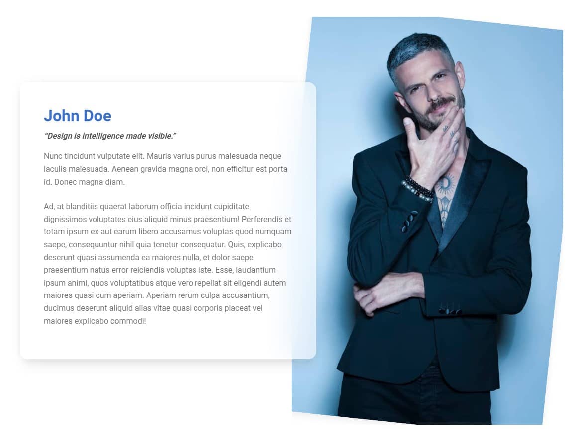
Step 1 - add a hover effect to the image in the About me section
In the second column of the About me section, we have a photo.
      <!-- Second column -->
      <div class="col-lg-6 mb-5 mb-lg-0">

        <img src="https://mdbootstrap.com/img/new/standard/people/272.jpg"
          class="w-100 rounded-7 shadow-4 rotate-lg" alt="" />

      </div>
      <!-- Second column -->
To be able to add a hover effect to it, we need to put it in a div with classes bg-image and hover-overlay.
    <div class="bg-image hover-overlay">
      <img src="https://mdbootstrap.com/img/new/standard/people/272.jpg"
        class="w-100 rounded-7 shadow-4 rotate-lg" alt="" />
    </div>
However, it causes a bug - the image is cut off.
To fix this, we need to move the rotate-lg class from the <img> element to the element with bg-image class. By the way, let's also move the rounded-7 and shadow-4 classes there, because this external wrapper will take over all the effects originally applied to the <img> element:
    <div class="bg-image hover-overlay rounded-7 shadow-4 rotate-lg">
      <img src="https://mdbootstrap.com/img/new/standard/people/272.jpg"
        class="w-100" alt="" />
    </div>
And now it's fine again.
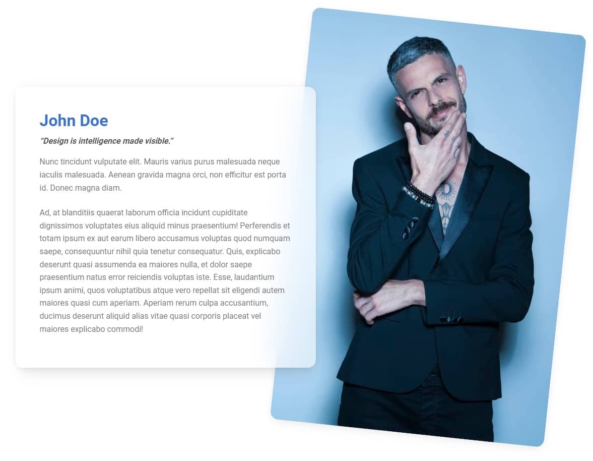
Step 2 - add a mask
As we wrote at the beginning of the lesson, to apply the hover-effect of the overlay type, we need to add a mask next to the <img> element.
    <div class="bg-image hover-overlay rounded-7 shadow-4 rotate-lg">
      <img src="https://mdbootstrap.com/img/new/standard/people/272.jpg" class="w-100" alt="" />
      <div class="mask"
           style="background: linear-gradient(
                  45deg,
                  hsla(169, 84.5%, 52%, 0.3),
                  hsla(263, 87.7%, 44.7%, 0.3) 100%
                  )">
        </div>
    </div>
And now when you hover over the image you will see a nice, gradient mask.

To learn more about hover effect read hover effects documentation page.

About author
Michal Szymanski
Co Founder at MDBootstrap / Listed in Forbes „30 under 30" / Open-source enthusiast / Dancer, nerd & book lover.
Author of hundreds of articles on programming, business, marketing and productivity. In the past, an educator working with troubled youth in orphanages and correctional facilities.