Free UI/UX design course
Learn how to create exceptional designs by reading my new tutorial.
Start learningNested flexbox
In the previous tutorial, we used flexbox to center content vertically and horizontally.
In this lesson, we will learn how to create a complex layout by embedding one flexbox into another.
Step 1 - add main heading
Let's add a main heading to our intro. Here we will use special display classes that make normal headings large (while also being responsive and reducing the size on small screens).
          <!-- First column -->
          <div class="col-lg-6 vh-100">

            <div class="">
              <h2 class="display-4">John Doe</h2>
              <h1 class="display-2 fw-bold text-uppercase">Web developer</h1>
            </div>

          </div>
          <!-- First column -->
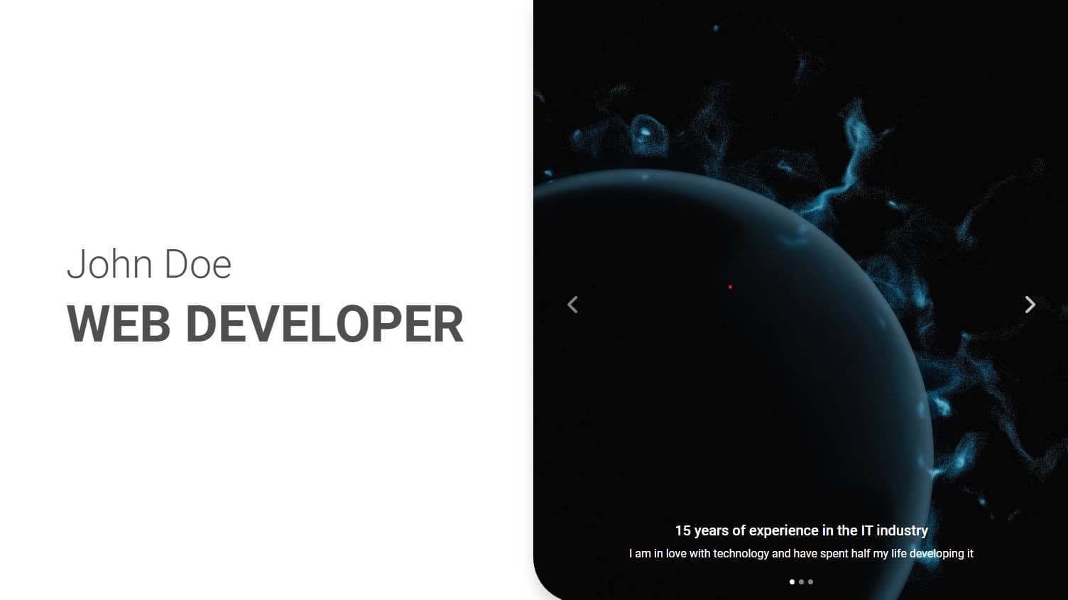
John Doe
Web developer
Step 2 - center the content using flexbox
Using the flexbox classes we learned in the previous tutorial, let's center the content horizontally and vertically by adding these classes to the first column.
            <!-- First column -->
            <div class="col-lg-6 vh-100 d-flex justify-content-center align-items-center">

              <div class="">
                <h2 class="display-4">John Doe</h2>
                <h1 class="display-2 fw-bold text-uppercase">Web developer</h1>
              </div>

            </div>
            <!-- First column -->
And now it's centered.
Step 3 - add CTA (Call to Action) elements
Below the headings we will add another div with a few more elements: a GitHub icon, a divider and a button (we covered all these things in the previous tutorial, so I won't dwell on it here).
        <!-- First column -->
        <div class="col-lg-6 vh-100 d-flex justify-content-center align-items-center">

          <!-- Headings -->
          <div class="">
            <h2 class="display-4">John Doe</h2>
            <h1 class="display-2 fw-bold text-uppercase">Web developer</h1>
          </div>

          <!-- CTA elements -->
          <div class="">
            <a href="https://github.com/mdbootstrap/mdb-ui-kit" target="_blank" class="text-dark"><i
                class="fab fa-github fa-xl"></i></a>
            <hr class="hr d-none d-xl-flex" style="height: 2px; width: 200px;">
            <a class="btn btn-primary btn-lg btn-rounded" href="#" role="button" data-mdb-ripple-init>See my projects<i
                class="fas fa-angle-down ms-2"></i></a>
          </div>

        </div>
        <!-- First column -->
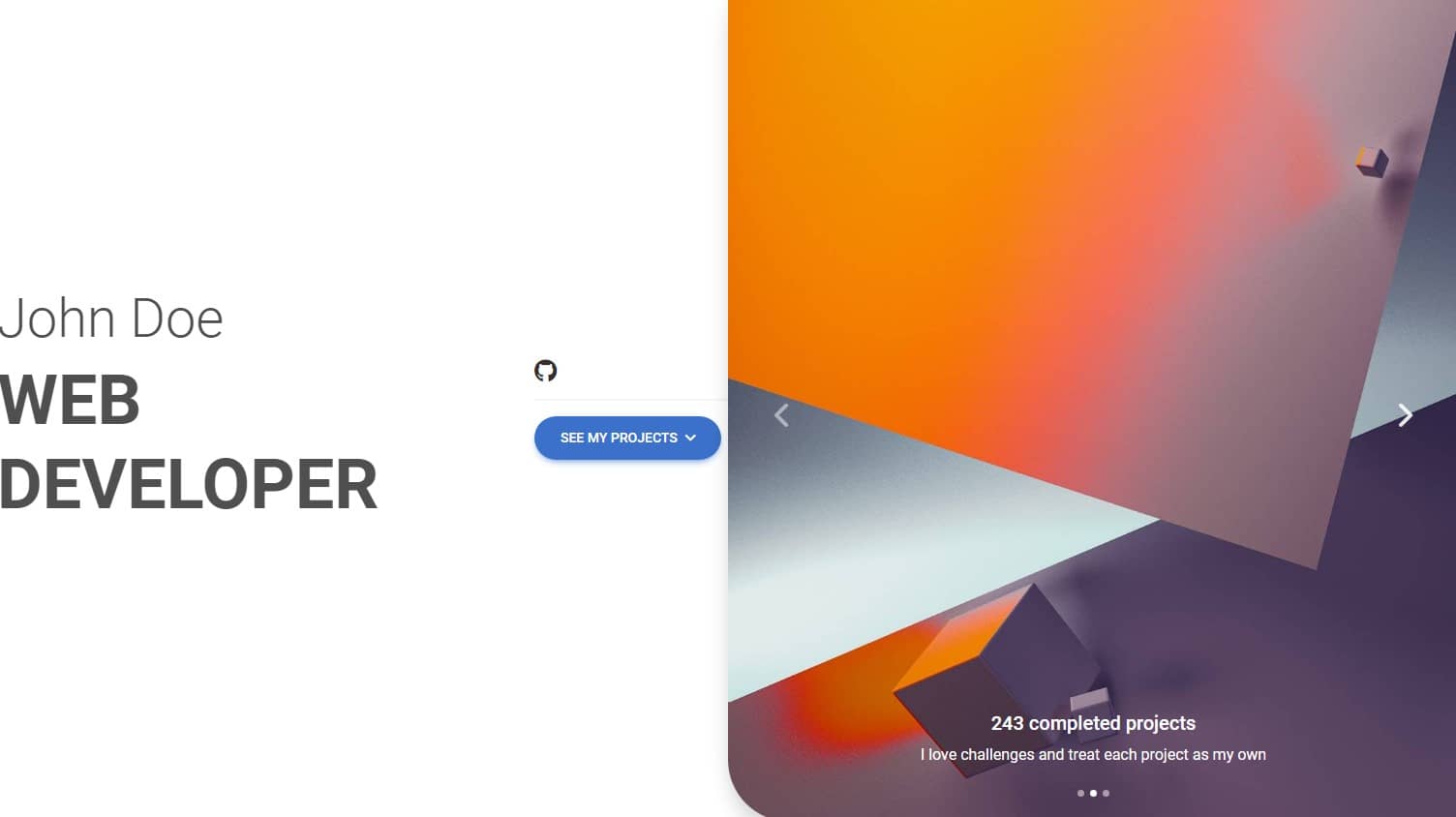
But now it's broken 😕
Step 4 - change the direction of the flexbox
By default, the flexbox is set horizontally, as you can see in our intro - all elements are arranged in one line instead of one below the other.
We can easily fix this by changing the direction of the flexbox from horizontal to vertical.
Just add the flex-column class to the flexbox wrapper (in this case, our first column).
            <!-- First column -->
            <div class="col-lg-6 vh-100 d-flex flex-column justify-content-center align-items-center">

              [...]

            </div>
            <!-- First column -->
And now they stack one under another.
Step 5 - fix CTA elements
Now we need to make the CTA elements line up horizontally in one line.
So we need to add another flexbox, this time to the wrapper containing the CTA.
          <!-- CTA elements -->
          <div class="d-flex">
            <a href="https://github.com/mdbootstrap/mdb-ui-kit" target="_blank" class="text-dark"><i
                class="fab fa-github fa-xl"></i></a>
            <hr class="hr d-none d-xl-flex" style="height: 2px; width: 200px;">
            <a class="btn btn-primary btn-lg btn-rounded" href="#" role="button" data-mdb-ripple-init>See my projects<i
                class="fas fa-angle-down ms-2"></i></a>
          </div>
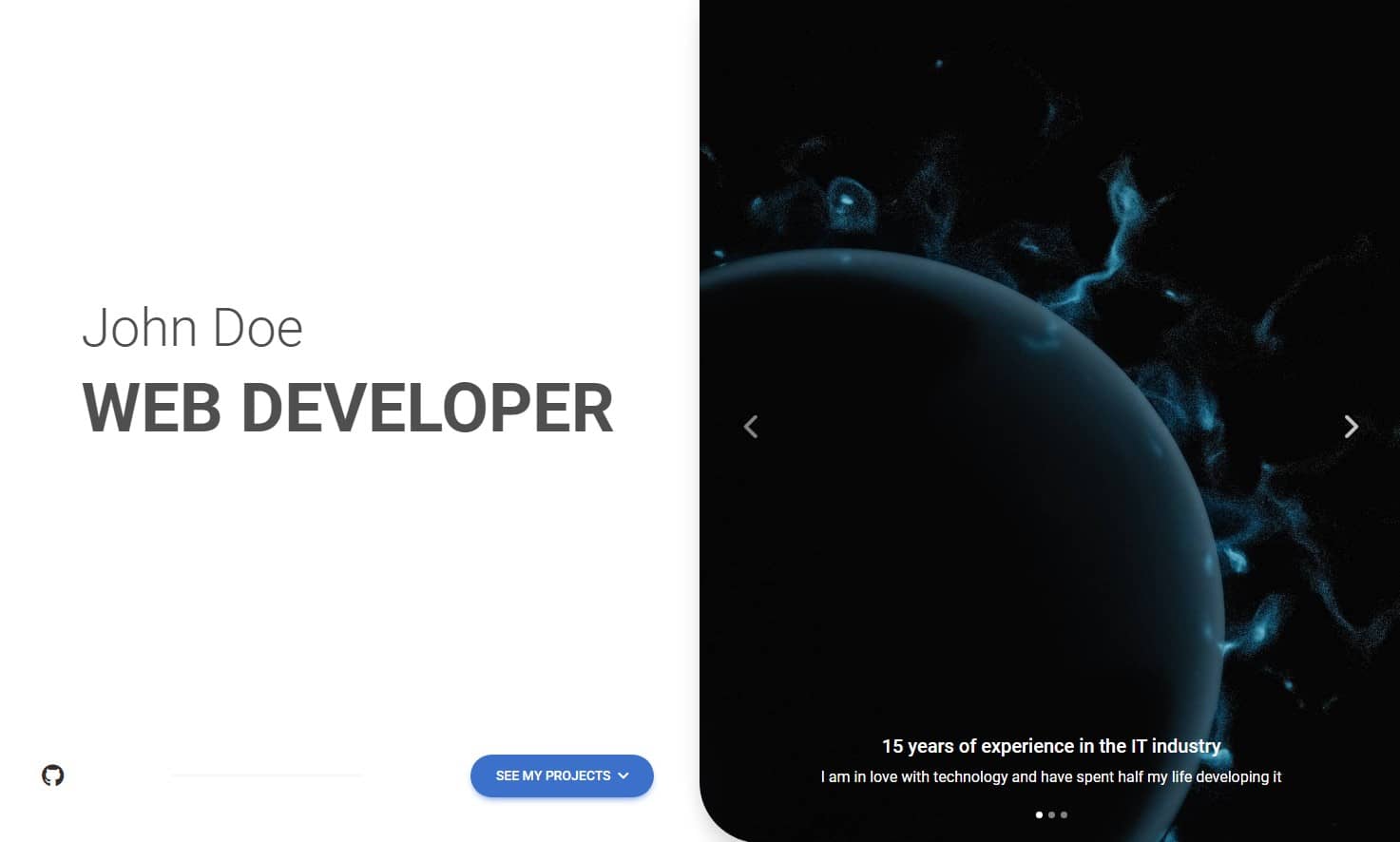
They line up, but they're crooked. We need few more classes to make it look good.
Add align-items-center class to align the items:
          <!-- CTA elements -->
          <div class="d-flex align-items-center">
            <a href="https://github.com/mdbootstrap/mdb-ui-kit" target="_blank" class="text-dark"><i
                class="fab fa-github fa-xl"></i></a>
            <hr class="hr d-none d-xl-flex" style="height: 2px; width: 200px;">
            <a class="btn btn-primary btn-lg btn-rounded" href="#" role="button" data-mdb-ripple-init>See my projects<i
                class="fas fa-angle-down ms-2"></i></a>
          </div>
Now add class w-100 to stretch the CTA wrapper to full width. Then add a justify-content-between class to distribute them evenly over the available space (first element leftmost, second element middle, third element rightmost).
By the way let's also add classes px-5 to add padding on the left and right and mb-5 to add a bottom margin.
          <!-- CTA elements -->
          <div class="d-flex align-items-center w-100 justify-content-between px-5 mb-5">
            <a href="https://github.com/mdbootstrap/mdb-ui-kit" target="_blank" class="text-dark"><i
                class="fab fa-github fa-xl"></i></a>
            <hr class="hr d-none d-xl-flex" style="height: 2px; width: 200px;">
            <a class="btn btn-primary btn-lg btn-rounded" href="#" role="button" data-mdb-ripple-init>See my projects<i
                class="fas fa-angle-down ms-2"></i></a>
          </div>
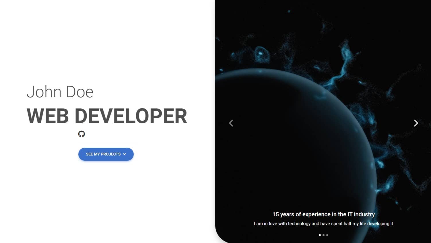
And now it's perfect.
Step 6 - add one more flexbox
Now something tricky - we want the headings to stay in the center, but move CTA elements to the bottom edge of the screen.
To do so, we need to wrap the div with the headings within another div, and this outer div needs to have a height set to 100% and a flexbox, to center the content horizontally and vertically.
Sounds complicated, doesn't it? It wil get easier when we actually use it. Let's do it:
        <!-- Headings -->
        <div class="h-100 d-flex justify-content-center align-items-center px-5">

          <div class="">
            <h2 class="display-4">John Doe</h2>
            <h1 class="display-2 fw-bold text-uppercase">Web developer</h1>
          </div>

        </div>
(By the way, we also added a px-5 class to give padding to the left and right sides. This will keep the headings from touching the edge directly.)
Now it's exactly how it should be!
Huh, that was crazy. A flexbox, inside a flexbox, and another flexbox inside.

For complex concepts such as nested flexbox, there is no better way to consolidate knowledge than simply experimenting. Before moving on to the next lesson, play around with our new intro - add and subtract individual flexbox classes to see what happens.
In the flexbox documentation page you can find all the avaialble flexbox option. Additionally you can play with our flexbox generator.
And if something in the tutorial is not clear, hit me up on twitter!

About author
Michal Szymanski
Co Founder at MDBootstrap / Listed in Forbes „30 under 30" / Open-source enthusiast / Dancer, nerd & book lover.
Author of hundreds of articles on programming, business, marketing and productivity. In the past, an educator working with troubled youth in orphanages and correctional facilities.