Free UI/UX design course
Learn how to create exceptional designs by reading my new tutorial.
Start learningGrid tips and tricks
Now that we've learned the basics of the grid, it's time to learn some useful tricks that will help us deal with problems like the ones described below.
First, there is very little space between the carousel column on the left and the detail column on the right. Our layout looks cramped and "there's no way to breathe". This takes away from its aesthetic value.
The second problem is that on smaller screens, when the column with "Details" jumps under the column with the carousel, there is no longer any space between them - they just "touch". This doesn't look good either.
Let's fix both issues.
Step 1 - add gutter
Gutters are the padding between your columns, used to responsively space and align content in the Bootstrap grid system.
They are very similar to the spacing classes and use a similar 5-point scale and the letters x and
y to specify the direction (x for the x-axis, which is horizontal, and y for
the y-axis, which is vertical).
Gutters are usually added to the row element. The example below will add a large space (5 is the
highest degree) on the x-axis between the columns.
        <!-- Gutter example -->
        <div class="row gx-5">
Let's add a gutter class to our project:
              <!-- Section: Details -->
              <section class="mb-10">

                <div class="row gx-5">

                  <div class="col-lg-7">

                    [...]

                  </div>

                  <div class="col-lg-5">

                    [...]

                  </div>

                </div>

              </section>
              <!-- Section: Details -->
.webp)
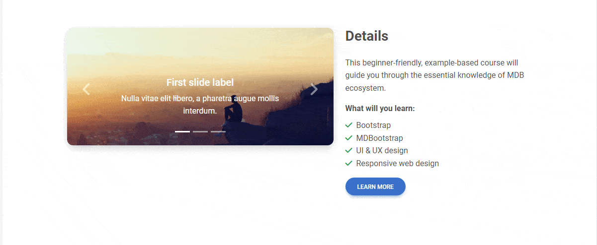
First slide label
Nulla vitae elit libero, a pharetra augue mollis interdum.
.webp)
Second slide label
Lorem ipsum dolor sit amet, consectetur adipiscing elit.
.webp)
Third slide label
Praesent commodo cursus magna, vel scelerisque nisl consectetur.
Details
This beginner-friendly, example-based course will guide you through the essential knowledge of MDB ecosystem.
What will you learn:
- Bootstrap
- MDBootstrap
- UI & UX design
- Responsive web design
Oh finally space! Now there is something to breathe 🥰
But unfortunately, this raises another problem. While on large screens such a distance is most advisable, on medium ones (e.g. on tablets) it may be too large.
I suspect you've already figured out how we're going to solve this.
Let's add a breakpoint to gutter!
<div class="row gx-xl-5">
Now wide spacing between columns will only appear on extra large screens, and will be the default on smaller screens.
Step 2 - add responsive bottom margin
Now let's solve our second problem. As we saw above, on small screens, when one column jumps under another, their content "touches".
We can easily solve this by adding spacing classes to the columns with a bottom margin, and additionally by using a breakpoint that will make the margin disappear when the columns are next to each other (because it is only needed when one is below the other).
                    <!-- Section: Details -->
                    <section class="mb-10">

                      <div class="row gx-xl-5">

                        <div class="col-lg-7 mb-5 mb-lg-0">

                          [...]

                        </div>

                        <div class="col-lg-5 mb-5 mb-lg-0">

                          [...]

                        </div>

                      </div>

                    </section>
                    <!-- Section: Details -->
And now it looks good on both desktop and mobile view.

By the way, we can replace the fixed bottom margin in the Header and Details sections with a responsive one. Thanks to this, on large screens the gap between one section and another will be larger (since we have more space at our disposal, let's use it), and on small screens the gap will be smaller.
 <!--Main Navigation-->
 <header class="mb-5 mb-lg-7">
      <!-- Section: Details -->
      <section class="mb-5 mb-lg-10">

About author
Michal Szymanski
Co Founder at MDBootstrap / Listed in Forbes „30 under 30" / Open-source enthusiast / Dancer, nerd & book lover.
Author of hundreds of articles on programming, business, marketing and productivity. In the past, an educator working with troubled youth in orphanages and correctional facilities.