Free UI/UX design course
Learn how to create exceptional designs by reading my new tutorial.
Start learningIntro section
Our intro section will have a cascading layout familiar to us from previous lessons.
We will divide it into 2 parts - the upper one (in gray) and the lower one (in white, which will blend with the background of the rest of the page).
Step 1 - create upper intro
Unfortunately, we can't accomplish our cascading layout with classes or inline CSS because we need Media Queries to be able to apply different conditions to different screen widths. Without this, we will not be able to create a version that will look good on both desktop and mobile.
We have to create a section with a div inside it. Then we need to give this div an ID so we can refer to it later in our CSS.
So let's set this ID to #intro-upper and then let's add a custom height and background color by referring to this ID via CSS:
    <!-- Section: Intro -->
    <section class="">

      <style>
        #intro-upper {
          height: 500px;
          background-color: hsl(0, 0%, 94%);
        }

        @media (max-width: 767.98px) {
          #intro-upper {
            height: 500px;
          }
        }
      </style>

      <div id="intro-upper">


      </div>

    </section>
    <!-- Section: Intro -->
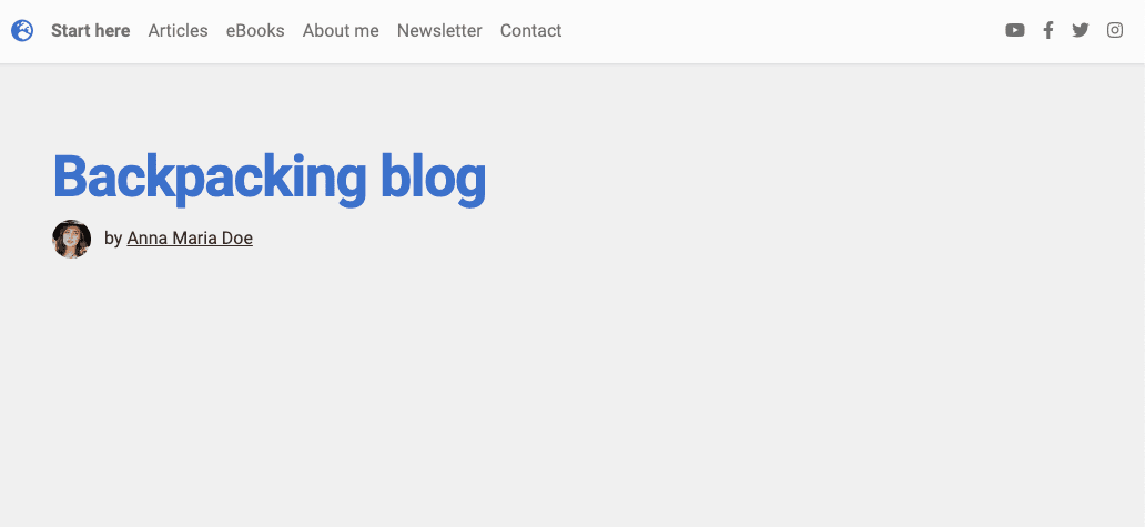
Step 2 - add content to the #intro-upper
Now let's add content to the section.
We put a container in the middle to give proper margins on the sides of the section.
As the header, we'll use an h1 element with the display class and some of the other text styling classes we've learned about in previous lessons.
Below the header, we put an avatar with the author's name.
      <!-- Section: Intro -->
      <section class="">

        <style>
          #intro-upper {
            height: 500px;
            background-color: hsl(0, 0%, 94%);
          }

          @media (max-width: 767.98px) {
            #intro-upper {
              height: 500px;
            }
          }
        </style>

        <div id="intro-upper" class="pb-5">

          <div class="container pt-4">

            <h1 class="display-4 pt-5 fw-bold ls-tight text-primary">Backpacking blog</h1>
            <p class="text-dark pb-5"> <img src="https://mdbootstrap.com/img/new/avatars/13.jpg"
                class="rounded-circle me-2" height="35" alt="" loading="lazy" />
              <span> by</span>
              <a href="" class="text-reset"><u>Anna Maria Doe</u></a>
            </p>

          </div>
        </div>

      </section>
      <!-- Section: Intro -->
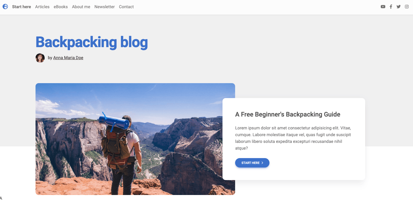
Step 3 - create lower intro
It's time for the lower part of the intro.
Below the #intro-upper part, let's create a div with the ID #intro-lower, and then referring to this ID in CSS, add a negative top margin that will cause the bottom section to overlap the top one and create a cascading effect.
          <!-- Section: Intro -->
          <section class="">

            <style>
              /* [...] */

              #intro-lower {
                margin-top: -240px;
              }

              @media (max-width: 767.98px) {
                #intro-lower {
                  margin-top: -270px;
                }
              }
            </style>

            <div id="intro-upper">

              [...]

            </div>

            <div id="intro-lower">

            </div>

          </section>
          <!-- Section: Intro -->
Step 4 - add content to the #intro-lower
It will be easy now.
In #intro-lower we add a container with a grid for 2 columns.
In the left column we add a responsive image.
In the right, we add a regular card with text and a Call to Action button.
In this case, we can achieve a cascading effect using Bootstrap spacing classes. All you have to do is add the ms-xl-n5 class (negative margin on the left side on XL screens) and the ms-0 class to the right column, so that the elements are displayed by default on mobile devices.
          <!-- Section: Intro -->
          <section class="">

            <style>
              /* [...] */

              #intro-lower {
                margin-top: -240px;
              }

              @media (max-width: 767.98px) {
                #intro-lower {
                  margin-top: -270px;
                }
              }
            </style>

            <div id="intro-upper">

              [...]

            </div>

            <div id="intro-lower">

              <div class="container">
                <div class="row g-0 align-items-center">
                  <div class="col-xl-7 mb-4 mb-xl-0">
                    <img src="https://blog-tutorial.mdbgo.io/assets/featured.jpg" class="w-100 rounded-6" alt="Backpacker" />
                  </div>
                  <div class="col-xl-5 ms-0 ms-xl-n5">
                    <div class="card rounded-6 shadow-5">
                      <div class="card-body px-4 p-4 p-md-5 p-lg-4 p-xl-5">
                        <h4 class="mb-4">A Free Beginner's Backpacking Guide
                        </h4>
                        <p class="text-muted mb-4">Lorem ipsum dolor sit amet consectetur adipisicing elit. Vitae, cumque. Labore molestiae itaque vel, quas fugit unde suscipit laborum libero soluta expedita excepturi recusandae nihil atque?</p>
                        <button data-mdb-ripple-init class="btn btn-primary btn-rounded">Start here <i
                            class="fas fa-angle-right ms-1"></i></button>
                      </div>
                    </div>
                  </div>
                </div>
              </div>

            </div>

          </section>
          <!-- Section: Intro -->
Finally, the entire intro section should look like this:
          <!-- Section: Intro -->
          <section class="">

            <style>
              #intro-upper {
                height: 500px;
                background-color: hsl(0, 0%, 94%);
              }

              @media (max-width: 767.98px) {
                #intro-upper {
                  height: 500px;
                }
              }

              #intro-lower {
                margin-top: -240px;
              }

              @media (max-width: 767.98px) {
                #intro-lower {
                  margin-top: -270px;
                }
              }
            </style>

            <div id="intro-upper" class="pb-5">

              <div class="container pt-4">

                <h1 class="display-4 pt-5 fw-bold ls-tight text-primary">Backpacking blog</h1>
                <p class="text-dark pb-5"> <img src="https://mdbootstrap.com/img/new/avatars/13.jpg"
                    class="rounded-circle me-2" height="35" alt="" loading="lazy" />
                  <span> by</span>
                  <a href="" class="text-reset"><u>Anna Maria Doe</u></a>
                </p>

              </div>
            </div>

            <div id="intro-lower">

              <div class="container">
                <div class="row g-0 align-items-center">
                  <div class="col-xl-7 mb-4 mb-xl-0">
                    <img src="https://blog-tutorial.mdbgo.io/assets/featured.jpg" class="w-100 rounded-6" alt="Backpacker" />
                  </div>
                  <div class="col-xl-5 ms-0 ms-xl-n5">
                    <div class="card rounded-6 shadow-5">
                      <div class="card-body px-4 p-4 p-md-5 p-lg-4 p-xl-5">
                        <h4 class="mb-4">A Free Beginner's Backpacking Guide
                        </h4>
                        <p class="text-muted mb-4">Lorem ipsum dolor sit amet consectetur adipisicing elit. Vitae, cumque. Labore molestiae itaque vel, quas fugit unde suscipit laborum libero soluta expedita excepturi recusandae nihil atque?</p>
                        <button data-mdb-ripple-init class="btn btn-primary btn-rounded">Start here <i
                            class="fas fa-angle-right ms-1"></i></button>
                      </div>
                    </div>
                  </div>
                </div>
              </div>

            </div>

          </section>
          <!-- Section: Intro -->

About author
Michal Szymanski
Co Founder at MDBootstrap / Listed in Forbes „30 under 30" / Open-source enthusiast / Dancer, nerd & book lover.
Author of hundreds of articles on programming, business, marketing and productivity. In the past, an educator working with troubled youth in orphanages and correctional facilities.