Free UI/UX design course
Learn how to create exceptional designs by reading my new tutorial.
Start learningUtility API
The utility-first approach is rapidly gaining popularity. It involves emphasizing writing code with "small" CSS classes that closely correspond to and constrained to a given CSS property (e.g. bg-red class for the background-color: red CSS property) instead of creating "big" classes that aggregate many different properties ( such as the card class aggregates multiple CSS properties that make up the card component, such as padding, shadow, display, and many more).
Bootstrap and MDB try to find a balance between these two approaches. On the one hand, they provide a wide range of predefined components, and on the other hand, an equally wide range of utilities.
An additional, extremely useful option is our Utilities API. It is a tool that allows you to easily adjust existing utilities to the needs of a given project or create new utilities if needed.
Let's learn how to use it.
Step 1 - import source files
Have a look a the /src/scss/style.scss file. You will notice an import like this:
@import 'mdb-ui-kit/css/mdb.min.css';
As you can tell by the name of the file, it is CSS. However, we need scss to be able to use the Utility API. So we need to import the scss version of the MDB instead of CSS.
So let's change the current import to this:
@import 'mdb-ui-kit/src/scss/mdb.free.scss';
mdb.free.scss file, you should add import mdb.pro.scss as in the example below.
@import 'mdb-ui-kit/src/scss/mdb.pro.scss';
Step 2 - create utility
Now we are ready to create our first custom utility.
Let's use something cool, like the transform property to rotate the element.
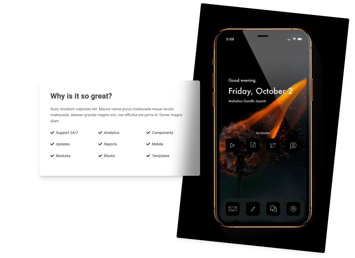
Such a utility will be extremely useful when creating original, fancy compositions like the one below:
How to do this? Have a look at the code below, that we added to src/scss/styles.scss file:
      $utilities: (
        "myNewUtility": (
          property: transform,
          values: (
            0: rotate(0deg),
            10: rotate(10deg),
            30: rotate(30deg),
            45: rotate(45deg),
            90: rotate(90deg),
            180: rotate(180deg),
          )
        )
      );

      @import 'mdb-ui-kit/src/scss/mdb.free.scss';
1. Above the import we added a sass map $utilities.
Maps in Sass hold pairs of keys and values, and make it easy to look up a value by its corresponding key.
They’re written (<expression>: <expression>, <expression>: <expression>). The expression before the : is the key, and the expression after is the value associated with that key. The keys must be unique, but the values may be duplicated.
Source: Official sass docs
I named this new utility myNewUtility, but you can name it whatever you want. It's good practice to call them the name of the property the utility applies to (in this case, that would be transform). So let's change it:
      $utilities: (
        "transform": (
          property: transform,
          values: (
            0: rotate(0deg),
            10: rotate(10deg),
            30: rotate(30deg),
            45: rotate(45deg),
            90: rotate(90deg),
            180: rotate(180deg),
          )
        )
      );

      @import 'mdb-ui-kit/src/scss/mdb.free.scss';
2. Next, we set the CSS property on which our utility is to be based, which in this case is property: transform .
3. Then we specify which classes should refer to which values of the transform property.
Showing it on a specific example - the following scss map:
      $utilities: (
        "transform": (
          property: transform,
          values: (
            0: rotate(0deg),
            10: rotate(10deg),
            30: rotate(30deg),
            45: rotate(45deg),
            90: rotate(90deg),
            180: rotate(180deg),
          )
        )
      );

      @import 'mdb-ui-kit/src/scss/mdb.free.scss';
...will generate the following CSS code for us:
      .transform-0 {
        transform: rotate(0deg) !important
      }

      .transform-10 {
        transform: rotate(10deg) !important
      }

      .transform-30 {
        transform: rotate(30deg) !important
      }

      .transform-45 {
        transform: rotate(45deg) !important
      }

      .transform-90 {
        transform: rotate(90deg) !important
      }

      .transform-180 {
        transform: rotate(180deg) !important
      }
And now we can use these classes in our HTML. Let's try this!
Step 3 - use the newly created utility classes in HTML
Let's add a simple image to the index.html file:
<img src="https://mdbootstrap.com/img/new/avatars/2.jpg">

Now let's add one of the newly created utility classes, for example transform-90:
<img class="transform-90" src="https://mdbootstrap.com/img/new/avatars/2.jpg">
Or transform-45:
<img class="transform-45" src="https://mdbootstrap.com/img/new/avatars/2.jpg">
Isn't it awesome? And this is just the beginning of the powerful API tool. Let's explore this even further.
Step 4 - make it responsive
The responsive option is one of the best things about the Utility API. Thanks to it, we can easily generate our utilities in a form containing responsive breakpoints (for example, transform-md-45 which will make our utility works only on a specific size of the screen).
All we need to do is to add the responsive boolean to our sass map:
        $utilities: (
          "transform": (
            property: transform,
            responsive: true,
            values: (
              0: rotate(0deg),
              10: rotate(10deg),
              30: rotate(30deg),
              45: rotate(45deg),
              90: rotate(90deg),
              180: rotate(180deg),
            )
          )
        );
And then we can use it in our HTML like this:
<img class="transform-lg-90" src="https://mdbootstrap.com/img/new/avatars/2.jpg">
And now the image below will be rotated 90 degrees only on large (lg) screens, i.e. wider than 992px. Resize your browser window to see the effect.
Step 5 - add state
You can use the state option to generate pseudo-class variations, for example :hover or :focus.
        $utilities: (
          "transform": (
            property: transform,
            state: hover,
            values: (
              0: rotate(0deg),
              10: rotate(10deg),
              30: rotate(30deg),
              45: rotate(45deg),
              90: rotate(90deg),
              180: rotate(180deg),
            )
          )
        );
And then we can use it in our HTML like this:
<img class="transform-90-hover" src="https://mdbootstrap.com/img/new/avatars/2.jpg">
Hover the image below to see it rotating 90 degrees.
These are the most important features of the Utility API, but there are more options. If you want to know more check out our Utility API documentation page.
And as always - if you have any questions, or something doesn't work as expected - hit me up on twitter 😉

About author
Michal Szymanski
Co Founder at MDBootstrap / Listed in Forbes „30 under 30" / Open-source enthusiast / Dancer, nerd & book lover.
Author of hundreds of articles on programming, business, marketing and productivity. In the past, an educator working with troubled youth in orphanages and correctional facilities.