Free UI/UX design course
Learn how to create exceptional designs by reading my new tutorial.
Start learningPosts
This lesson will be short and simple.
In one of the previous tutorials we learn how to create a cascading card. In this lesson we will use the same technic to create the entire listing such cards.
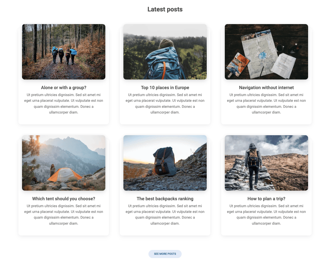
Step 1 - add posts section
Inside of the <main> section and within the container, add posts section.
Then add a 3 columns grid inside.
We want to have 6 cards in this section, 3 cards per row. But note, that we don't need to add 2 separate .row. If we specify correctly the column units, Bootstrap will distribute it automatically.
As you remember from the grid lesson, Bootstrap grid allows you to add up to 12 units in one line. If you add more than 12, the excess column will jump to the next line.
Here we are using .col-lg-4, so 4 units for each column. It's easy to count, that 12 of available unites divided by 4 units of each column will result in 3 columns per row.
        <!--Main layout-->
        <main>
          <div class="container">

            <!-- Section: Posts -->
            <section class="text-center mb-10">

              <h3 class="fw-bold mb-7 text-center">Latest posts</h3>

              <div class="row gx-lg-5">

                <!-- Column -->
                <div class="col-lg-4 col-md-12 mb-7">


                </div>
                <!-- Column -->

                <!-- Columns -->
                <div class="col-lg-4 mb-7">


                </div>
                <!-- Columns -->

                <!-- Column -->
                <div class="col-lg-4 mb-7">


                </div>
                <!-- Column -->

                <!-- Column -->
                <div class="col-lg-4 col-md-12 mb-7">


                </div>
                <!-- Column -->

                <!-- Columns -->
                <div class="col-lg-4 mb-7">


                </div>
                <!-- Columns -->

                <!-- Column -->
                <div class="col-lg-4 mb-7">


                </div>
                <!-- Column -->

              </div>

            </section>
            <!-- Section: Posts -->

          </div>
        </main>
        <!--Main layout-->
There is one more problem - there is no enough space between our intro section and posts section, so the "Lates posts" heading touches the image of intro section.
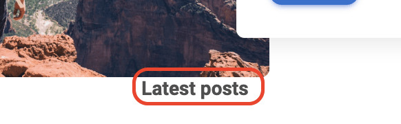
Let's fix it by adding .mb-10 class to the <header>. It will provide a proper bottom margin.
    <!--Main Navigation-->
    <header class="mb-10">
Step 2 - add cascading cards
As mentioned before, we already learned how to create a cascading card, so let's use this knowledge and let's add a card to each of the column.
    <!-- Section: Posts -->
    <section class="text-center mb-10">

      <h3 class="fw-bold mb-7 text-center">Latest posts</h3>

      <div class="row gx-lg-5">

        <!-- Column -->
        <div class="col-lg-4 col-md-12 mb-7">

          <div class="card rounded-6 h-100">
            <div class="bg-image hover-overlay ripple mx-3 shadow-4-strong rounded-6 mt-n3"
                 data-mdb-ripple-init data-mdb-ripple-color="light">
              <img src="https://blog-tutorial.mdbgo.io/assets/1.jpg" class="w-100">

              <a href="#!">
                <div class="mask" style="background-color: rgba(251, 251, 251, 0.15);"></div>
              </a>

            </div>
            <div class="card-body">
              <h5 class="card-title">Alone or with a group?</h5>

              <p class="text-muted">
                Ut pretium ultricies dignissim. Sed sit amet mi eget urna
                placerat vulputate. Ut vulputate est non quam dignissim
                elementum. Donec a ullamcorper diam.
              </p>
            </div>
          </div>

        </div>
        <!-- Column -->

        <!-- Columns -->
        <div class="col-lg-4 mb-7">

          <div class="card rounded-6 h-100">
            <div class="bg-image hover-overlay ripple mx-3 shadow-4-strong rounded-6 mt-n3"
                 data-mdb-ripple-init data-mdb-ripple-color="light">
              <img src="https://blog-tutorial.mdbgo.io/assets/2.jpg" class="w-100">

              <a href="#!">
                <div class="mask" style="background-color: rgba(251, 251, 251, 0.15);"></div>
              </a>

            </div>
            <div class="card-body">
              <h5 class="card-title">Top 10 places in Europe</h5>

              <p class="text-muted">
                Ut pretium ultricies dignissim. Sed sit amet mi eget urna
                placerat vulputate. Ut vulputate est non quam dignissim
                elementum. Donec a ullamcorper diam.
              </p>
            </div>
          </div>

        </div>
        <!-- Columns -->

        <!-- Column -->
        <div class="col-lg-4 mb-7">

          <div class="card rounded-6 h-100">
            <div class="bg-image hover-overlay ripple mx-3 shadow-4-strong rounded-6 mt-n3"
                 data-mdb-ripple-init data-mdb-ripple-color="light">
              <img src="https://blog-tutorial.mdbgo.io/assets/3.jpg" class="w-100">

              <a href="#!">
                <div class="mask" style="background-color: rgba(251, 251, 251, 0.15);"></div>
              </a>

            </div>
            <div class="card-body">
              <h5 class="card-title">Navigation without internet</h5>
              <p class="text-muted">
                Ut pretium ultricies dignissim. Sed sit amet mi eget urna
                placerat vulputate. Ut vulputate est non quam dignissim
                elementum. Donec a ullamcorper diam.
              </p>
            </div>
          </div>

        </div>
        <!-- Column -->

        <!-- Column -->
        <div class="col-lg-4 col-md-12 mb-7">

          <div class="card rounded-6 h-100">
            <div class="bg-image hover-overlay ripple mx-3 shadow-4-strong rounded-6 mt-n3"
                 data-mdb-ripple-init data-mdb-ripple-color="light">
              <img src="https://blog-tutorial.mdbgo.io/assets/4.jpg" class="w-100">

              <a href="#!">
                <div class="mask" style="background-color: rgba(251, 251, 251, 0.15);"></div>
              </a>

            </div>
            <div class="card-body">
              <h5 class="card-title">Which tent should you choose?</h5>

              <p class="text-muted">
                Ut pretium ultricies dignissim. Sed sit amet mi eget urna
                placerat vulputate. Ut vulputate est non quam dignissim
                elementum. Donec a ullamcorper diam.
              </p>
            </div>
          </div>

        </div>
        <!-- Column -->

        <!-- Columns -->
        <div class="col-lg-4 mb-7">

          <div class="card rounded-6 h-100">
            <div class="bg-image hover-overlay ripple mx-3 shadow-4-strong rounded-6 mt-n3"
                 data-mdb-ripple-init data-mdb-ripple-color="light">
              <img src="https://blog-tutorial.mdbgo.io/assets/5.jpg" class="w-100">

              <a href="#!">
                <div class="mask" style="background-color: rgba(251, 251, 251, 0.15);"></div>
              </a>

            </div>
            <div class="card-body">
              <h5 class="card-title">The best backpacks ranking</h5>
              <p class="text-muted">
                Ut pretium ultricies dignissim. Sed sit amet mi eget urna
                placerat vulputate. Ut vulputate est non quam dignissim
                elementum. Donec a ullamcorper diam.
              </p>
            </div>
          </div>

        </div>
        <!-- Columns -->

        <!-- Column -->
        <div class="col-lg-4 mb-7">

          <div class="card rounded-6 h-100">
            <div class="bg-image hover-overlay ripple mx-3 shadow-4-strong rounded-6 mt-n3"
                 data-mdb-ripple-init data-mdb-ripple-color="light">
              <img src="https://blog-tutorial.mdbgo.io/assets/6.jpg" class="w-100">

              <a href="#!">
                <div class="mask" style="background-color: rgba(251, 251, 251, 0.15);"></div>
              </a>

            </div>
            <div class="card-body">
              <h5 class="card-title">How to plan a trip?</h5>
              <p class="text-muted">
                Ut pretium ultricies dignissim. Sed sit amet mi eget urna
                placerat vulputate. Ut vulputate est non quam dignissim
                elementum. Donec a ullamcorper diam.
              </p>
            </div>
          </div>

        </div>
        <!-- Column -->

      </div>

      <a data-mdb-ripple-init class="btn btn-secondary btn-rounded" href="#" role="button">See more posts</a>

    </section>
    <!-- Section: Posts -->
Note, that we don't add a button to each card.
Currently, it is natural for users that when they click on the picture of the card, they will be transferred to the article. So there's no need to add an extra button that will do the same thing.
If you can avoid adding some UI elements without sacrificing user experience, you should always go this way. Minimalism reduces the mental effort that the user has to make to process each additional element of the interface.
Instead we added a single button See more posts, in case user would like to see more articles.

About author
Michal Szymanski
Co Founder at MDBootstrap / Listed in Forbes „30 under 30" / Open-source enthusiast / Dancer, nerd & book lover.
Author of hundreds of articles on programming, business, marketing and productivity. In the past, an educator working with troubled youth in orphanages and correctional facilities.