Free UI/UX design course
Learn how to create exceptional designs by reading my new tutorial.
Start learningTheming and dark mode
In this tutorial we will learn how to create a famous dark mode in our MDBootstrap project and also how to create a custom theme with the colors we want (for example the colors of our brand).
Enable dark mode for the entire project
Since version 7.0.0, starting dark mode in MDB is child's play - just add a special attribute data-mdb-theme="dark" to the <html> element, your project will change the theme to dark mode!
<html lang="en" data-mdb-theme="dark">
After saving the file, your project will change to dark mode.
Enable color mode for a specific component
You can also change the mode to dark only for the specific component. For example, to change the color mode of a
card, add data-mdb-theme="light" or
data-mdb-theme="dark" to the div with .card class. Now, no matter the global color mode,
these cards will display with the specified theme value.
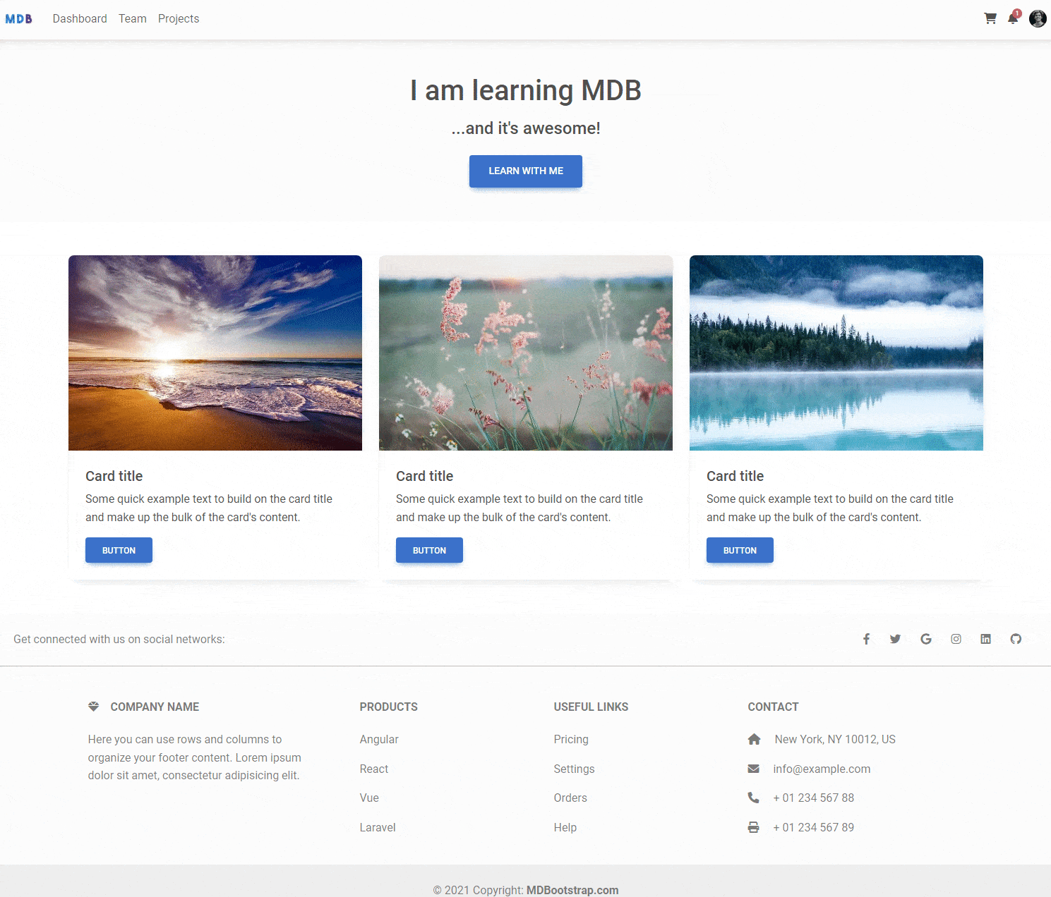
Card title
Some quick example text to build on the card title and make up the bulk of the card's content.
Card title
Some quick example text to build on the card title and make up the bulk of the card's content.
                <div class="row gx-lg-5">

                  <div class="col-lg-6 mb-5 mb-lg-0">

                    <div class="card">
                      <div class="card-body">
                        <h5 class="card-title">Card title</h5>
                        <p class="card-text">Some quick example text to build on the card title and make up the bulk of the card's content.</p>
                        <button type="button" class="btn btn-primary" data-mdb-ripple-init>Button</button>
                      </div>
                    </div>

                  </div>

                  <div class="col-lg-6 mb-5 mb-lg-0">

                    <div class="card" data-mdb-theme="dark">
                      <div class="card-body">
                        <h5 class="card-title">Card title</h5>
                        <p class="card-text">Some quick example text to build on the card title and make up the bulk of the card's content.</p>
                        <button type="button" class="btn btn-primary" data-mdb-ripple-init>Button</button>
                      </div>
                    </div>

                  </div>

                </div>
Building with Sass
If you want to control the color mode and have access to more advanced modifications, you need to use SCSS and one of our starters - e.g. Vite, which we use in this tutorial.
The first thing you need to do is in the src/scss/styles.scss file, change the import of the MDB file from regular css:
@import 'mdb-ui-kit/css/mdb.min.css';
To scss:
@import 'mdb-ui-kit/src/scss/mdb.free.scss';
mdb.free.scss file, you should add import mdb.pro.scss as in the example below.
@import 'mdb-ui-kit/src/scss/mdb.pro.scss';
Custom color modes
While the primary use case for color modes is light and dark mode, custom color modes are also possible. You can create
your own data-mdb-theme selector with a custom value as the name of your color mode, then modify our
Sass and CSS variables as needed.
For example, you can create a “blue theme” with the selector data-mdb-theme="blue". In src/scss/styles.scss file, below @import 'mdb-ui-kit/src/scss/mdb.free.scss'; add the new selector and override any global or component CSS variables as needed.
            @import 'mdb-ui-kit/src/scss/mdb.free.scss';

            [data-mdb-theme="blue"] {
                --mdb-body-color: var(--mdb-white);
                --mdb-body-color-rgb: #{to-rgb($white)};
                --mdb-body-bg: var(--mdb-blue);
                --mdb-body-bg-rgb: #{to-rgb($blue)};
                --mdb-tertiary-bg: #{$blue-600};

                .dropdown-menu {
                  --mdb-dropdown-bg: #{mix($blue-500, $blue-600)};
                  --mdb-dropdown-link-active-bg: #{$blue-700};
                }

                .btn-outline-secondary {
                  --mdb-btn-bg: #{mix($gray-600, $blue-400, 0.5)};
                  --mdb-btn-color: var(--mdb-white);
                  --mdb-btn-border-color: var(--mdb-white);
                  --mdb-btn-hover-bg: #{darken(mix($gray-600, $blue-400, 0.5), 5%)};
                  --mdb-btn-hover-border-color: #{rgba($white, 0.25)};
                  --mdb-btn-active-bg: #{darken(mix($gray-600, $blue-400, 0.5), 10%)};
                  --mdb-btn-active-border-color: #{rgba($white, 0.5)};
                  --mdb-btn-focus-border-color: #{rgba($white, 0.5)};
                  --mdb-btn-focus-box-shadow: 0 0 0 0.25rem rgba(255, 255, 255, 0.2);
                  --mdb-btn-hover-color: var(--mdb-white);
                  --mdb-btn-outline-focus-border-color: #{rgba($white, 0.5)};
                  --mdb-btn-active-color: #{rgba($white, 0.5)};
                }
              }
Some paragraph text to show how the blue theme might look with written copy.
          <div data-mdb-theme="blue">
            ...
          </div>
And that's it for this lesson. Congratulation, you have finished the MDB Advanced Features tutorial! It wasn't that easy, so well done you 💪
If something doesn't work as expected or you have some question - do not hesitate to hit me up on the twitter 😉

About author
Michal Szymanski
Co Founder at MDBootstrap / Listed in Forbes „30 under 30" / Open-source enthusiast / Dancer, nerd & book lover.
Author of hundreds of articles on programming, business, marketing and productivity. In the past, an educator working with troubled youth in orphanages and correctional facilities.