Free UI/UX design course
Learn how to create exceptional designs by reading my new tutorial.
Start learningCascading effect
In this lesson, we will create a section with a cascading effect of elements that overlap each other and thus give the impression of depth and three-dimensionality. We did a similar thing in the previous lesson when creating cascading cards, but this time the effect will be slightly different.
Step 1 - add an empty About me section
Below the Projects modals section, add a new About me section, and place a grid with two equal columns in it:
        <!-- Section: About me -->
        <section class="mb-10">

          <div class="container">
            <div class="row">

              <!-- First column -->
              <div class="col-lg-6 mb-5 mb-lg-0">

              </div>
              <!-- First column -->

              <!-- Second column -->
              <div class="col-lg-6 mb-5 mb-lg-0">

              </div>
              <!-- Second column -->

            </div>
          </div>

        </section>
        <!-- Section: About me -->
Step 2 - add content to the columns
Add a card with a text to the first column and an image to the second:
<!-- Section: About me -->
<section class="mb-10">
<div class="container">
<div class="row">
<!-- First column -->
<div class="col-lg-6 mb-5 mb-lg-0">
<div class="card rounded-7">
<div class="card-body p-lg-5 shadow-5">
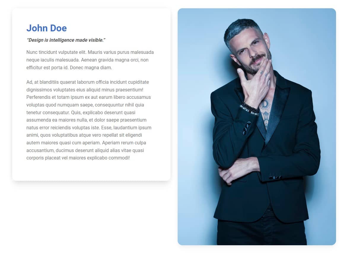
<h2 class="fw-bold">
<span class="text-primary">John Doe</span>
</h2>
<p class="fw-bold"><em>“Design is intelligence made visible.”</em></p>
<p class="text-muted mb-4">
Nunc tincidunt vulputate elit. Mauris varius purus malesuada
neque iaculis malesuada. Aenean gravida magna orci, non
efficitur est porta id. Donec magna diam.
</p>
<p class="text-muted">
Ad, at blanditiis quaerat laborum officia incidunt
cupiditate dignissimos voluptates eius aliquid minus
praesentium! Perferendis et totam ipsum ex aut earum libero
accusamus voluptas quod numquam saepe, consequuntur nihil
quia tenetur consequatur. Quis, explicabo deserunt quasi
assumenda ea maiores nulla, et dolor saepe praesentium natus
error reiciendis voluptas iste. Esse, laudantium ipsum
animi, quos voluptatibus atque vero repellat sit eligendi
autem maiores quasi cum aperiam. Aperiam rerum culpa
accusantium, ducimus deserunt aliquid alias vitae quasi
corporis placeat vel maiores explicabo commodi!
</p>
</div>
</div>
</div>
<!-- First column -->
<!-- Second column -->
<div class="col-lg-6 mb-5 mb-lg-0">
<img
src="https://mdbootstrap.com/img/new/standard/people/272.jpg"
class="w-100 rounded-7 shadow-4" alt="" />
</div>
<!-- Second column -->
</div>
</div>
</section>
<!-- Section: About me -->
Step 3 - add a cascading effect
Let's make the card overlap the photo to create a cascading effect.
First - remove the gap between the columns by adding class gx-0 to the element with class row.
<div class="row gx-0">
And since we're already at the row element, we can immediately add the align-items-center flexbox class here so that our card is exactly in the middle of the photo's height.
Note that for an element with a row class, we don't need to add the d-flex class to enable flexbox, because row has it enabled by default. So we can immediately use flexbox modification classes.
<div class="row gx-0 align-items-center">
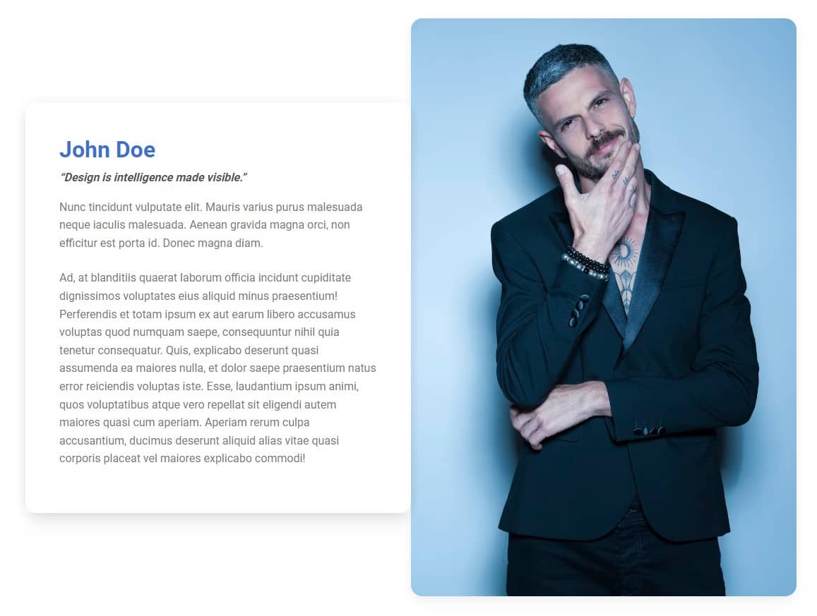
And now we need to add a negative right margin to the card in the first column. So let's use me-lg-n5 class.
Note, that we are using -lg- breakpoint because we only want our cascading effect on large screens (mobile devices lack space to implement it).
          <!-- First column -->
          <div class="col-lg-6 mb-5 mb-lg-0">

            <div class="card rounded-7 me-lg-n5">


About author
Michal Szymanski
Co Founder at MDBootstrap / Listed in Forbes „30 under 30" / Open-source enthusiast / Dancer, nerd & book lover.
Author of hundreds of articles on programming, business, marketing and productivity. In the past, an educator working with troubled youth in orphanages and correctional facilities.