Free UI/UX design course
Learn how to create exceptional designs by reading my new tutorial.
Start learningAnimated navbar
Our navbar already looks good, but we can still improve it.
Currently, the color of our navbar is fixed. However, we, using a bit of custom CSS and JS, will create an animated navbar, which will be transparent at the start, and when the user starts scrolling, the navbar will change color.
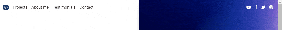
Here's what we want to achieve:

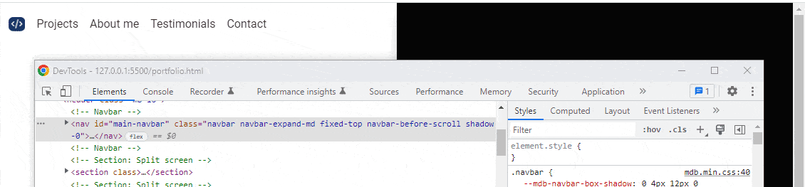
Step 1 - prepare the navbar
We need to add some small modifications to our navbar:
- Remove the shadow by adding
shadow-0class - Remove
navbar-lightandbg-body-tertiaryclasses, because we will set colors in a different way - Add the id
main-navbarthat we will use later in our JavaScript code - Add
navbar-before-scrollclass that we will use to style the navbar before scrolling - Replace
navbar-expand-lgclass withnavbar-expand-mdclass, so the navbar collapses on medium, instead large screens
          <!-- Navbar -->
          <nav id="main-navbar" class="navbar navbar-expand-md fixed-top navbar-before-scroll shadow-0">

            [...]
Step 2 - add small piece of JavaScript code
We need to add a small piece of JavaScript code that will grab our navbar and add a new class to it when the user starts scrolling the page.
Just below linked js/mdb.umd.min.js file and before closing </body> tag open new <script> tags.
    <!-- MDB -->
    <script type="text/javascript" src="js/mdb.umd.min.js"></script>

    <!-- Custom scripts -->
    <script type="text/javascript">


    </script>
Then let's grab the navbar with the ID we set (main-navbar ) and store it in the variable named navbar.
    <!-- MDB -->
    <script type="text/javascript" src="js/mdb.umd.min.js"></script>

    <!-- Custom scripts -->
    <script type="text/javascript">

        const navbar = document.getElementById("main-navbar")

    </script>
Next, let's add an even listener that will perform the desired action when the scrolling starts.
This desired action will be to add a navbar-after-scroll class to the navbar, which we will later use to add new styles to the navbar.
The window.pageYOffset property returns the pixels a
document has scrolled from the upper left corner of the window. In the if statement below we use this property to define if page scrolling happened and if the function should add or remove the class navbar-after-scroll to the navbar.
      const navbar = document.getElementById("main-navbar")

      window.addEventListener('scroll', function () {
        if (window.pageYOffset > 0) {
          navbar.classList.add("navbar-after-scroll")
        } else {
          navbar.classList.remove("navbar-after-scroll")
        }
      })
Step 3 - check if the script works
Let's check if the JavaScript we wrote works properly.
Inside of the <head>, just below linked css/mdb.min.css file and before closing </head> tag open new <style> tags.
  <!-- MDB -->
  <link rel="stylesheet" href="css/mdb.min.css" />

  <!-- Custom styles -->
  <style>

  </style>
</head>
Next, add some CSS code that will make the navbar-after-scroll class (the class that our JavaScript adds to the navbar after scrolling) make the navbar red.
    <!-- MDB -->
    <link rel="stylesheet" href="css/mdb.min.css" />

    <!-- Custom styles -->
    <style>

      .navbar-after-scroll {
        background-color: red;
      }

    </style>
  </head>
Now when you start scrolling the page the navbar will turn red. However, when you return to the starting point, it will become transparent again.

If you open the developer console, you'll see that when you start scrolling, the navbar-after-scroll class is added to the navbar, and red is added along with it. When the scoll returns to the starting point, both class and color are removed.
If everything works fine, you can remove the CSS code that gives the navbar a red color, as it was only for testing purposes.
Step 4 - set the color of the links
Let's make the navbar links white at the starting point, and when we start scrolling, make them gray, and make the navbar itself white.
  <!-- Custom styles -->
  <style>
    /* Color of the links BEFORE scroll */
    .navbar-before-scroll .nav-link,
    .navbar-before-scroll .navbar-toggler-icon {
      color: #fff;
    }

    /* Color of the links AFTER scroll */
    .navbar-after-scroll .nav-link,
    .navbar-after-scroll .navbar-toggler-icon {
      color: #4f4f4f;
    }
    /* Color of the navbar AFTER scroll */
    .navbar-after-scroll {
      background-color: #fff;
    }

  </style>
Step 5 - add animation
Let's make the color change while scrolling smooth. To do this, let's define the transition property in our CSS code.
      <!-- Custom styles -->
  <style>

    [...]

    /* Transition after scrolling */
    .navbar-after-scroll {
      transition: background 0.5s ease-in-out, padding 0.5s ease-in-out;
    }

    /* Transition to the initial state */
    .navbar-before-scroll {
      transition: background 0.5s ease-in-out, padding 0.5s ease-in-out;
    }
  </style>

Step 6 - add navbar height change when scrolling
We can make it even better by making the navbar slightly change its height when scrolling.
          <!-- Custom styles -->
      <style>

        [...]

        /* An optional height of the navbar AFTER scroll */
        .navbar.navbar-before-scroll.navbar-after-scroll {
          padding-top: 5px;
          padding-bottom: 5px;
        }
      </style>

Step 7 - fix mobile view
Because we removed the default color classes from the navbar, we broke the mobile view.
You can't see it now, but if we had any content on the page, since the navbar doesn't have a background color to start with, its elements would look something like this:

However, we can easily fix this by using media queries and defining the background and link colors on screens smaller than 991.98px
          <!-- Custom styles -->
      <style>

        [...]

    /* Navbar on mobile */
    @media (max-width: 991.98px) {
      #main-navbar {
        background-color: #fff;
      }

      .nav-link,
      .navbar-toggler-icon {
        color: #4f4f4f !important;
      }
    }
      </style>
Uhhh, we're done! I know it wasn't an easy lesson, but I hope you feel satisfaction when you see a tasteful animation of your navbar 😉
If something is unclear, don't hesitate to hit me up on twitter!

About author
Michal Szymanski
Co Founder at MDBootstrap / Listed in Forbes „30 under 30" / Open-source enthusiast / Dancer, nerd & book lover.
Author of hundreds of articles on programming, business, marketing and productivity. In the past, an educator working with troubled youth in orphanages and correctional facilities.