Free UI/UX design course
Learn how to create exceptional designs by reading my new tutorial.
Start learningAnswering secondary questions
After finding the answer to the primary questions, it's time to think about secondary ones.
The word "secondary" doesn't mean they are not worthy of answering. Quite the opposite.
"Secondary" means that the UI elements that we will design as an implementation of the answers to these questions will not occupy central positions in the design composition, but will be in its background.
They will still be relevant and accessible to the user, but they will not be noticeable at first glance so as not to distract from the primary elements.
This is the so-called hierarchy principle, which teaches us that the user should be able to identify what is most important in the interface and what main action we expect from him without any problems or distractions.
So again, let's find the answer to the questions one by one.
What are the secondary goals?
We have already established that the primary goal is to provide users with valuable, engaging, free content, and the ultimate goal is to sell eBooks.
All right. But these are not the only things our blog can achieve.
An essential element in the long-term development of a project such as this is the promotion of the author's personal brand and establishing the closest possible relationship with the readers.
In order to create an author's personal brand and help him connect with the user, we need to expose his figure and tell his story. In addition, we also need to take care of other communication channels that will support the blog and ensure the continuation of the relationship even after the user leaves the blog.
To sum up, in our case the secondary goals will be:
- creating the author's personal brand
- establishing, maintaining and deepening relationships with users
- creating and promoting additional communication channels that will help achieve the above objectives
And now that we have the necessary information, we can think about what UI elements and in what composition can help us achieve the above goals.
To expose the author's character and story, we can use the so-called author-boxes and place them in places with medium visibility (so that they do not distract attention from the primary goals, but so that they always appear somewhere in the background, gradually and unobtrusively embedding in the user's memory)

As mentioned above, we need additional communication channels to be able to maintain and deepen the relationship with the user, even after he leaves our blog.
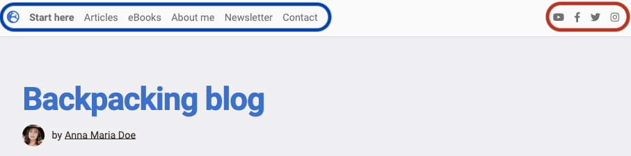
The standard and most effective communication channels are the newsletter and social media. Links to them should be placed in the navigation, for example in the navbar:
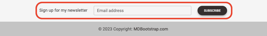
...and in the footer we can even place the entire form:
What will be the perfect flow for the user? In what order and from what pages he should he go? And what pages should he go to?
Remember those situations when you were looking for knowledge on a specialized topic and finally found a website that contained a ton of valuable material in the form of hundreds or even thousands of articles?
And remember maybe that feeling of being lost when you didn't know what to click on and where to start?
Don't make your users go through the same thing.
If you have a well-defined target group and clearly defined goals, design the UI so that the new user has no doubts where to start and what to click.
Of course, you'll never create a perfect UI that perfectly fits every user's needs. But that's not the goal.
The goal is for you to take care of the needs of your target group as best as possible. Focus on that and the rest of the users will manage somehow.
Remember, it's impossible to please everyone, but it's pretty easy to piss everyone off.
So try not to annoy everyone, but please the most important ones.
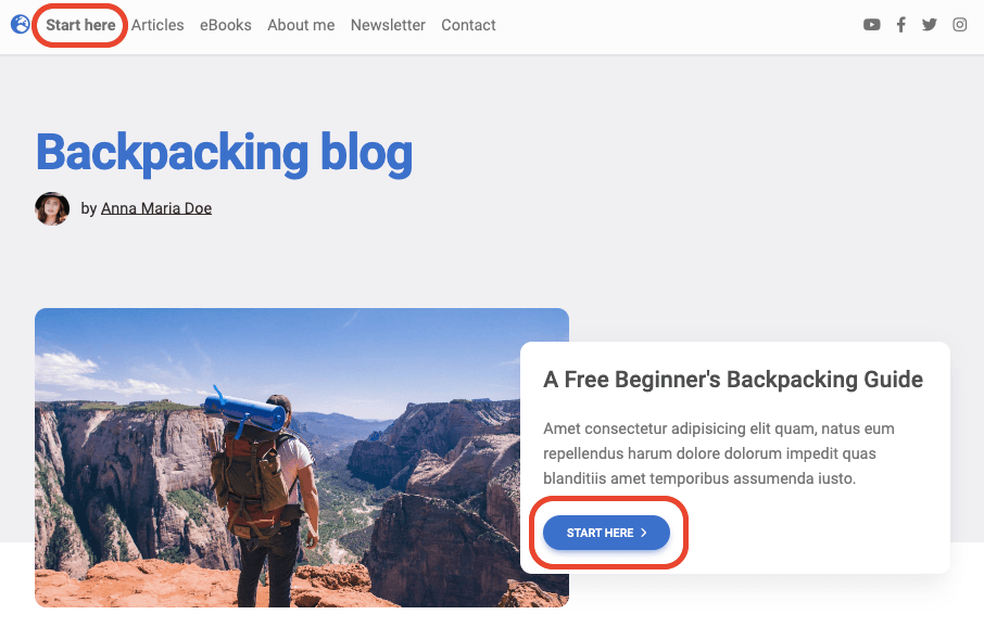
We have specified that our target group will be beginner backpackers, and our goal will be to provide them with valuable, free content.
So we want them to start their contact with our blog with the guide "A Free Beginner's Backpacking Guide".
In key places, such as the intro section on the homepage and in the navbar, we place buttons with a clear "Start here" message.
And since this guide will be a series of interconnected articles, we should include a clear link to the next text in each of them.
You may have already noticed this pattern somewhere 😉
Okay, that was a lot of theory. It's time to roll up our sleeves and jump into the code to put everything we've established into practice.

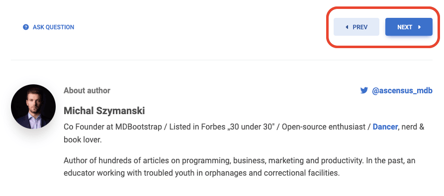
About author
Michal Szymanski
Co Founder at MDBootstrap / Listed in Forbes „30 under 30" / Open-source enthusiast / Dancer, nerd & book lover.
Author of hundreds of articles on programming, business, marketing and productivity. In the past, an educator working with troubled youth in orphanages and correctional facilities.