Free UI/UX design course
Learn how to create exceptional designs by reading my new tutorial.
Start learningReorder columns
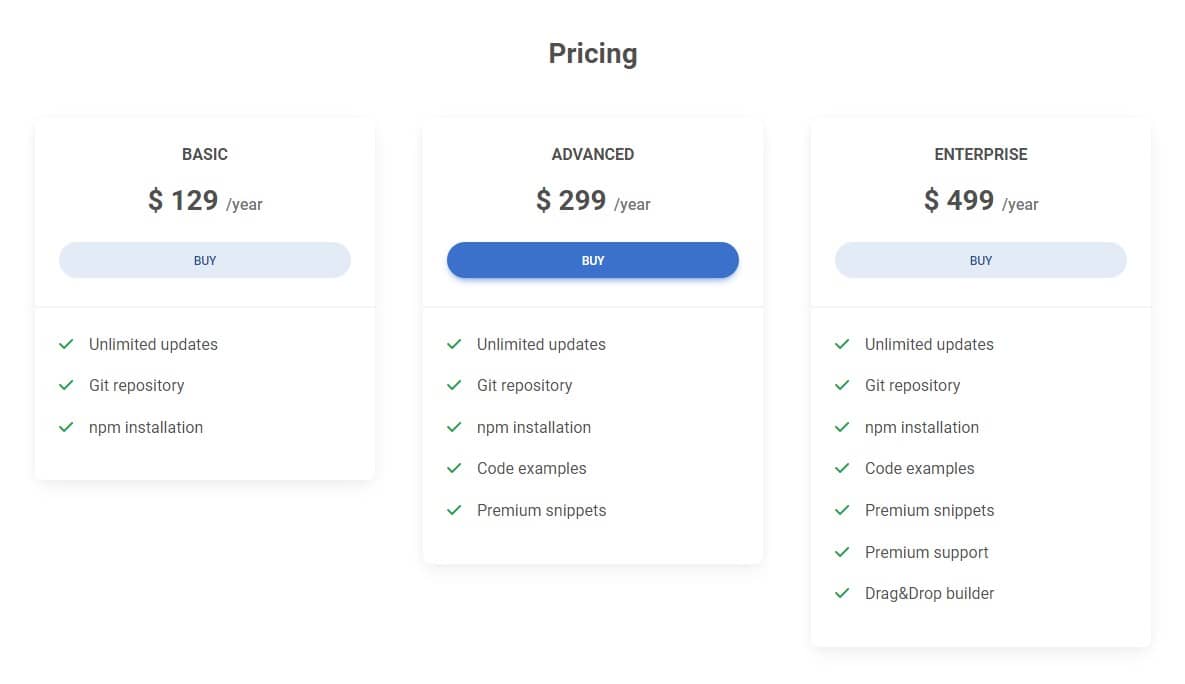
Our pricing cards look good on big screens...
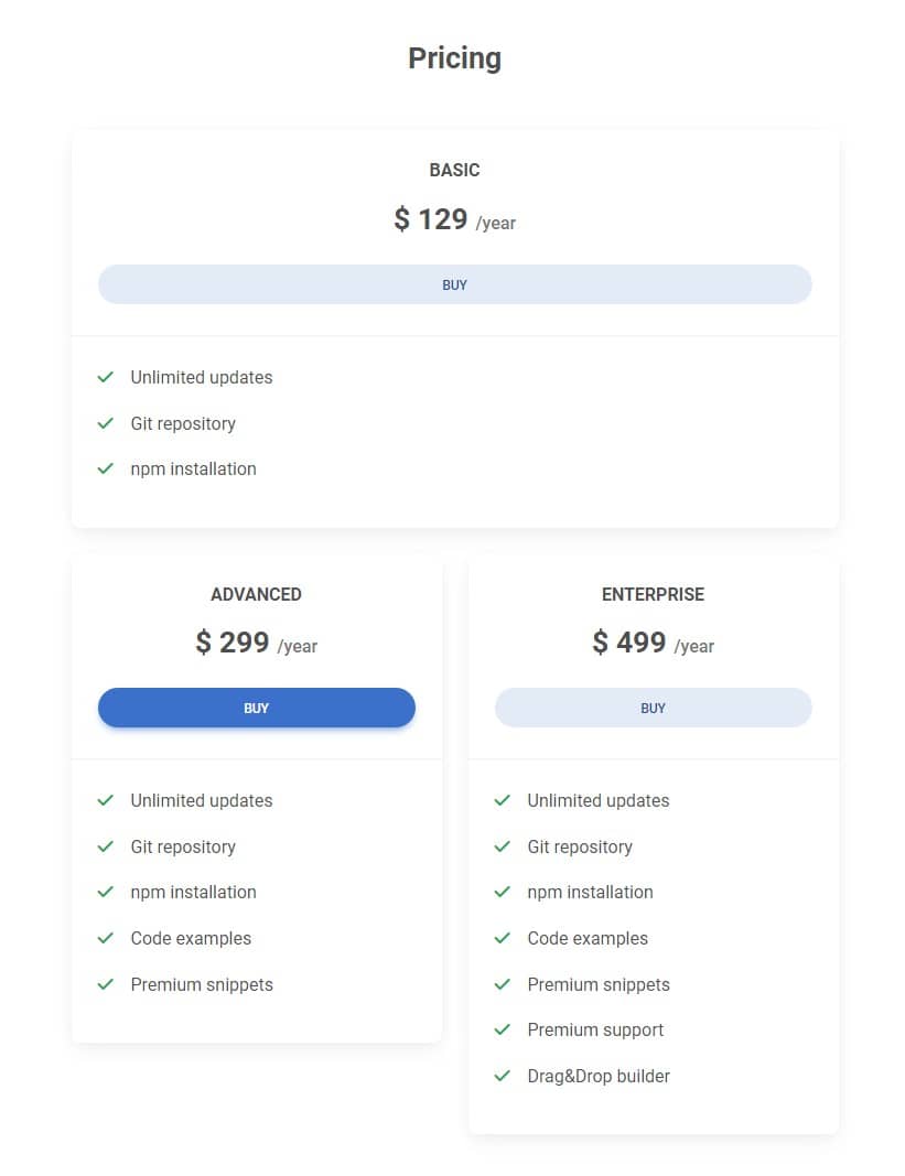
...but there is a problem with them on medium screens (specifically in a vertical tablet view).
The natural reaction of human perception is that what is in the middle is the most important. Therefore, in the desktop view, when we have 3 cards next to each other, the middle one is the best highlighted (we strengthen this impression by adding a stronger color to the button).
Such a composition tells the user - "This is the recommended option and we want you to pay the most attention to it!"
However, look at what's happening in the tablet view - the first card occupies the top position and additionally extends to full width. The second card (i.e. the one we want to stand out the most) together with the third are pushed below. Now the first card looks like the most important one, and we don't want that.
Columns Reordering
See the example below. This is the simplest grid with 3 equal columns. As you can see, each column is displayed in the browser in the order they were added in the HTML.
        <div class="row">
          <div class="col">First</div>
          <div class="col">Second</div>
          <div class="col">Third</div>
        </div>
However, using reordering classes we can change their order.
        <div class="row">
          <div class="col order-2">First</div>
          <div class="col order-3">Second</div>
          <div class="col order-1">Third</div>
        </div>
How does it work:
order-classes control the visual order of your content- The lower the number, the higher the priority - so the column with the class
order-1will be the first from the left, and the column with the classorder-3will be the last. - Reordering classes are responsive and can use breakpoints. So we can define a different order on small screens and a completely different one on large ones.
- We have 5 tiers at our disposal - from the
order-1class to theorder-5class
Step 1 - set the order for mobile view
What we want to do with our pricing cards:
- On large screens, we want the order to remain as it is now - i.e. the second (most important) card should stay in the middle
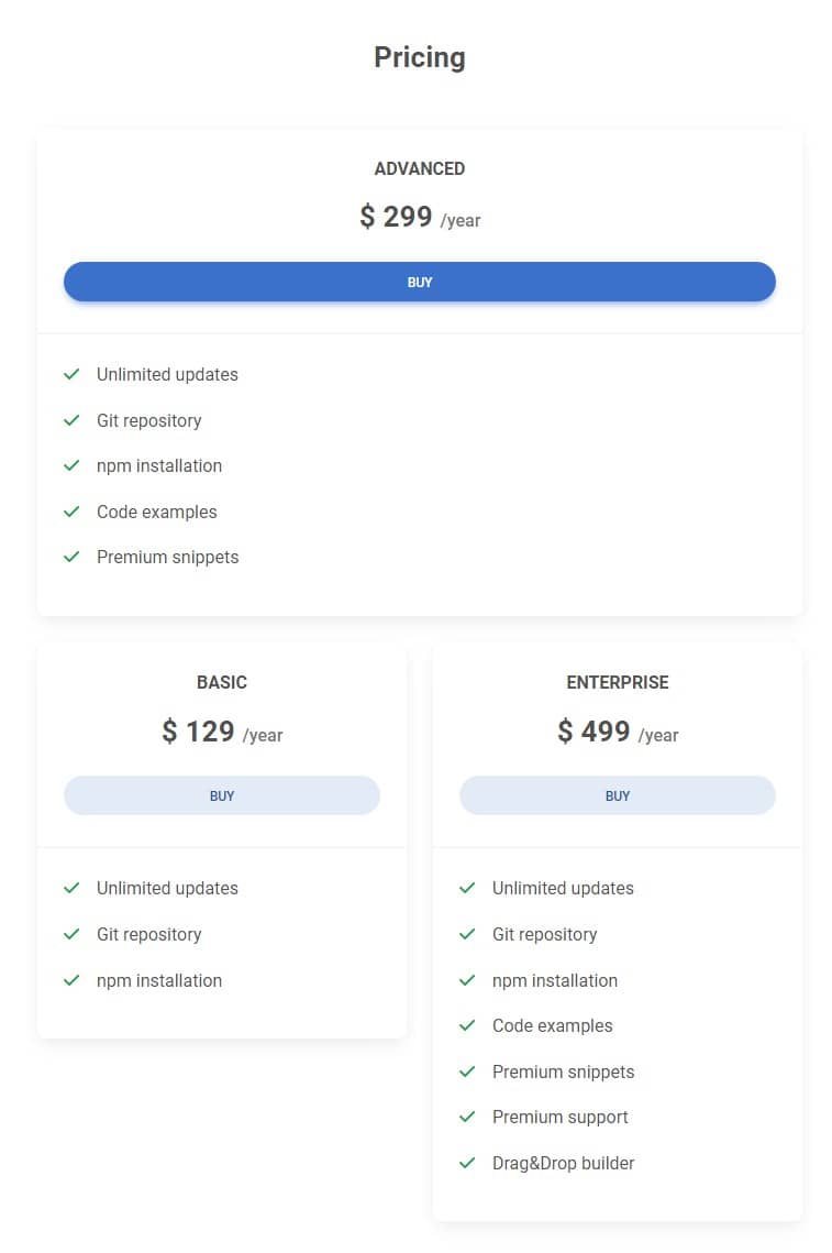
- On small to medium screens, we want the second (most important) card to be on top
Let's add the order-1 class to the second column (the lowest number, and therefore the highest in the hierarchy - so it will be displayed first).
Let's add the order-2 class to the first column so that it displays second.
Let's add the order-3 class to the third column so that it appears last.
We also need to make the first column 6 units wide on medium screens and the second column 12 units wide.
      <!-- Section: Pricing -->
      <section class="mb-5 mb-lg-10">

        <h3 class="fw-bold text-center mb-5">Pricing</h3>

        <div class="row gx-xl-5">
          <div class="col-lg-4 col-md-6 mb-4 mb-lg-0 order-2">

            [...]

          </div>

          <div class="col-lg-4 col-md-12 mb-4 mb-lg-0 order-1">

            [...]

          </div>

          <div class="col-lg-4 col-md-6 mb-4 mb-lg-0 order-3">

            [...]

          </div>
        </div>

      </section>
      <!-- Section: Pricing -->
And done!
Step 2 - set the order for desktop view
We need to fix one thing. When you switch to the desktop view, you will see that now the second card, which should be in the middle on large screens, is the first one.
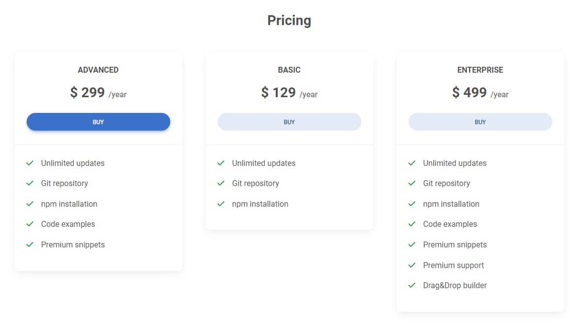
But since we already know how to use breakpoints, this is not a problem for us. So let's set the default column order for the desktop view:
      <!-- Section: Pricing -->
      <section class="mb-5 mb-lg-10">

        <h3 class="fw-bold text-center mb-5">Pricing</h3>

        <div class="row gx-xl-5">
          <div class="col-lg-4 col-md-6 mb-4 mb-lg-0 order-2 order-lg-1">

            [...]

          </div>

          <div class="col-lg-4 col-md-12 mb-4 mb-lg-0 order-1 order-lg-2">

            [...]

          </div>

          <div class="col-lg-4 col-md-6 mb-4 mb-lg-0 order-3 order-lg-3">

            [...]

          </div>
        </div>

      </section>
      <!-- Section: Pricing -->
If something does not work as it should or you have any doubts - click on the button below, which will take you to the demo with the source code so that you can compare it with your project.

About author
Michal Szymanski
Co Founder at MDBootstrap / Listed in Forbes „30 under 30" / Open-source enthusiast / Dancer, nerd & book lover.
Author of hundreds of articles on programming, business, marketing and productivity. In the past, an educator working with troubled youth in orphanages and correctional facilities.