Free UI/UX design course
Learn how to create exceptional designs by reading my new tutorial.
Start learningSplit screen
Once again, click the button below and have a look at the final demo of our portfolio.
See the final demoPay attention to the characteristic screen divided into two equal parts. This is a variation of the Full Screen Hero Image, which you know from the previous tutorial.
In this lesson, we will learn a technique that will allow us to create such a Split screen.
Step 1 - create a 2 columns grid
Creating a basic Split screen layout in Bootstrap is simple, but the complications start with the details.
However, before we get to the complications in the <header> section, let's add the Split screen section, and then let's add the well-known grid, using cointainer-fluid.
        <!--Main Navigation-->
        <header class="mb-10">

          <!-- Section: Split screen -->
          <section class="">

            <div class="container-fluid">
              <div class="row">
                <div class="col-lg-6">
                </div>
                <div class="col-lg-6 bg-primary">
                </div>
              </div>
            </div>

          </section>
          <!-- Section: Split screen -->

        </header>
        <!--Main Navigation-->
Step 2 - set a height to the columns
As with the classic Hero Image, with our Split screen we also want it to always cover the full screen.
So let's add the vh-100 class to the columns, and for testing purposes, let's also add color classes to them, so that we can observe the visual effect of our changes.
        <!-- Section: Split screen -->
        <section class="">

          <div class="container-fluid">
            <div class="row">
              <div class="col-lg-6 vh-100 bg-danger">
              </div>
              <div class="col-lg-6 vh-100 bg-primary">
              </div>
            </div>
          </div>

        </section>
        <!-- Section: Split screen -->
And done! Simple, right?

Unfortunately, there are still a few challenges ahead of us that are not visible at first glance.
In the future we will want to add content to the columns of our Split screen and by default Bootstrap grid will add spacing between the columns.
This will spoil the concept because we want our Split screen to fit perfectly, with no gaps between the right and left columns.
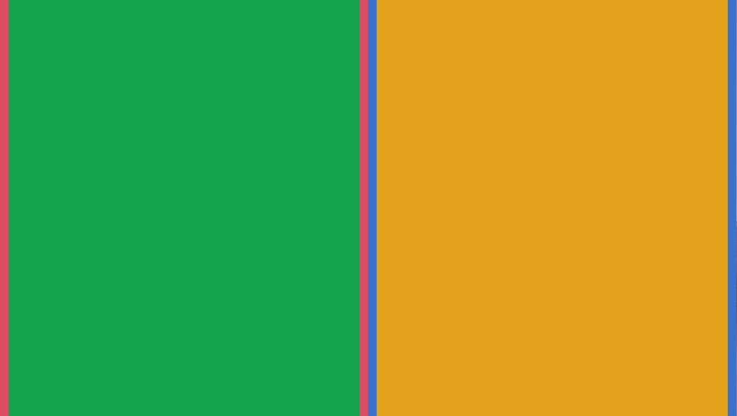
To give you an idea of what I mean, let's add an empty <div> element to each column with the height set to vh-100 and the color classes so we can see them.
    <!-- Section: Split screen -->
    <section class="">

      <div class="container-fluid">
        <div class="row">
          <div class="col-lg-6 vh-100 bg-danger">
            <div class="vh-100 bg-success"></div>
          </div>
          <div class="col-lg-6 vh-100 bg-primary">
            <div class="vh-100 bg-warning"></div>
          </div>
        </div>
      </div>

    </section>
    <!-- Section: Split screen -->
See the red and blue stripes? This is exactly the spacing we don't want. Ultimately, our content (i.e. green and yellow colors) should fill 100% of the screen.
Step 3 - remove the spacing
We can remove spacing between columns by adding class g-0 to the element with class row.
      <div class="container-fluid">
        <div class="row g-0">

          [...]

        </div>
      </div>
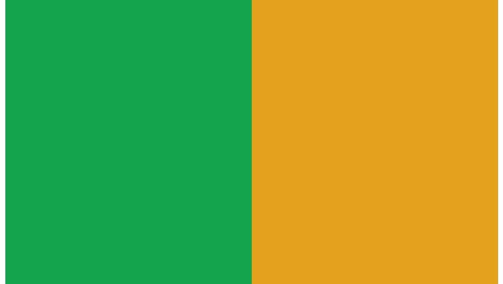
The spacing between the columns disappeared, but white stripes appeared on the left side of our Split screen.
This is the padding of the container-fluid element and we can remove it by adding the px-0 class.
      <div class="container-fluid px-0">
        <div class="row g-0">

          [...]

        </div>
      </div>
And now it's perfect!

Step 4 - clean up the code
Finally, let's clean up our code a bit - let's remove color classes from the grid and empty <div> elements that we used for testing purposes.
      <!-- Section: Split screen -->
      <section class="">

        <div class="container-fluid px-0">
          <div class="row g-0">

            <!-- First column -->
            <div class="col-lg-6 vh-100">

            </div>
            <!-- First column -->

            <!-- Second column -->
            <div class="col-lg-6 vh-100">

            </div>
            <!-- Second column -->

          </div>
        </div>

      </section>
      <!-- Section: Split screen -->
And here we are, again with the white screen. But not for long ;)

About author
Michal Szymanski
Co Founder at MDBootstrap / Listed in Forbes „30 under 30" / Open-source enthusiast / Dancer, nerd & book lover.
Author of hundreds of articles on programming, business, marketing and productivity. In the past, an educator working with troubled youth in orphanages and correctional facilities.