Free UI/UX design course
Learn how to create exceptional designs by reading my new tutorial.
Start learningSizing
Our pricing cards look good now, but wouldn't they be even better if they were the same height? 🤔
Of course they would! Symmetry in UI design never goes out of style.
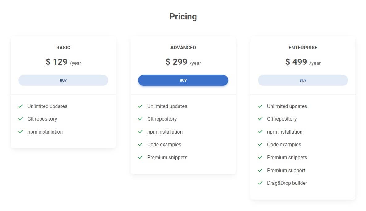
By default, the card's height is defined by its content (that is, the card's height will adjust to the amount of content you add to it). This is the desired behavior in most situations. However, we want to change that.
This is a good opportunity to look at sizing utilities.
Relative to the parent
Width and height utilities includes support for 25%, 50%, 75%, 100%,
and auto by default. Modify those values as you need to generate different
utilities here.
Width
      <div class="w-25">Width 25%</div>
      <div class="w-50">Width 50%</div>
      <div class="w-75">Width 75%</div>
      <div class="w-100">Width 100%</div>
      <div class="w-auto">Width auto</div>
Height
      <div style="height: 100px;">

        <div class="h-25">
          Height 25%
        </div>
        <div class="h-50">
          Height 50%
        </div>
        <div class="h-75">
          Height 75%
        </div>
        <div class="h-100">
          Height 100%
        </div>
        <div class="h-auto">
          Height auto
        </div>

      </div>
Max width and height
You can also use max-width: 100%; and max-height: 100%; utilities as
needed.

<img src="https://mdbcdn.b-cdn.net/img/new/slides/041.webp" class="mw-100" alt="wild landscape" />
Step 1 - set the cards to equal height
As we read above, sizing utilities are relative to the parent.
For our cards, this means that if, for example, we use the h-100 class, the cards will take up 100% of their columns (since the columns are the parents of the cards).
And it makes our task extremely easy, because the columns in the grid always have the same height by default.
You do not believe? For demonstration, add a red background and a white border to the columns - then you can easily see that they are of equal height.
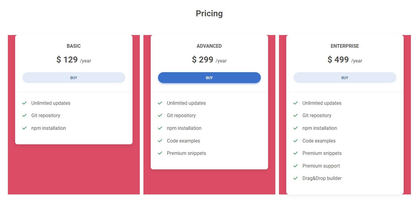
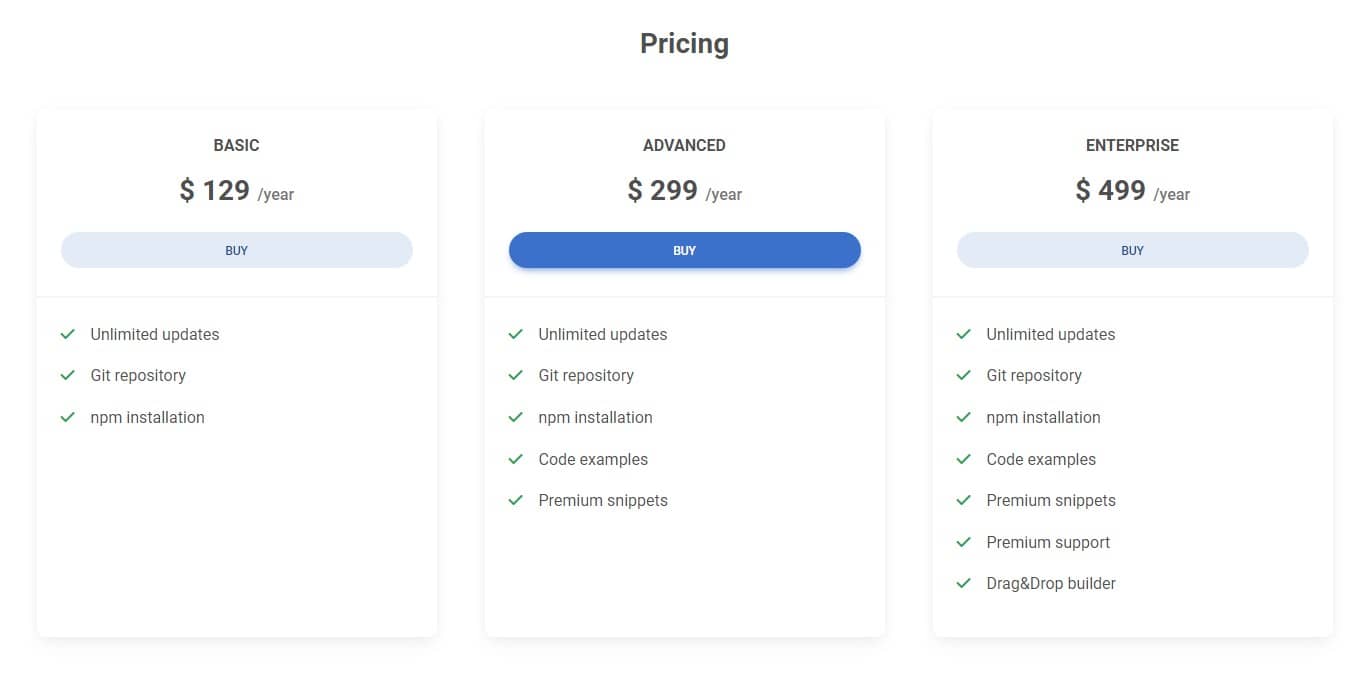
So the only thing we need to do is add the h-100 class to each card. This will make each of them take up 100% of the parent's height. And since the parents are columns that are the same height, the cards also will be the same height.
      <div class="card h-100">

        [...]

      </div>
So the whole section will look like this:
      <!-- Section: Pricing -->
      <section class="mb-5 mb-lg-10">

        <h3 class="fw-bold text-center mb-5">Pricing</h3>

        <div class="row gx-xl-5">
          <div class="col-lg-4 col-md-6 mb-4 mb-lg-0 order-2 order-lg-1">

            <div class="card h-100">

              [...]

            </div>

          </div>

          <div class="col-lg-4 col-md-12 mb-4 mb-lg-0 order-1 order-lg-2">

            <div class="card h-100">

              [...]

            </div>

          </div>

          <div class="col-lg-4 col-md-6 mb-4 mb-lg-0 order-3 order-lg-3">

            <div class="card h-100">

              [...]

            </div>

          </div>
        </div>

      </section>
      <!-- Section: Pricing -->
And done!

About author
Michal Szymanski
Co Founder at MDBootstrap / Listed in Forbes „30 under 30" / Open-source enthusiast / Dancer, nerd & book lover.
Author of hundreds of articles on programming, business, marketing and productivity. In the past, an educator working with troubled youth in orphanages and correctional facilities.