Free UI/UX design course
Learn how to create exceptional designs by reading my new tutorial.
Start learningTransforms
In this lesson, we'll learn how to use the CSS transform property to add effects such as scale, rotate, skew or translate to our Bootstrap project.
Let's start!
How transform works
It is simple. Suppose we have a regular image placed as an <img> element.
<img src="https://mdbootstrap.com/img/new/avatars/9.jpg" class="img-fluid shadow-5-strong rounded-7" alt="Woman">

Now suppose we want to rotate the image 45 degrees to the right. Using inline CSS, we can set the value of the transform property to rotate(45deg) :
        <img
            style="transform: rotate(45deg);"
            src="https://mdbootstrap.com/img/new/avatars/9.jpg" class="img-fluid shadow-5-strong rounded-7"
            alt="Woman"
         >
You can rotate the image a full 360 degrees - just set the appropriate value to transform: rotate(X). For example, let's turn the image upside down by setting rotate to 180 degrees:
Scale
You can use transform: scale(x) to make an element bigger or smaller:
        <!-- scale(.75) -->
        <img style="transform: scale(.75);"
             src="https://mdbootstrap.com/img/new/avatars/9.jpg"
             class="img-fluid shadow-5-strong rounded-7 d-block"
             alt="Woman">

        <!-- scale(1) = natural scale -->
        <img style="transform: scale(1);"
             src="https://mdbootstrap.com/img/new/avatars/9.jpg"
             class="img-fluid shadow-5-strong rounded-7 d-block"
             alt="Woman">

        <!-- scale(1.25) -->
        <img style="transform: scale(1.25);"
            src="https://mdbootstrap.com/img/new/avatars/9.jpg"
            class="img-fluid shadow-5-strong rounded-7 d-block"
            alt="Woman">
Translate
You can use transform: translate(x) to shift an element on X or Y axis:
        <img style="transform: translateX(80px);"
             src="https://mdbootstrap.com/img/new/avatars/9.jpg"
             class="img-fluid shadow-5-strong rounded-7"
             alt="Woman">
        <img style="transform: translateY(80px);"
              src="https://mdbootstrap.com/img/new/avatars/9.jpg"
              class="img-fluid shadow-5-strong rounded-7"
              alt="Woman">
Skew
You can use transform: skew(x) to skew an element on X or Y axis (or both):
        <img style="transform: skewX(12deg);"
              src="https://mdbootstrap.com/img/new/avatars/9.jpg"
              class="img-fluid shadow-5-strong rounded-7"
              alt="Woman">
        <img style="transform: skewY(12deg);"
              src="https://mdbootstrap.com/img/new/avatars/9.jpg"
              class="img-fluid shadow-5-strong rounded-7"
              alt="Woman">
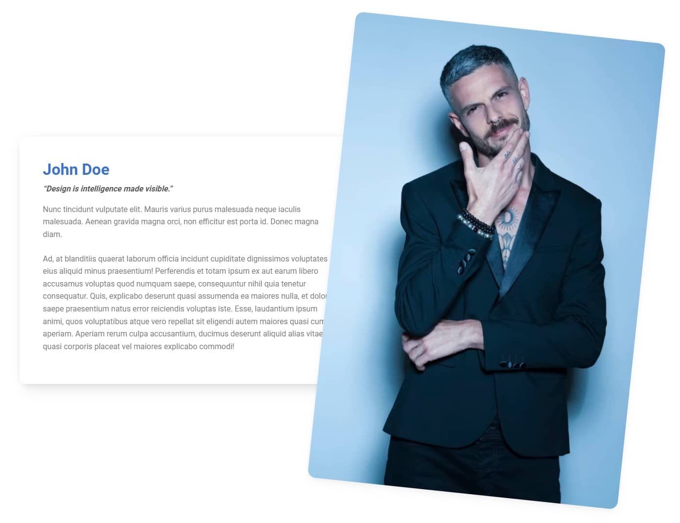
Step 1 - rotate the image in the Aboue me section
Let's rotate the image in the About me section to the right by 6 degrees.
We need to pay attention to one thing - the rotated photo fits well on large screens, but on mobile devices it should be in its default position. That's why we can't use inline CSS. We need to create a new class and then use media queries by writing regular CSS.
So let's add the rotate-lg class to the image in the second column:
        <img
          src="https://mdbootstrap.com/img/new/standard/people/272.jpg"
          class="w-100 rounded-7 shadow-4 rotate-lg"
          alt=""
        />
Next, in the <head> section, where we have the <style> tags, let's add our custom CSS and define what exactly our newly created class rotate-lg should do. Remember that we need to place it inside a media query:.
        @media (min-width: 992px) {
          .rotate-lg {
            transform: rotate(6deg);
          }
        }
The image is rotated as intended, but we have an unwanted side effect - the photo overlaps the card, instead of the card on the photo.
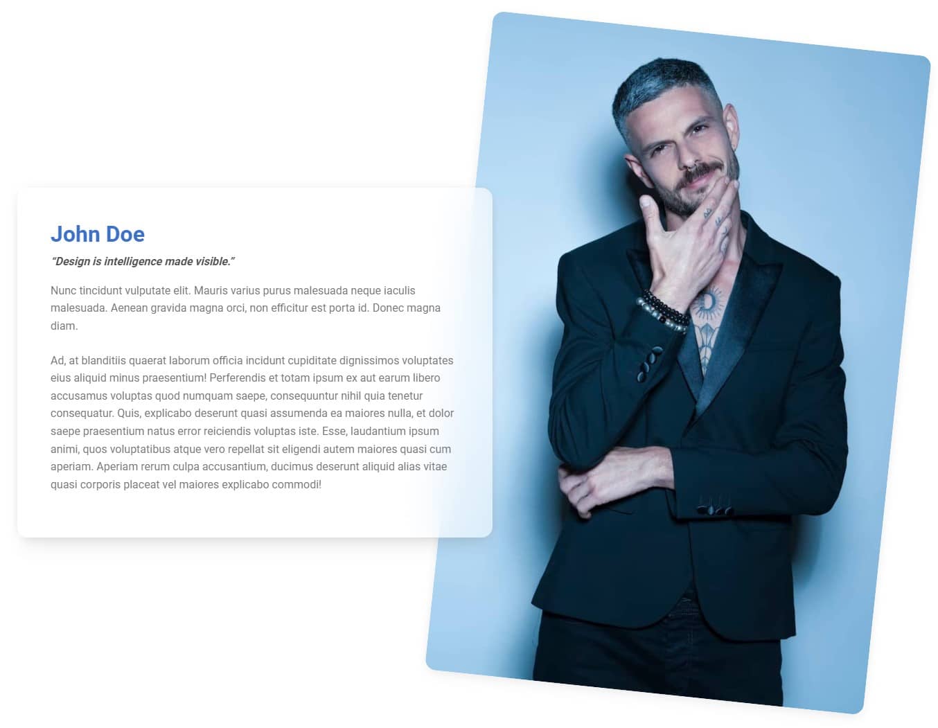
Step 2 - increase z-index property
To fix the bug from the previous step, we need to change the z-index property of the card.
The z-index property specifies the stack order of an element An element with greater stack order is always in front of an element with a lower stack order.
By default, elements do not have a defined z-index value, which in practice boils down to the fact that they behave as if they had a value of 0. Therefore, we can assume that our image will behave as if it had a z-index of 0, and for the card to overlap for the picture, just define its z-index as equal to 1:
                <!-- First column -->
                <div class="col-lg-6 mb-5 mb-lg-0">

                  <div style="background: hsla(0, 0%, 100%, 0.55);
                              backdrop-filter: blur(30px);
                              z-index: 1;"
                       class="card rounded-7 me-lg-n5">
And now it works as expected.

About author
Michal Szymanski
Co Founder at MDBootstrap / Listed in Forbes „30 under 30" / Open-source enthusiast / Dancer, nerd & book lover.
Author of hundreds of articles on programming, business, marketing and productivity. In the past, an educator working with troubled youth in orphanages and correctional facilities.