Free UI/UX design course
Learn how to create exceptional designs by reading my new tutorial.
Start learningFlexbox
It's time to take a look at another famous Bootstrap tool - flexbox.
In fact, flexbox itself is not a creation of Bootstrap, but simply CSS, but thanks to Bootstrap, we can comfortably use flexbox using the class utilities.
But enough talk, let's explain it better with examples.
Step 1 - add headings
Our Hero Image is impressive, but since it contains no content, it is of little use.
We need to add some kind of Call to action. One big heading, one subheading and one button will be best.
Let's do it. Inside the div with our image, let's add another div with headings and a button inside.
    <!-- Background image -->
    <div class="bg-image vh-100" style="
                 margin-top: -58.59px;
                 background-image: url('https://mdbcdn.b-cdn.net/img/new/fluid/city/018.jpg');">

      <!-- Call to action -->
      <div>
        <h1>Whoah, what a view!</h1>
        <h5>Learning web design is such an amazing thing</h5>
        <a class="btn btn-primary" href="#" role="button">Learn with me</a>
      </div>

    </div>
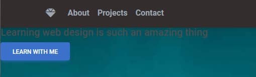
They appeared in the upper left corner of the screen, partially covered by the navbar. This is definitely not a satisfactory solution.
We have to figure out a way to perfectly center them horizontally and vertically. Regardless of the size of the screen, we want our Call to action to appear in the center.
Difficult task. But fortunately, we have flexbox at our disposal, thanks to which we will deal with it in the blink of an eye.
Step 2 - add container
However, before we add flexbox, we need to put our Call to action inside the container.
As you remember from previous lessons, containers provide us with the basic layout and margins for our interface. So update the code in your project as follows:
    <!-- Background image -->
    <div class="bg-image vh-100" style="
                 margin-top: -58.59px;
                 background-image: url('https://mdbcdn.b-cdn.net/img/new/fluid/city/018.jpg');">

      <!-- Container -->
      <div class="container">

        <!-- Call to action -->
        <div>
          <h1>Whoah, what a view!</h1>
          <h5>Learning web design is such an amazing thing</h5>
          <a class="btn btn-primary" href="#" role="button">Learn with me</a>
        </div>

      </div>

    </div>
Step 3 - add flexbox
And now flexbox comes into action.
First, to enable flexbox, we need to add the d-flex class to the selected element ("d" is short for "display", so d-flex = display: flex).
Since we want to center our Call to action, we need to add the d-flex class to the container.
The container is the parent of the div containing the Call to action, so all its child elements will be displayed in flexbox mode.
      <!-- Container -->
      <div class="container d-flex">

        <!-- Call to action -->
        <div>
          <h1>Whoah, what a view!</h1>
          <h5>Learning web design is such an amazing thing</h5>
          <a class="btn btn-primary" href="#" role="button">Learn with me</a>
        </div>

      </div>
So far, so good, but nothing changes after we save the file.
And that's because enabling flexbox is only the first step. Now we need to choose one of the many available options to define how exactly we want to align given elements.
To center elements horizontally, we use the justify-content-center class. To center them vertically we use the align-items-center class.
Let's add them next to the d-flex class.
      <!-- Container -->
      <div class="container d-flex justify-content-center align-items-center">

        <!-- Call to action -->
        <div>
          <h1>Whoah, what a view!</h1>
          <h5>Learning web design is such an amazing thing</h5>
          <a class="btn btn-primary" href="#" role="button">Learn with me</a>
        </div>

      </div>

It seems that the content was only centered horizontally, but vertically remained the same 🤔
However, if you look closely, you'll see that's not true - vertical centering worked as well.
The problem, however, is that the height of the container on which we run flexbox is only as high as the height of the elements it contains. As a result, there is no visual effect of vertical centering.
Step 4 - set a height
Let's do an experiment - let's add the bg-danger class to the container, which will give it a red background. Thanks to this, we will be able to see its actual height.
      <!-- Container -->
      <div class="container d-flex justify-content-center align-items-center bg-danger">

        <!-- Call to action -->
        <div>
          <h1>Whoah, what a view!</h1>
          <h5>Learning web design is such an amazing thing</h5>
          <a class="btn btn-primary" href="#" role="button">Learn with me</a>
        </div>

      </div>
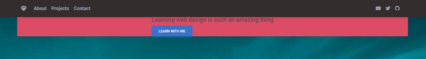
Look at the red rectangle - the container ends and begins exactly where its contents end and begin - in this case, Call to action elements.
To extend the container to the full height of our Hero Image, we need to set its height equal to 100% of the available space.
This is very easy to do with Bootstrap. Just add the h-100 class to the container ("h" for height, so h-100 = height: 100%).
      <!-- Container -->
      <div class="container d-flex justify-content-center align-items-center h-100 bg-danger">

        <!-- Call to action -->
        <div>
          <h1>Whoah, what a view!</h1>
          <h5>Learning web design is such an amazing thing</h5>
          <a class="btn btn-primary" href="#" role="button">Learn with me</a>
        </div>

      </div>
After saving the file and refreshing the browser, you will see that this time Call to action is centered both horizontally and vertically.
You can remove the bg-danger class. It only served us to demonstrate the height of the container, so we don't need it anymore.
We still have a lot to improve on our Call to action (like poor visibility), but we'll cover that in the next lesson.
Regarding flexbox - in this lesson we have learned only the basic functionalities. We will cover advanced topics many times in the future, because flexbox is useful in virtually every project.
However, if you want to experiment with flexbox a bit, take a look at our flexbox generator. This is an extremely useful tool that allows you to play with flexbox settings live, while getting the result in the form of ready-to-use code. You can also additionally read the flexbox documentation page to see all the available options.
When you're ready, click "next" and move on to the next lesson.

About author
Michal Szymanski
Co Founder at MDBootstrap / Listed in Forbes „30 under 30" / Open-source enthusiast / Dancer, nerd & book lover.
Author of hundreds of articles on programming, business, marketing and productivity. In the past, an educator working with troubled youth in orphanages and correctional facilities.