Free UI/UX design course
Learn how to create exceptional designs by reading my new tutorial.
Start learningFilters
It will be a super exciting lesson. In it, we will learn how to use CSS filters and how to apply them to a project in Bootstrap. I will also show you how to create famous instagram filters and glass effect(a.k.a. glassmorphism) via CSS.
Let's start!
What are CSS filters?
To be precise - by CSS filters we understand filter or backdrop-filter property that applies graphical effects like blur or color shift to an element. Filters are commonly used to adjust the rendering of images, backgrounds, and borders.
The best way to understand what filters are and how they work is to personally experiment with them.
At MDB, we have created a CSS filter generator that allows you to recreate the famous Instagram filters or create your own filters and then turn them into CSS code that you can add directly to your website.
So go to our filter generator and click through the different options. Then come back to this lesson where we will continue our project and learn how we can specifically apply filters to our current case.
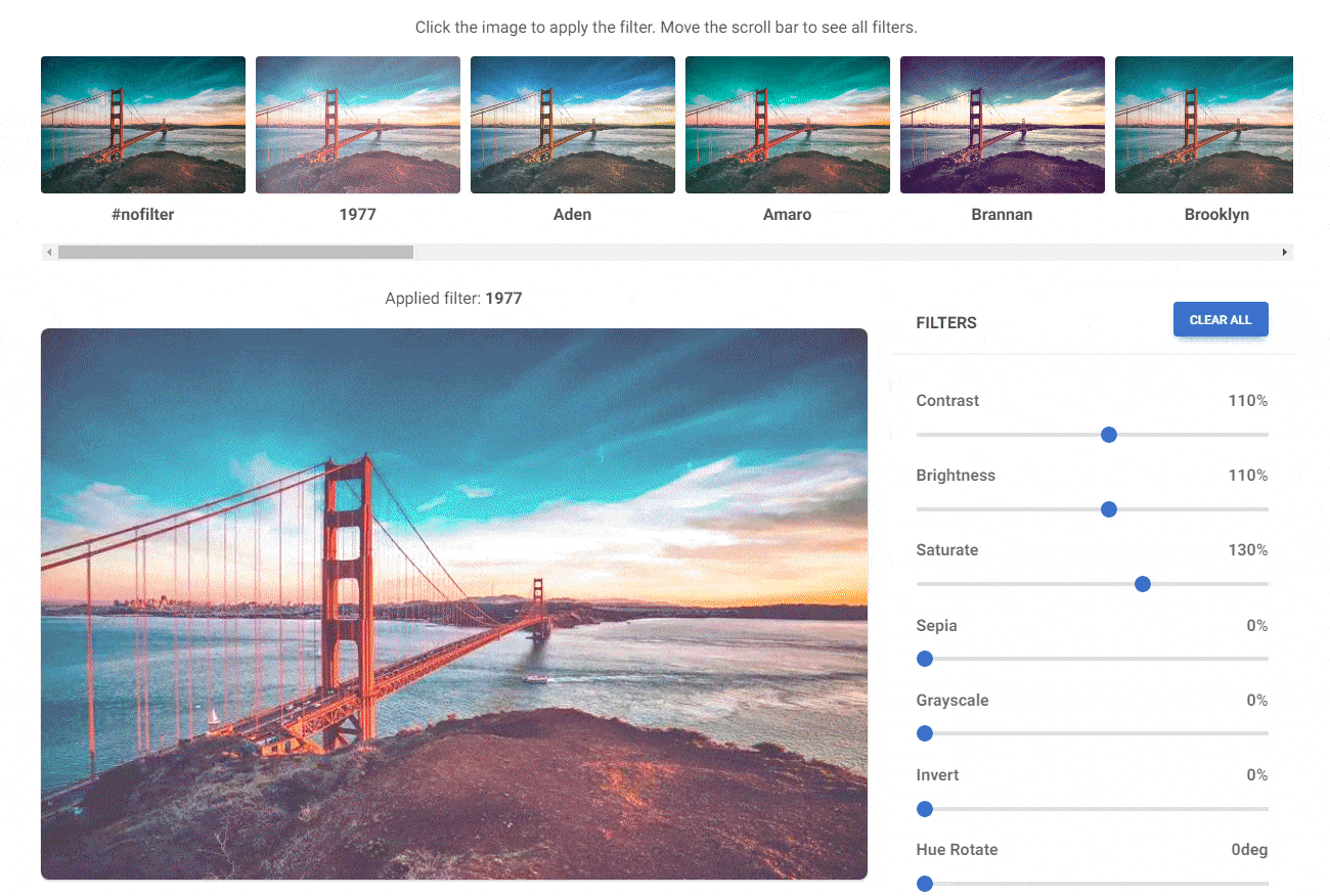
How to apply a filter from the generator to an image?
The filter generator uses the backdrop-filter property because the filter is not applied directly to the image, but to the mask that covers it. This provides better control over the composition and enables additional functionalities, such as adding text to the image. This works especially well if you use the MDB UI KIT and our masks.
#nofilter

Applied filter: Brannan
In this situation, if you want to add a filter to the image, all you have to do is copy the CSS properties generated by the filter generator and add them to the mask as inline CSS:
      <div class="bg-image">
        <img src="https://mdbcdn.b-cdn.net/img/new/standard/city/053.webp" class="w-100" alt="Louvre Museum" />
          <div class="mask"
             style="backdrop-filter: contrast(140%) brightness(100%) saturate(100%) sepia(50%) hue-rotate(0deg) grayscale(0%) invert(0%) blur(0px);
                    mix-blend-mode: lighten;
                    background: rgba(161, 44, 199, 0.31);
                    opacity: 1;"
           >
        </div>
      </div>
If you want to add a filter directly to the photo without using a mask or other element covering the photo, you need to use the filter property instead of the backdrop-filter property:
#nofilter

Applied filter: Inkwell
       <img style="filter: contrast(110%) brightness(110%) saturate(100%) sepia(30%) hue-rotate(0deg) grayscale(100%) invert(0%) blur(0px);
                   mix-blend-mode: normal;
                   background: rgba(0, 0, 0, 0);
                   opacity: 1;"
                   src="https://mdbootstrap.com/img/new/standard/people/272.jpg"
                   class="w-100 rounded-7 shadow-4"
                   alt=""
       />
Ok, now let's go back to our project and finally apply some filter to our portfolio!
Step 1 - add partial transparency to the card
We will be original and in our project, instead of adding a filter to the photo, we will add it to the card.
But first, let's add partial transparency to the card using a circle in HSLA format.
The HSLA color format is extremely useful and I strongly recommend it to you instead of HEX or RGBA. We will learn what its advantages are in future lessons. For now, all you need to do is remember what the individual parameters in the HSLA format mean:
hsla(hue, saturation, lightness, alpha)
The alpha parameter is a number between 0.0 (fully transparent) and 1.0 (not transparent at all). Set the value to about halfway:
<div style="background: hsla(0, 0%, 100%, 0.55);" class="card rounded-7 me-lg-n5">
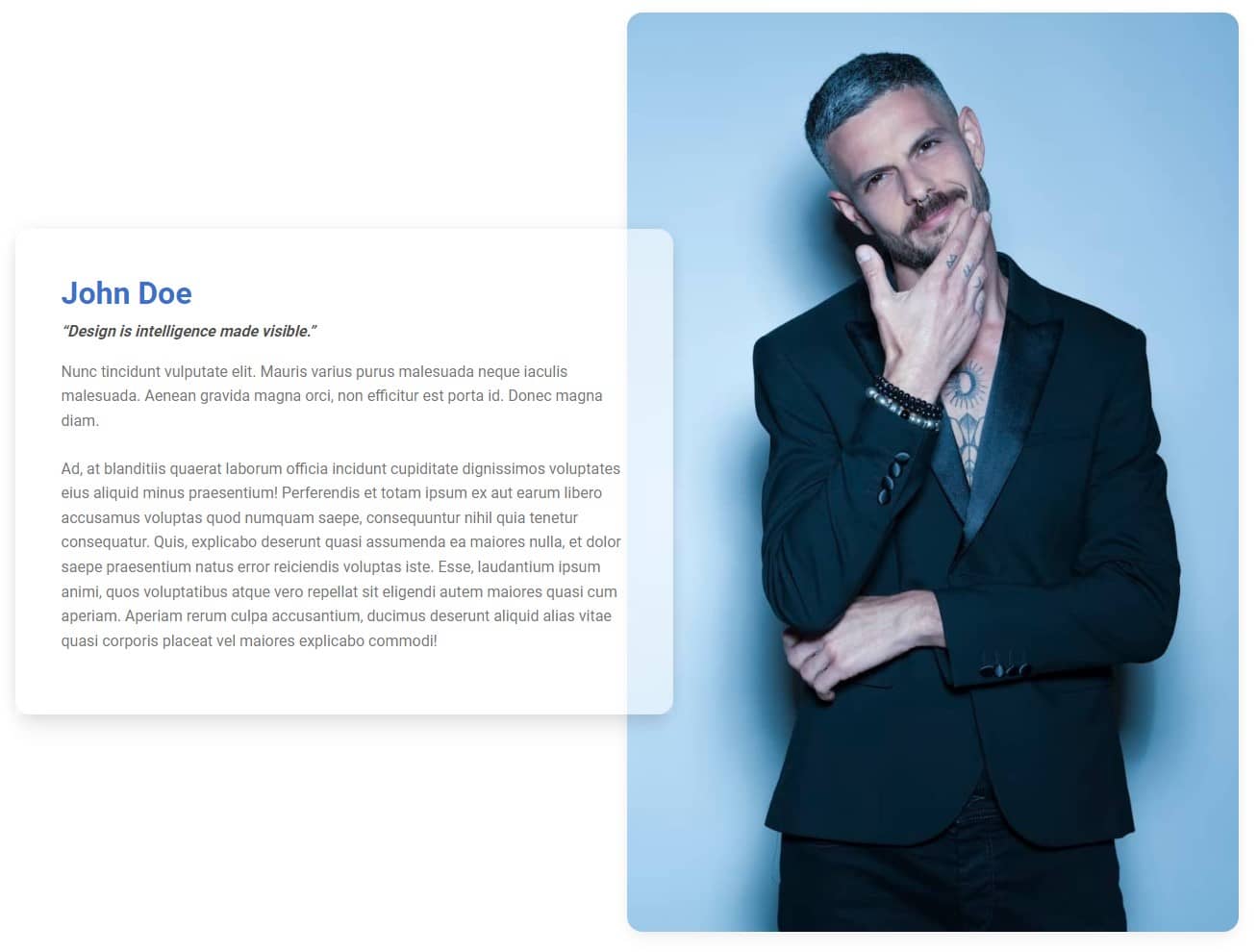
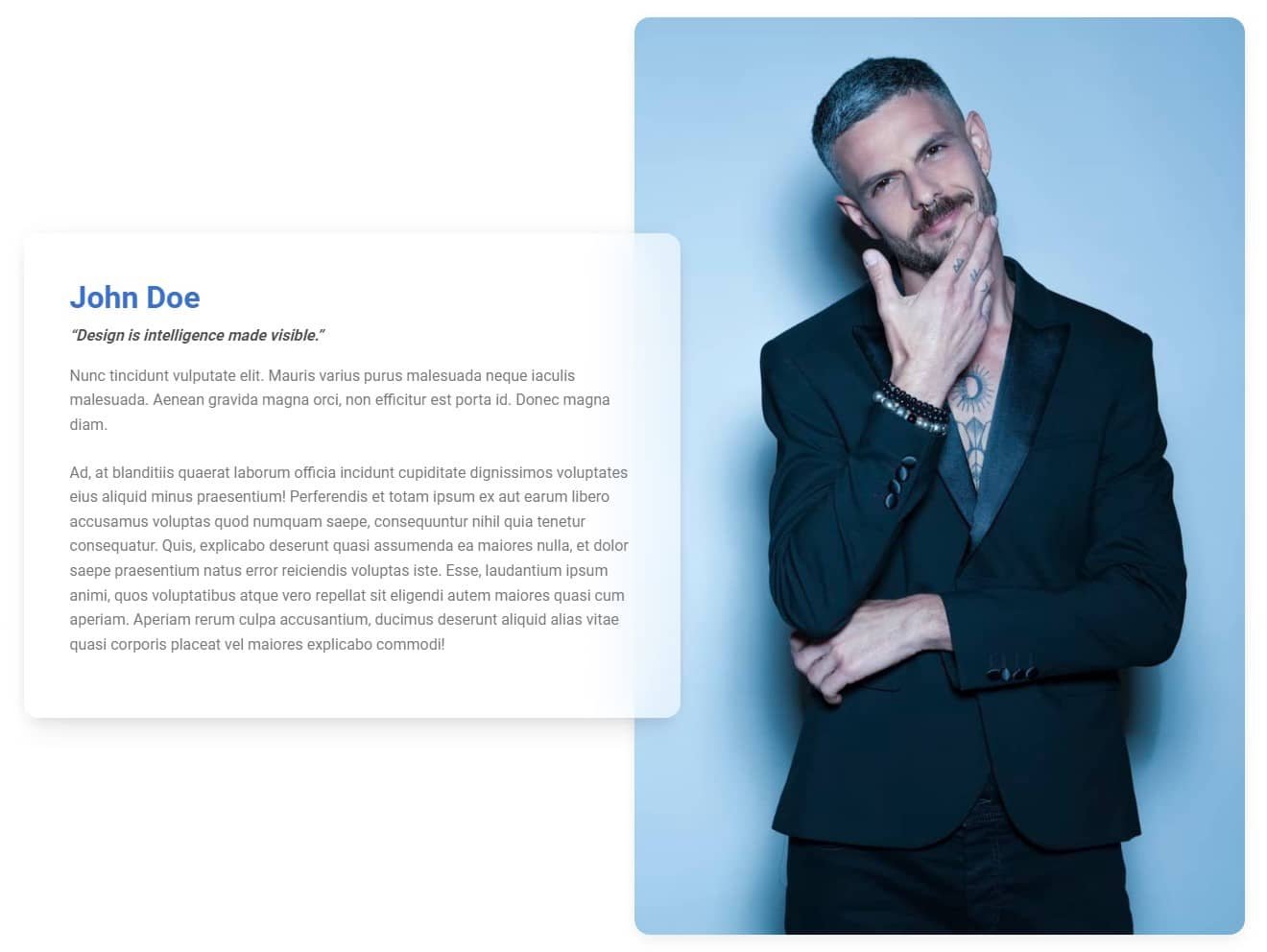
Step 2 - add a filter and create a glass effect
This will be the easiest part. To create the glass effect, all we have to do is gently blur our card.
Add a backdrop-filter property and set its value to blur(30px). A larger value will create more blur, so you can adjust it to your preferences.
       <div style="background: hsla(0, 0%, 100%, 0.55);
                   backdrop-filter: blur(30px);"
            class="card rounded-7 me-lg-n5"
        >

About author
Michal Szymanski
Co Founder at MDBootstrap / Listed in Forbes „30 under 30" / Open-source enthusiast / Dancer, nerd & book lover.
Author of hundreds of articles on programming, business, marketing and productivity. In the past, an educator working with troubled youth in orphanages and correctional facilities.