Free UI/UX design course
Learn how to create exceptional designs by reading my new tutorial.
Start learningNavbar
Navbar is a complex component with a lot of options available.
However, since in any project good navigation is an absolutely key element of the interface, in this lesson we will look at the Bootstrap navbar in depth.
Step 1 - add the navbar basic example to the project
Go to the navbar documentation page and copy the code of the basic example. Then paste it into the index.html file, inside of the <header> section.
          <!--Main Navigation-->
          <header>

              <!-- Navbar -->
              <nav class="navbar navbar-expand-lg navbar-light bg-body-tertiary">
                <!-- Container wrapper -->
                <div class="container-fluid">
                  <!-- Toggle button -->
                  <button
                    data-mdb-collapse-init
                    class="navbar-toggler"
                    type="button"
                    data-mdb-target="#navbarSupportedContent"
                    aria-controls="navbarSupportedContent"
                    aria-expanded="false"
                    aria-label="Toggle navigation"
                  >
                    <i class="fas fa-bars"></i>
                  </button>

                  <!-- Collapsible wrapper -->
                  <div class="collapse navbar-collapse" id="navbarSupportedContent">
                    <!-- Navbar brand -->
                    <a class="navbar-brand mt-2 mt-lg-0" href="#">
                      <img
                        src="https://mdbcdn.b-cdn.net/img/logo/mdb-transaprent-noshadows.webp"
                        height="15"
                        alt="MDB Logo"
                        loading="lazy"
                      />
                    </a>
                    <!-- Left links -->
                    <ul class="navbar-nav me-auto mb-2 mb-lg-0">
                      <li class="nav-item">
                        <a class="nav-link" href="#">Dashboard</a>
                      </li>
                      <li class="nav-item">
                        <a class="nav-link" href="#">Team</a>
                      </li>
                      <li class="nav-item">
                        <a class="nav-link" href="#">Projects</a>
                      </li>
                    </ul>
                    <!-- Left links -->
                  </div>
                  <!-- Collapsible wrapper -->

                  <!-- Right elements -->
                  <div class="d-flex align-items-center">
                    <!-- Icon -->
                    <a class="text-reset me-3" href="#">
                      <i class="fas fa-shopping-cart"></i>
                    </a>

                    <!-- Notifications -->
                    <div class="dropdown">
                      <a
                        data-mdb-dropdown-init
                        class="text-reset me-3 dropdown-toggle hidden-arrow"
                        href="#"
                        id="navbarDropdownMenuLink"
                        role="button"
                        aria-expanded="false"
                      >
                        <i class="fas fa-bell"></i>
                        <span class="badge rounded-pill badge-notification bg-danger">1</span>
                      </a>
                      <ul
                        class="dropdown-menu dropdown-menu-end"
                        aria-labelledby="navbarDropdownMenuLink"
                      >
                        <li>
                          <a class="dropdown-item" href="#">Some news</a>
                        </li>
                        <li>
                          <a class="dropdown-item" href="#">Another news</a>
                        </li>
                        <li>
                          <a class="dropdown-item" href="#">Something else here</a>
                        </li>
                      </ul>
                    </div>
                    <!-- Avatar -->
                    <div class="dropdown">
                      <a
                        data-mdb-dropdown-init
                        class="dropdown-toggle d-flex align-items-center hidden-arrow"
                        href="#"
                        id="navbarDropdownMenuAvatar"
                        role="button"
                        aria-expanded="false"
                      >
                        <img
                          src="https://mdbcdn.b-cdn.net/img/new/avatars/2.webp"
                          class="rounded-circle"
                          height="25"
                          alt="Black and White Portrait of a Man"
                          loading="lazy"
                        />
                      </a>
                      <ul
                        class="dropdown-menu dropdown-menu-end"
                        aria-labelledby="navbarDropdownMenuAvatar"
                      >
                        <li>
                          <a class="dropdown-item" href="#">My profile</a>
                        </li>
                        <li>
                          <a class="dropdown-item" href="#">Settings</a>
                        </li>
                        <li>
                          <a class="dropdown-item" href="#">Logout</a>
                        </li>
                      </ul>
                    </div>
                  </div>
                  <!-- Right elements -->
                </div>
                <!-- Container wrapper -->
              </nav>
              <!-- Navbar -->

          </header>
          <!--Main Navigation-->
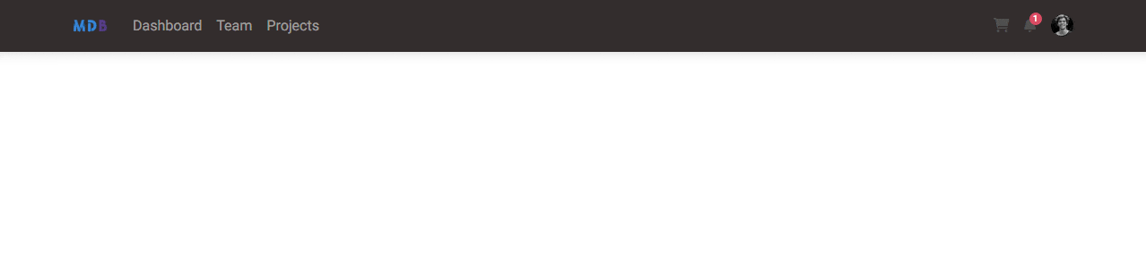
Save the file and refresh the browser. You should see the navigation bar.
Kind of like a normal navigation bar, right? So why so much code? Let's break it down into smaller chunks and analyze it one by one.
Let's first look at the main, outermost element of the navbar.
      <!-- Navbar -->
      <nav class="navbar navbar-expand-lg navbar-light bg-body-tertiary">
What it does:
navbarclass provides a base styling and behavior for the component. If you remove it, it will be completely broken.navbar-expand-lgclass defines at which breakpoint (that is, above which screen size) the navbar will expand and changes from the mobile to the desktop view. As you remember from the previous lesson about grid, breakpoint-lgmeans equal or above 992px. If you want to change the breakpoint you can choose from the available options.navbar-lightclass defines that the navbar links should be adjusted to the light background. You can change it to thenavbar-darkclass and the links will turn white, so you will need to change the background color of the navbar to something dark, to provide proper contrast.bg-body-tertiarydefines the background color of the navbar as a very light grey in a light mode, and light dark in a dark mode. If you don't want / don't need switching between light/dark modes you can define whatever single color you want and stick with it - for examplebg-darkor other available colors.
Step 2 - modify the navbar
Making use of the knowledge above, let's tinker a little on the navbar. Change the outermost element as follows:
        <!-- Navbar -->
        <nav class="navbar navbar-expand-lg navbar-dark bg-dark">
Navbar seems kind of broken right now, as for example, the elements on the right are barely visible. But don't worry, we'll fix it soon.
bg-dark
Step 3 - change the container
The next element we will look at is already well known to us. It's a container that allows us to set basic margins for our layout. As you can see now, it is a container-fluid, i.e. a container without margins, stretched to full width.
        <!-- Container wrapper -->
        <div class="container-fluid">
Change this container to a regular container, so we can enjoy some margins.
        <!-- Container wrapper -->
        <div class="container">
Step 4 - have a look at the toggle button
Below the opening tag of the container element we have a toggle button. It contains a lot of attributes, but we're really only interested in this one: data-mdb-target="#navbarSupportedContent".
      <!-- Toggle button -->
      <button data-mdb-collapse-init class="navbar-toggler" type="button" data-mdb-target="#navbarSupportedContent"
        aria-controls="navbarSupportedContent" aria-expanded="false" aria-label="Toggle navigation">
        <i class="fas fa-bars"></i>
      </button>
As you can see, it points to an element with a specific id, which is #navbarSupportedContent . If you look at your index.html file, at the navbar, you'll see that the collapse class element contains just such an id. This means that our toggle button will trigger the collapse element with this specific id (#navbarSupportedContent) when the navbar collapses to the mobile view.
Note that the toggle button (also called hamburger) is not visible in the desktop view. It only appears when the navbar collapses to mobile view (specifically, when the screen is smaller than the breakpoint we set in the navbar-expand-lg class, so 992px in this case)
Below the toggle button we have the collapse element with an id navbarSupportedContent we just mentioned.
   <!-- Collapsible wrapper -->
   <div class="collapse navbar-collapse" id="navbarSupportedContent">
Inside of this collapse we need to place all the elements we want to be hidden on the mobile view.
Step 5 - change navbar-brand
The first element inside the collapser is the navbar-brand element. In this case, it is a graphic with the MDB logo.
          <!-- Navbar brand -->
          <a class="navbar-brand mt-2 mt-lg-0" href="#">
            <img src="https://mdbcdn.b-cdn.net/img/logo/mdb-transaprent-noshadows.webp" height="15" alt="MDB Logo"
              loading="lazy" />
          </a>
We could put some other graphic in there, but we'll go a different route and use an icon instead.
Go to the icon documentation page and choose the icon you like. I chose the diamond icon .
Then replace the <img> element with this icon and additionaly add text-secondary class to it, to change the color to nice grey tint.
      <a class="navbar-brand mt-2 mt-lg-0" href="#">
        <i class="fas fa-gem text-secondary"></i>
      </a>
After saving the file and refreshing the browser, you should see the icon of your choice in the navbar instead of the MDB logo.
Step 6 - change the links
Below the navbar-brand element you will find links:
          <!-- Left links -->
          <ul class="navbar-nav me-auto mb-2 mb-lg-0">
            <li class="nav-item">
              <a class="nav-link" href="#">Dashboard</a>
            </li>
            <li class="nav-item">
              <a class="nav-link" href="#">Team</a>
            </li>
            <li class="nav-item">
              <a class="nav-link" href="#">Projects</a>
            </li>
          </ul>
          <!-- Left links -->
It's a very simple element and there's not much to go into here. However, we will make a few changes.
        <!-- Left links -->
        <ul class="navbar-nav me-auto mb-2 mb-lg-0">
          <li class="nav-item">
            <a class="nav-link text-secondary fw-bold" href="#">About</a>
          </li>
          <li class="nav-item">
            <a class="nav-link text-secondary fw-bold" href="#">Projects</a>
          </li>
          <li class="nav-item">
            <a class="nav-link text-secondary fw-bold" href="#">Contact</a>
          </li>
        </ul>
        <!-- Left links -->
What we did:
- We changed the text in the links (to About, Projects and Contact) to correspond to future sections of our landing page that we will create in future lessons.
- We added a
text-secondaryclass to make the links the same color as thenavbar-brandelement. - We added the
fw-boldclass to the links to make the text bolder. ("fw" is short for "font weight"). If you want to check other available options for changing the font have a look at text documentation page.
This is how it should look like now:
Step 7 - change the icons
Below the collaps you will find icons embedded in a div labeled "Right elements".
That they are placed outside the collapse - this means they will still be visible on the mobile view and this is desirable behavior.
d-flex and align-items-center classes are present here. They concern flexbox, another powerful Bootstrap tool. We'll explore them in detail in later lessons, but for now let's just leave them as they are.
          <!-- Right elements -->
          <div class="d-flex align-items-center">
            <!-- Icon -->
            <a class="text-reset me-3" href="#">
              <i class="fas fa-shopping-cart"></i>
            </a>

            <!-- Notifications -->
            <div class="dropdown">
              <a class="text-reset me-3 dropdown-toggle hidden-arrow" href="#" id="navbarDropdownMenuLink" role="button"
                data-mdb-toggle="dropdown" aria-expanded="false">
                <i class="fas fa-bell"></i>
                <span class="badge rounded-pill badge-notification bg-danger">1</span>
              </a>
              <ul class="dropdown-menu dropdown-menu-end" aria-labelledby="navbarDropdownMenuLink">
                <li>
                  <a class="dropdown-item" href="#">Some news</a>
                </li>
                <li>
                  <a class="dropdown-item" href="#">Another news</a>
                </li>
                <li>
                  <a class="dropdown-item" href="#">Something else here</a>
                </li>
              </ul>
            </div>
            <!-- Avatar -->
            <div class="dropdown">
              <a class="dropdown-toggle d-flex align-items-center hidden-arrow" href="#" id="navbarDropdownMenuAvatar"
                role="button" data-mdb-toggle="dropdown" aria-expanded="false">
                <img src="https://mdbcdn.b-cdn.net/img/new/avatars/2.webp" class="rounded-circle" height="25"
                  alt="Black and White Portrait of a Man" loading="lazy" />
              </a>
              <ul class="dropdown-menu dropdown-menu-end" aria-labelledby="navbarDropdownMenuAvatar">
                <li>
                  <a class="dropdown-item" href="#">My profile</a>
                </li>
                <li>
                  <a class="dropdown-item" href="#">Settings</a>
                </li>
                <li>
                  <a class="dropdown-item" href="#">Logout</a>
                </li>
              </ul>
            </div>
          </div>
          <!-- Right elements -->
In addition to the usual static shopping cart icon, you will also find two drop-down menus: "Notifications" and "Avatar".
Since this lesson is getting really long, we'll cover dropdowns in future lessons. So let's replace them with 2 other static icons. We will simply copy the icon of the shopping cart and paste it 2 more times.
      <!-- Right elements -->
      <div class="d-flex align-items-center">
        <!-- Icon -->
        <a class="text-reset me-3" href="#">
          <i class="fas fa-shopping-cart"></i>
        </a>
        <a class="text-reset me-3" href="#">
          <i class="fas fa-shopping-cart"></i>
        </a>
        <a class="text-reset me-3" href="#">
          <i class="fas fa-shopping-cart"></i>
        </a>
      </div>
      <!-- Right elements -->
Now we want to replace these icons with social media icons and link external pages to them. In addition, as with the previous links, we will add a text-secondary class to make them color-coherent with the rest.
And again - you can use our huge collection of icons and choose the icons you want and link them wherever you want.
          <!-- Right elements -->
          <div class="d-flex align-items-center">
            <!-- Icon -->
            <a class="text-secondary me-3" href="https://www.youtube.com/c/Mdbootstrap/videos" rel="nofollow" target="_blank">
              <i class="fab fa-youtube"></i>
            </a>
            <!-- Icon -->
            <a class="text-secondary me-3" href="https://twitter.com/ascensus_mdb" rel="nofollow" target="_blank">
              <i class="fab fa-twitter"></i>
            </a>
            <!-- Icon -->
            <a class="text-secondary me-3" href="https://github.com/mdbootstrap/mdb-ui-kit" rel="nofollow" target="_blank">
              <i class="fab fa-github"></i>
            </a>

          </div>
          <!-- Right elements -->
And this should be the final result of our modifications in the navbar:
Huh, that was a long one! You can safely feel satisfied, because we have processed a lot of important and quite heavy material. Good job!

About author
Michal Szymanski
Co Founder at MDBootstrap / Listed in Forbes „30 under 30" / Open-source enthusiast / Dancer, nerd & book lover.
Author of hundreds of articles on programming, business, marketing and productivity. In the past, an educator working with troubled youth in orphanages and correctional facilities.